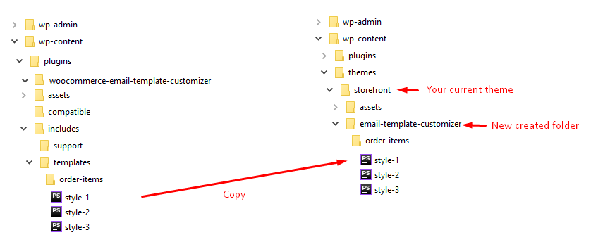
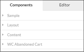
1 – Add a new category in sidebar components.
ViWec.Components.registerCategory($id, $display_name);
2 – Add a new component
ViWec.Components.add({
category: 'category_id',
type: 'component_type',
name: 'component_name',
icon: 'component_icon',
html: '<div class="target_selector">HTML after stop drag</div>',
properties: [
{
key: "unique_key",
inputType: SectionInput,
name: false,
section: contentSection,
data: {header: "Section header"},
},
{
key: "option_key",
htmlAttr: 'innerHTML',
target: '.target_selector',
section: contentSection,
col: 16,
inputType: TextInput,
renderShortcode: true,
data: {shortcodeTool: true}
},
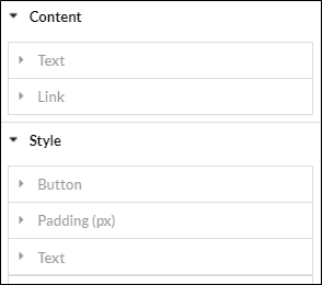
{
key: "padding_header",
inputType: SectionInput,
name: false,
section: styleSection,
data: {header: "Padding (px)"}
},
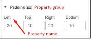
{
name: "Left",
key: "padding-left",
htmlAttr: "style",
section: styleSection,
col: 4,
unit: 'px',
inputType: NumberInput,
data: {id: 20, max: 250},
},
{
name: "Top",
key: "padding-top",
htmlAttr: "style",
section: styleSection,
col: 4,
unit: 'px',
inputType: NumberInput,
data: {id: 20},
},
{
name: "Right",
key: "padding-right",
htmlAttr: "style",
section: styleSection,
col: 4,
unit: 'px',
inputType: NumberInput,
data: {id: 20, max: 250},
},
{
name: "Bottom",
key: "padding-bottom",
htmlAttr: "style",
section: styleSection,
col: 4,
unit: 'px',
inputType: NumberInput,
data: {id: 20},
}
],
inheritProp: ['text', 'alignment', 'margin']
});
|
Description |
|
| Element |
| Type |
Identify for element |
|
| Category |
Group elements in order |
 |
| Name |
Name displayed in element list |
 |
| Icon |
Icon |
 |
| html |
html of components after dragging to view area |
|
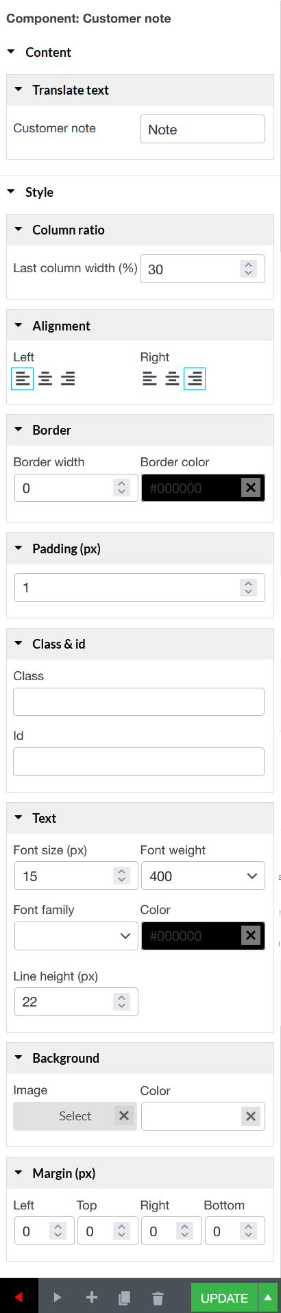
| Properties |
Declare attributes of components |
 |
| Onchange |
Processing functions when an attribute changes |
|
| Properties |
| Key |
Attribute (href, padding, border,… or other spontanous values) |
|
| Name |
Display name of attributes or group of attributes |
 |
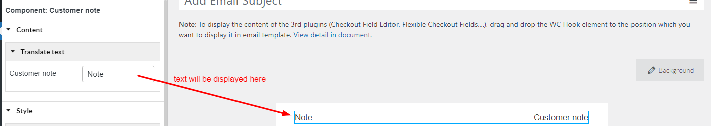
| htmlAttr |
Classify attributes: inner HTML, style, child Style, other(href, data-*,…).
When attribute values change, the result is:
– inner HTML: Value will display in view side.
– style: set style for div cover outside of component.
– childStyle: set style for component inside as the selector declared (target)
– other: set attribute for component as selector. |
|
| Target |
Class or id of child component needs to edit |
|
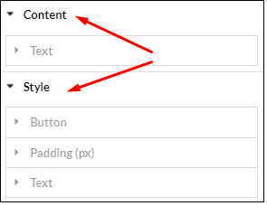
| Section |
Declare group which property belongs to (content Section or style Section) |
 |
| Col |
The display width of property control (4, 8, 16) |
 |
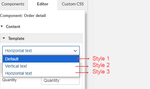
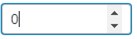
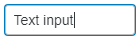
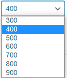
| Input Type |
Input control types can be rendered: Section Input, Number Input, Text Input, Img Input, Color Input, Select2Input, Select Input, Checkbox Input, Text Editor |
 |
 |
 |
 |
| Data |
Pass data to control (Mainly pass options to select input type) |
|
| Unit |
Some properties need unit like padding, margin,… |
|
| OnChange |
Hook when occurring events with input |
|