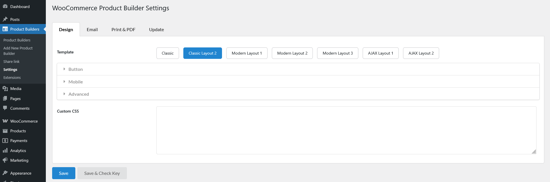
Go to Dashboard >> Product Builders >> Settings >> Design
In the Design tab, you can choose the product builder templates, customize the button on the product builder page, customize on mobile mode, and other advanced features.
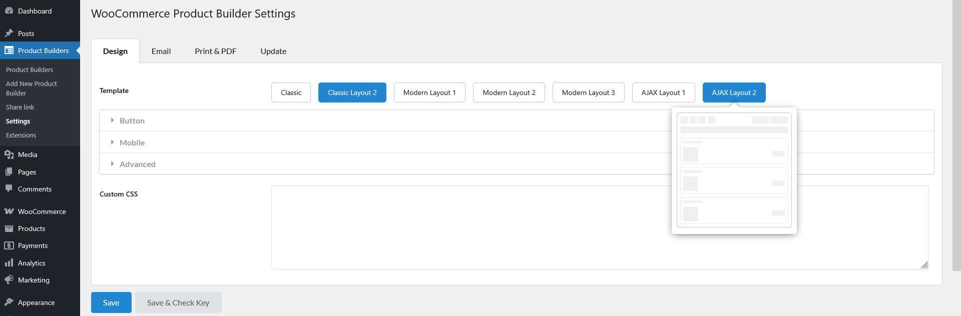
Template
Choose from 7 available templates to define how your product builder appears on the frontend. Refer to our documentation for a detailed preview of each template and their differences.
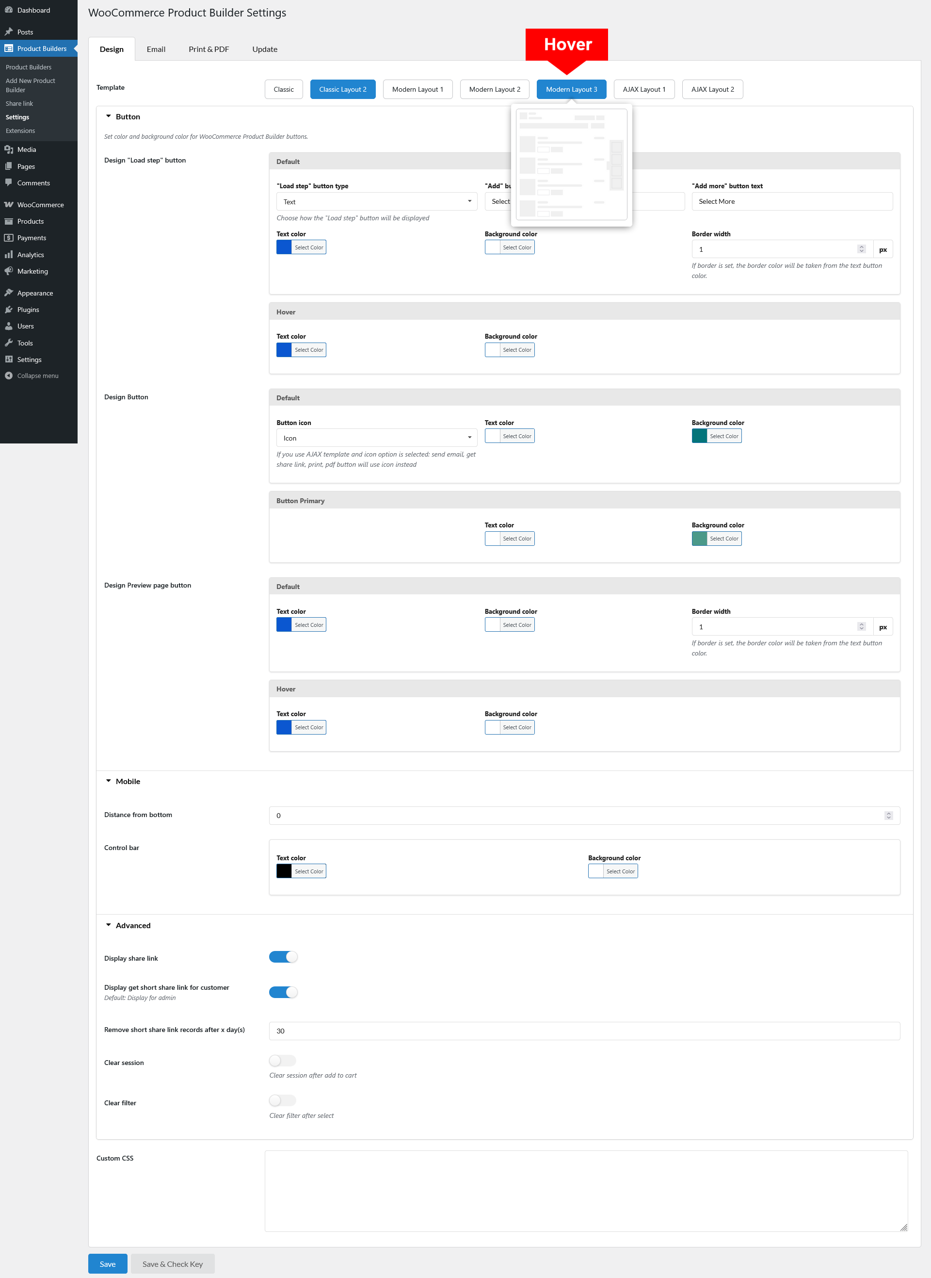
Hover the template you want to see its preview
Button
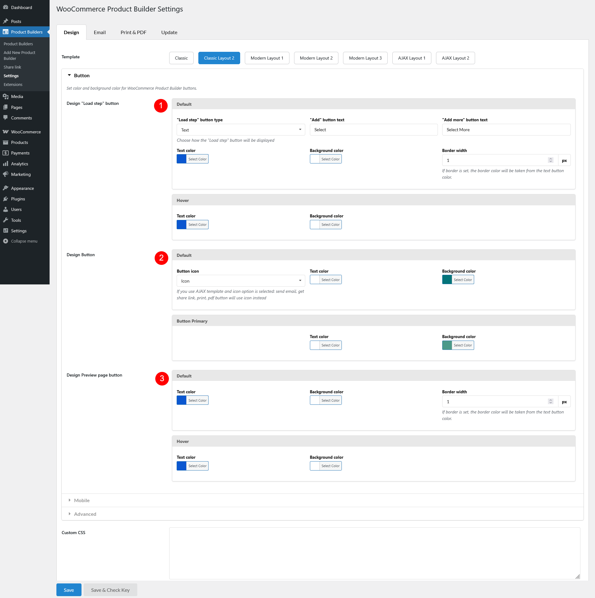
- Design “Load step” button:
- Default status: Set the initial state of the “Load Step” butt
- “Load step” button type: Choose how the button appears – icon or text
- “Add” button text: Specify the label for the “Add” button
- “Add more” button text: Specify the label for the “Add more” button
- Text color: Set the button’s text color
- Background color: Choose the button’s background color
- Border width: Adjust the border thickness. If a border is set, its color will match the button text color
- On hover: Customize the button appearance when hovered
- Text color: Set hover text color
- Background color: Choose a hover background color
- Default status: Set the initial state of the “Load Step” butt
- Design Button
- Default
- Button icon: Choose whether to display an icon or text for certain buttons (AJAX templates use icons for email, share, print, and PDF actions)
- Text color: Set the default text color
- Background color: Select the default background color
- Button Primary
- Text color: Customize the primary button text color
- Background color: Choose the primary button background color
- Default
- Design Preview page button
- Default
- Text color: Set the default text color
- Background color: Choose a background color
- Border width: Adjust the border thickness (border color will match text color if applied)
- Hover state
- Text color: Define hover text color
- Background color: Select a hover background color
- Default
Mobile
Optimize the product builder for mobile users.
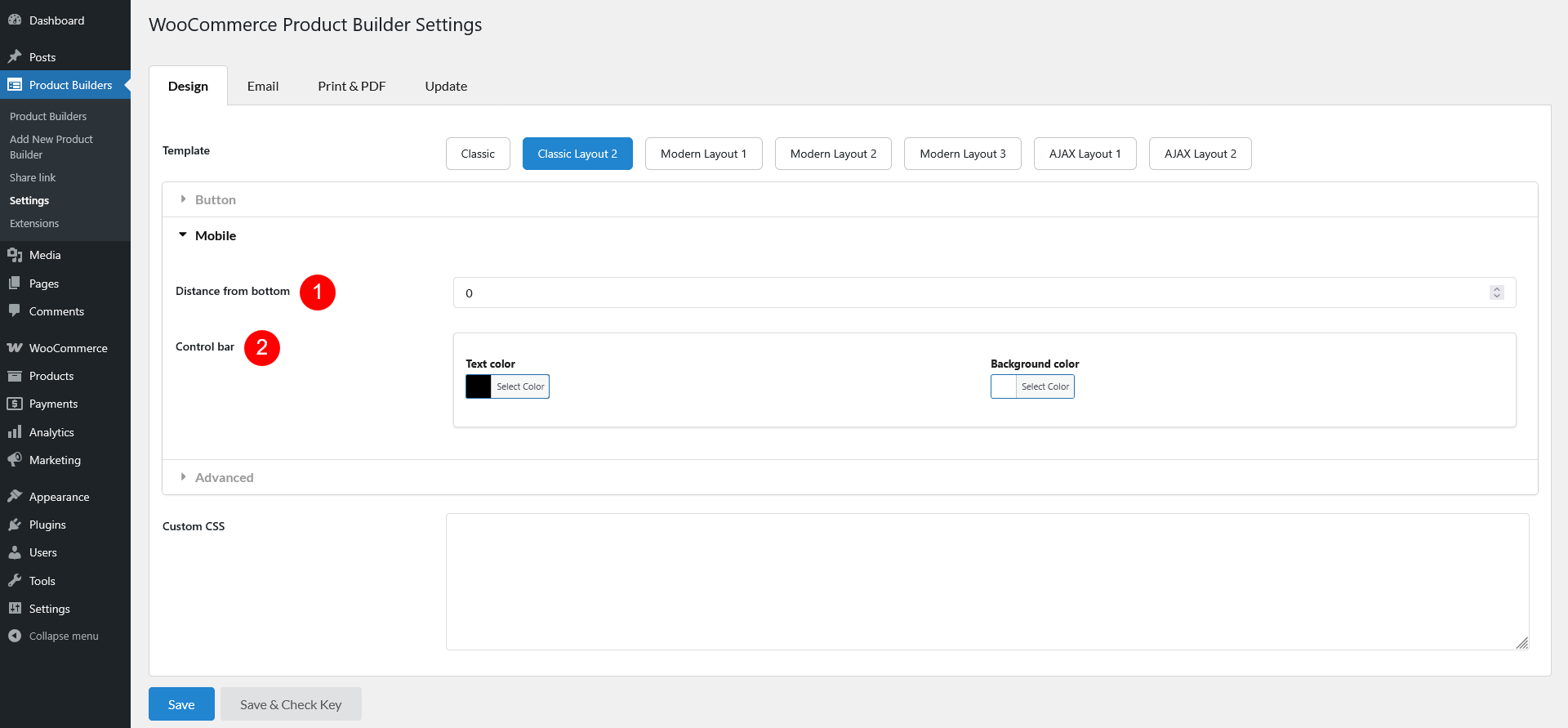
- Distance from bottom: Adjust the control bar’s distance from the bottom of the screen
- Control bar

- Text color: Customize control bar text color
- Background color: Set control bar background color
Advanced
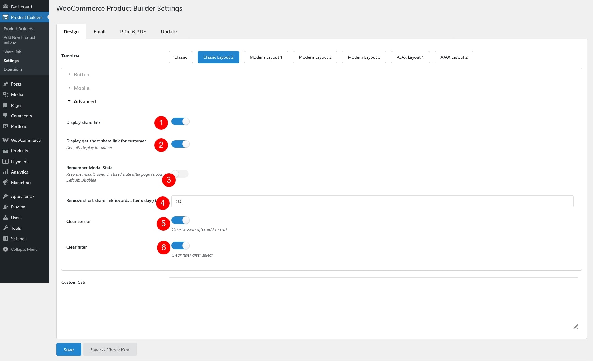
- Display share link: Toggle to show or hide the share link
- Display get short share link for customer: Enable or disable short links for customers (default: always visible for admin)
- Remember Modal State: When enabled, the widget will remember whether it was open or closed and keep that state after the page reloads. Turn this option off if you don’t want the widget to retain its previous state
- Remove short share link records after x day(s): Set the number of days before short share links are automatically deleted
- Clear session: Reset session data for a fresh start after customer adds a product builder to cart
- Clear filter: Remove applied filters after being selected
Custom CSS
For developers and advanced users, apply custom CSS to further style and modify the product builder according to your needs.