Contact

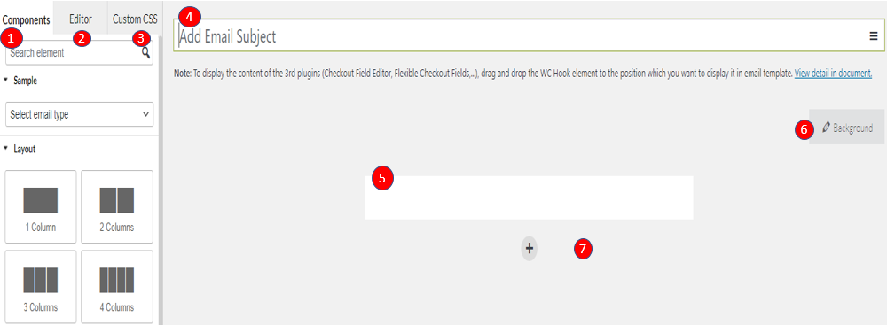
The Contact element allows your site’s visitors a simple way to get in touch with you.
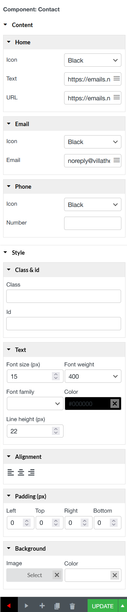
A. Content

Home

  • Icon: Add the home icon format: Black; White; White/border; Black/border; Black/White; White/Black.
  • Text: Enter text you want to your homepage to be displayed, it can be an URL link or your homepage name.
  • URL: Enter a link URL of your homepage.

Email

  • Icon: Add the Email icon format: Black; White; White/border; Black/border; Black/White; White/Black.
  • Email: An email type. Includes validation for email.

Phone

  • Icon: Add the Phone icon format: Black; White; White/border; Black/border; Black/White; White/Black.
  • Number: A telephone number type.


B. Style

  • Class & id: Specify a class and/or ID for the component. Each component can have only one ID, but you can assign multiple classes, just separate them with spaces.
  • Text: Font size (px); Font weight; Color; 
  • Alignment: Align the text to the left, right, center.
  • Padding: Type space between the border of  and the content inside it.
  • Background: Set Image and color for contact background if it is necessary.


Socials

The Social element lets you add icon links to all your social media profiles.


A. Content

Supported social media icons are: Facebook; Twitter, Instagram, Youtube, Linkedin, Whatsapp, Telegram, TikTok, Pinterest, Discord

* Use the Icon library to choose the Social Network icon of your choice, and enter a link URL to the social network.


B Style

  • Image: Control the direction of the social icons Horizontal or vertical, and their width
  • Class & id: Specify a class and/or ID for the component. Each component can have only one ID, but you can assign multiple classes, just separate them with spaces
  • Alignment: Align the text to the left, right, center.
  • Padding: Type space between the border of  and the content inside it.
  • Background: Set Image and color for social background if it is necessary.


Menu Bar

The Menu bar element allows you to create menu bar in the template, containing a list of maximum 4 items, with text and URL link. In a real email, when user clicks to the text of an item, they’ll be redirected to the link assigned to that item.

A. Content

  • Text: Give the anchor a name.
  • Link: Add an URL link to the item in this field.

B. Style

  • Direction: Horizontal or vertical.
  • Class & id: Specify a class and/or ID for the component. Each component can have only one ID, but you can assign multiple classes, just separate them with spaces.
  • Text: Font size (px); Font weight; Color; 
  • Alignment: Align the text to the left, right, center.
  • Padding: Type space between the border of  and the content inside it.
  • Background: Set Image and color for menu background if it is necessary.


Image

The Image element helps you display images in the email template. Scroll down to read more details.

Note: If you don’t see the image visible in real emails, please try this suggestion.

A. Content

Image – Upload an image like featured image, Site Logo, and Author Profile Picture.

  • URL: Add and URL links to the picture in this field.
  • Alt: An alternative name for the picture or a description, it will also link to the picture when click it.

B. Style

  • Size: Choose the size of the image (Width px)
  • Class & id: Specify a class and/or ID for the component. Each component can have only one ID, but you can assign multiple classes, just separate them with spaces.
  • Alignment: Set the image Alignment: left, right, center.
  • Padding: Type space between the border of  and the content inside it.
  • Background: Set Image and color for image background if you need.


Button

The Button element helps you easily design and customize buttons without the need for any other plugins or shortcodes.

  • Content
    • Text: Enter the button’s text and you can add ()shortcode if you need
    • Link: Set the URL for the button’s link.
  • Style 
    • Button: Border width; Border radius; Border color; Border style; Button color; and Button width.
    • Class & id: Specify a class and/or ID for the component. Each component can have only one ID, but you can assign multiple classes, just separate them with spaces.
    • Text: Font size (px); Font weight; Color;
    • Alignment: Align the text to the left, right, center.
    • Margin (px): Left; Top; Right; Bottom.


Text

The Text element gives you more styling options that let you change settings like font weight, line height, letter spacing, alignment and more.


A. Text Editor

  1. Typography: Set the typography options for the text – Bold; Italic; or Underline
  2. Alignment: Align the text to the left, right, center, or justified
  3. Link: Mark particular text, and insert/edit link.
  4. Image: Insert/Edit image.
  5. Font size: Set font size for the text.
  6. Text Color: Choose the color of the text.
  7. Background Color: Choose the background color for the text.
  8. Information icons: List of information icons you can use, select the icon you want in this list.
  9. Social icons: List of social icons you can use, select the icon you want in this list.
  10. Shortcode: List of shortcodes you can use, select the shortcode you want in this list.
  11. Font-family: Choose the font you want the text to be displayed


You can edit the “Text” element with HTML tags by selecting the “Text” tab that’s next to the “Visual” tab

B. Style

You can style the text includes: Line height (px); Background; Padding; Border (Width, Radius)

  • Alignment: Tick “Center on mobile” checkbox if you want to show the text at the center on the mobile screen
  • Class & id: Specify a class and/or ID for the component. Each component can have only one ID, but you can assign multiple classes, just separate them with spaces
  • Line height (px): Type value for the height of text line.
  • Background: Set Image and color for text background.
  • Padding: Type space between the border of  and the content inside it.
  • Border color and style: Set the color and style for the border
  • Border Width (px) and Radius (px): Control the thickness of the border around the text and set the border-radius to control corner roundness.


EMAIL PANELS OVERVIEW


1. Widget panel and Editing area


1. Components: The panel of components helps you work with options in order to drag and drop layout and contents to the editing space.

2. Editor: The editor panel will appear when you are working with an element and allow you to customize such us the borders, background color, padding, margin…

3. Custom CSS:  You can add your own CSS code to design on the front-end as you want.

4. Email Subject: Add email subject, customize easily with variety of shortcodes.

5. Edit space: The area displays the email content you are editing.

6. Background color: insert background for email. You can add images and customize the color.

7. Select layout button: Click to add a new layout quickly.


2. Actions with current email template.

At the left bottom of the email editing page, you can choose to interact with the email:

1. Exit to Dashboard 4. Copy to draft
2. Toggle admin menu 5. Move to trash
3. Add new email template 6. Publish the email


3. Advanced options

a. Rules: Set rules to send an email if an order matches the rules.

1. Apply to billing countries: Select countries which this email template is applied to.

2. Apply to categories: Select categories which this email template is applied to.

3. Apply to products: Select products which this email template is applied to.

4. Apply to payment methods: Select payment methods which this email template is applied to.

5. Choose the price type which is applied to min/max price orders: Select the price type to apply this template, they can be Order subtotal, Order total.

6. Apply to min price order: Send this email template to the orders hit this min amount.

7. Apply to max price order: Send this email template to the orders hit this max amount.


b. Testing: Observe emails by the preview in PC and mobile mode; Check the email design before the real sending.


1. Select order: Select an order to send this email template.

2. PC preview: Observe emails by the preview in PC.

3. Mobile preview: Observe emails by the preview in mobile.

4. Send to: Testing email will be sent to this email address.

BUILD YOUR NEW EMAIL TEMPLATE

Steps 1: Go to Email Template settings> Add new.


Step 2: Create an email template you want to send customers, it can be: New Order;  Order On-Hold; Order Processing; Order Completed; Canceled Order; Failed Order…

WooCommerce Email Template Customizer uses 3 main building blocks: Row, Column and elements.  Row are the largest building blocks, and inside them are groups of Columns. Columns are used to cover outside elements. Elements are placed inside of columns.

You control, edit duplicate, remove row, Columns with their handles.

To edit row, column padding.

To duplicate row, column.

To remove row, column and element.


A. Layout

The layout can be 1-4 columns for you to choose from.

1. Set the Columns padding. You can do it under Layout, or drag the dashed line between the Columns.

2. Insert elements to your Columns.

B. Content

Content includes with different elements (Basic, Woocommerce and hooks) to your email template with full shopping information of WooCommerce and users’ information. The editing tab will show allow you to work directly on fast and effectively each element.

1. Insert Elements inside your Columns

2. Click on each element to edit and style.

3. Follow the Basic and WooCommerce Elements tab below to learn how to use Elements.