The Products element helps you display to recommend some products and links to the products in your store.
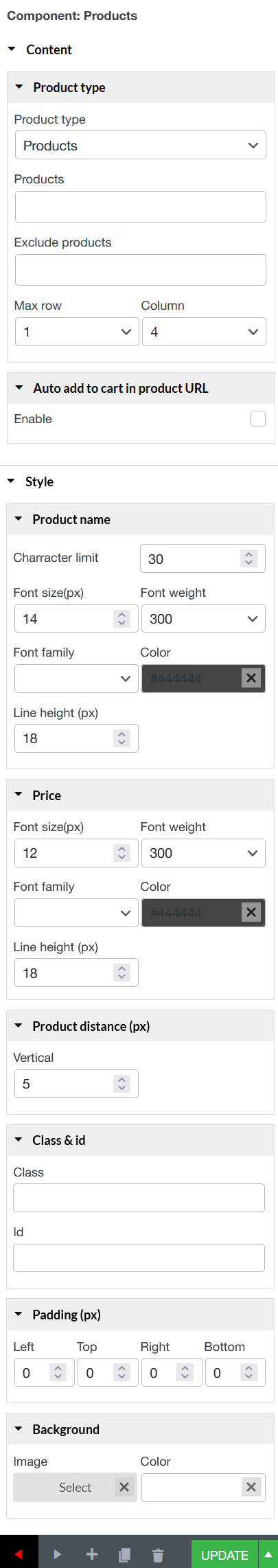
Content
Product type
Product type: Choose the type of products to display in your email recommendation block. You can dynamically insert products based on different criteria:
Newest: Displays the most recently added products
Related: Shows products related to the customer’s order items
Category: Displays products from the same categories of the order items
On sale: Highlights products that are currently on sale.
Featured: Displays products marked as “Featured” in your store
Up sell: Shows upsell products of the customer’s purchased items
Cross sell: Same as Upsells but this is items specified under order’s cross-sell
Best seller: Shows the best-selling products from your store
Best rated: Displays products with the highest average ratings
Products: If you select Products as the type, manually choose specific products to include. Enter the product titles in the “Products” field provided.
Select specific products you do not want to appear in the recommendation block.
Max row: Select the number of the suggest product rows, max row is 4.
Column: Select the number of the suggest product columns, max column is 4.
Auto add to cart in product URL: Tick in the Enable box if you want to automatically add to cart of customer when they click the link to the product.
Style
Product name: Customize the appearance of the product title text using the following
Charracter limit: Set a maximum number of characters to display in product names. Useful for keeping email layouts tidy
Font size(px): Set the font size for product names in pixels
Font weight: Define the thickness of the text
Font family: Choose the font style for the product name text
Color: Choose the text color for product names using a color picker
Price: Customize the appearance of the product price text using the following
Font size(px): Set the size of the price text.
Font weight: Choose how bold or thin the price text appears
Font family: Select the font used for the price.
Color: Choose a color for the product price text
Product distance (px): Set the vertical spacing (in pixels) between product items when displayed in vertical layout mode.
Class & id: Specify a class and/or ID for the component. One can have only one ID, but you can assign multiple classes, just separate them with spaces.
Padding: Type space between the border of the image column and the content inside it.
Background: Set Image or color for background if you need.
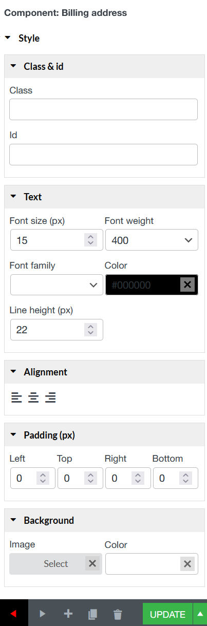
The Billing Addresselement and The Shipping Address element help you display the billing details and shipping details in the email template with customization for the color, size, and alignment of the heading and details separately. Also, customize the borders, background color, padding, margin.
Billing Address
Class & id: Specify a class and/or ID for the component. Each component can have only one ID, but you can assign multiple classes, just separate them with spaces.
Text: Font size (px); Font weight; Color;
Alignment: Align the content to the left, right, center.
Padding: Type space between the border of and the content inside it.
Background: Set Image and color for background if it is necessary.
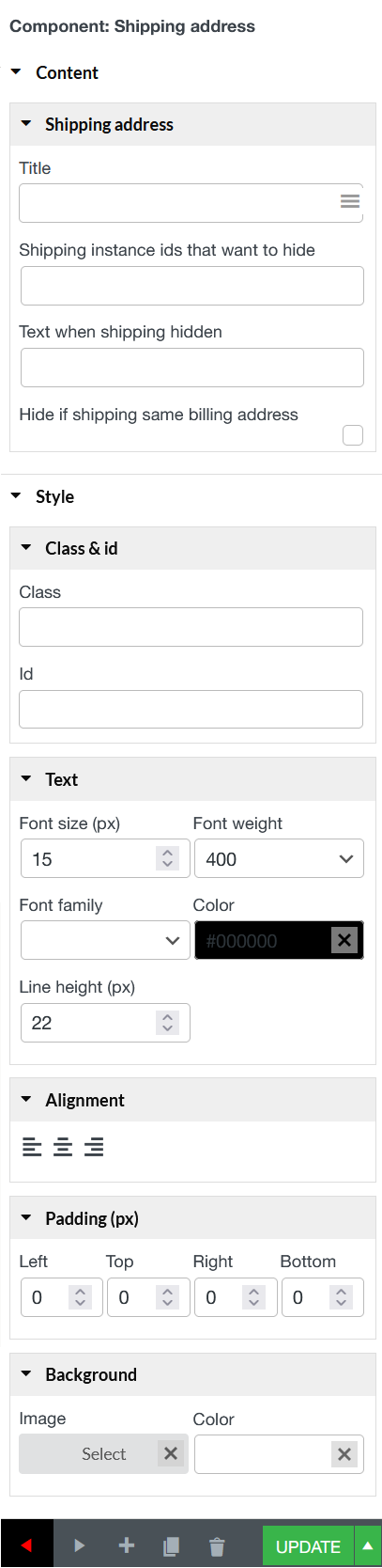
Shipping Address
Content
Shipping address:
Title: Customize the title that appears above the shipping address section in your email. Click the hamburger menu next to the input field to see all available shortcodes you can use. If there’s no shipping details to show or are hidden via settings, the title is hidden accordingly
Shipping instance ids that want to hide: Enter the specific Shipping Method Instance IDs that you want to hide the shipping address for
Text when shipping hidden: When the shipping address is hidden (based on your conditions), this text will appear in its place. For example: “No shipping required for this order.”. This helps avoid empty or confusing spaces in the email layout.
Hide if shipping same billing address: Check this box to automatically hide the shipping address when it is identical to the billing address
Style:
Class & id: Specify a class and/or ID for the component. Each component can have only one ID, but you can assign multiple classes, just separate them with spaces.
Text: Font size (px); Font weight; Color;
Alignment: Align the content to the left, right, center.
Padding: Type space between the border of and the content inside it.
Background: Set Image and color for background if it is necessary.
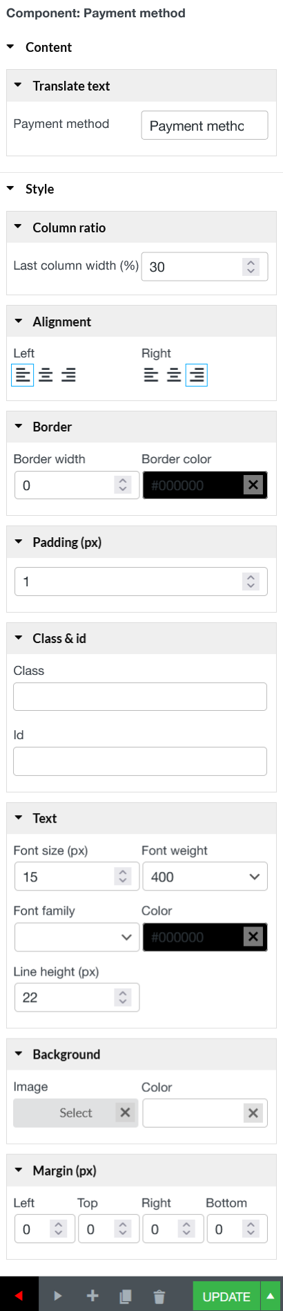
The Payment methodelement helps you display the payment method in the template, customize the borders, background color, padding, margin.
A. Content
Translate text: Type to change the title of the Payment method field.
B. Style
Column ratio: Control the width of last column of payment method (%)
Alignment: Align the payment method content to the left, right, center.
Border: Control the thickness of the payment method border and choose the border color.
Padding: Type space between the border of and the content inside it.
Class & id: Specify a class and/or ID for the component. Each component can have only one ID, but you can assign multiple classes, just separate them with spaces
Text: Font size (px); Font weight; Color;
Background: Set Image and color for payment method background if it is necessary.
Margin: Set the space between the border of payment method column and the next element in pixel including: Left; Top; Right; Bottom.
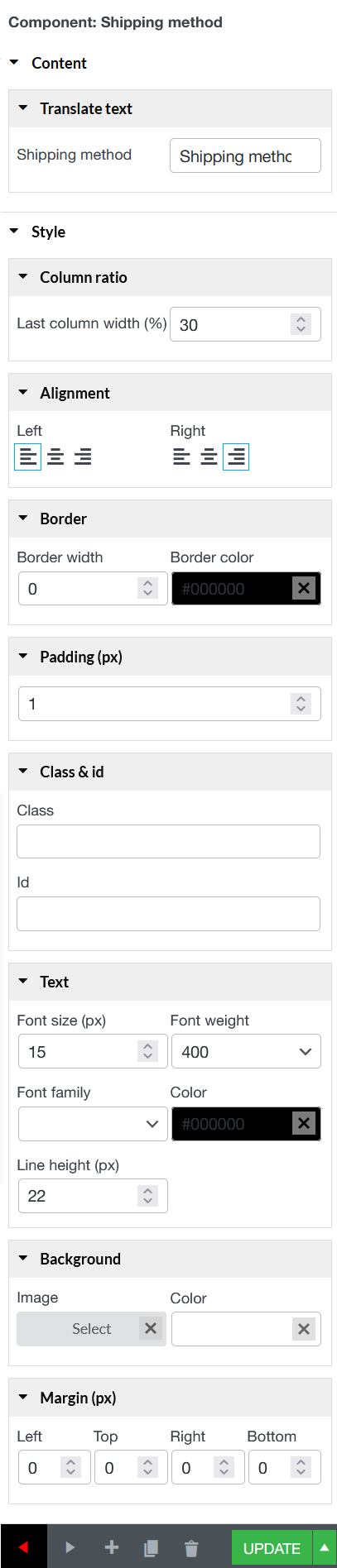
The Shipping methodelement helps you display the shipping method in the template, customize the borders, background color, padding, margin.
A. Content
Translate text: Type to change the shipping method field title.
B. Style
Column ratio: Control the width of last column of shipping method (%)
Alignment: Align the shipping method content to the left, right, center.
Border: Control the thickness of the shipping method border and choose the border color.
Padding: Type space between the border of and the content inside it.
Class & id: Specify a class and/or ID for the component. Each component can have only one ID, but you can assign multiple classes, just separate them with spaces
Text: Font size (px); Font weight; Color;
Background: Set Image and color for shipping method background if it is necessary.
Margin (px): Set the space between the border of shipping method column and the next element in pixel including: Left; Top; Right; Bottom.
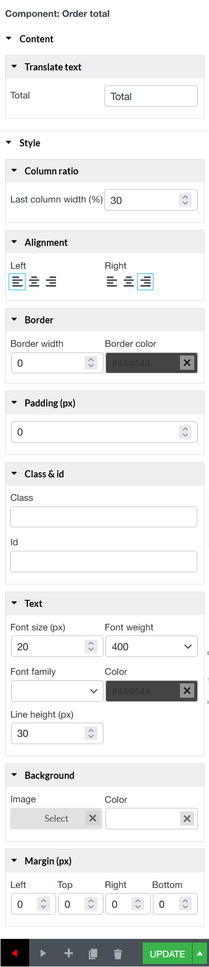
The Order total element helps you display total number of orders including Subtotal, discount, shipping, payment method, order fully refunded, total…with customization for the color, size, and alignment of the heading and details separately. Also, customize the borders, background color, padding, margin.
A. Content
Translate text: Type to change the title for Order Total field.
B. Style
Column ratio: Control the width of last column of order total (%)
Alignment: Align the order total content to the left, right, center.
Border: Control the thickness of the order total border and choose the border color.
Padding: Type space between the border of and the content inside it.
Class & id: Specify a class and/or ID for the component. Each component can have only one ID, but you can assign multiple classes, just separate them with spaces
Text: Font size (px); Font weight; Color;
Background: Set Image and color for order total background if it is necessary.
Margin: Set the space between the border of order total column and the next element in pixel including: Left; Top; Right; Bottom.
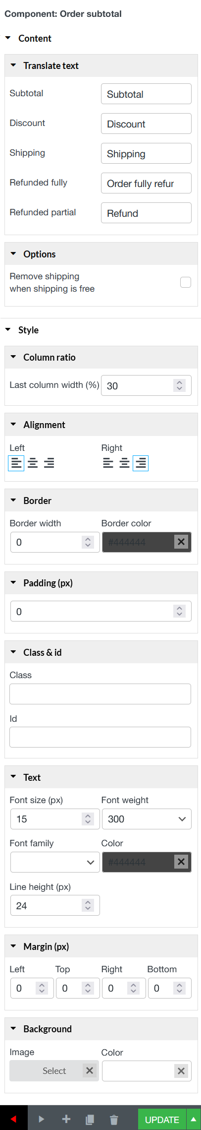
The Order subtotal element helps you display specifically components of orders: including Subtotal, discount, shipping, payment method, order fully refunded, …with customization for the color, size, and alignment of the heading and details separately. Also, customize the borders, background color, padding, margin.
A. Content
Translate text: Type to change the title for Subtotal; Discount; Shipping; Refunded fully; Refund partially fields.
Option: Tick “Remove shipping when shipping is free” checkbox if you want to remove Shipping field when shipping is free.
B. Style
Column ratio: Control the width of last column of order subtotal (%)
Alignment: Align the order subtotal content to the left, right, center.
Border: Control the thickness of the order subtotal border and choose the border color.
Padding: Type space between the border of and the content inside it.
Class & id: Specify a class and/or ID for the component. Each component can have only one ID, but you can assign multiple classes, just separate them with spaces.
Text: Font size (px); Font weight; Color;
Margin: Set the space between the border of order subtotal column and the next element in pixel including: Left; Top; Right; Bottom.
Background: Set Image and color for order subtotal background if it is necessary.
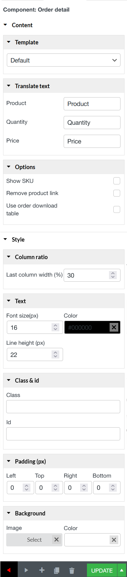
The Order detailelement helps you easily display fully the details of orders with customization for the color, size, and alignment of the heading and details separately. Also, customize the borders, background color, padding, margin.
A. Content
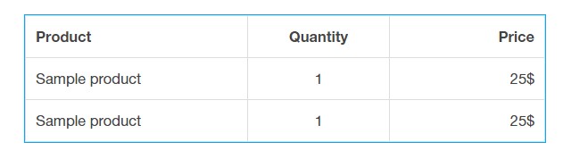
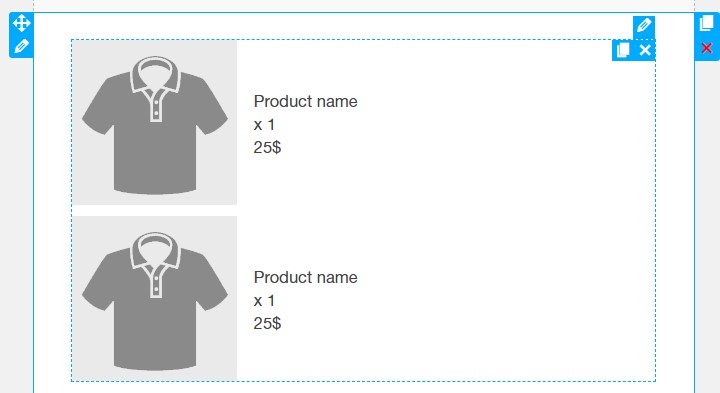
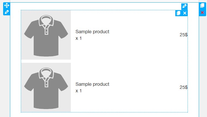
– Template: There are 3 templates of order detail to choose including:
Default
Vertical text
Horizontal text
– Translate text: Type text you want to display on the email. For both Horizontal text and Vertical text templates, just enter text for “Quantity”. With Default Temple, they are: Product, Quantity, Price.
– Option: Tick in the boxes if you want to:
Show SKU
Remove product link
Use order download table
B. Style
If Template is “Default”
Column ratio: Control the width of the last column by adding the value without unit (percentage).
Text: Change appearance of text by change value in Font size, Color and Line height.
Class & id: Specify a class and/or ID for the component. Each component can have only one ID, but you can assign multiple classes, just separate them with spaces.
Padding: Type space between the border of and the content inside it.
Background: Set Image and color for order detail background if it is necessary.
If Template is “Horizontal text” or “Vertical text”
Order items: Adjust the background color, image width (px), border width and border color, and the vertical distance between product items to create a clean and readable product list.
Product name: Control how product names appear by setting the font size, font weight, font family, text color, and line height.
Price: Customize the look of product prices using font size, font weight, font family, text color, and line height.
Quantity: Style the quantity field with options for font size, font weight, font family, text color, and line height to match your overall email design.
Class & id: Specify a class and/or ID for the component. Each component can have only one ID, but you can assign multiple classes, just separate them with spaces.
Padding: Type space between the border of and the content inside it.
Background: Set Image and color for order detail background if it is necessary
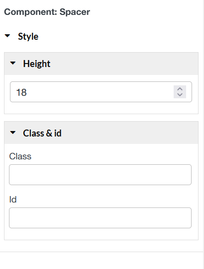
The Spacer element creates a block of space anywhere on your page. You can fill this block of space with a color or an image. You can use it to create cool shapes and elements as well.
Height: Set the amount of vertical space.
Class & id: Specify a class and/or ID for the component. Each component can have only one ID, but you can assign multiple classes, just separate them with spaces
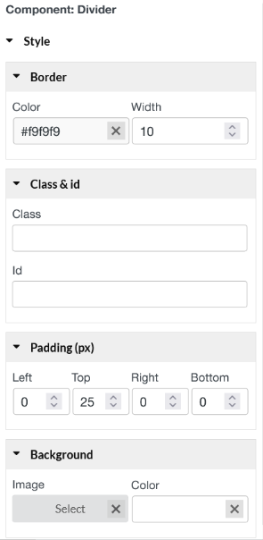
The Divider element allows you to add styled horizontal lines that divide your content.
Border: Color – Choose the color of the divider; Width – Control the width of the divider.
Class & id: Specify a class and/or ID for the component. Each component can have only one ID, but you can assign multiple classes, just separate them with spaces.
Padding: Left; Top; Right; Bottom.
Background: Set Image and color for divider background if it is necessary.