Copyright Villatheme 2015-2026
Created: 10/2021
Update: 6/2026 – Updated version: 1.2.11
By Villatheme
Thank you for purchasing our plugin. If you have any questions that are beyond the scope of this documentation, please feel free to request support at our Support Forum. Thanks so much!
System required:
Recommended:
Download plugin:
Go to Plugin/Add New/Upload Plugin/Choose file/
Select plugin zip file pofily-woocommerce-product-filters.zip
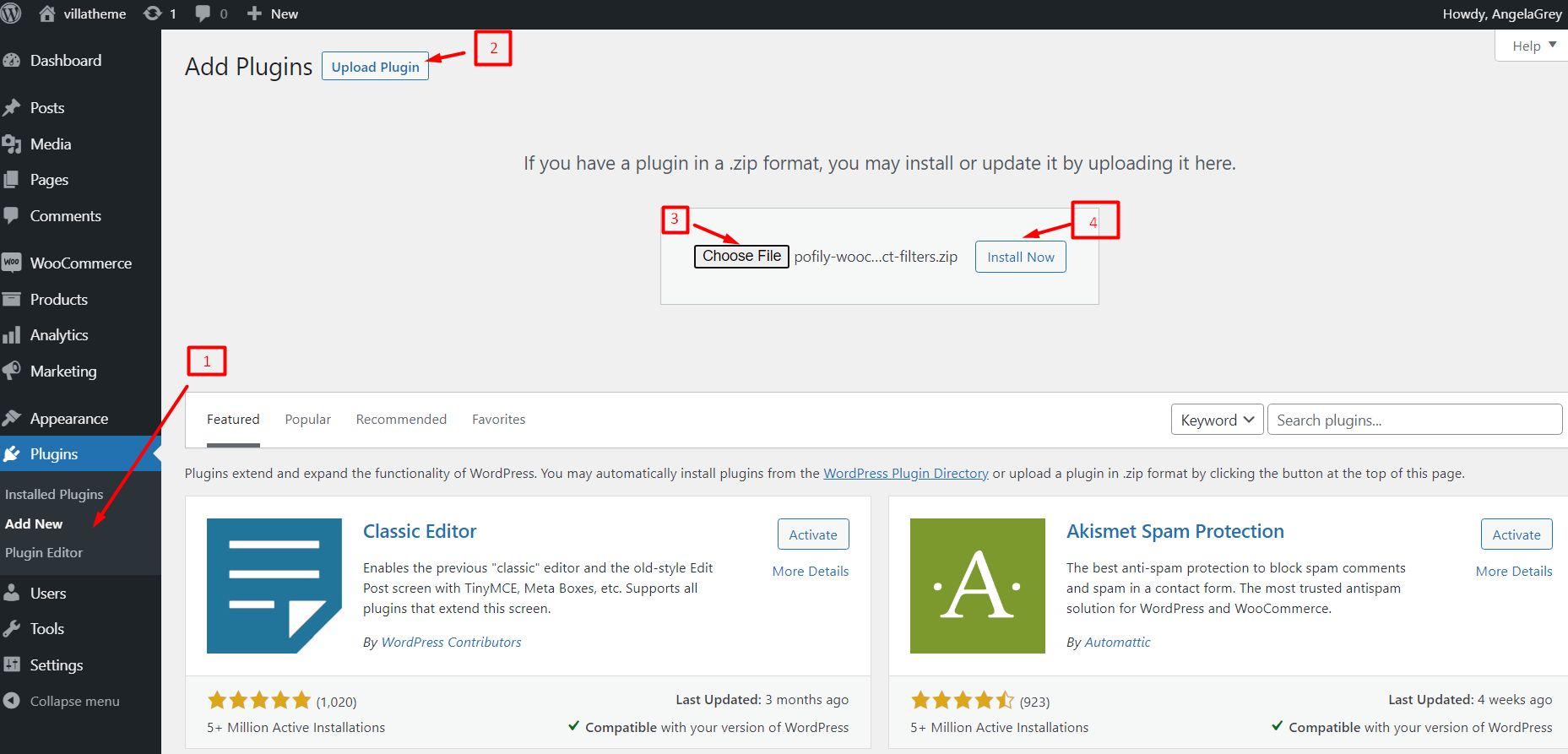
Install now –> Activate plugin
Video for guidance on How to install and use Pofily – WooCommerce Product Filters
After installing and activating Pofily, you can:
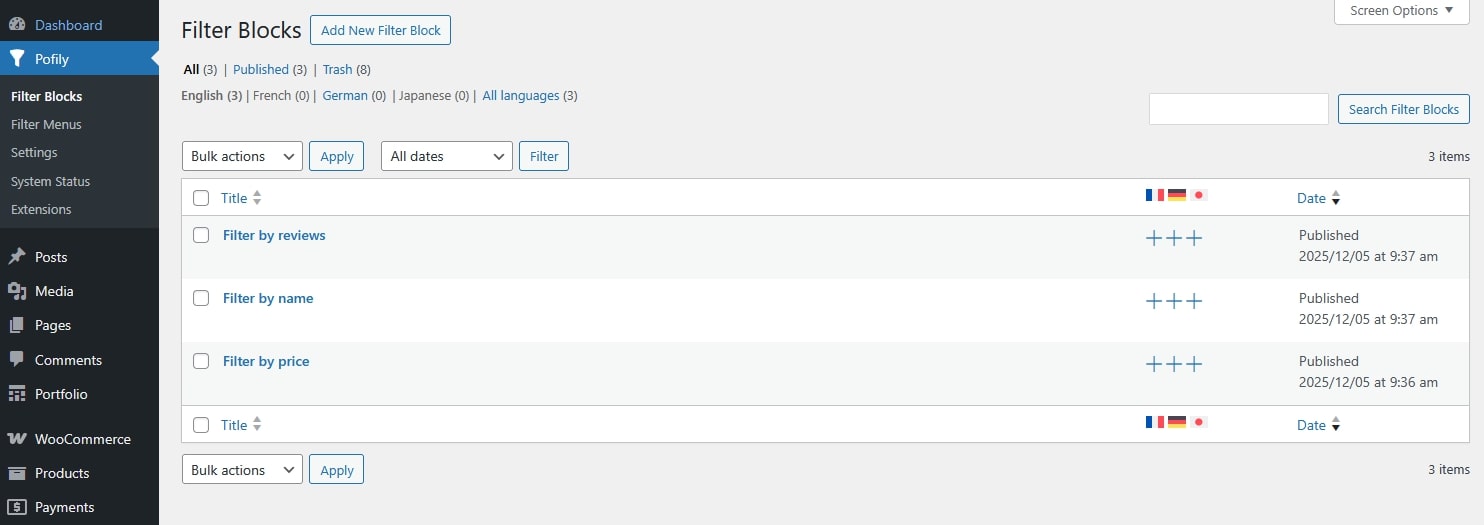
Add and edit filter blocks with various options to customize at Filter Blocks. 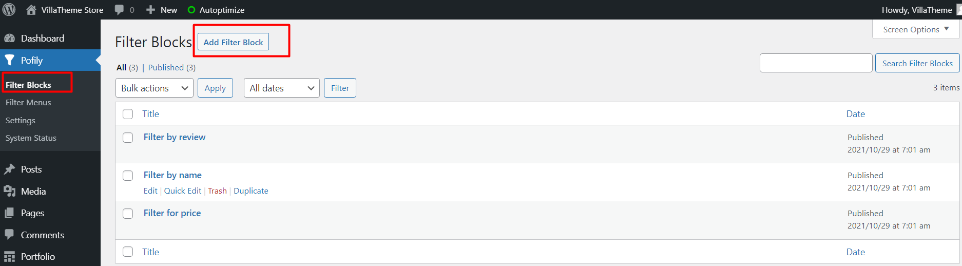
Add and edit filters menu with new-made or available filter blocks you created and customize how it displays on the frontend at Filter Menu. 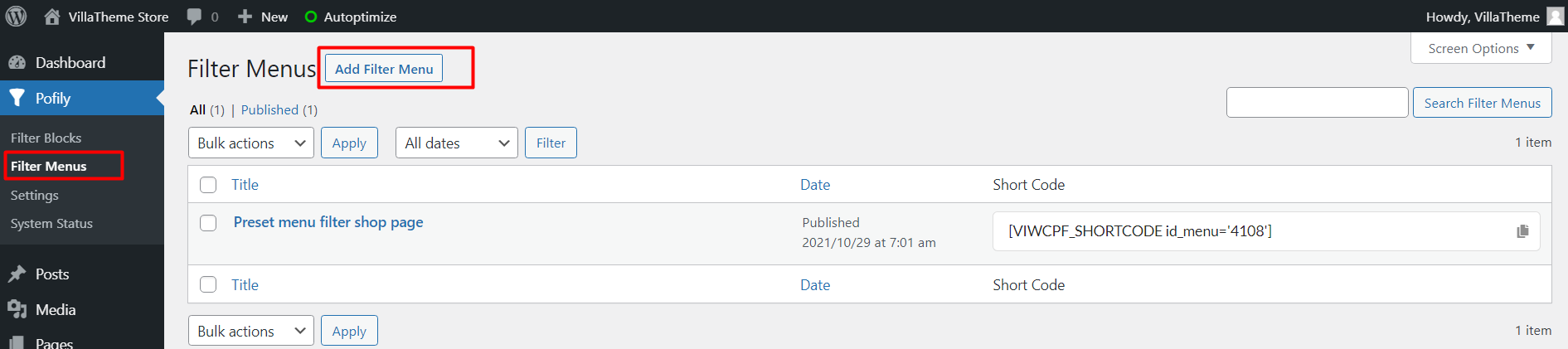
Go to Pofily –> Filter Blocks –> Add Filter Blocks
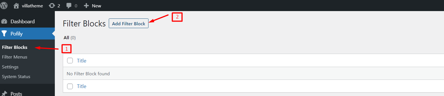
Now you can start creating new Filter Blocks

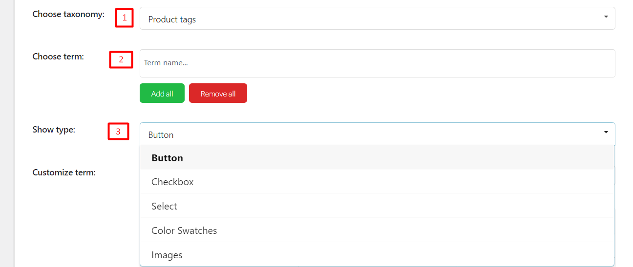
Choose taxonomy: Choose one option of taxonomy.
Choose term: You can add terms of category or tag based on your selection above manually. Or use Add all Button to add all available terms.
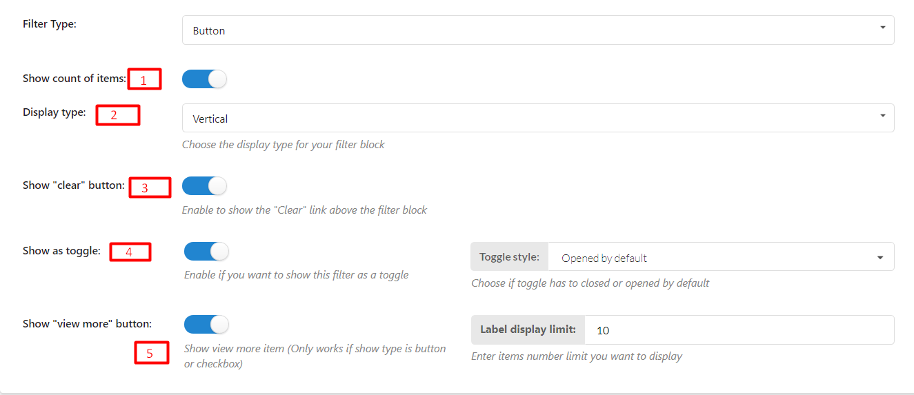
BUTTON TYPE
When you choose this type, Taxonomy will display as a button.
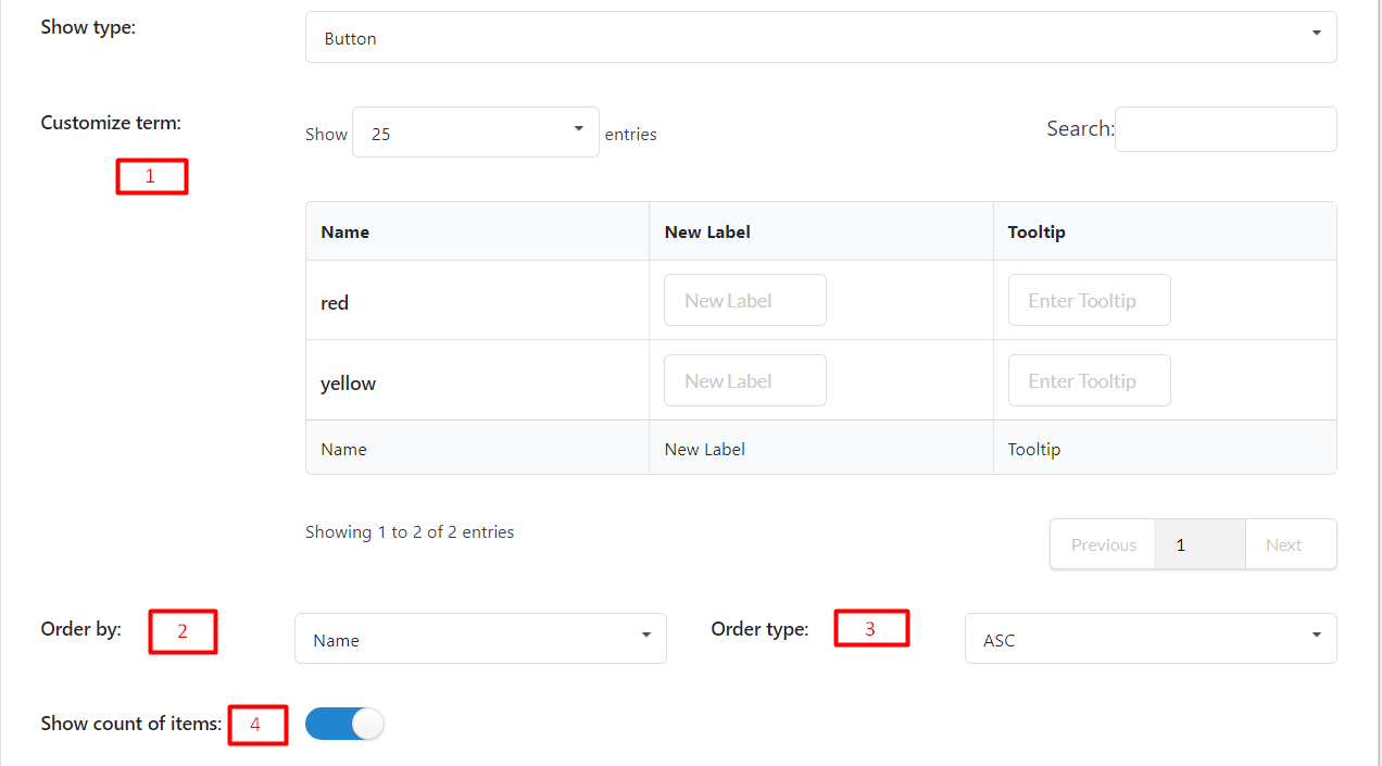
Name: After you add a term, the name of the term will appear in this column.
New Label: Add a label for the term. This field is optional and will appear on the frontend when you show Filter. If this field is empty, it will take the Name to display
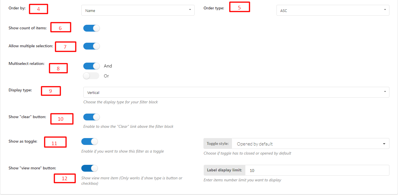
CHECKBOX TYPE
When you choose this type, Taxonomy will display as checkboxes.
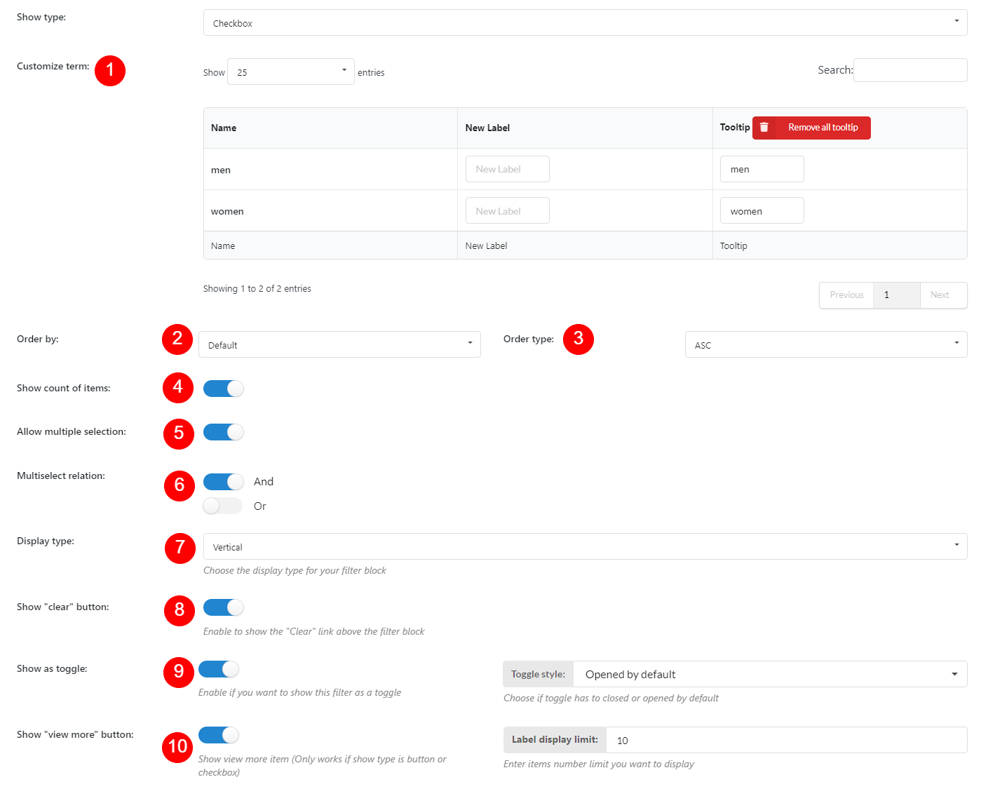
Name: After you add a term, the name of the term will appear in this column.
New Label: Add a label for the term. This field is optional and will appear on the frontend when you show Filter. If this field is empty, it will take the Name to display
SELECT TYPE
When you choose this type, Taxonomy will show up as selections.
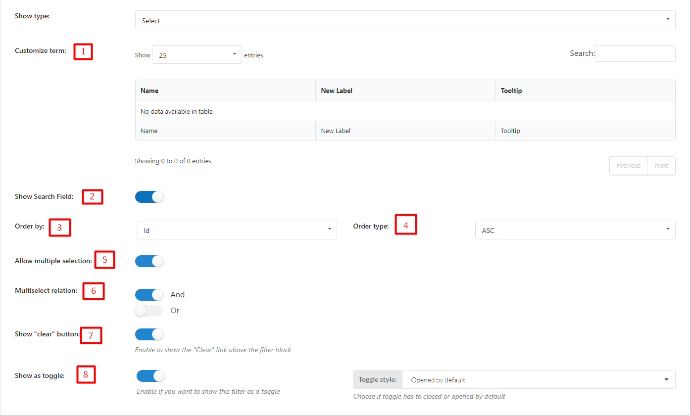
Name: After you add a term, the name of t the term will appear in this column.
New Label: Add a label for the term. This field is optional and will appear on the frontend when you show Filter. If this field is empty, it will take the Name to display
COLOR SWATCHES TYPE
When you choose this type, taxonomy will show up as colored buttons.
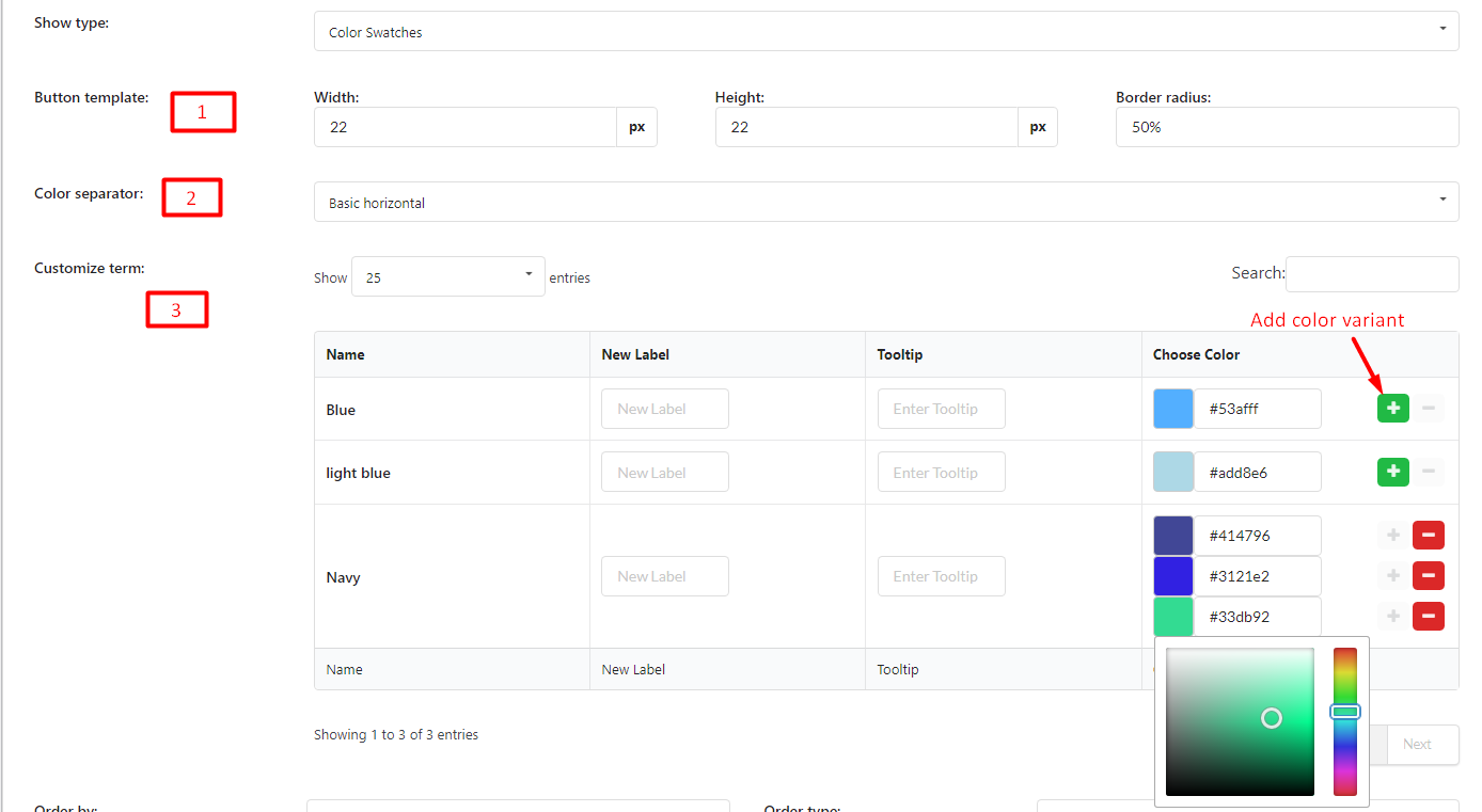
Name: After you add a term, the name of the term will appear in this column.
New Label: Add a label for the term. This field is optional and will appear on the frontend when you show Filter. If this field is empty, it will take the Name to display
IMAGES TYPE
When you choose this type, Taxonomy will display as images.
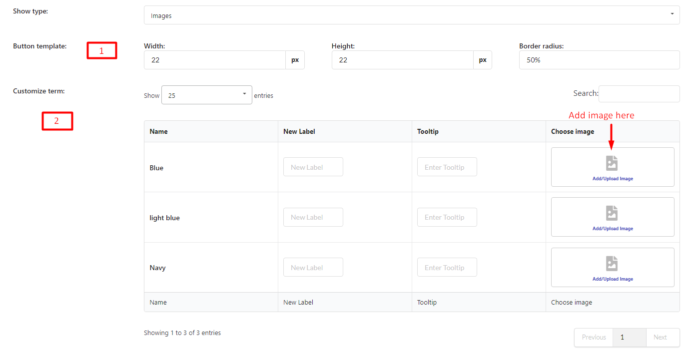
Name: After you add a term, the name of the term will appear in this column.
New Label: Add a label for the term. This field is optional and will appear on the frontend when you show Filter. If this field is empty, it will take the Name to display
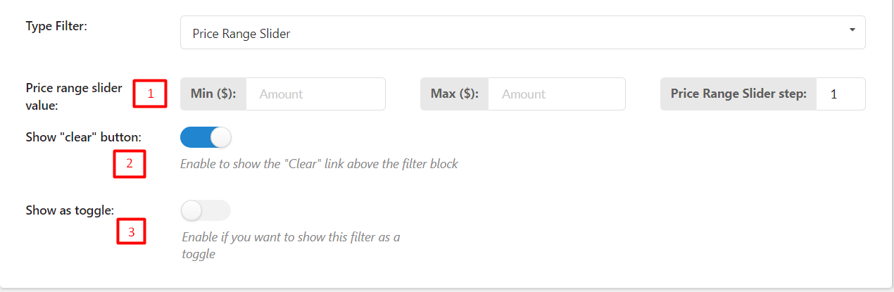
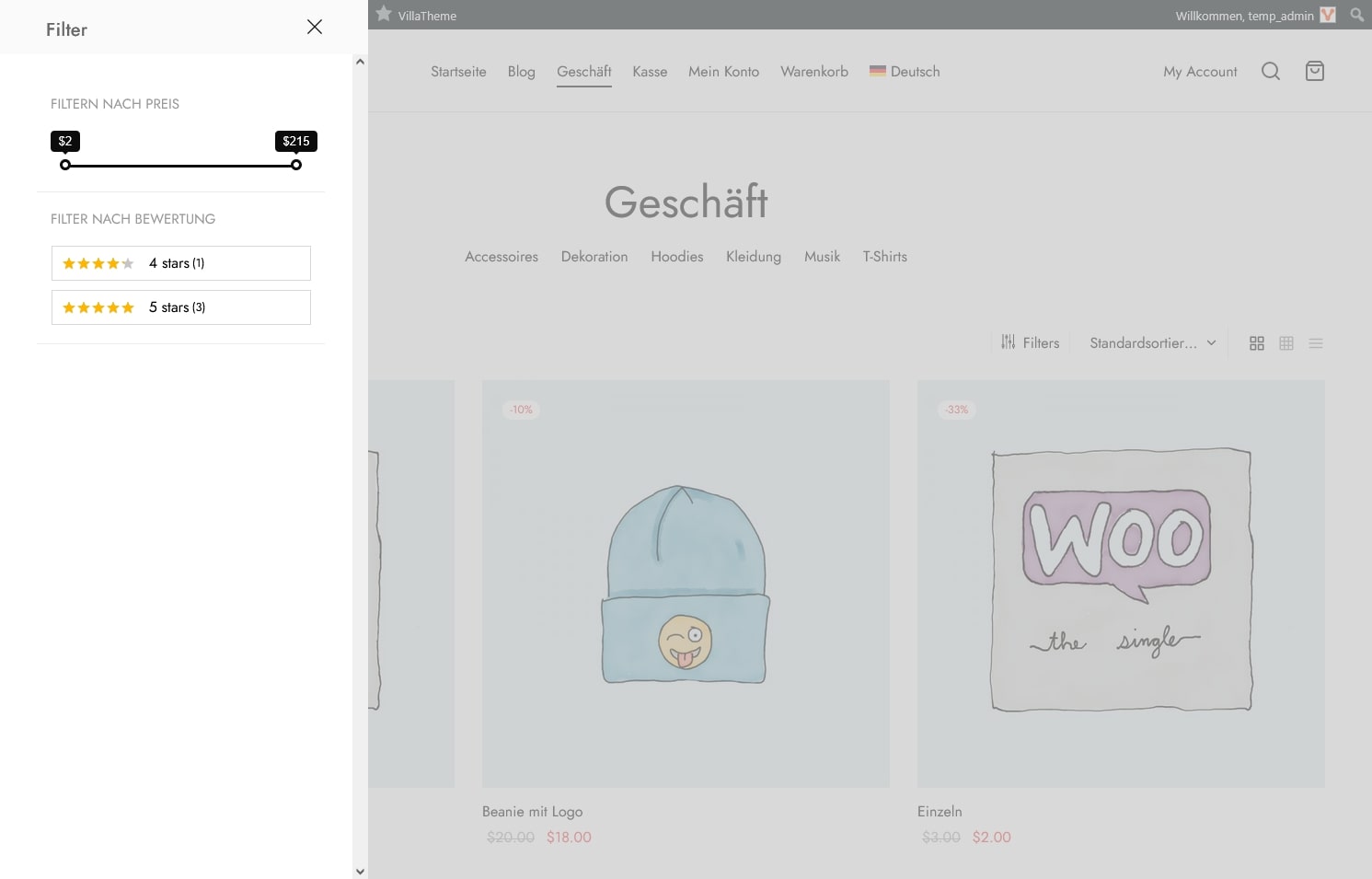
When you choose this Filter, customers can search for products with prices that match their needs.
There are 2 types of Filter: Price Range Slider and Price Range
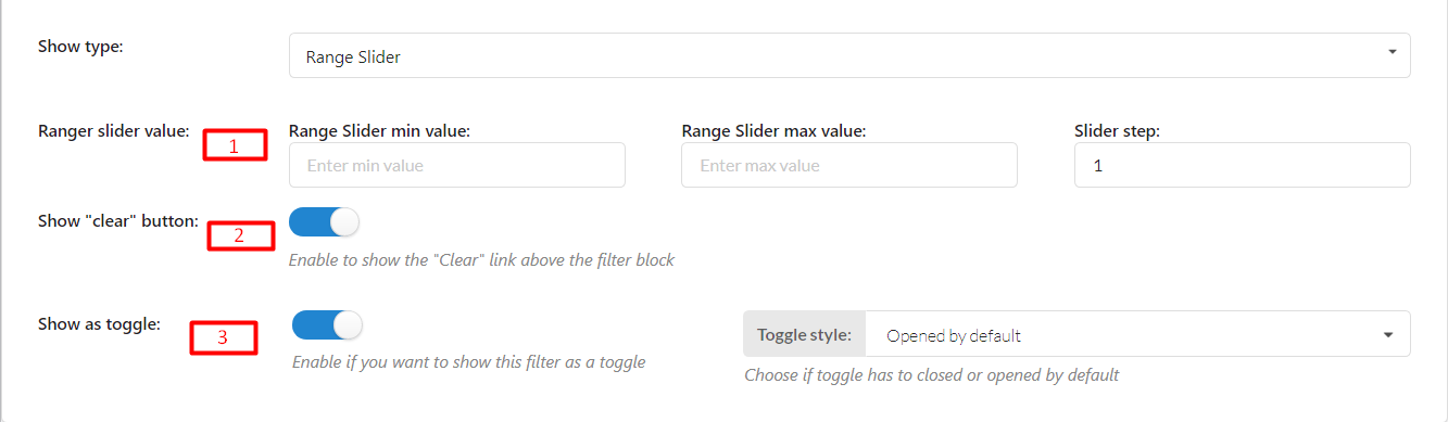
PRICE RANGE SLIDER
Create a range slider that allows customers to search for products with ideal prices flexibly.
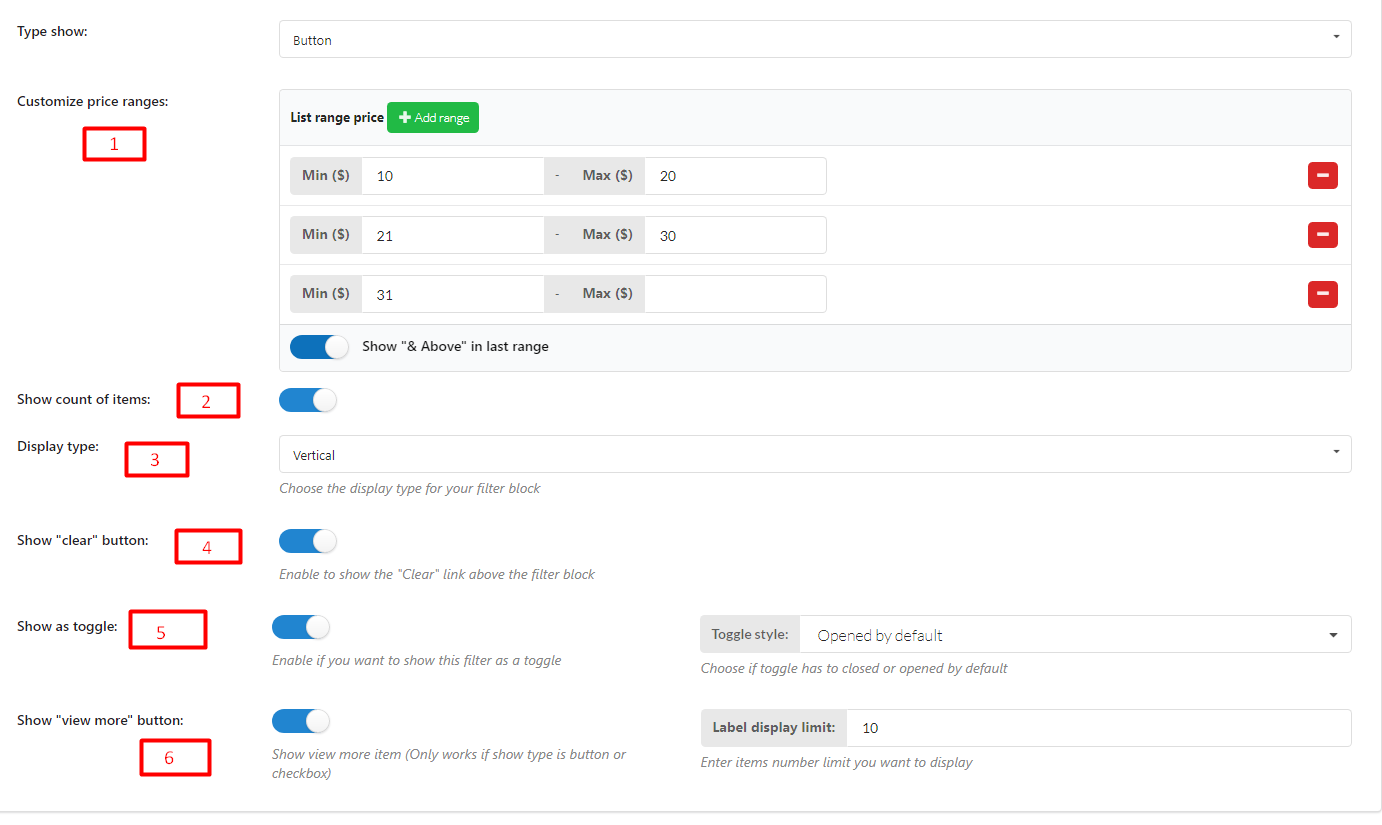
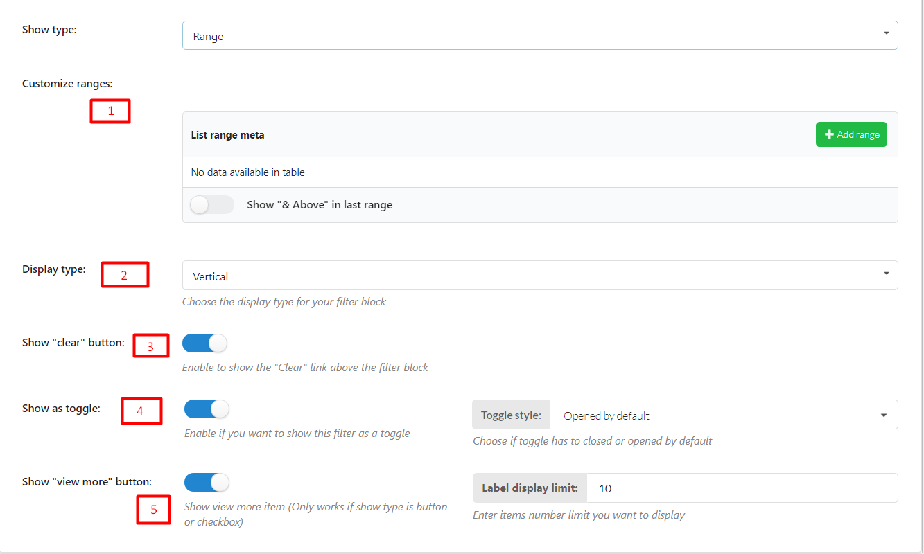
PRICE RANGE
Create a stable range manually where customers can find their ideal price by selecting available options.
There are 3 options to display range on frontend: Button, Select and None
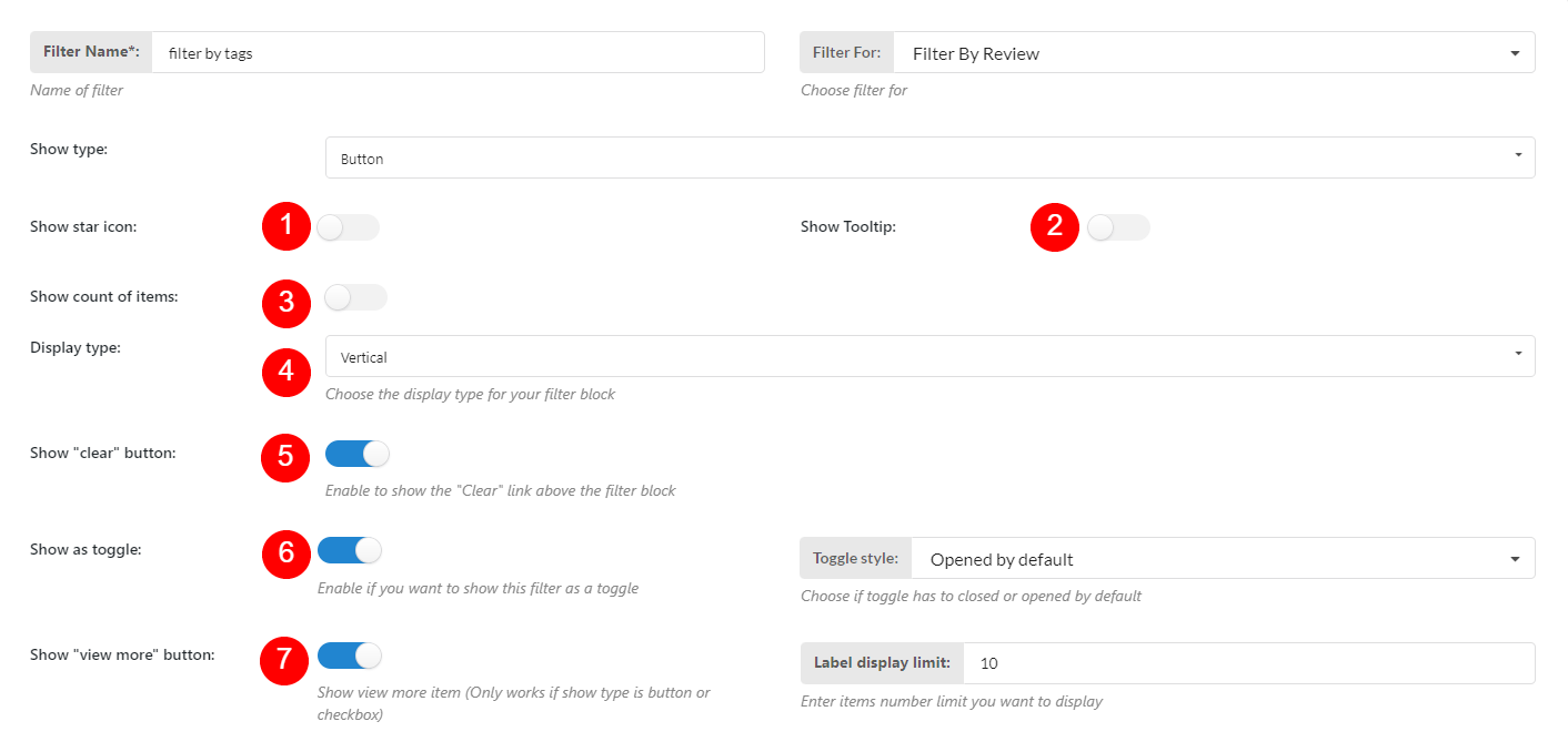
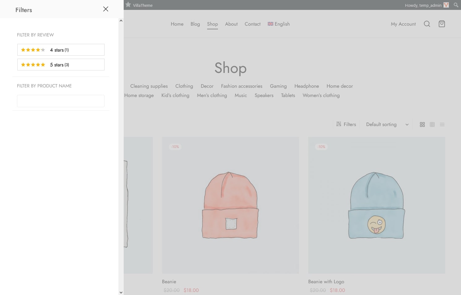
This Filter helps customers find products using ratings and reviews.
There are 2 types to display Filter By Review: Button and Select
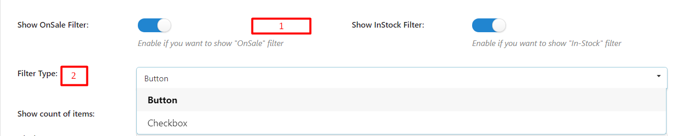
This Filter helps customers find products on sale/in stock.
This filter helps customers find their product by entering the product name into the search field

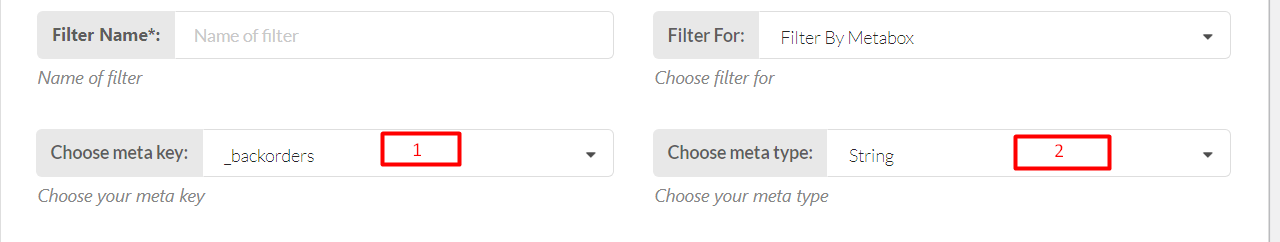
This Filter helps customers find products they want by using meta keys and meta values in metadata.
STRING TYPE
There are 3 types to display this Filter with String type on the frontend: Button, Checkbox, and Select
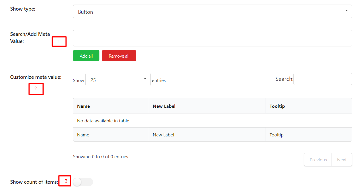
Name: After you add a value, the original value will appear in this column.
New Label: Add a label for the value. This field is optional and will appear on the front end when you show Filter. If this field is empty, it will take the Name to display
NUMERIC TYPE
There are 2 options to show Filter with Numeric type
Range
Range Slider
WooCommerce popular meta key:
| _price | filter by Product price (Custom Field Num) |
|---|---|
| _stock_status | filter by Product Stock status (Custom Field) |
| _sale_price | by Sale Price (Custom Field Num) or on Sale Status (Custom Field Exists) |
| total_sales | by Sales Count |
| _backorders | by Backorders Status (Custom Field) |
| _downloadable | by Downloadable Status (Custom Field) |
| _sold_individually | by Sold Individually status (Custom Field) |
| _stock | by Stock Quantity (Custom Field Num) |
| _virtual | by Product Virtual status (Custom Field) |
| _length | by product Length |
| _width | by product Width |
| _height | by product Height |
| _weight | by product Weight |
| _wc_average_rating | filter by Product Average Rating. |
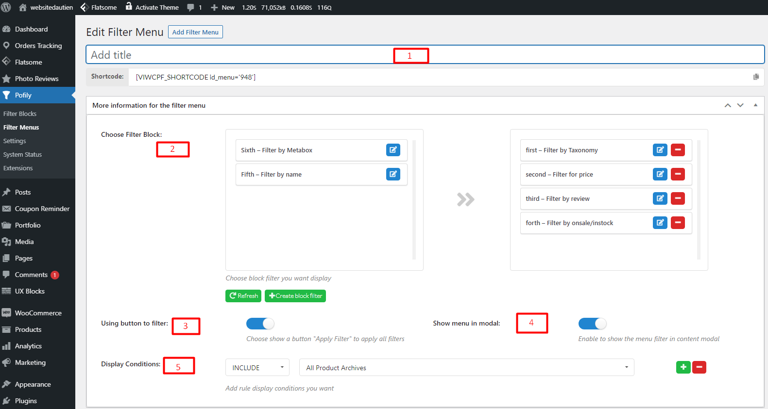
Create Filter Menus to display Filter Blocks on the frontend.
You can create as many menus as you want, and set rules to apply them in different places.
Go to Dashboard –> Pofily –> Filter Menus –> Add Filter Menus
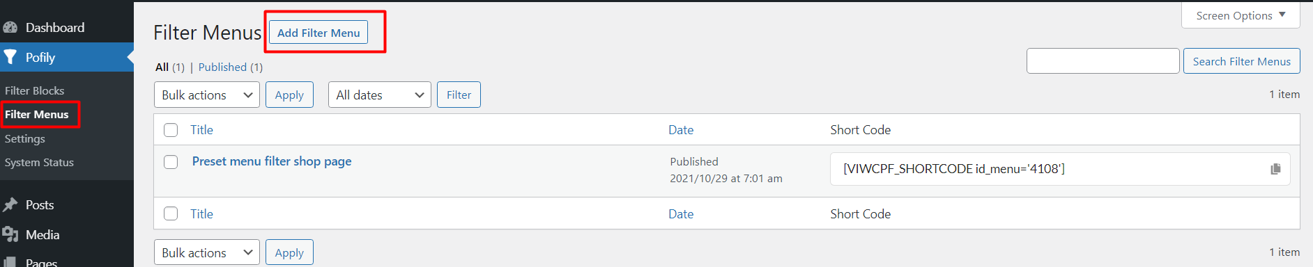
Then start to create a Filter Menu
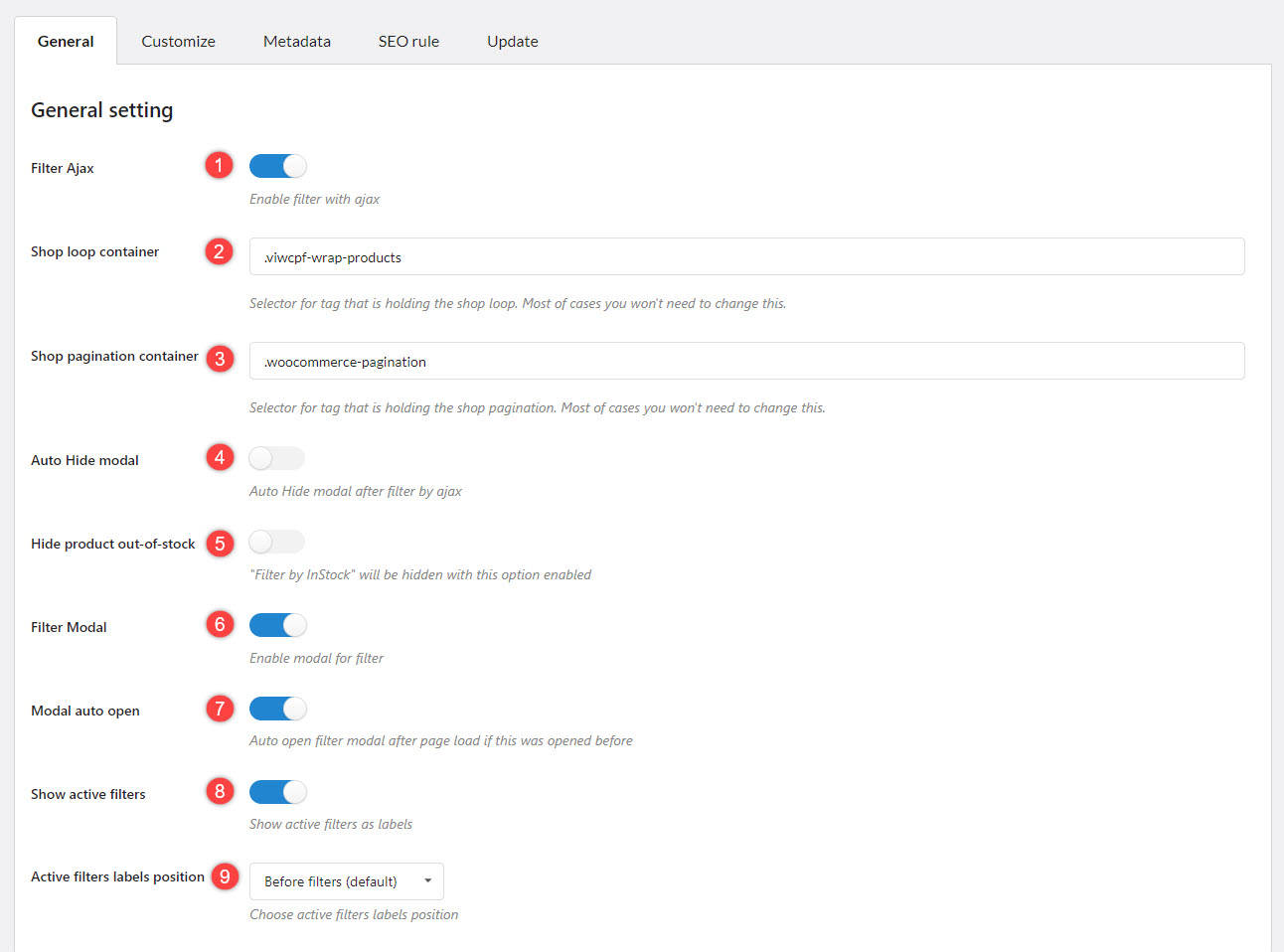
Manage general settings and design how the Filter Menu appears on the frontend as you want at Pofily –> Settings.
GENERAL
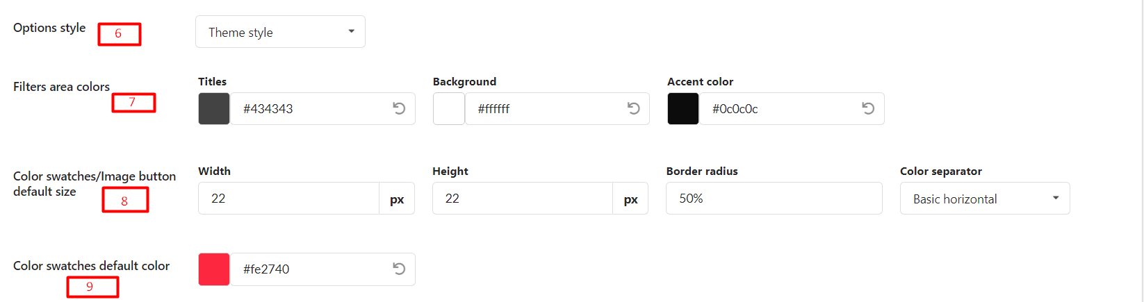
CUSTOMIZE
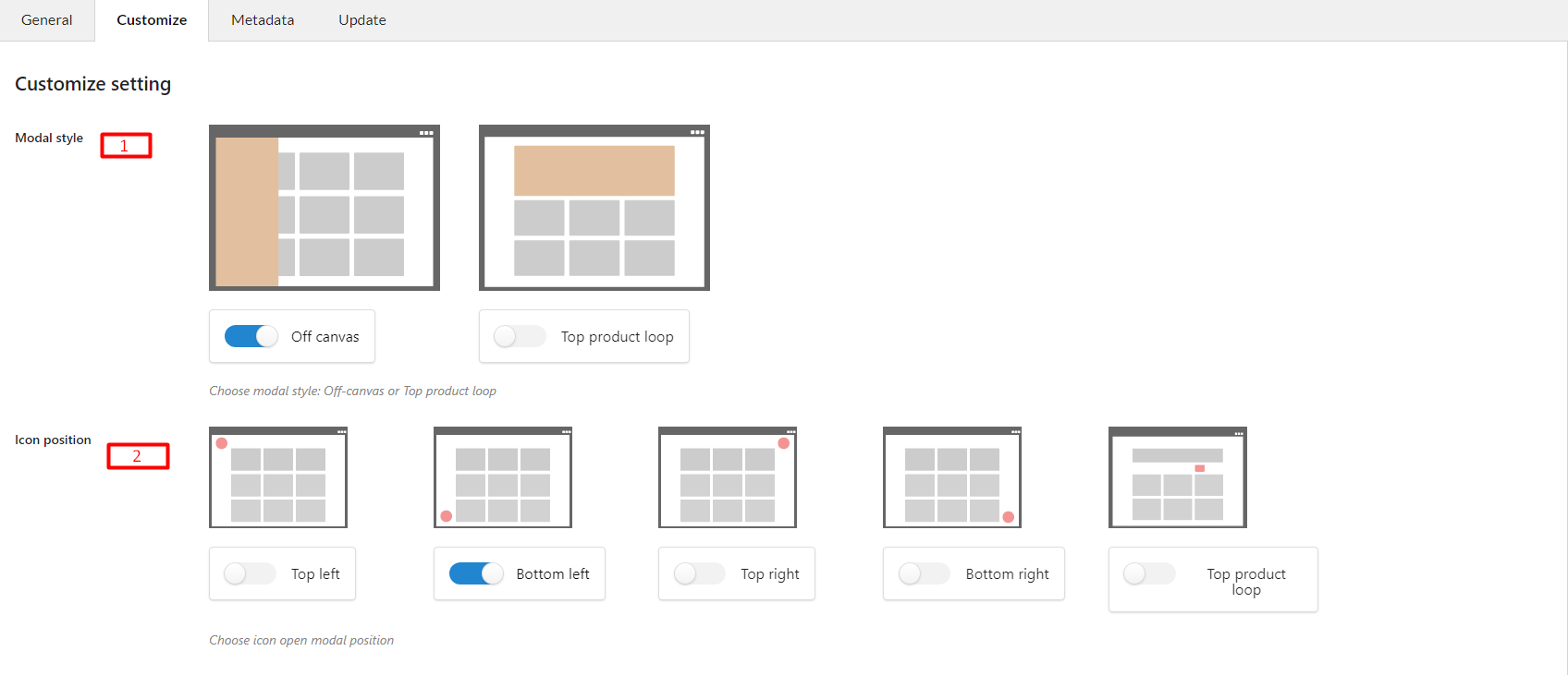

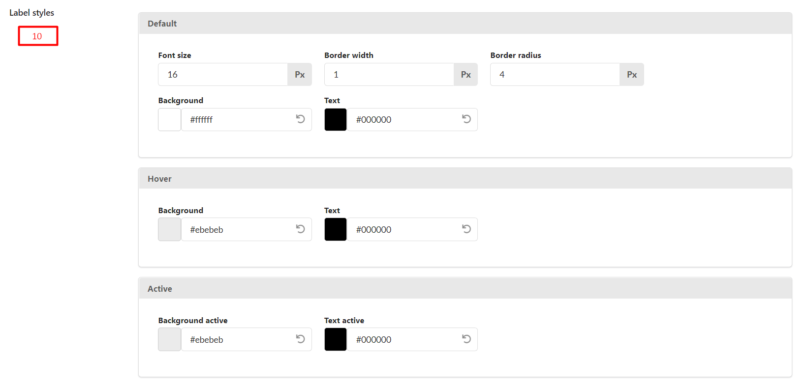
NOTE: The (1), (2), (3), (4), (5) will be unavailable if the Settings –> General –> Filter Modal feature is disabled
.
METADATA
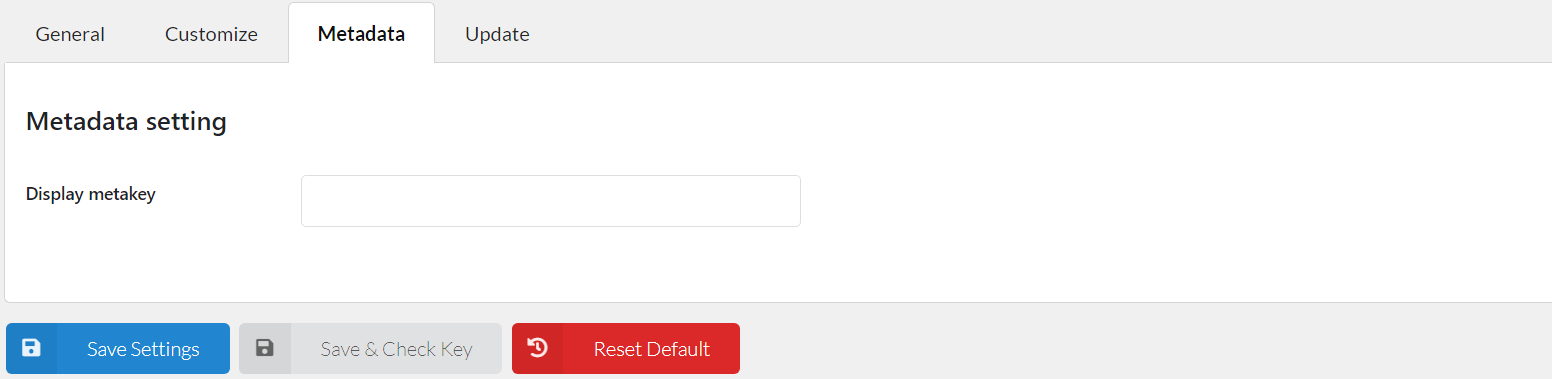
In the Metadata setting, we provide meta keys for Products available in your database, choose as many meta keys you want to display. The meta key you chose will display on Filter By Metadata –> Choose meta key field. You need to manage the setting in this section before choosing the meta key when creating Filter By Metadata.
Important Note:
/product/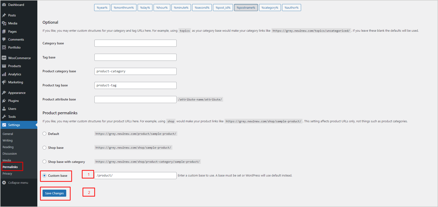
Through these settings, the admin can make their website friendly to the search engine. By investing in creating an SEO-friendly website, you will rank better in the search results and drive more traffic to your page.
This function of our plugin will support your website along with an SEO plugin to make it rank better in the search results.
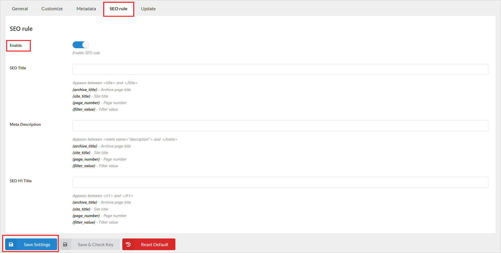
– Go the Dashboard > Pofily > Settings > SEO rule. Then enable the option “Enable SEO rule”
– Configure the 3 rules below
– Click “Save Settings”
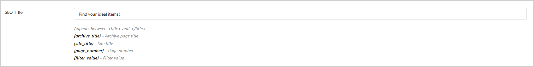
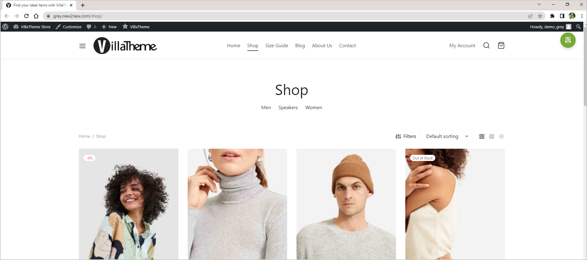
Create a good SEO title easily with the provided shortcodes. You simply just need to click on the shortcodes to add, no need to write them manually or copy/paste them. It’s way quicker and more convenient.
The SEO title you formulate will appear with the construction it was built when a user filters.
For example; the title after editing the rule will be like this, see the title on the top left of the image below:
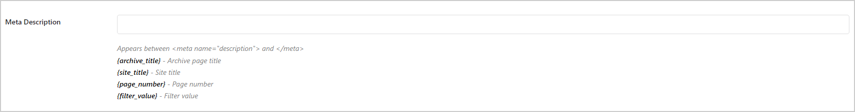
These settings support a friendly SEO Meta Description, which is a brief summary letting users know the general idea of the content within the page, after the filter is active.

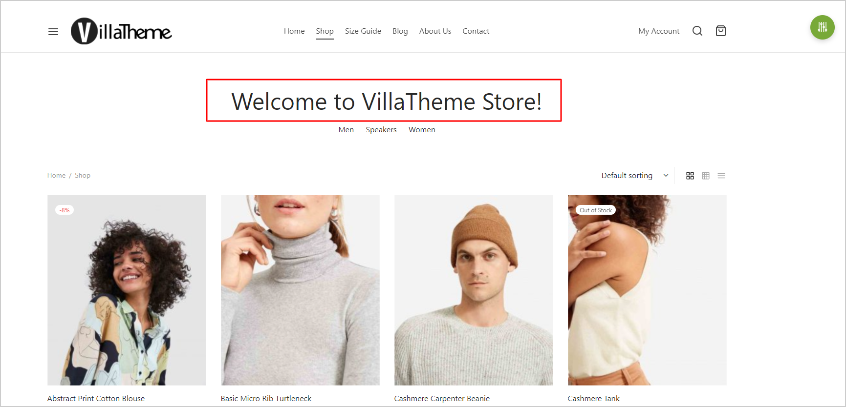
This controls the H1 Title of your website, the construction in this field will be added between the 2 tags <h1> and </h1>
Note: Not every theme/site has an H1 title, so please make sure you’re using one that has this title before checking this rule operation.
Below is an example of SEO H1 Title when you configure this rule:
The plugin provides shortcodes to:
The plugin provides a shortcode for each menu, so you can show the filter menu, by copying/pasting them on the position you need.
Step 1: Copy the shortcode in the filter menu list/filter menu editor with the “Copy” button
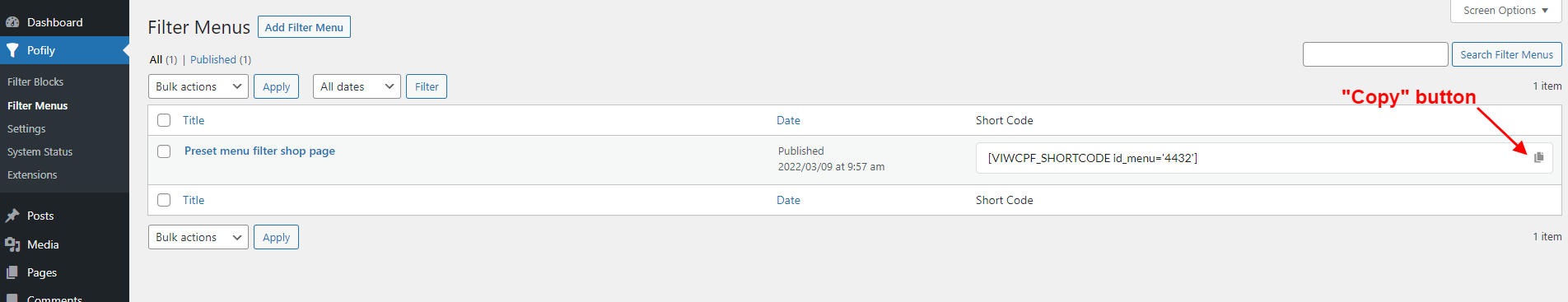
Step 2: Paste it to the place you want to display the filter menu.
This filter menu shortcode can only show the filter menu on WooCommerce product archive pages (for example; Shop page, single product page…). If you put on a non-archive page of WooCommerce, the filter will not be visible (for example; a Blog page).
This shortcode helps to display the modal icon (if you’re using modal to display the filter menu) on any page.
[VIWCPF_SHORTCODE_MODAL_ICON link="http://google.com/"]
The parameter link="http://google.com/" is optional, you can add it or leave it empty.
Make your filters appear in different languages with WPML
Step 1. Prepare Your Filter Blocks
Before working with WPML, make sure you already have your own filter blocks set up in Pofily. These will serve as the base content for translation.
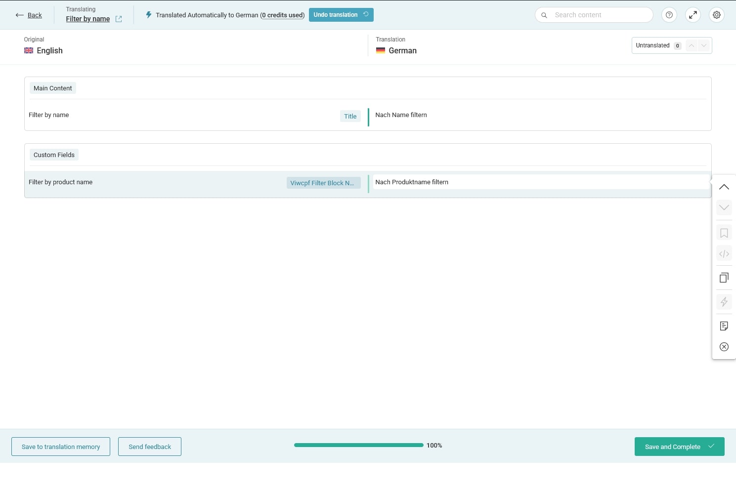
Step 2. Translate Filter Blocks in WPML
Once your filter blocks exist, you can translate them just like any WPML-supported post type.
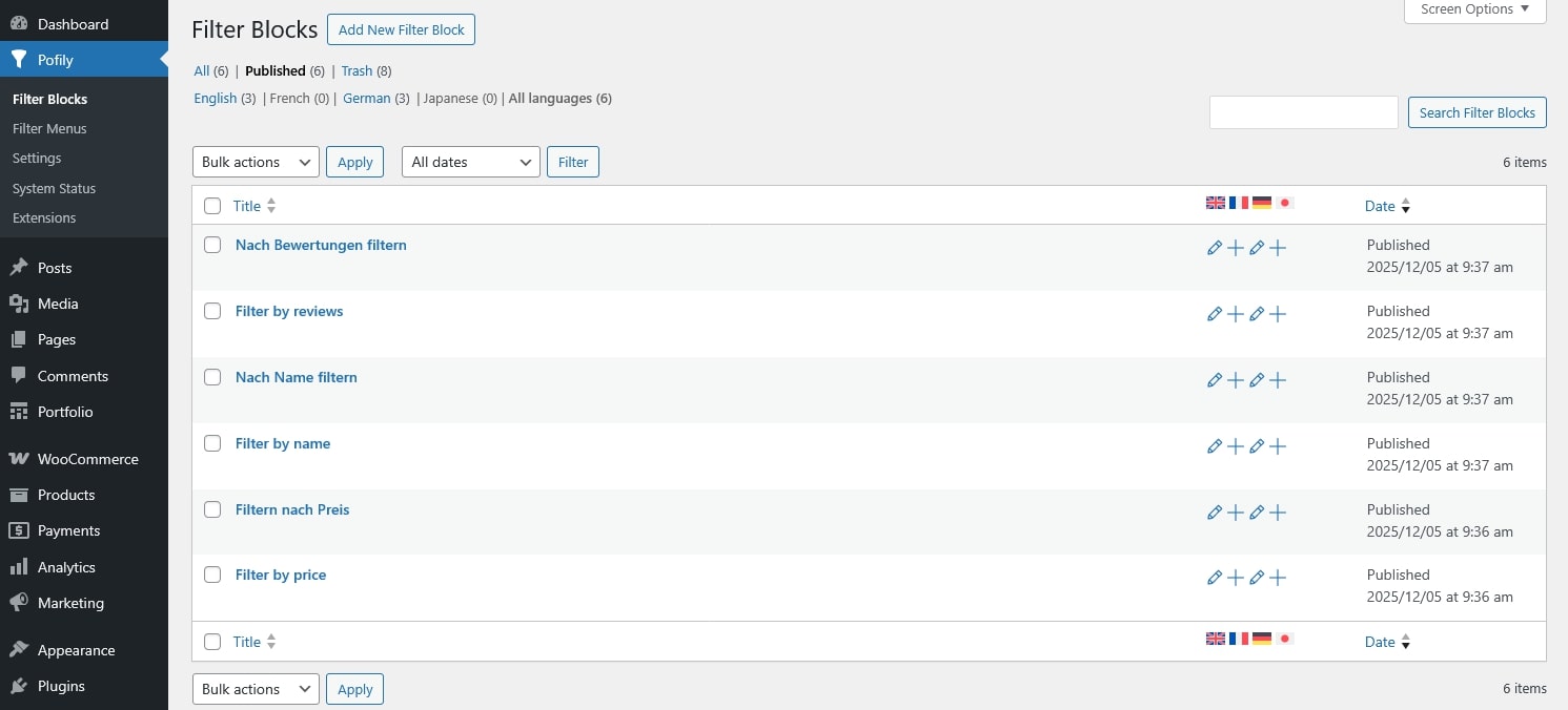
Step 3. Add Translated Blocks to a Filter Menu
A Pofily menu can contain multiple filter blocks. After translation, you can include blocks from different languages inside the same menu.
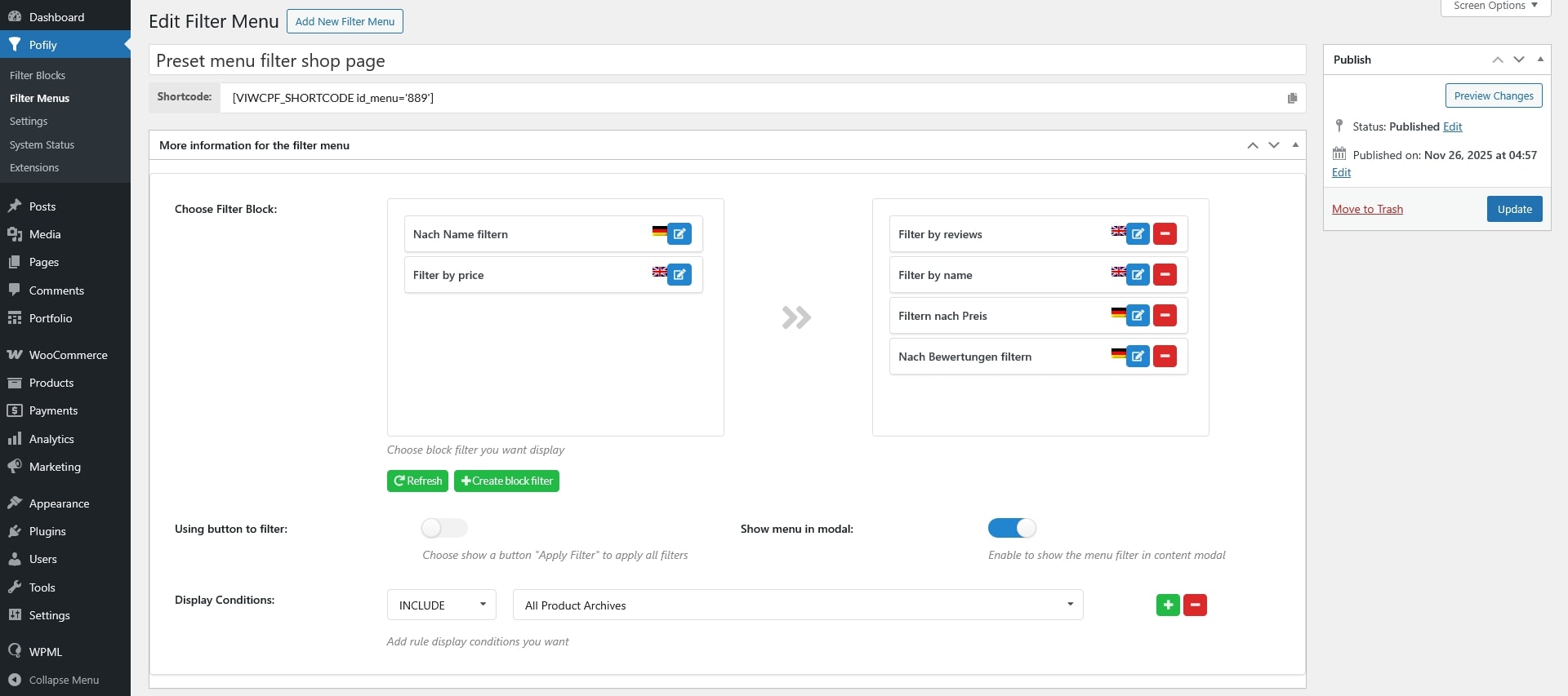
Note: Filter blocks inside a menu do not need to be translations of one another. You may have a different number of filters per language.
Examples: English may have 3 filters, while German may have only 2. You may assign the “Filter by Name” block for English and “Filter by Price” block for German in the same menu – both setups will work perfectly.