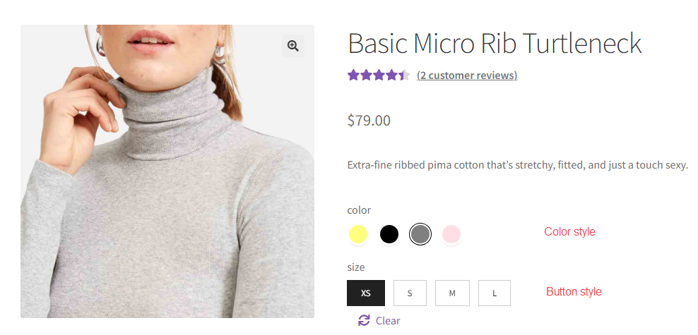
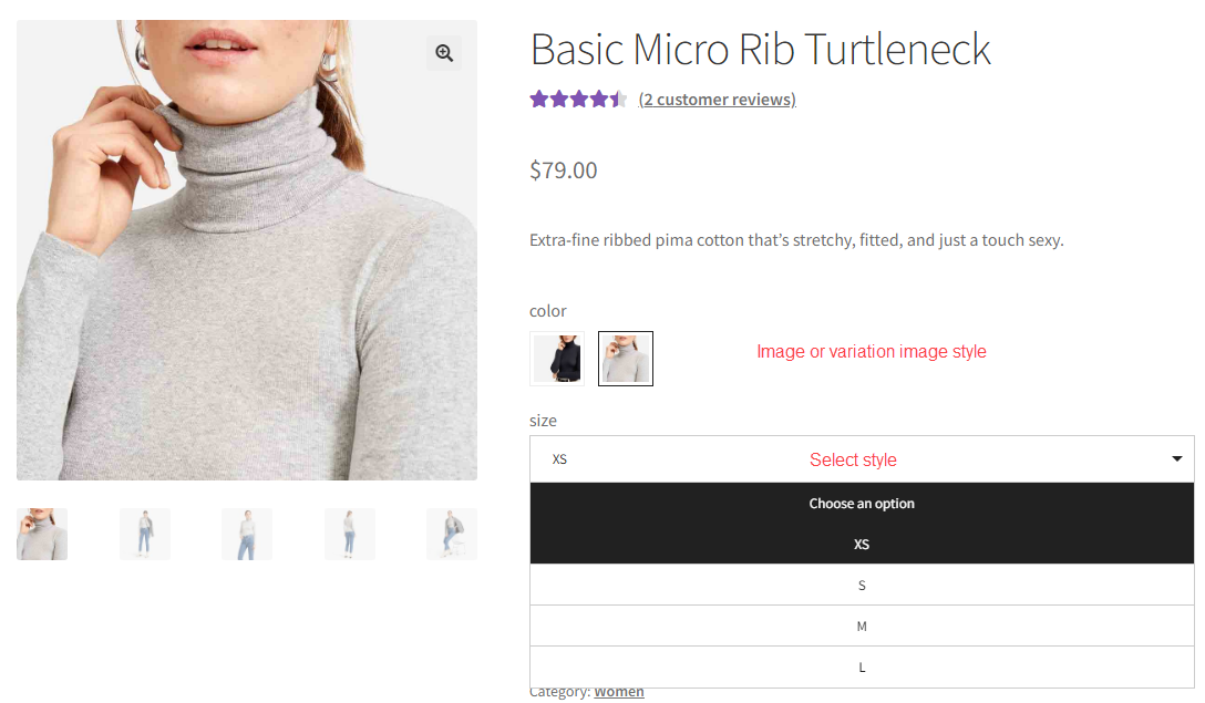
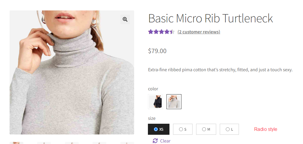
You have a variety of swatch styles available to showcase your attribute, tailored to your preference including button, color, image, variation image, radio, select, or theme default. Below are the ways these styles are displayed. To change among swatch styles, switch among options in the Display type for:
- Global attribute => Go to Global Attributes > Navigate to a specific attribute > Default design > Display type, go to this part of the documentation No3.
- Custom attribute => Go to Custom Attributes > Add Attribute name > Display type, go to this part of the documentation No3
- On a single product editing page => Scroll down to the product data section > Attributes, Navigate to a specific attribute > Swatches settings > Select swatch type, go to this part of documentation
You can see this video guide to observe each style and how to switch among them.


