- Start
- FILE INCLUDES
- INTRODUCTION
- INSTALLATION
- HOW TO USE
- HOW DOES IT WORK
- Compatibility
- EXTRA INFORMATION
Copyright Villatheme 2015-2026
Created: 2024.09
Updated: 2026.03 – Updated version: 1.0.9
By: VillaTheme
Thank you for purchasing our plugin. If you have any questions that are beyond the scope of this documentation, please feel free to request support at our Support Forum. Thanks so much!
Make sure that those limits to a minimum as follows in order for free-trouble while installing:
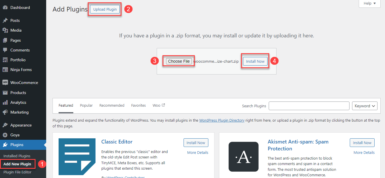
Go to Plugin/Add New/Upload Plugin/Choose file/ select plugin zip file woocommerce-product-size-chart/click “Install Now“/click “Active plugin“.
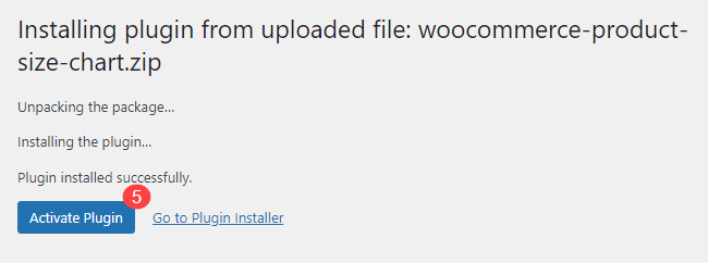
Done! Let’s start using the plugin.
Guiding video on how to install and use WooCommerce Product Size Chart:
The Setup Wizard for the size chart is designed to streamline the configuration process, making it user-friendly and efficient. It consists of two main steps:
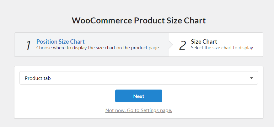
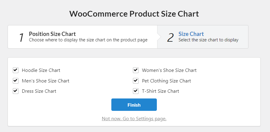
By following these steps in the Setup Wizard, you can easily customize your size chart to enhance the shopping experience on your site.
1.1. Create a new Size Chart
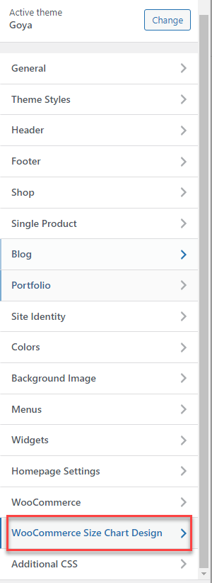
Go to the Dashboard > Size Chart > Add New to create a new size chart.
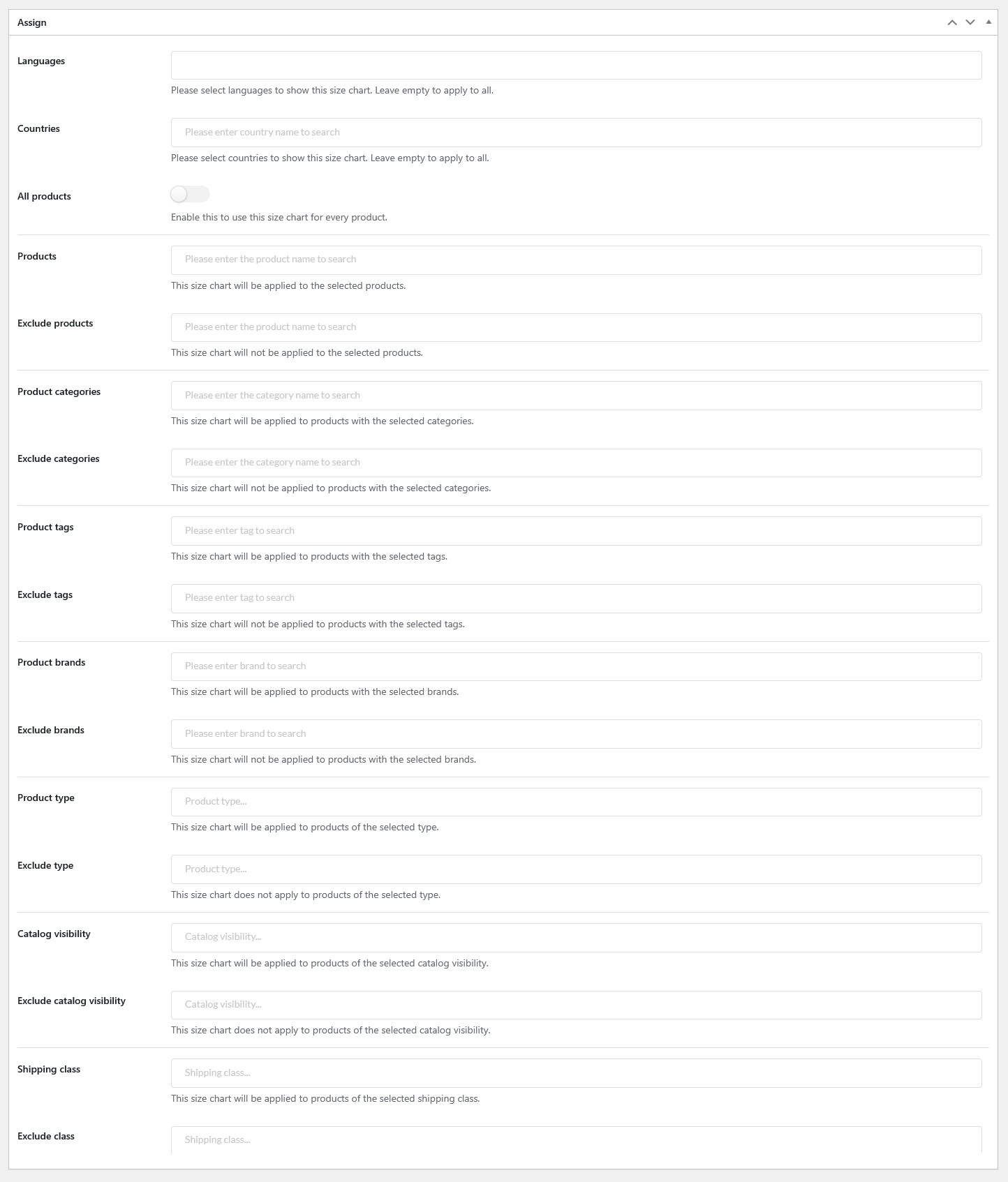
1.2. Assign the Size chart with rules
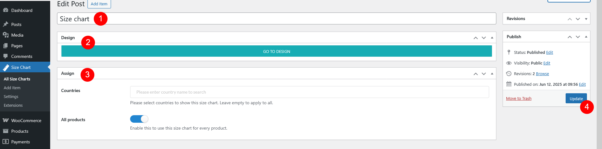
4. Update: After adding the name and assigning the rules, click the “Update” button to save your changes.
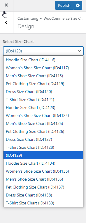
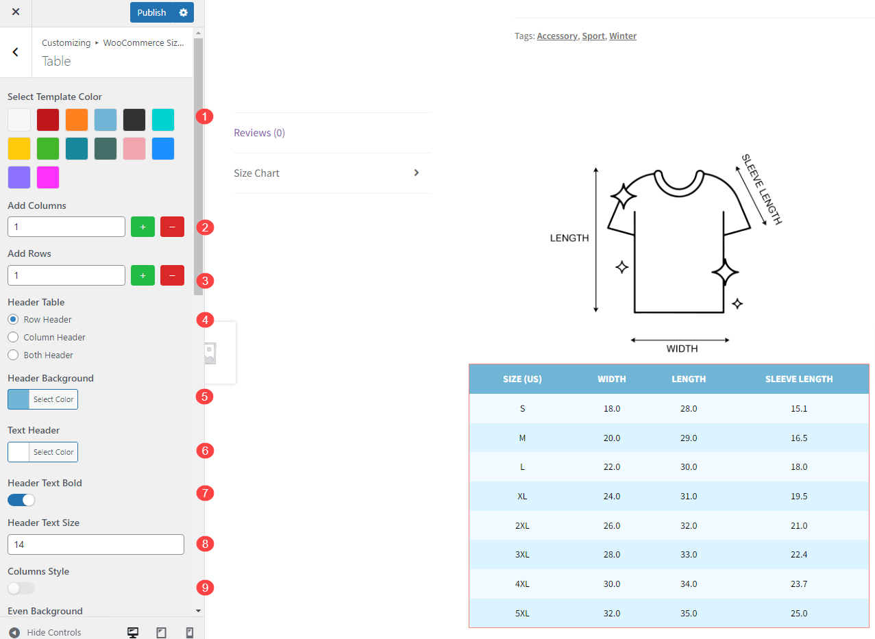
Once you click on “Go to design,” you will be redirected to the customizer, where you can personalize the appearance and layout of your size chart.
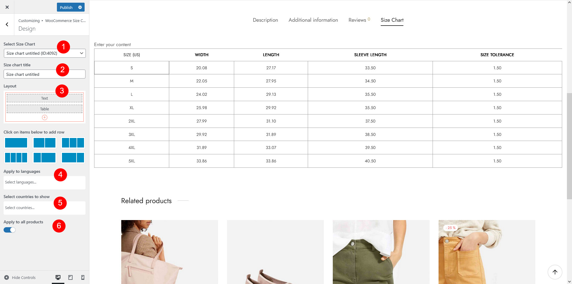
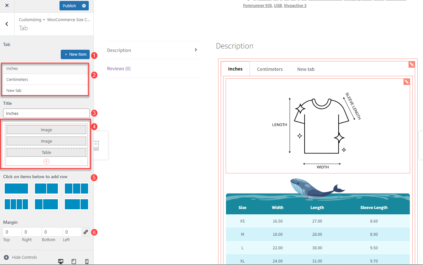
 add different components to your size chart for flexibility and customization. The available components include:
 to edit each one to customize it to your needs. Adjust the content, font style, colors, and alignment to ensure the design matches your style and is easy to read. For more setting details, go to the How Does It Work > Size chart components section.
 icon
icon icon
icon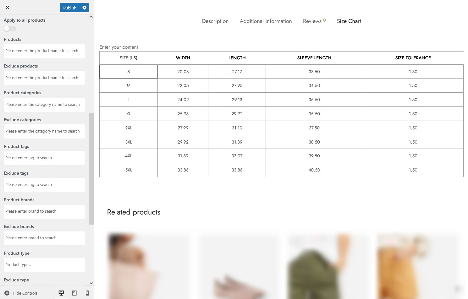
Once you’ve completed your size chart design and made sure everything is in place, click “Publish” to make the size chart live.
You can easily customize the size chart templates that are applied to a specific product. Follow these steps to access and modify the size chart for a product:
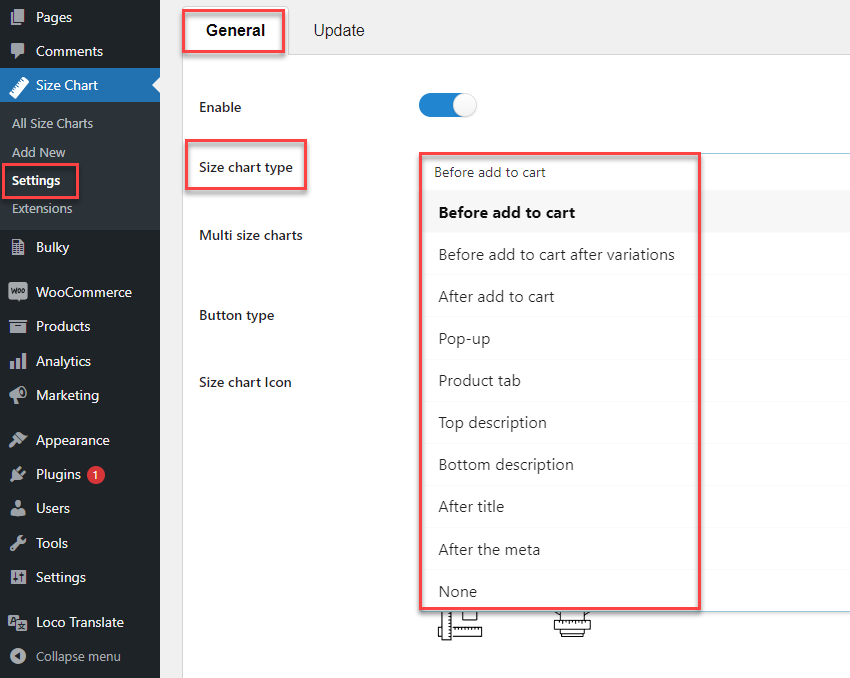
When choosing where the size chart displays on the product page, you have several options to control its visibility and placement for the best user experience:
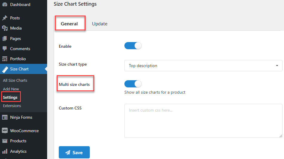
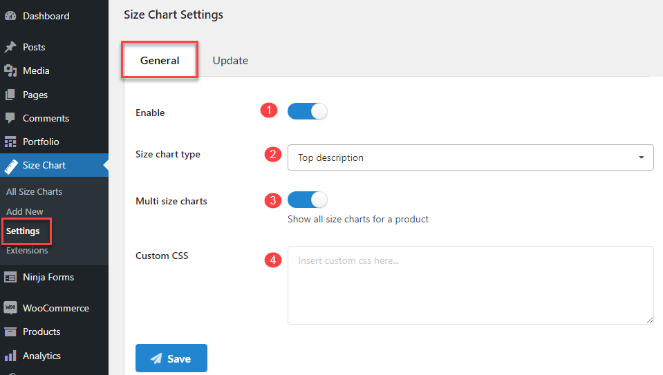
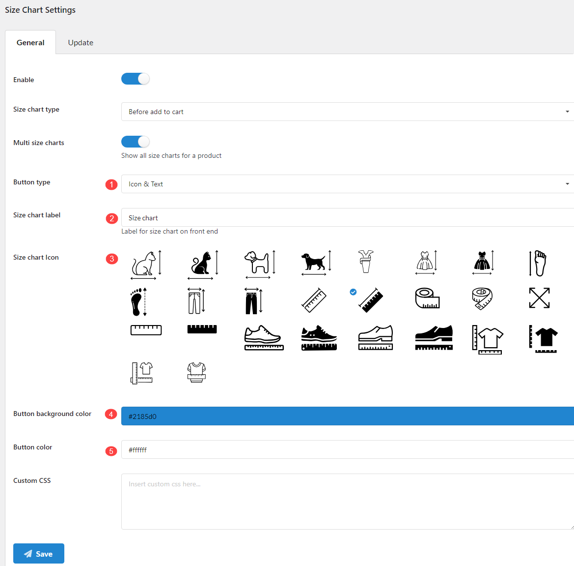
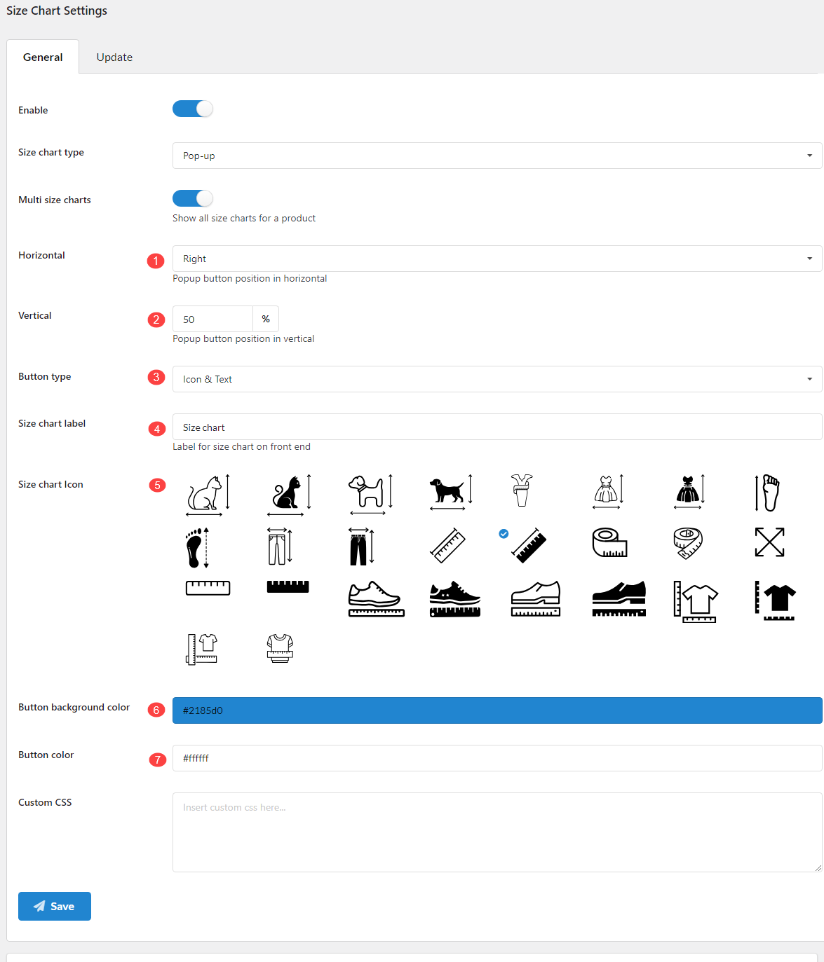
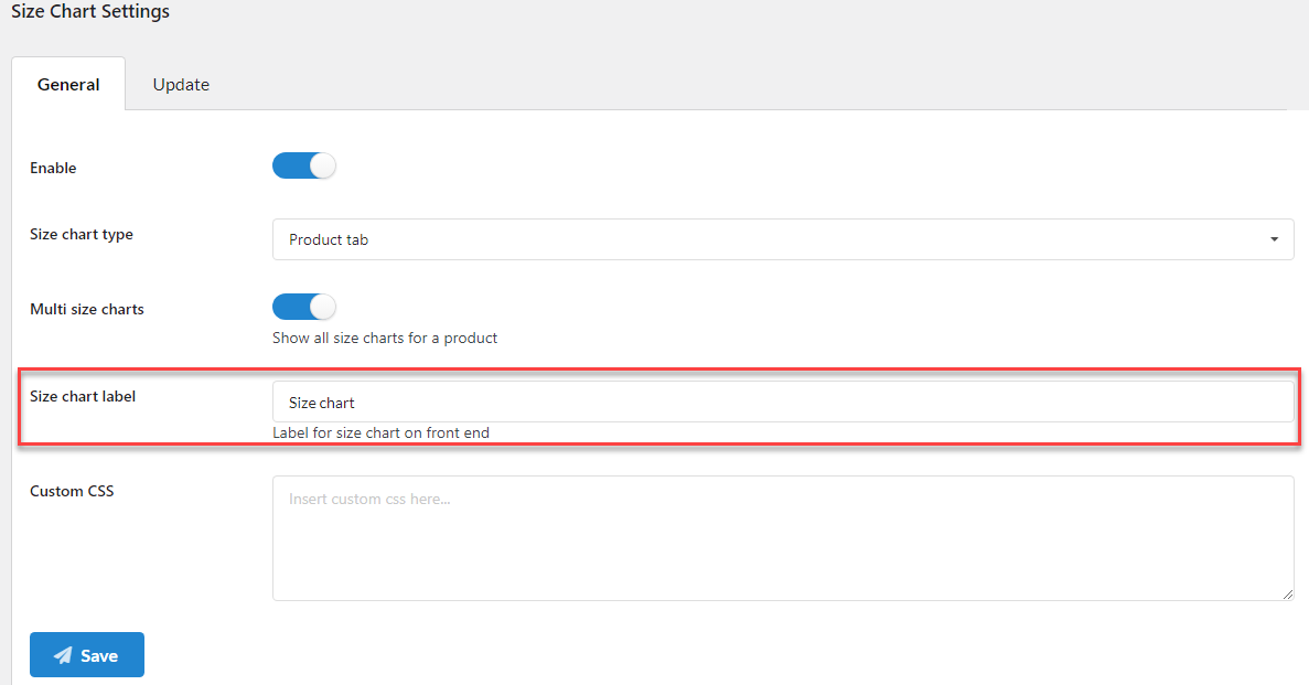
Go to your Dashboard > Size Chart > Settings > General, in the Size chart type, select available options to display the size chart on the product page:
For more setting details, go to the How Does It Work > Size chart type settings section.
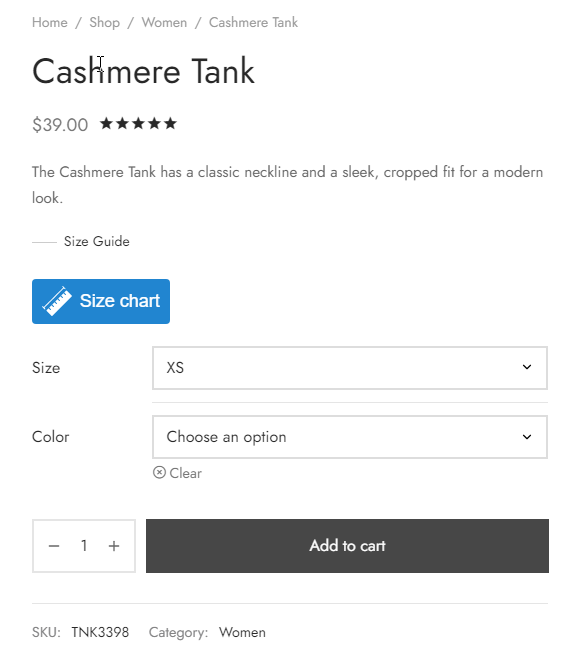
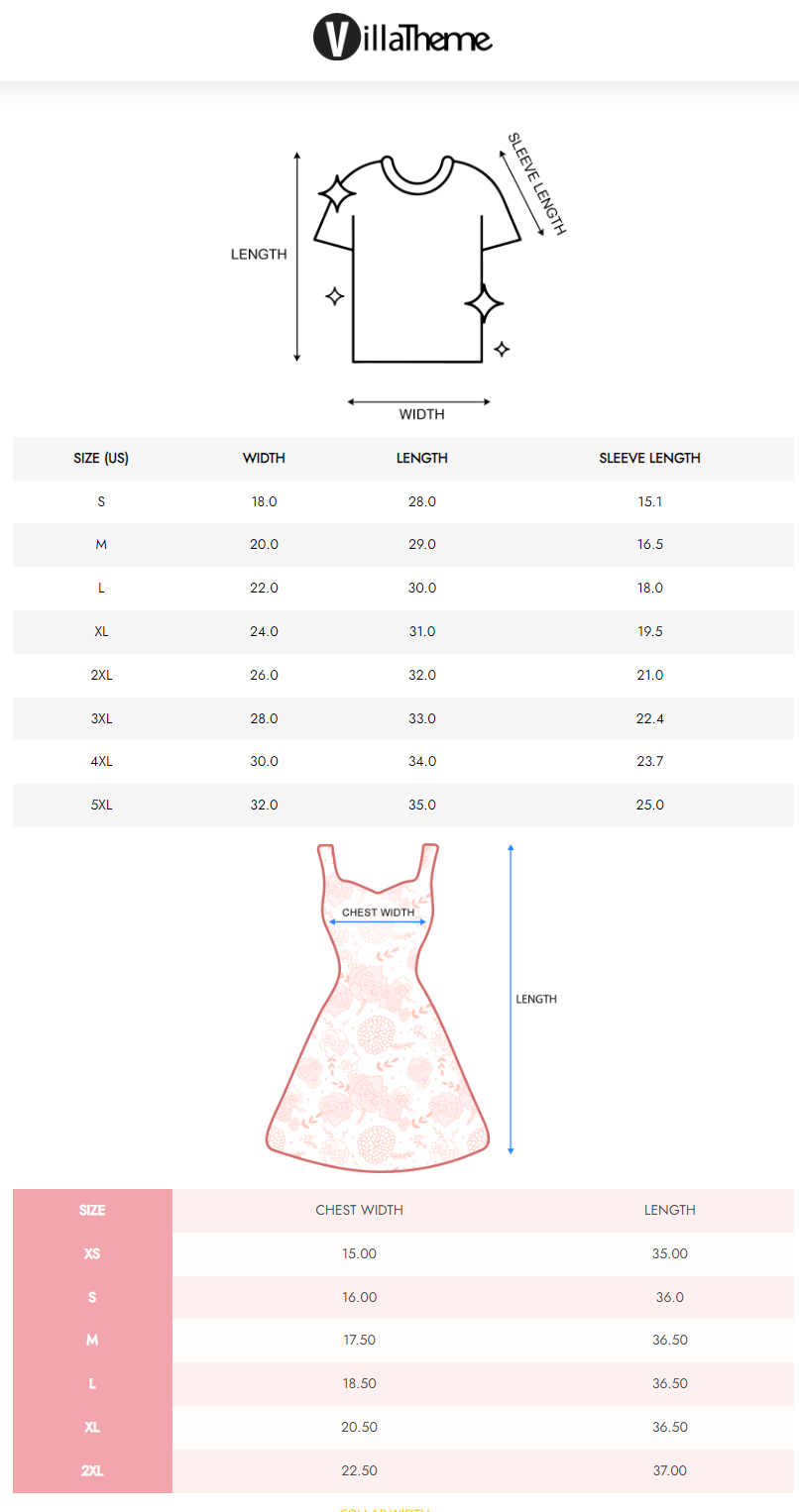
Below are visuals of each size chart type:
Multi Size Charts allow you to create and manage multiple size charts for products. This feature enables you to tailor sizing information based on specific criteria, ensuring that customers receive the most relevant size guide for their selected items. You can easily assign, customize, and display these charts across your site to enhance the shopping experience.
Go to your Dashboard > Size Chart > Settings > General, enable Multi size chart on the product page:
Once you enable the Multi Size Chart feature, you can assign multiple size chart templates to products. This allows for flexibility in providing tailored sizing information for certain products. You can also create multi size chart by Selecting Size Chart Template on the Editing Product Page > Override
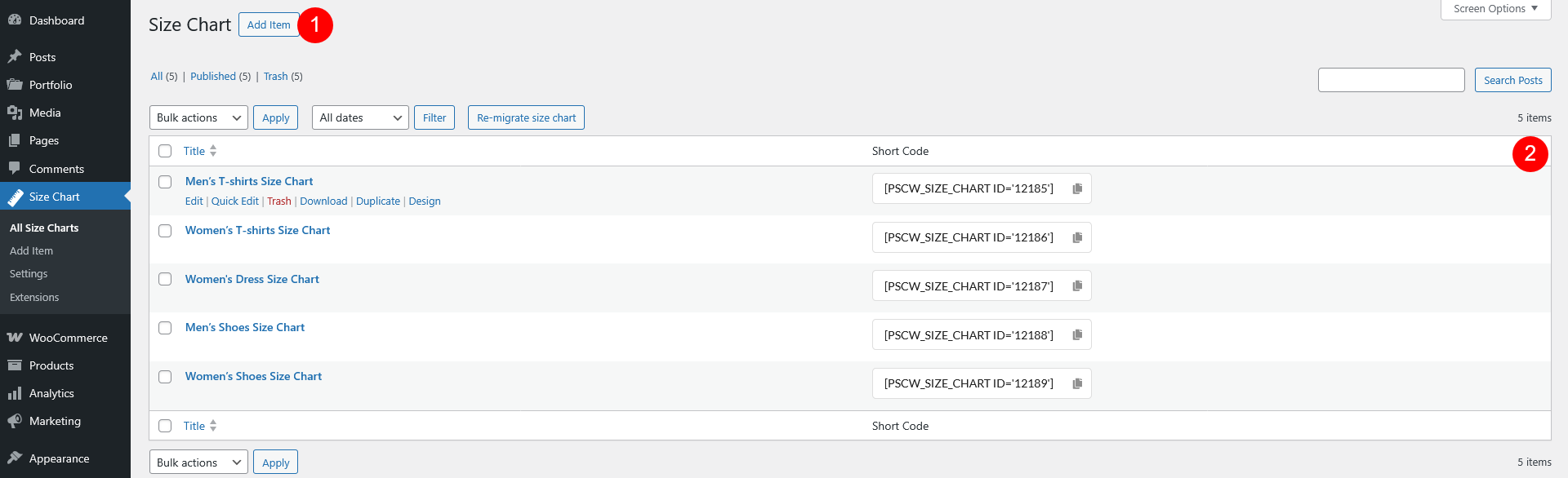
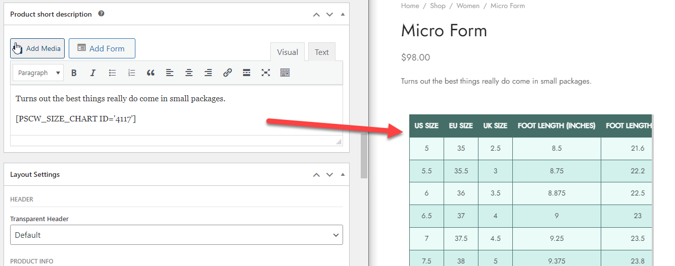
shortcode allows you to easily display a specific size chart on any page of your site. By simply inserting the shortcode into the page area, you can embed the designated size chart wherever you need it, making it easy to provide sizing information across multiple pages.
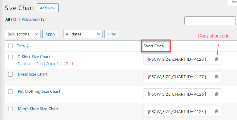
Go to the Dashboard > Size Chart, in the size chart list, you will see the shortcodes associated with each size chart.
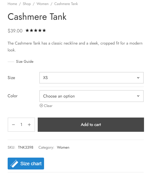
For example, you can copy and paste the size chart shortcode in the product short description of a product:
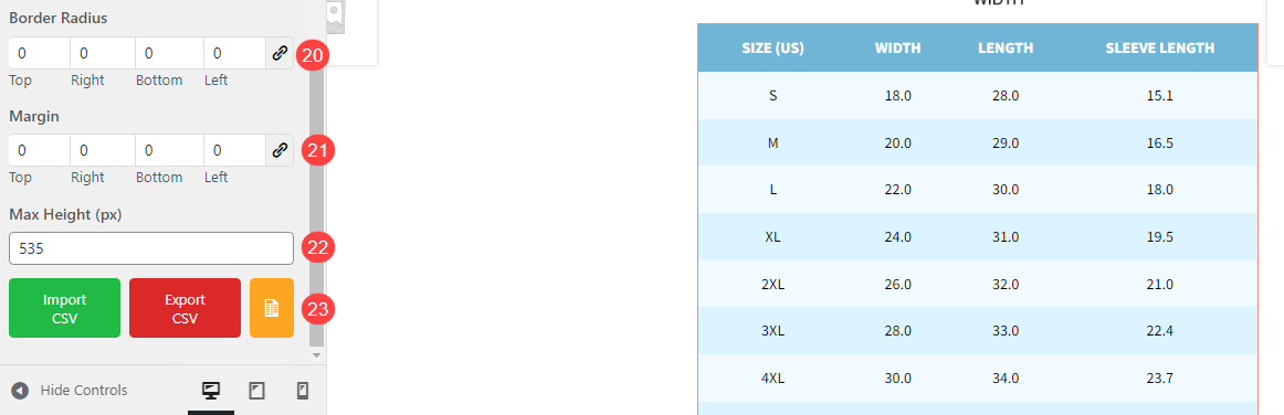
The Export & Import Size Chart via CSV feature allows you to efficiently manage your size charts by exporting them into a CSV file for backup or editing purposes and importing them back into your system when needed.
Follow the steps below to successfully import your size chart data using a CSV file:
Add Component button. to customize the table component.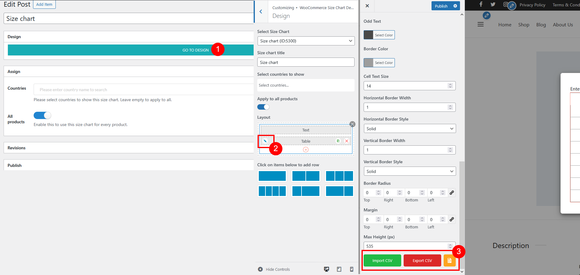
4. Prepare Your CSV File:
Before uploading your CSV file, make sure it is properly formatted to match the table structure. A tip is that you can Export CSV file of the current size chart or export the Sample size chart data  then add your detailed size chart information, and reimport this CSV file.
Ensure the file is saved in CSV format (.csv) can be used to create this file, but it must be exported as a CSV before uploading.
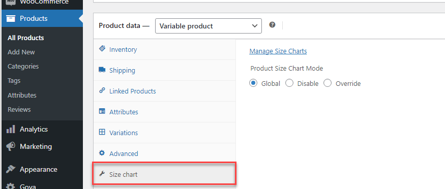
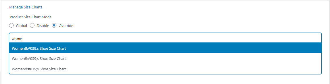
The Select Size Chart Template feature allows you to assign specific size chart templates to individual products directly from the product editing page in your WooCommerce store.
The General Settings section in the size chart plugin allows you to configure basic and overarching settings.
Size Chart Type settings for these positions share the same options:
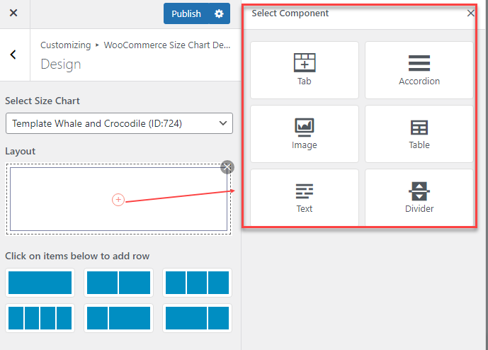
Size chart components can be added to the layout structure to enhance the presentation and usability of the size chart, including Tab; Accordion; Image; Table; Text; Divider
A. Tab
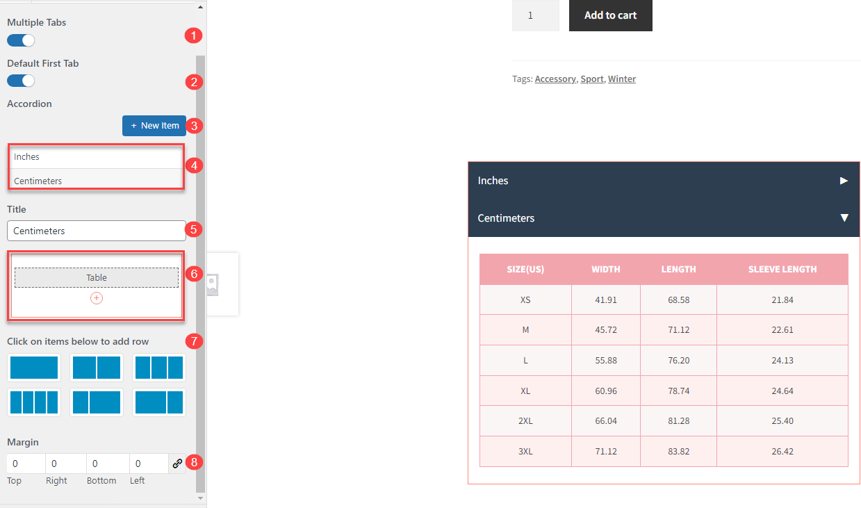
B. Accordion
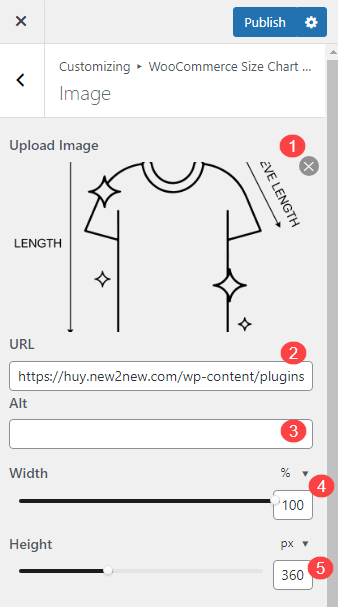
C. Image
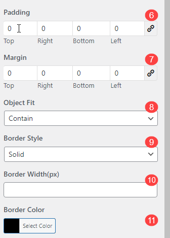
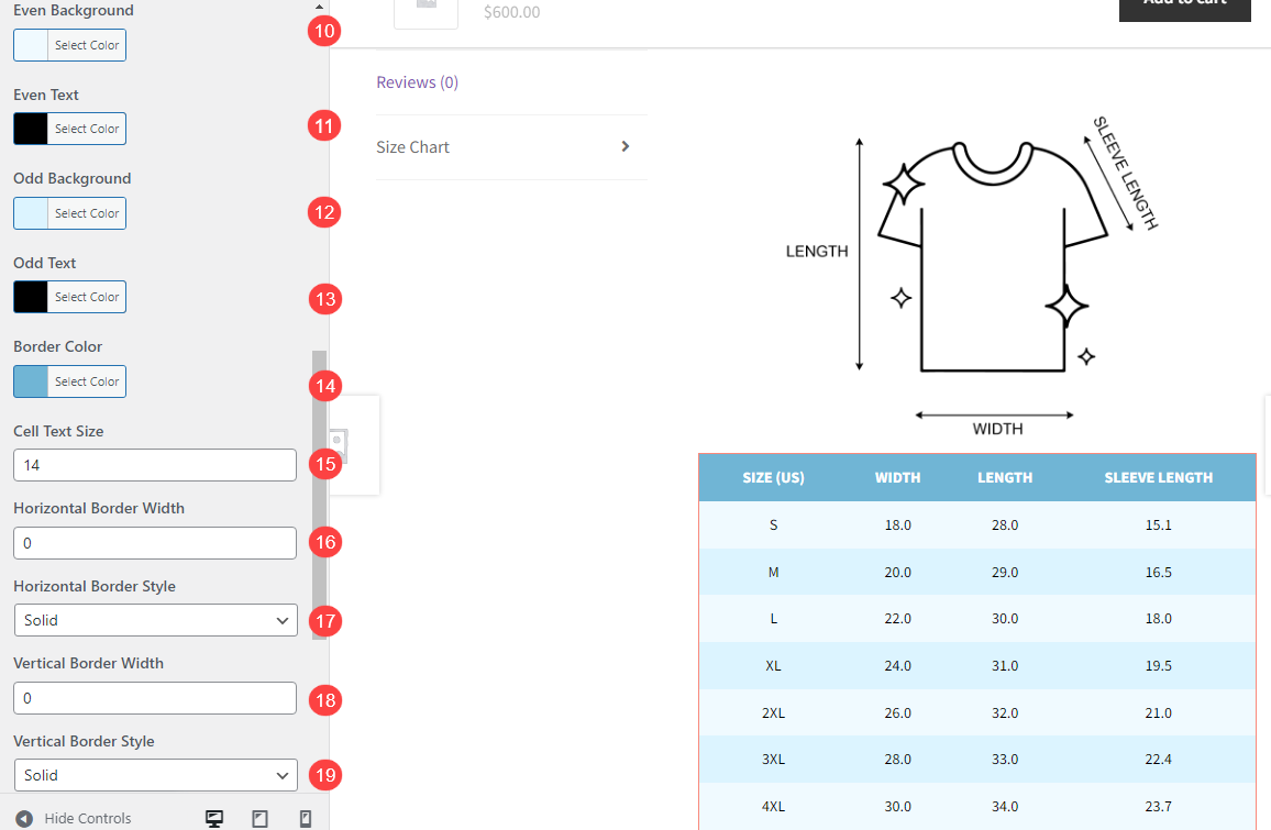
D. Table
E. Text
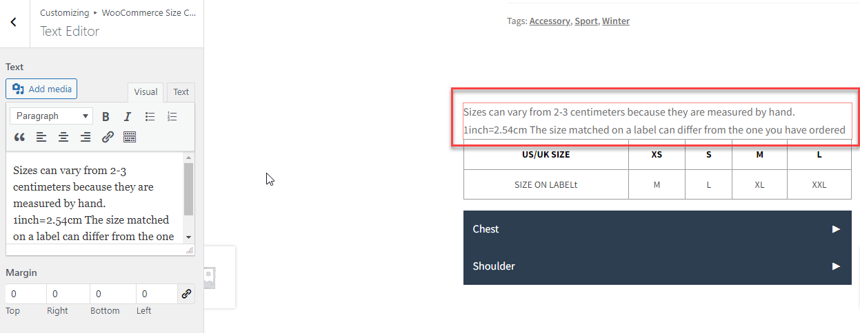
Text Component provides a versatile way to customize the textual content within your size charts. It supports a range of formatting and editing options:
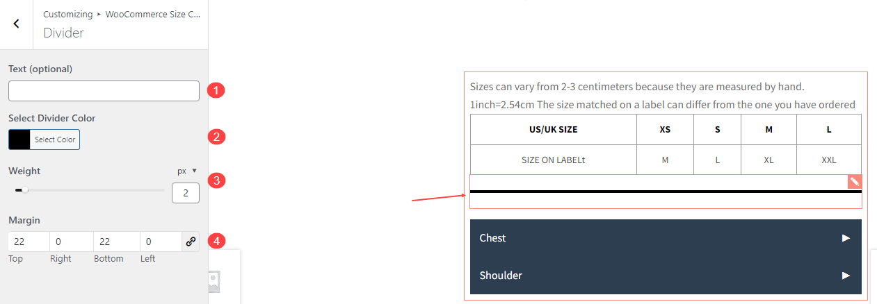
F. Divider
| Plugin | Author |
| WPML | OnTheGoSystems |
| Polylang | WP SYNTEX |
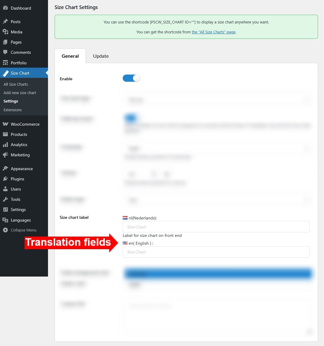
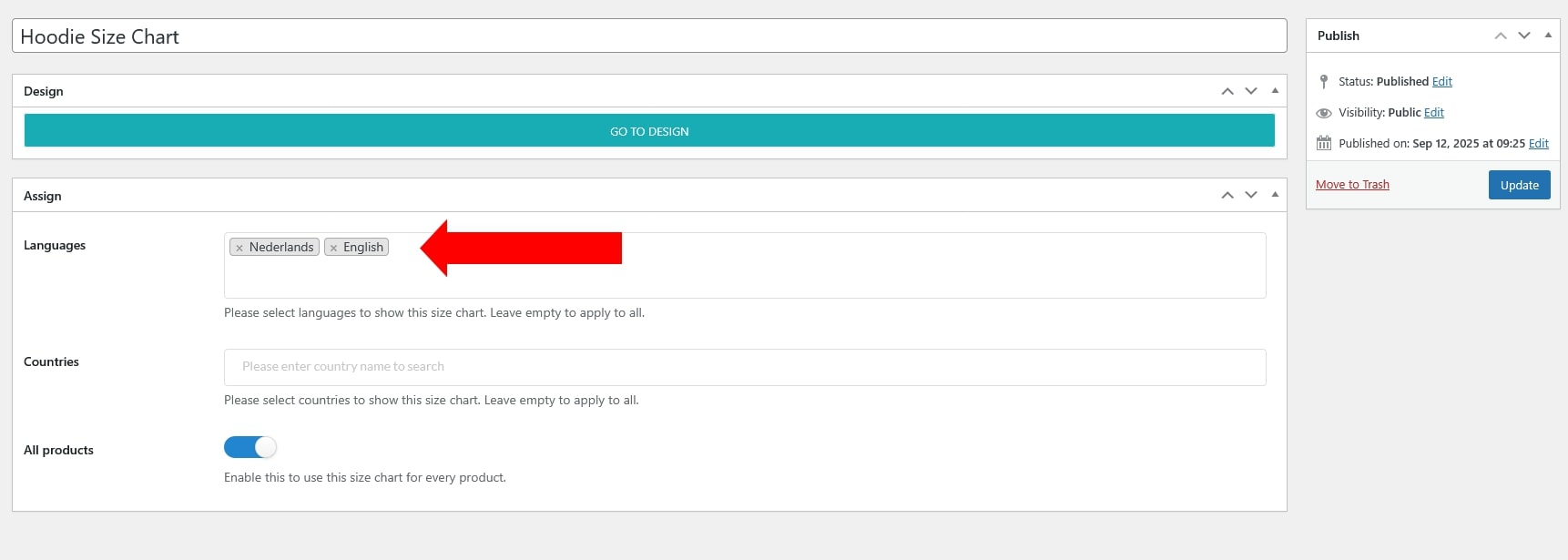
After installing a multilingual plugin, choose the language for the size chart template to apply.
Size chart template
Design page
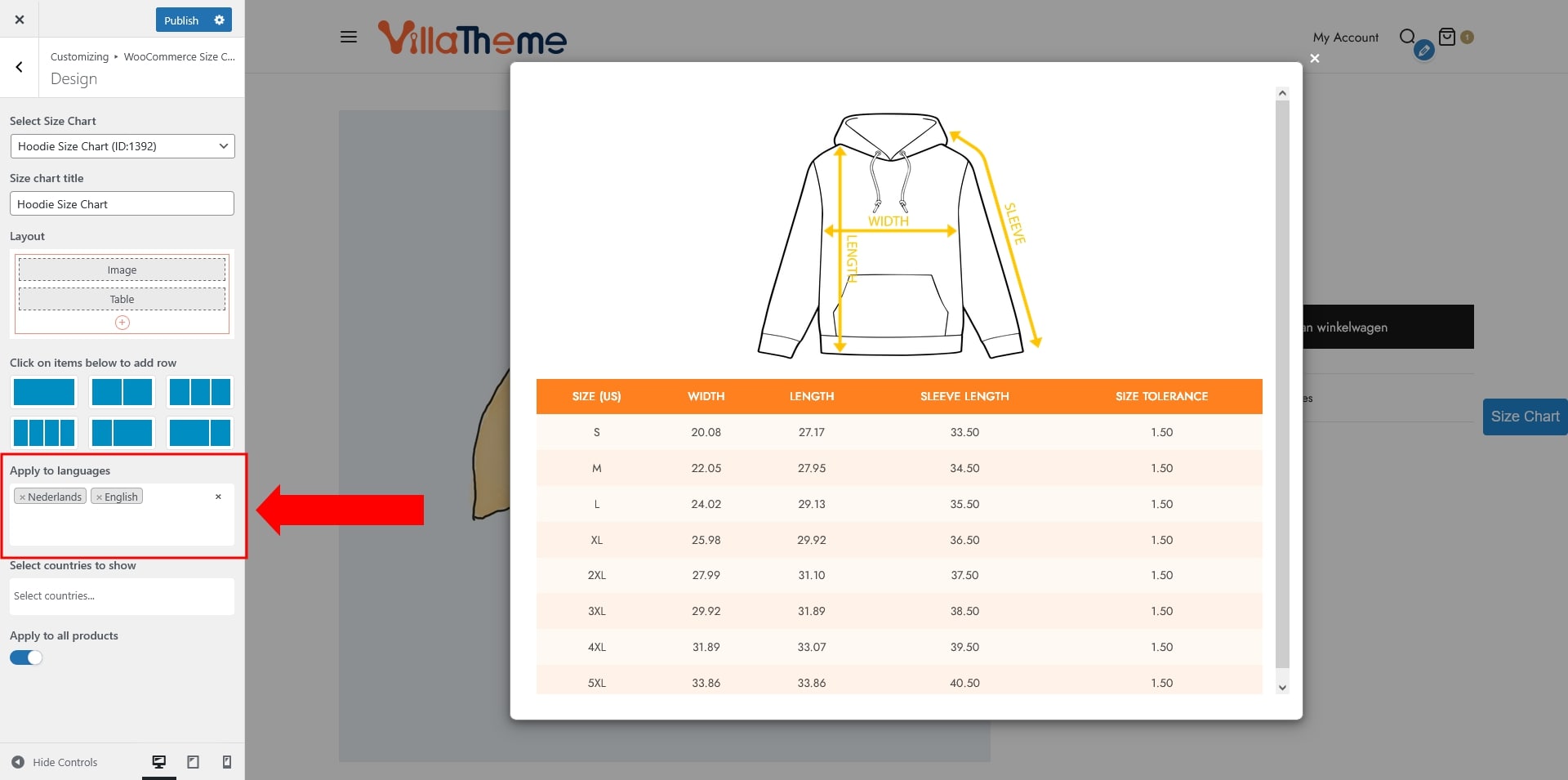
You can also translate the text fields in the plugin settings as shown below.