Copyright Villatheme 2015-2026
Created: 03/2024
Last updated: 2026-02 – Updated version: 1.0.1
By: VillaTheme
Thank you for using our plugin. If you have any questions that are beyond the scope of this documentation, please feel free to request support at our Support Forum. Thanks so much!
Make sure that those limits are to a minimum as follows for free trouble while installing:
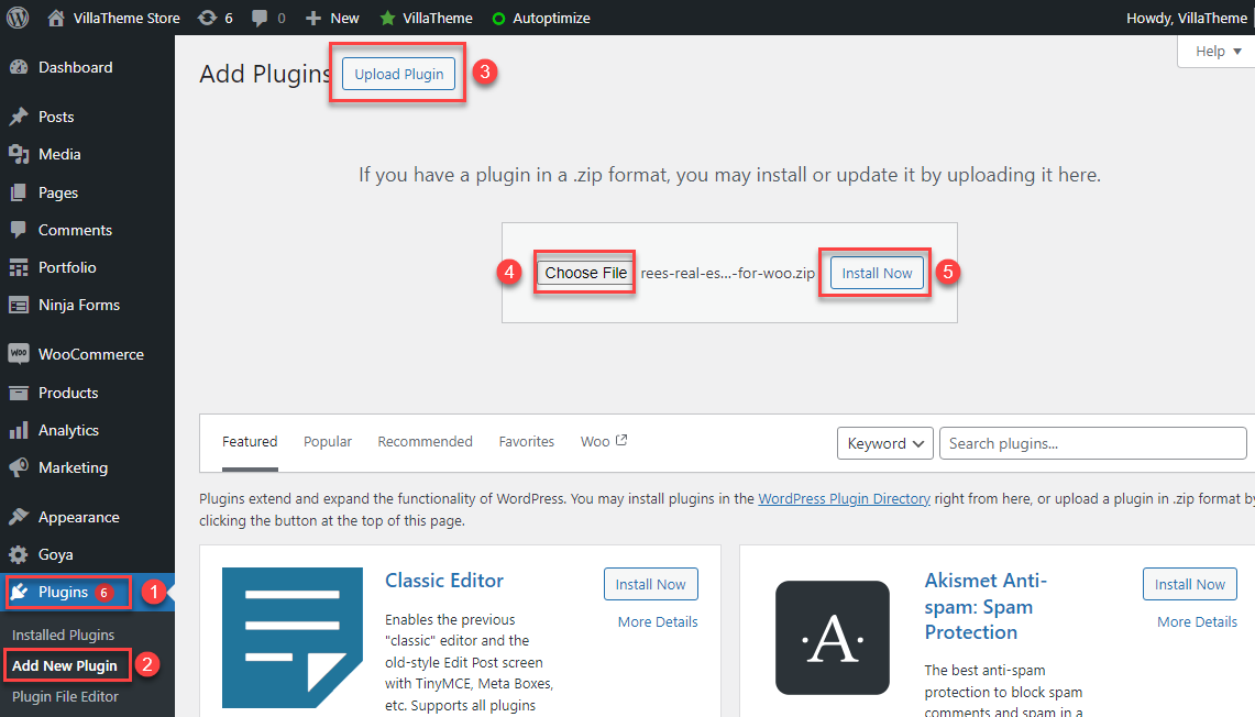
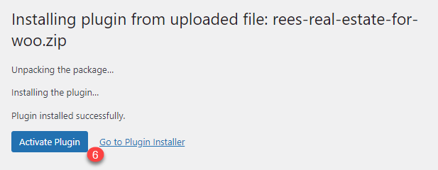
Go to Plugin/Add New/Upload Plugin/Choose file/ select plugin zip file rees-real-estate-for-woo/click “Install Now“/click “Active plugin“.
Let’s see this video on how to install and use REES – Real Estate for WooCommerce
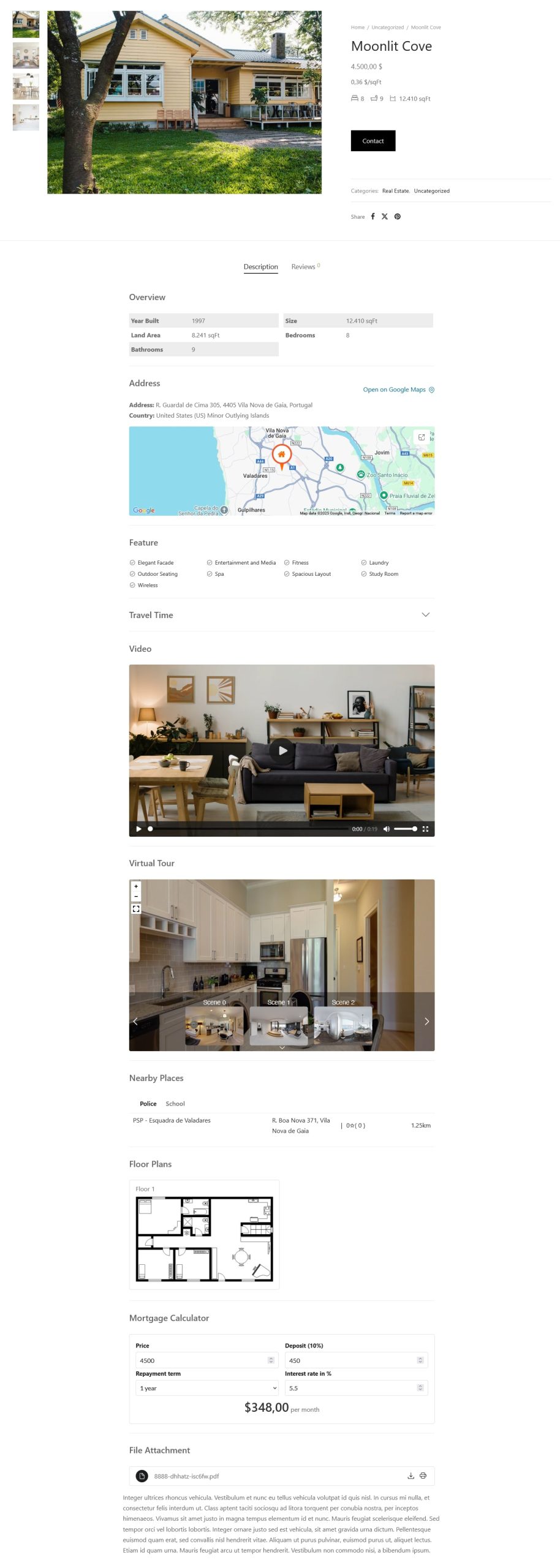
Learn how to create a proper real estate product, for example:
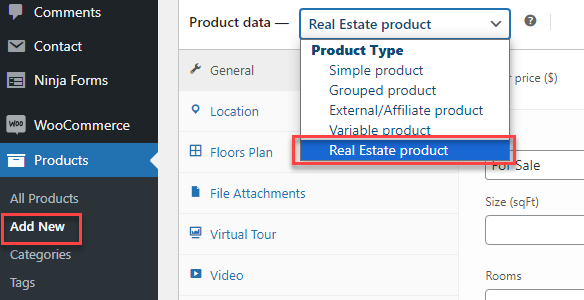
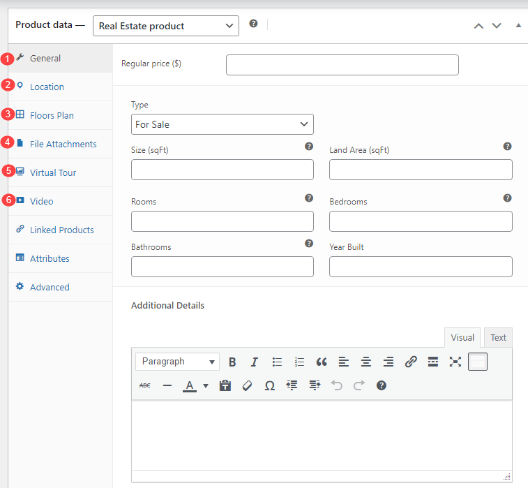
You need to go to Dashboard > Products > Add New, select “Real Estate product” in Product data to create Real estate products.
After creating the Real Estate product type, you will configure properties for this real estate product including General information, location, floor information, file attachments, virtual tour, and video.
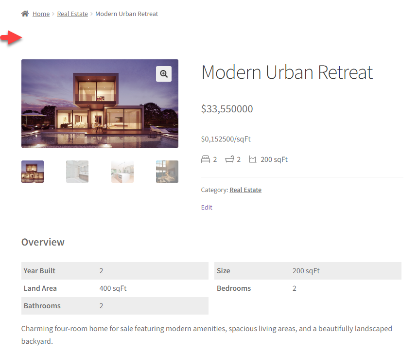
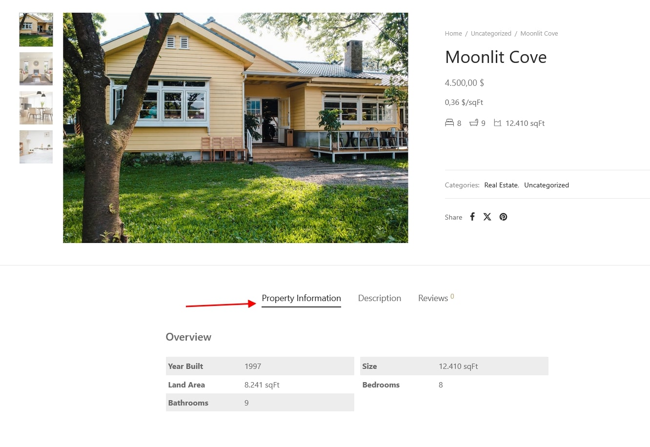
The overview provides a concise summary of the property, including essential details such as price, type, size, number of rooms, and year built. It serves as a quick reference point for potential buyers or renters to assess whether the property meets their criteria.
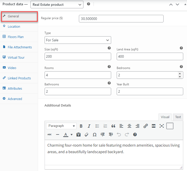
Go to the Product editing page > In the Product data > General: Furnish information about this real estate including price, type, size, land area, number of rooms, bedrooms, bathrooms, year built, and additional details
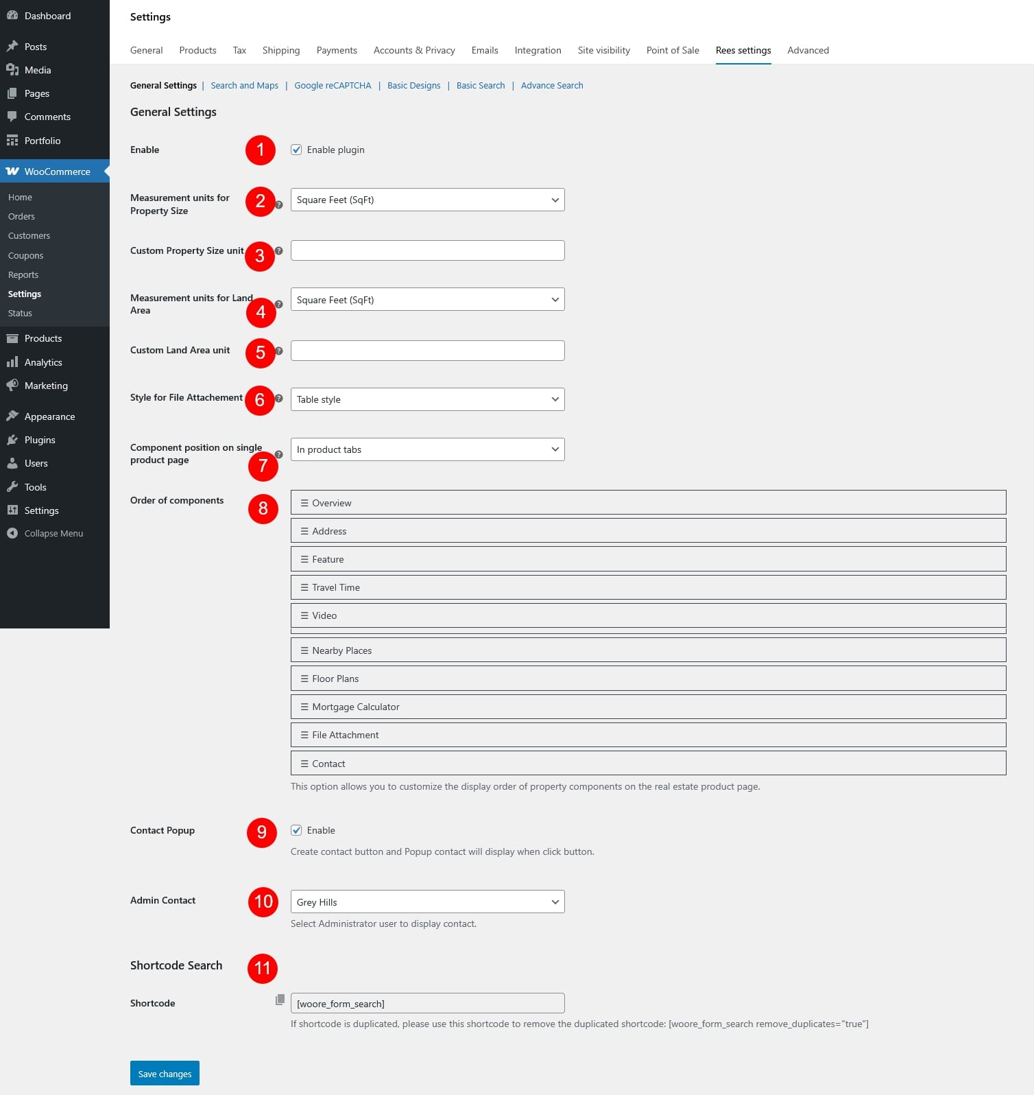
To change the measurement units of the property size and land area, go to WooCommerce >> Settings >> Rees settings > General
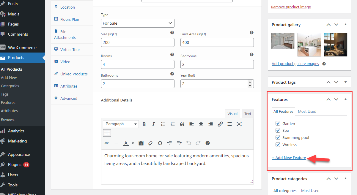
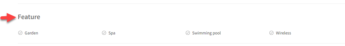
In addition, you add features for the property
Go to the Product editing page > Features, add new features and save
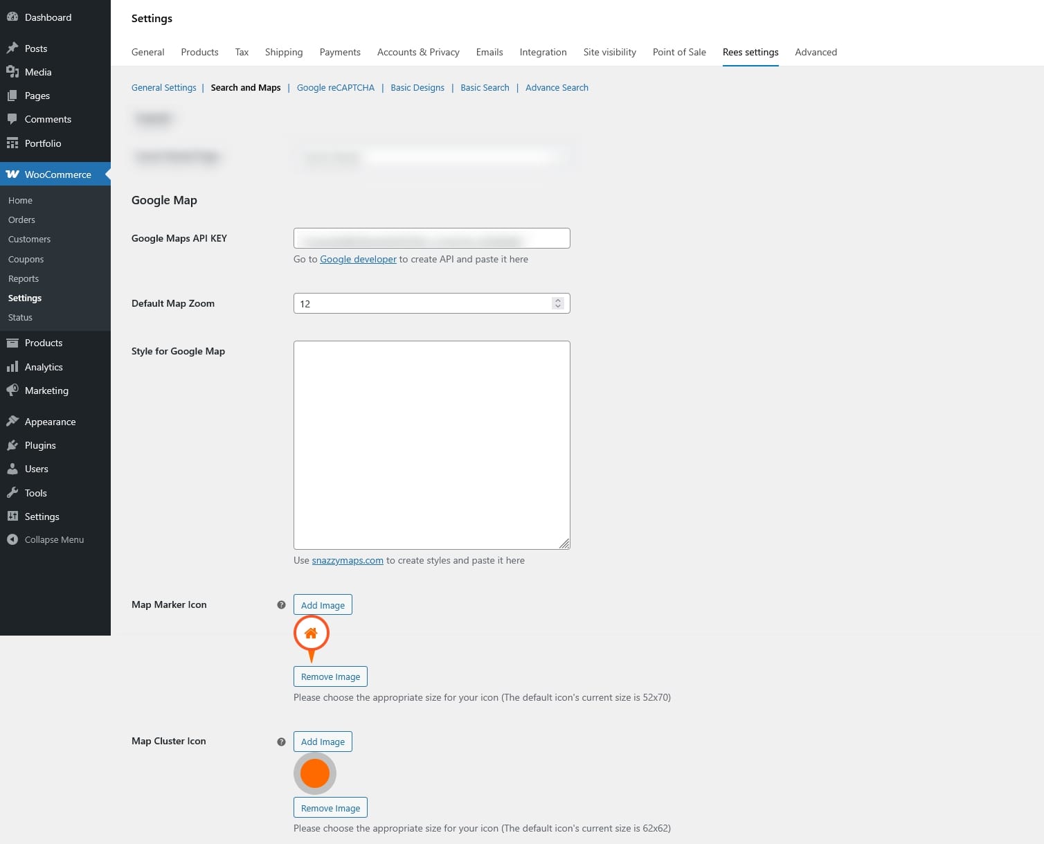
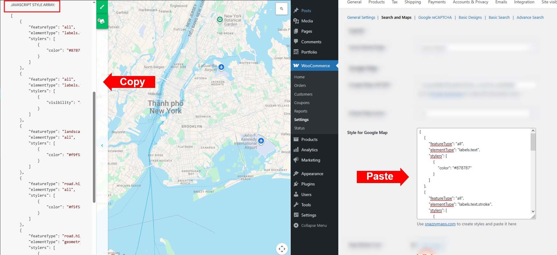
Step 1: Configure Google map
Create Google Maps API key from Google developer and paste the key to “Google Maps API KEY” under Search and Maps settings. Then configure the other settings related like:
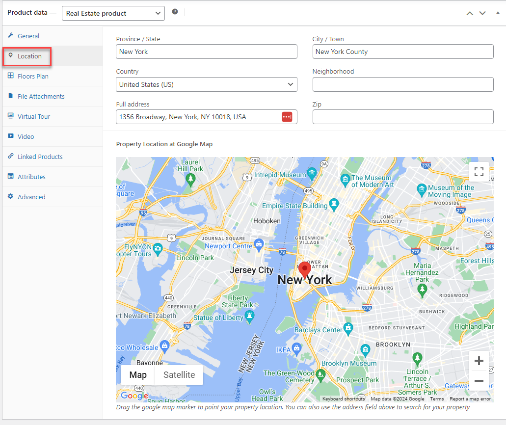
Step 2: Enter the location of the property
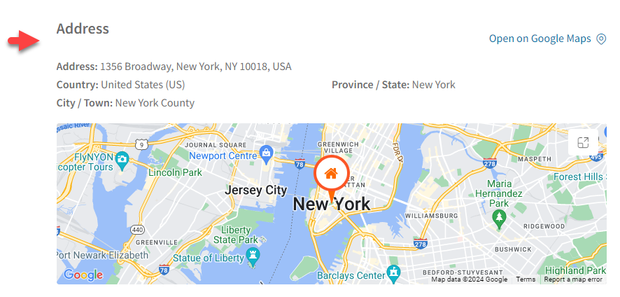
The location provides detailed information about the property’s geographical position, including the Province/State, City/Town, Country, Neighborhood, Full address, and zip code of the real estate. This information helps potential buyers or renters evaluate the property’s desirability and suitability based on their lifestyle preferences and needs.
Go to the Product editing page > In the Product data > Location: Including these details ensures potential buyers or renters can easily identify and locate the property including the Province/State, City/Town, Country, Neighborhood, Full address, and zip code of the real estate.
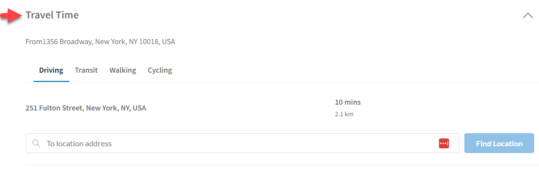
Step 3: Enable travel time and nearby place feature
Besides you can display the travel time which refers to the duration it takes to commute from a specific location to the real estate property.
Go to Dashboard > WooCommerce > Settings > Rees settings > Search and Maps =>> Enable Travel Time
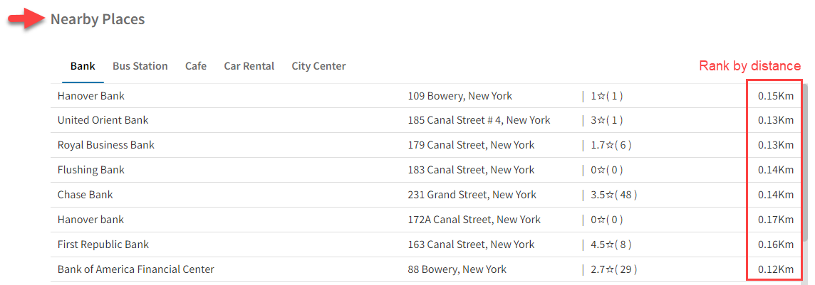
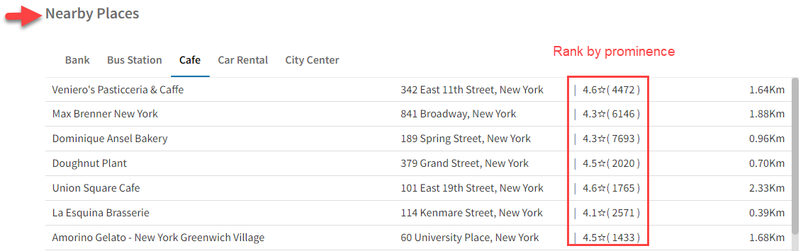
In addition, the Nearby place feature provides information about nearby places helps potential buyers or renters assess the convenience and desirability of the property’s location based on their lifestyle preferences and daily needs.
Nearby place can be ranked by distance or prominence
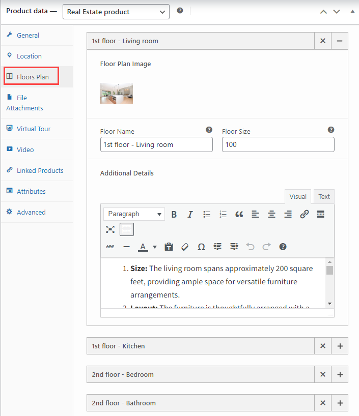
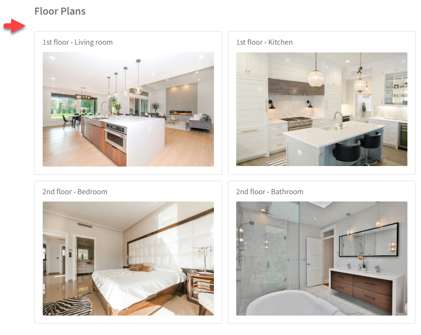
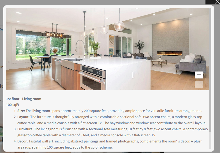
A Floor plan is a detailed graphical representation illustrating the layout and dimensions of each room and space within the property and provides a visual guide for potential buyers or renters to understand the spatial arrangement and flow of the property.
Go to the Product editing page > In the Product data > Floor plan: Provides information including the floor name, the plan image of each floor, the floor size, and additional information about each floor.
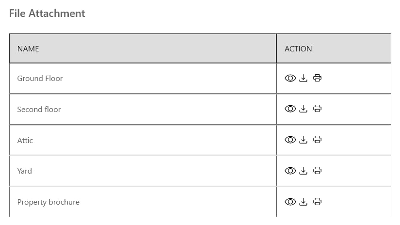
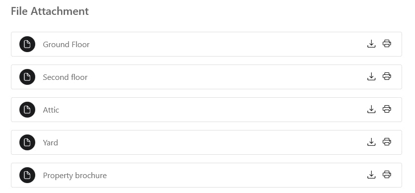
A file attachment is the inclusion of supplementary files or documents relevant to the property listing, such as PDFs, brochures, or additional images.
Go to the Product editing page > In the Product data > File attachment: this allows for the sharing of comprehensive information, documents, or promotional materials related to the property.
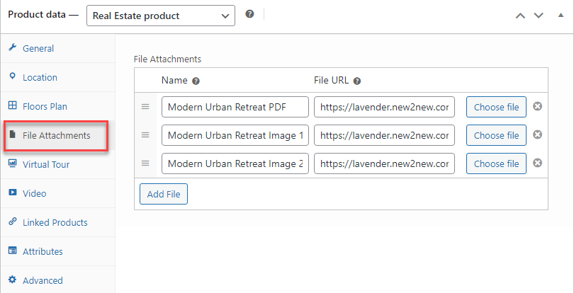
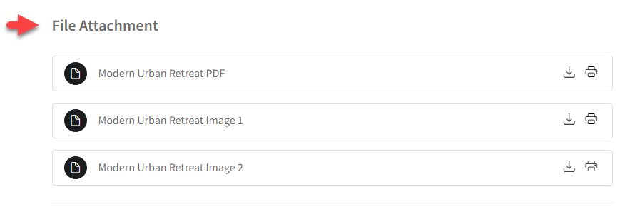
You can change the styles of file attachments: Table style or list style – in Dashboard > WooCommerce > Settings > Rees settings > Choose one option from “Style for File Attachment”
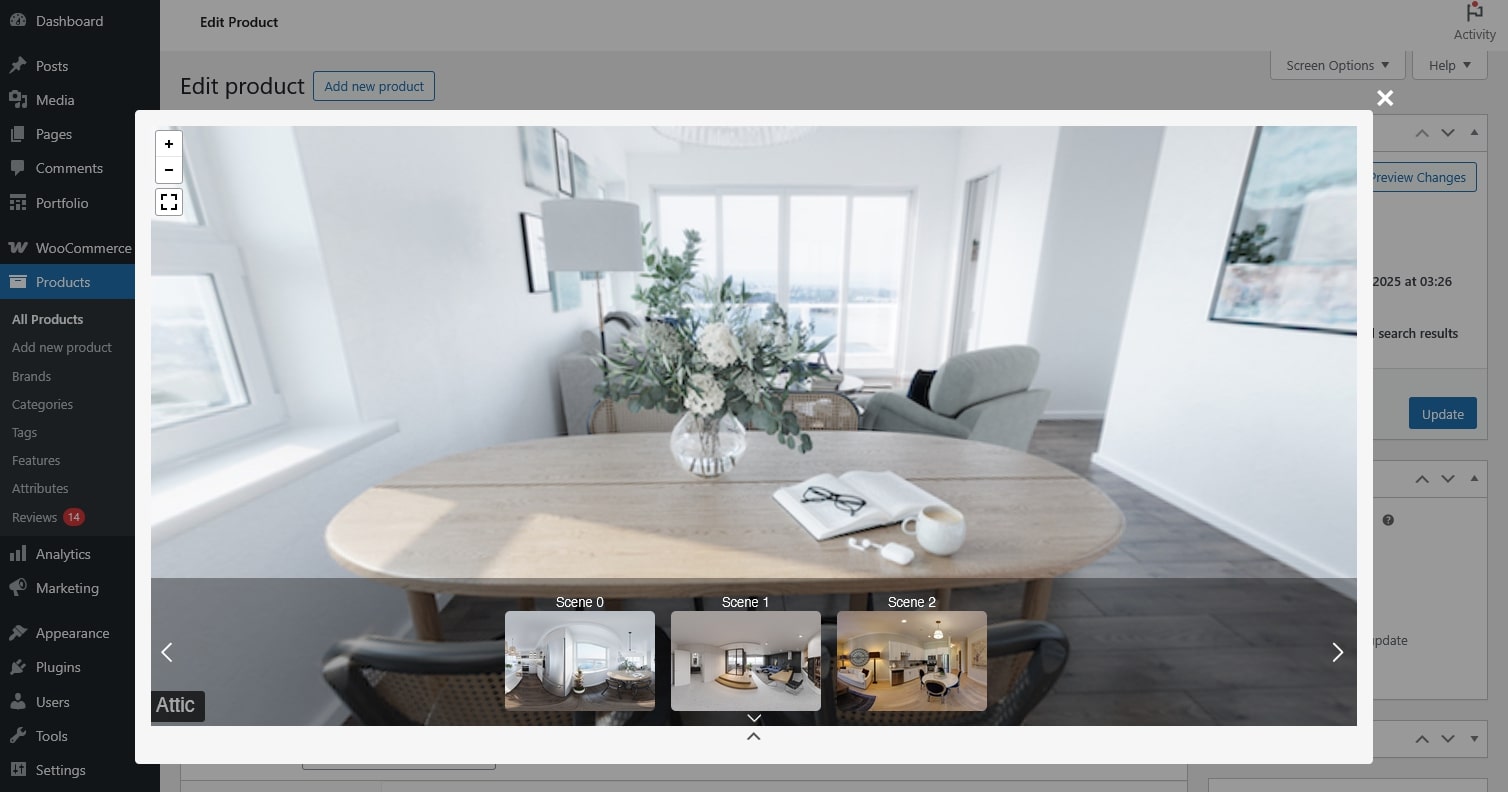
The virtual tour is an immersive, interactive online presentation that allows users to navigate and explore the property virtually.
Go to the Product editing page > In the Product data > Virtual tour: Offers a realistic and dynamic experience for potential buyers or renters who cannot physically visit the property, enhancing their understanding of its features.
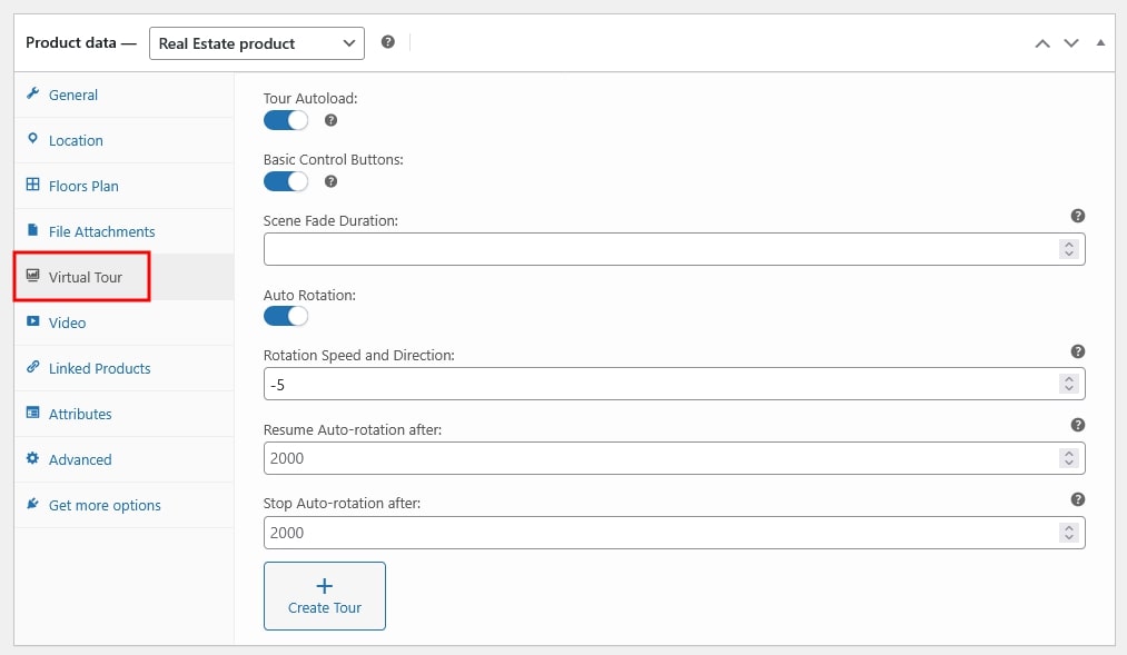
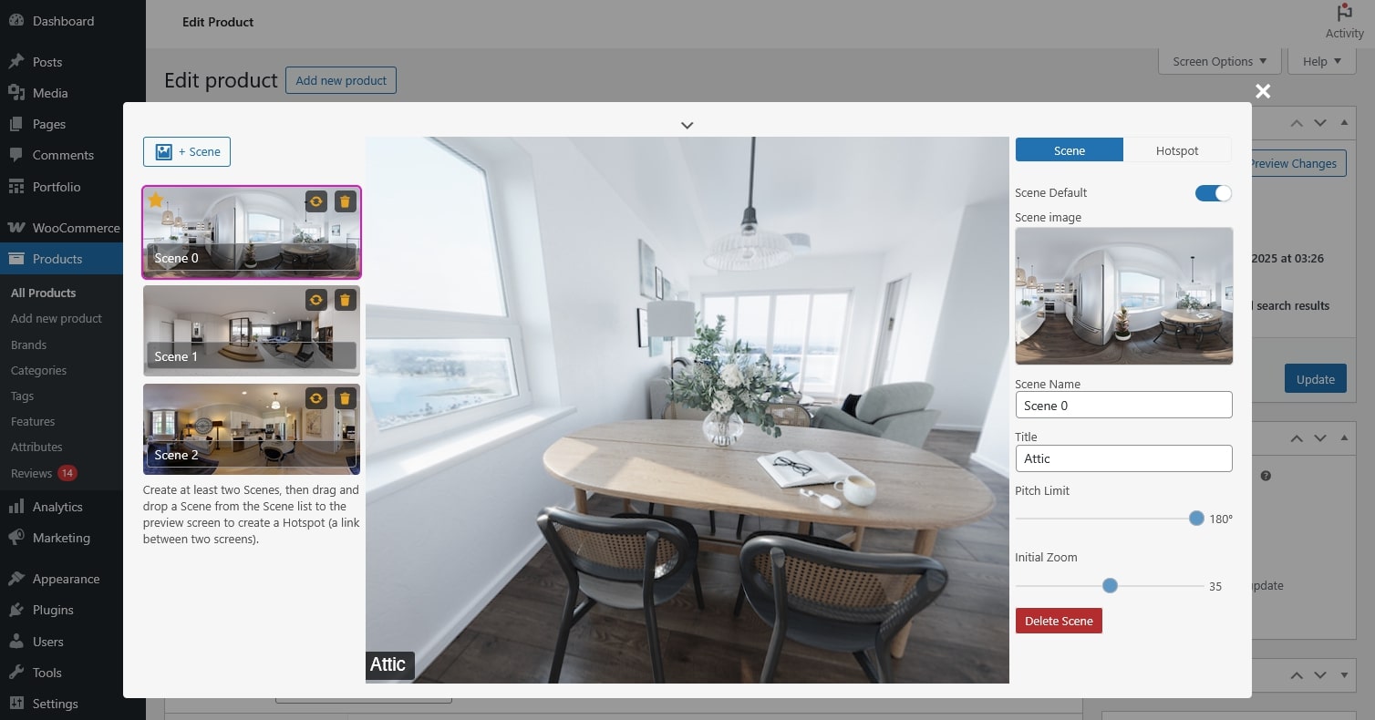
Click the top chevron to open the virtual tour preview and expand or collapse the pages.
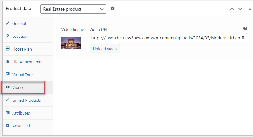
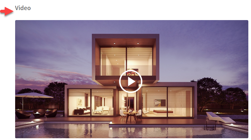
A video is a visual presentation, typically in motion, showcasing the property’s interior, exterior, and surroundings.
Go to the Product editing page > In the Product data > Video: Update the video and a preview image for the video.
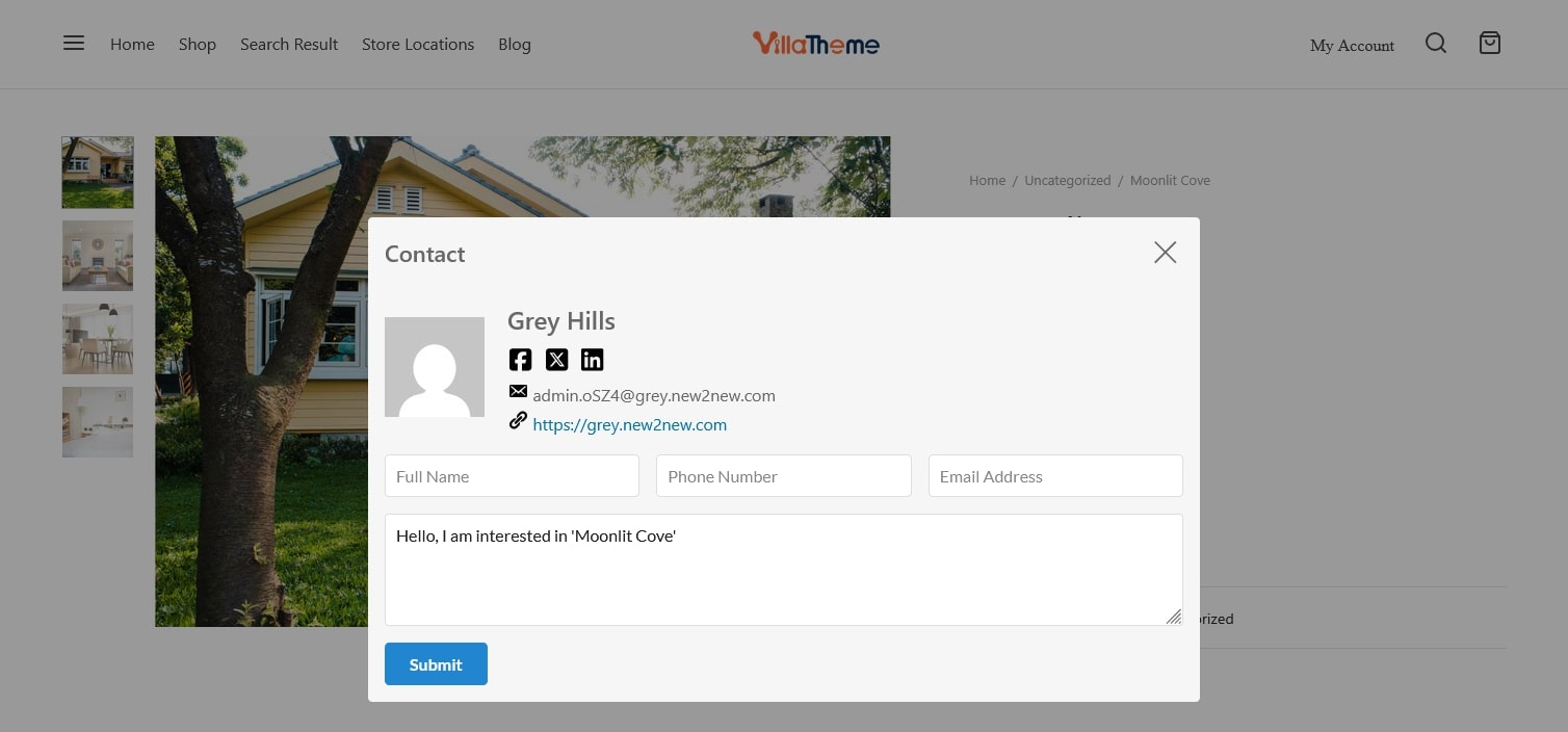
Contact refers to reaching out to the individual or entity responsible for selling a real estate property. This typically involves initiating communication through various channels such as phone, email, social media.
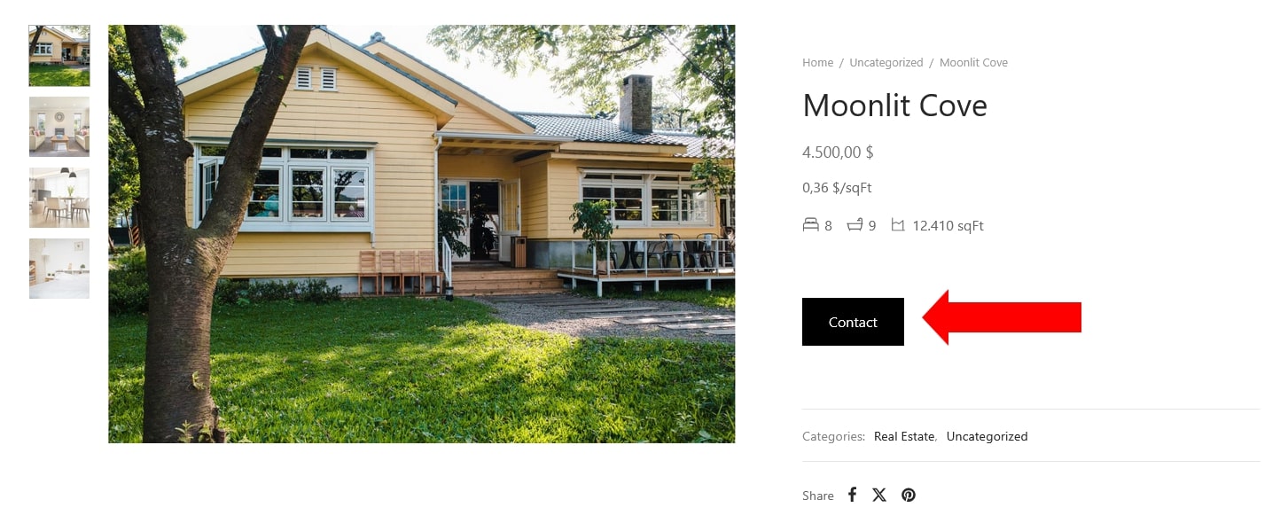

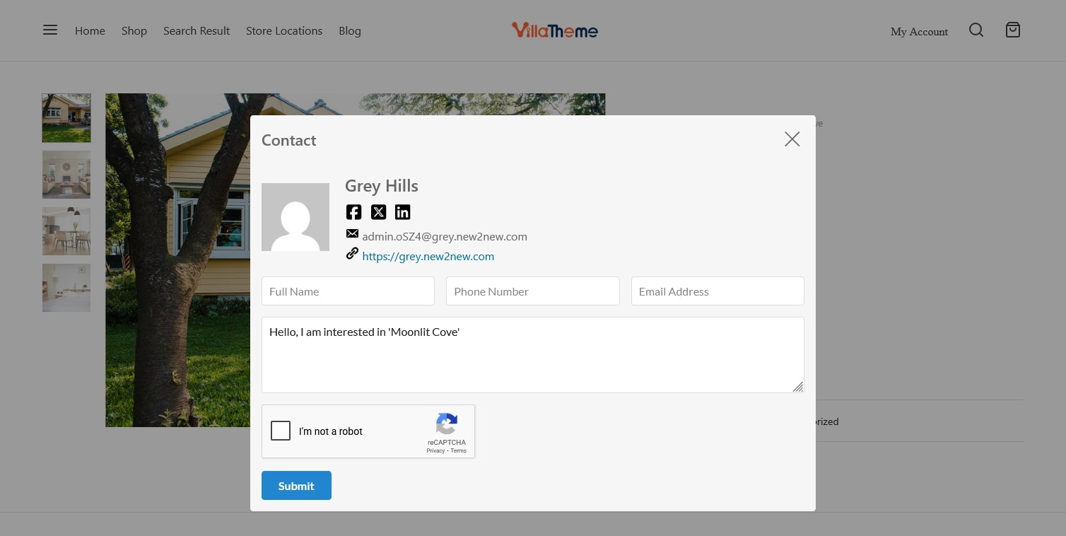
Add admin contact
The Mortgage calculation section can be used to estimate monthly mortgage payments and deposit based on property price, interest rate, repayment term. It helps users understand the financial impact of taking out a mortgage loan.
On the single product page, the mortgage calculation is located under a real estate information section. In order to compute monthly mortgage payments, the price of the property will automatically be added. Buyers or renters can use this information to recalculate the desired load.
Go to Dashboard > WooCommerce > Settings > Rees settings > Search and Maps > Calculation =>> Enable “Mortgage calculator”
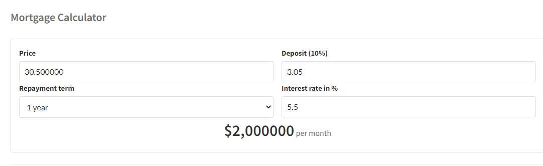
Besides, Mortgage calculator shortcode is also available and can be added into your desired area you want such as the sidebar area by going to Appearance -> Widgets.
[woore_mortgage_calculator]
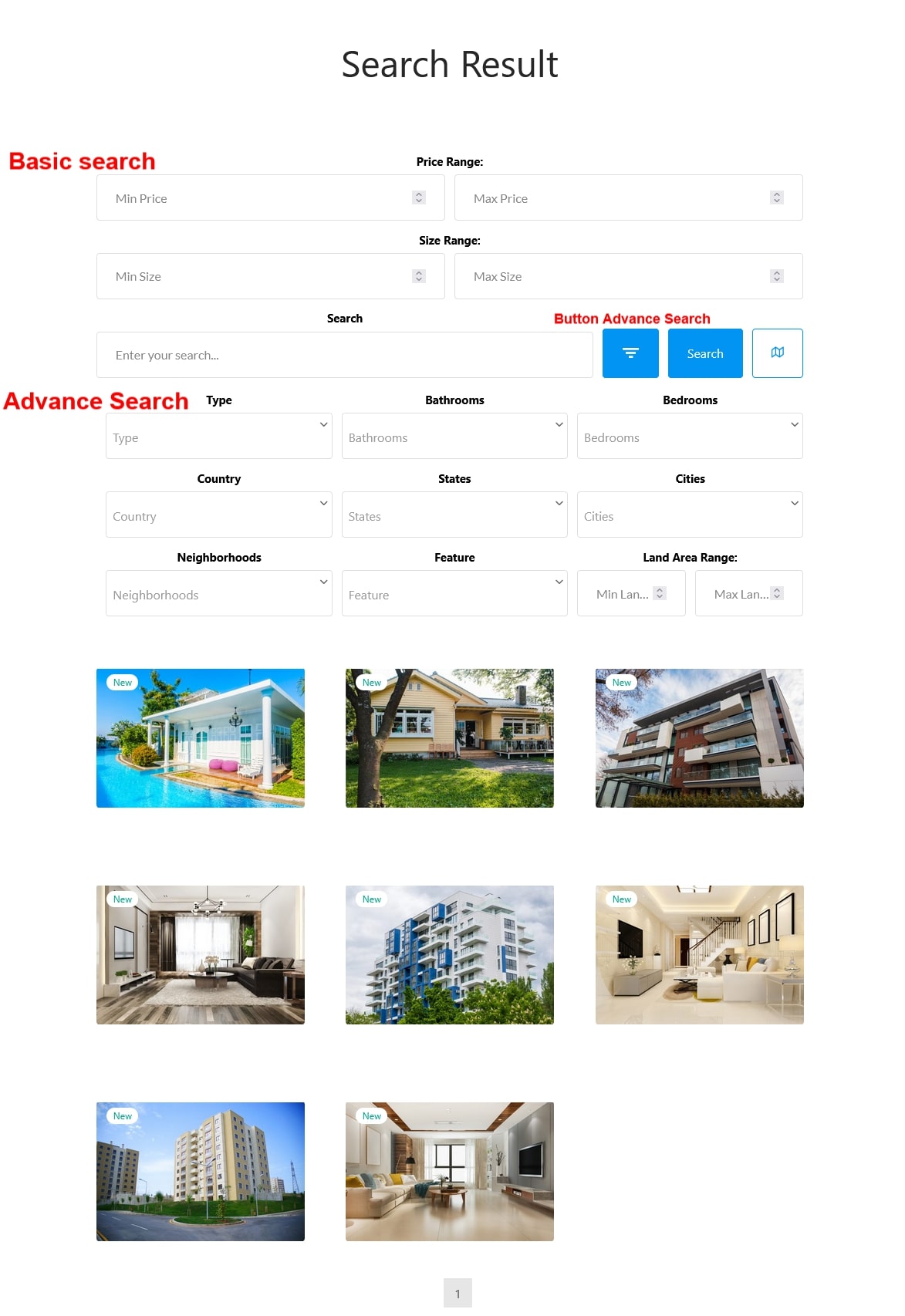
Search Property conveniently with the search form on a Search Result page.
The components of the property information can be reordered: Overview, Location, Travel time, Video, Virtual tour, Floor plans, Mortgage calculation, Nearby places, File attachment, Contact.
Go to Dashboard > WooCommerce > Settings > Rees settings > General Settings, in “Order of components “, drag and drop the components.
Go to Dashboard > WooCommerce > Settings > Rees Settings > General Settings
Go to Dashboard > WooCommerce > Settings > Rees settings > Search and Maps

Go to Dashboard > WooCommerce > Settings > Rees settings > Google ReCAPTCHA
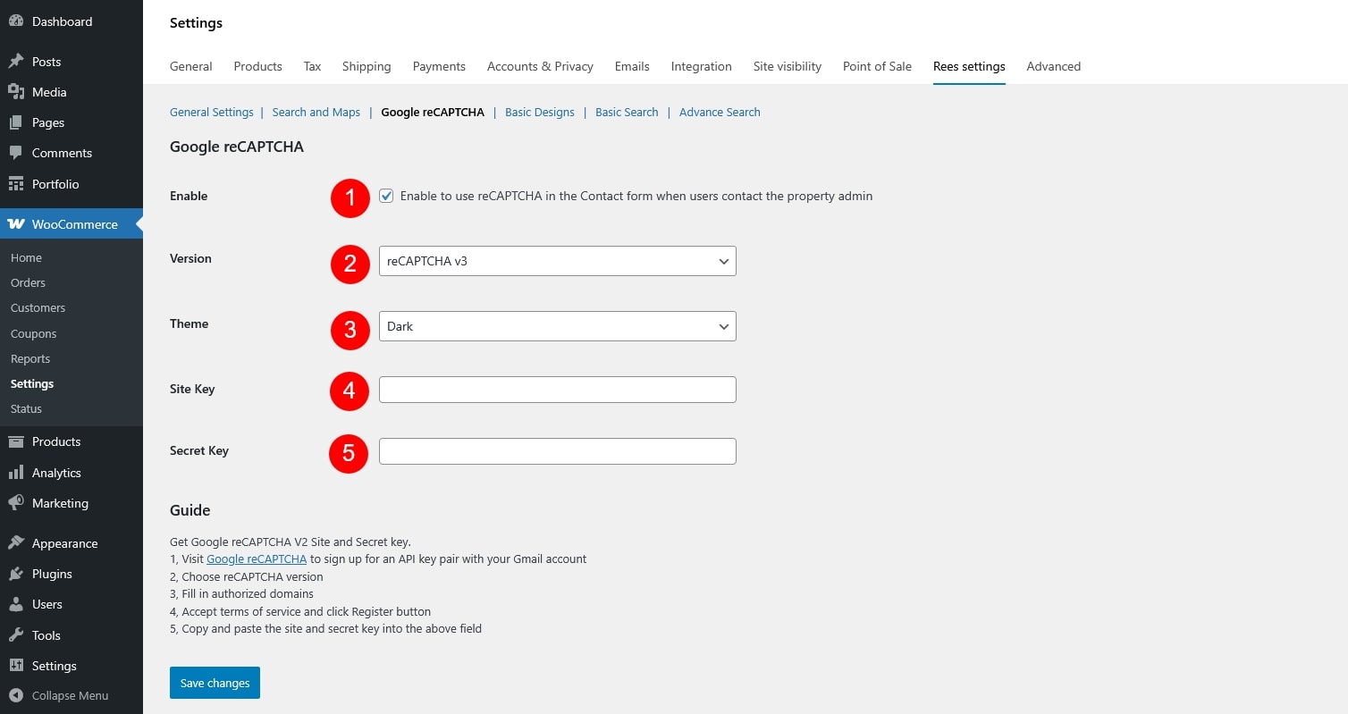
Get Google reCAPTCHA V2 Site and Secret key
Both Site Key and Secret Key must be generated from the Google reCAPTCHA admin console and entered correctly for reCAPTCHA to work

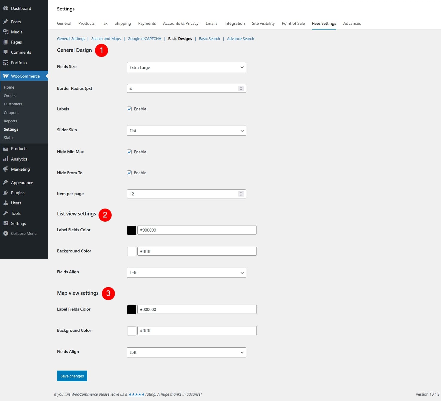
Go to Dashboard > WooCommerce > Settings > Rees settings > Basic Designs


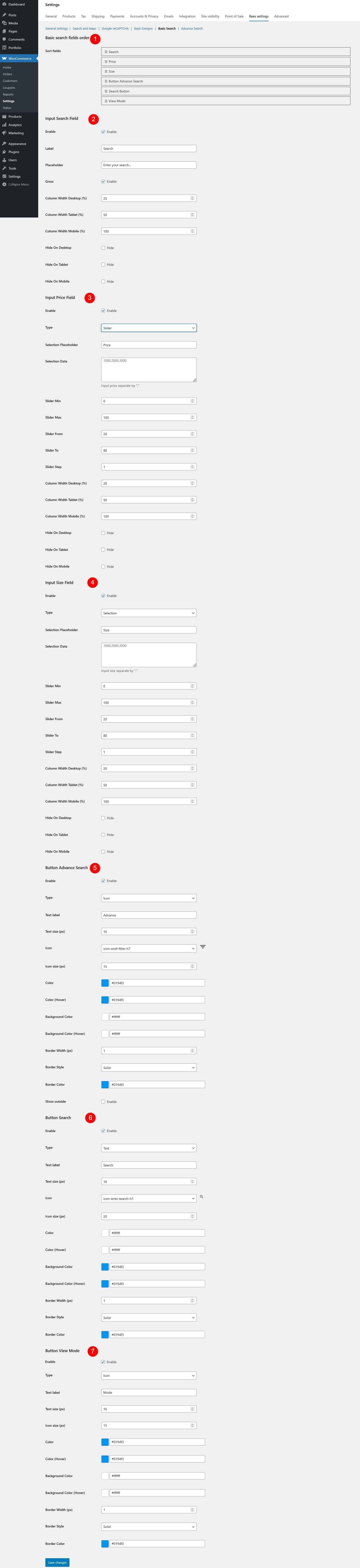
Go to Dashboard > WooCommerce > Settings > Rees settings > Basic Search
Go to Dashboard > WooCommerce > Settings > Rees settings > Advance Search
