These settings include global attribute and background customization of the email template.
RESPONSIVE POINT
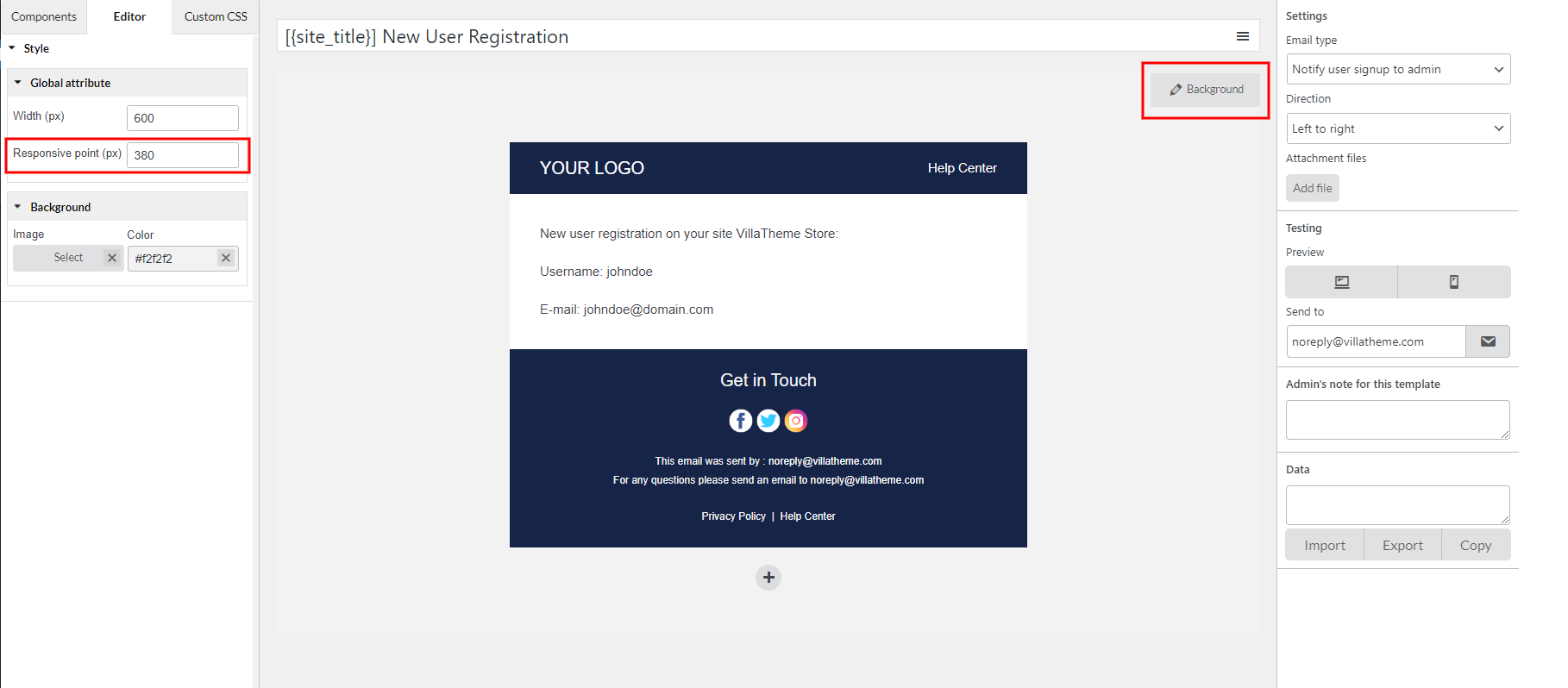
If you view the email template via Preview mode, but you’re still not happy with how it looks on different screen. You may want to make the email on the desktop and mobile look the same, or perhaps you want elements on mobile look bigger than how they look on desktop.
Responsive point will help you with that. It allows your email content to flow freely across all screen resolutions and sizes, and renders it to look great on all devices.
Step 1: Click the “Background” button >> Global attributes
Step 2: In the “Responsive point” field, change the value.
- If you want to make the email components look smaller on mobile, set a lower value.
- Otherwise, set a higher value to make them look bigger
You can’t view the change with the preview mode, but you can send a test email to check this, it shows immediately without having to hit the “Update” button.
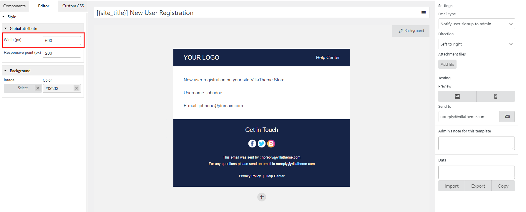
WIDTH
This option will manage the width of that email template. Add the email width you want to this field.
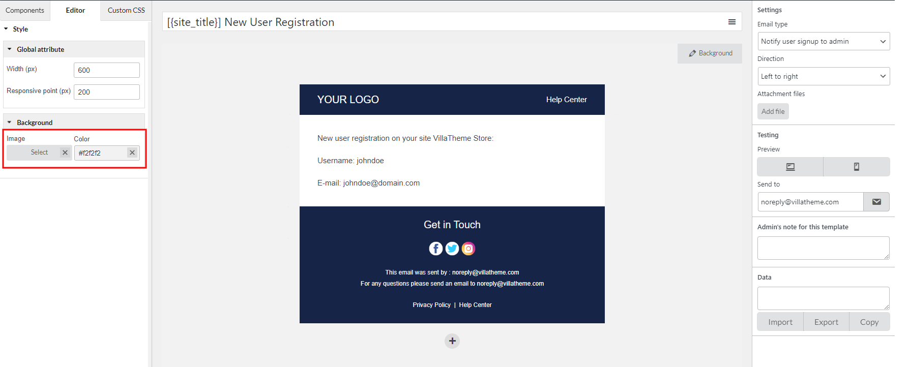
BACKGROUND COLOR / IMAGE
Lastly, add the email image background/color you want.


