- Start
- FILE INCLUDES
- Download and Install
- Introduction
- How to use
- HAPPY
- Knowledge Base
- HAPPY settings
- Ticket Forms
- Happy Author page
- Compatibility
- Extra Information
Copyright Villatheme 2015-2026
Created: 07/2024
Last updated: 2026.03 – Updated version: 1.0.11
By: VillaTheme
Thank you for using our plugin. If you have any questions that are beyond the scope of this documentation, please feel free to request support at our Support Forum. Thanks so much!
Make sure that those limits are to a minimum as follows for free-trouble while installing:
Go to Dashboard >> Plugins >> Add New Plugins.
happy-helpdesk-support-ticket-system.zip downloaded from this official source.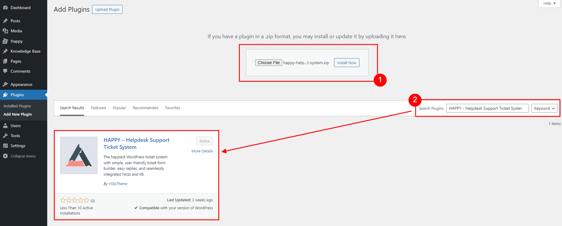
See this instruction for more details.
Once you activate the plugin, you’ll be redirected to our Setup Wizard, which is designed to guide you through the initial configuration process with ease. The Setup Wizard is your key to quickly getting started, allowing you to set up essential components and customize your support system without hassle.
HAPPY will automatically create three critical pages and three key roles for you:
Step 1: For new users, start by configuring these settings to set up your ticket management system:
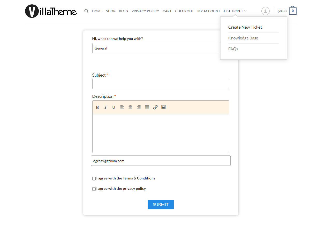
Once configured, on front end, customer will be able to open a ticket via a ticket form:
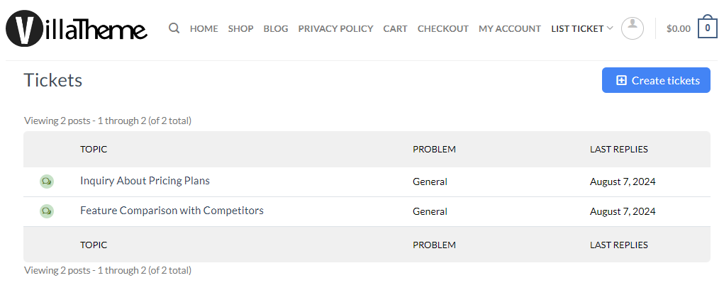
And customer can start viewing their created tickets through the Ticket List
Step 2: To reduce the workload and streamline ticket management process, consider
And that’s it! You now have a basic ticket system set up. You can start receiving tickets and get to work. Now let’s move on to see how HAPPY will appear to your customers once your configuration is complete. Enjoy the smooth, efficient support experience with HAPPY!
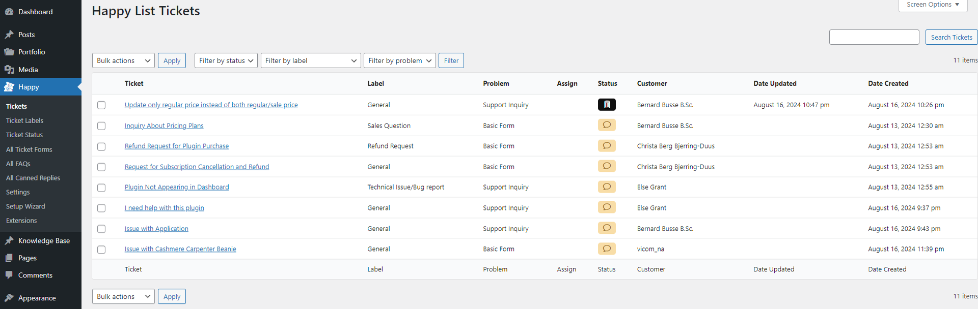
This section provide view of all support tickets one can see – depending the role you have. E.g. the Support Manager can see all tickets – from both front end and back end – and manage them both ways. But customers can only see tickets they created themselves.
Go to Dashboard >> Happy >> Tickets
For Support Manager, the back-end ticket list offers overview of all tickets and advanced management and administrative features, including:
Ticket List on front end can be access by the Support Page setup under Page Setting
For customers, the front-end ticket list displays all their submitted tickets in a user-friendly interface.
They can:
 on the ticket page to reply the ticket
 button on the ticket page to close the ticket
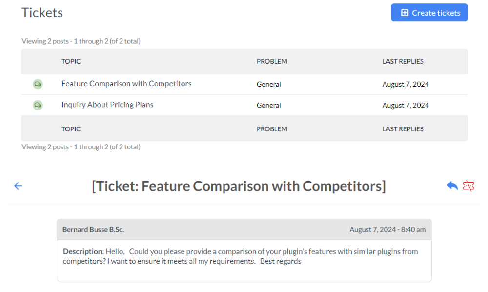
For admin, other than viewing the tickets on the list, they can take actions to manage or make it easier to manage them, like:
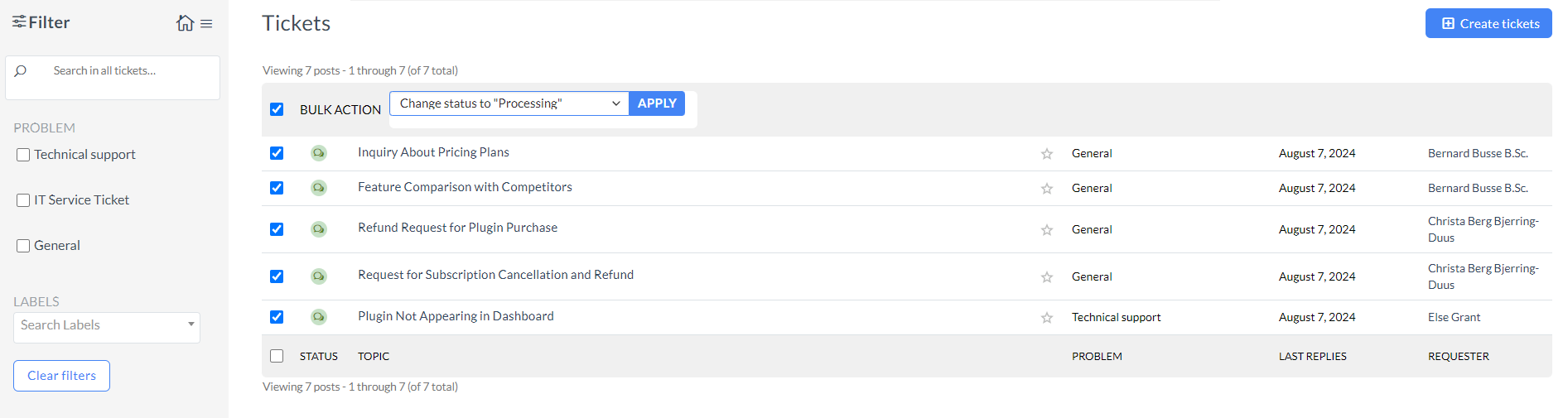
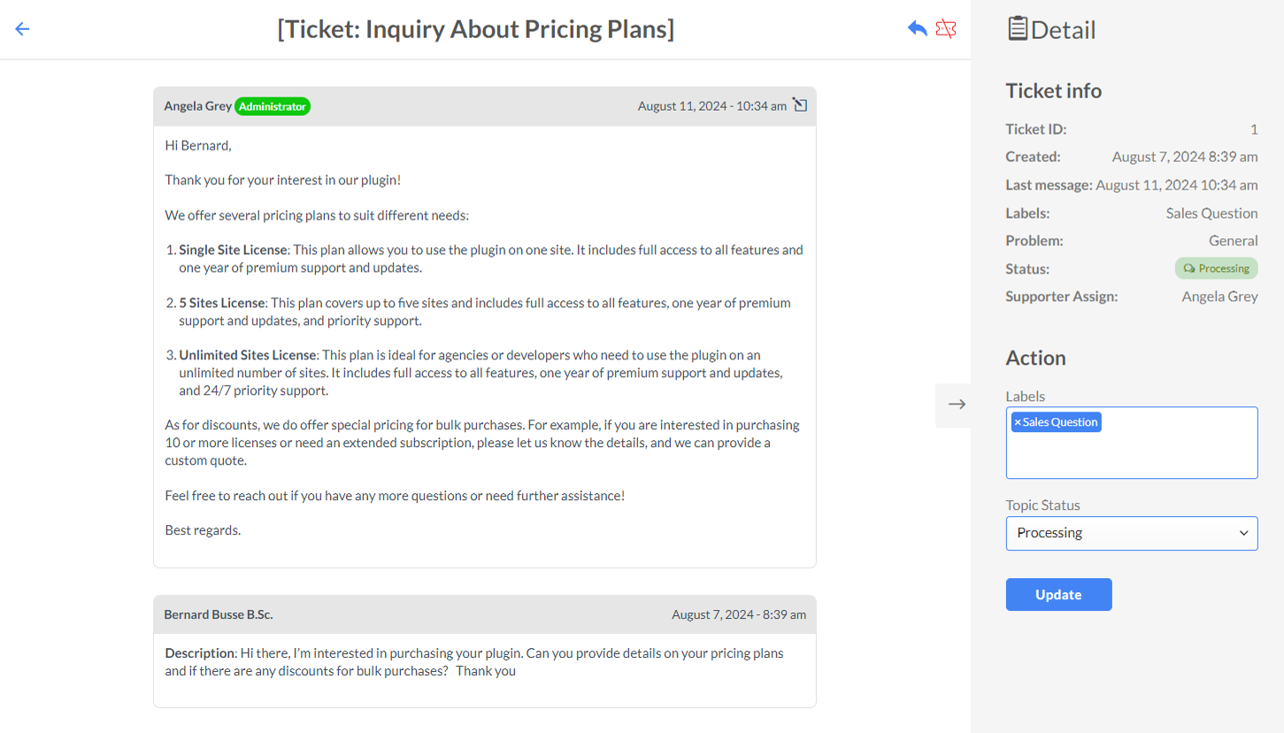
1. On the ticket page, the supporter can:
to reply the ticket to close the ticket on the right to open the widget for:
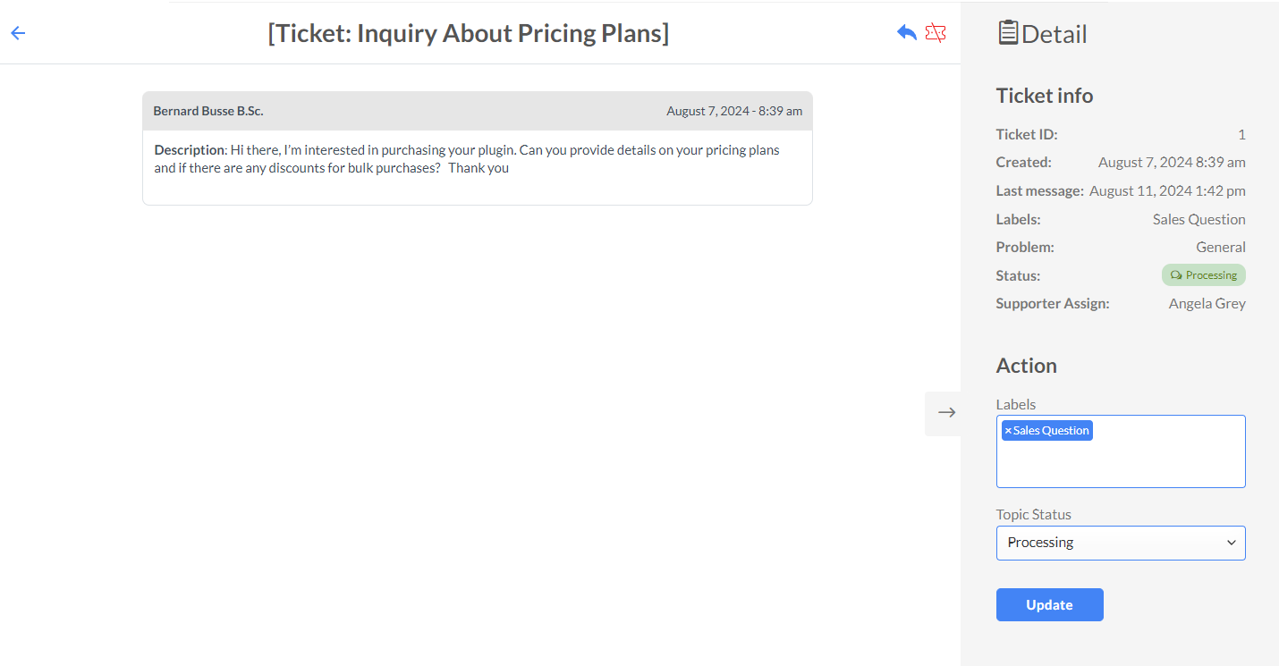
2. After replying, there is an edit button on the top right corner, for the admin to edit the reply.
Go to Dashboard >> Happy >> Ticket Labels
This feature allows you to organize support tickets into different tags. This helps in managing and prioritizing tickets more effectively, ensuring that they are routed to the appropriate support staff and handled efficiently.
This is the page where the Support Manager can see all the available ticket labels, take an overview, change their position or visit a list of tickets with specific label assigned.
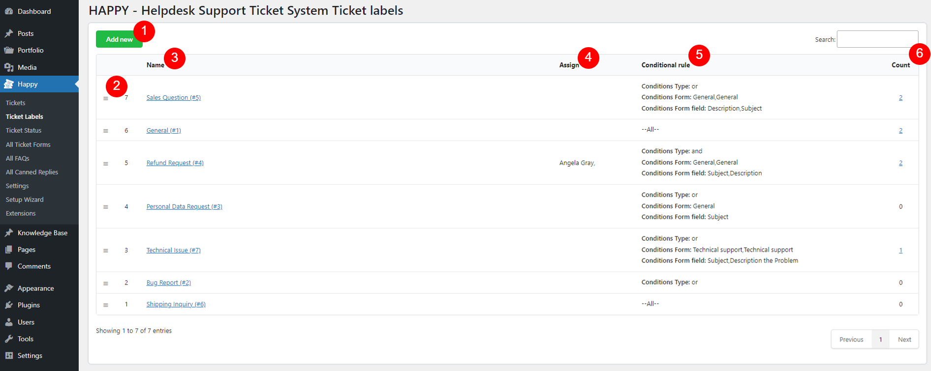
 icon to drag and drop to change the position of the label.
This page is to configure a specific label.
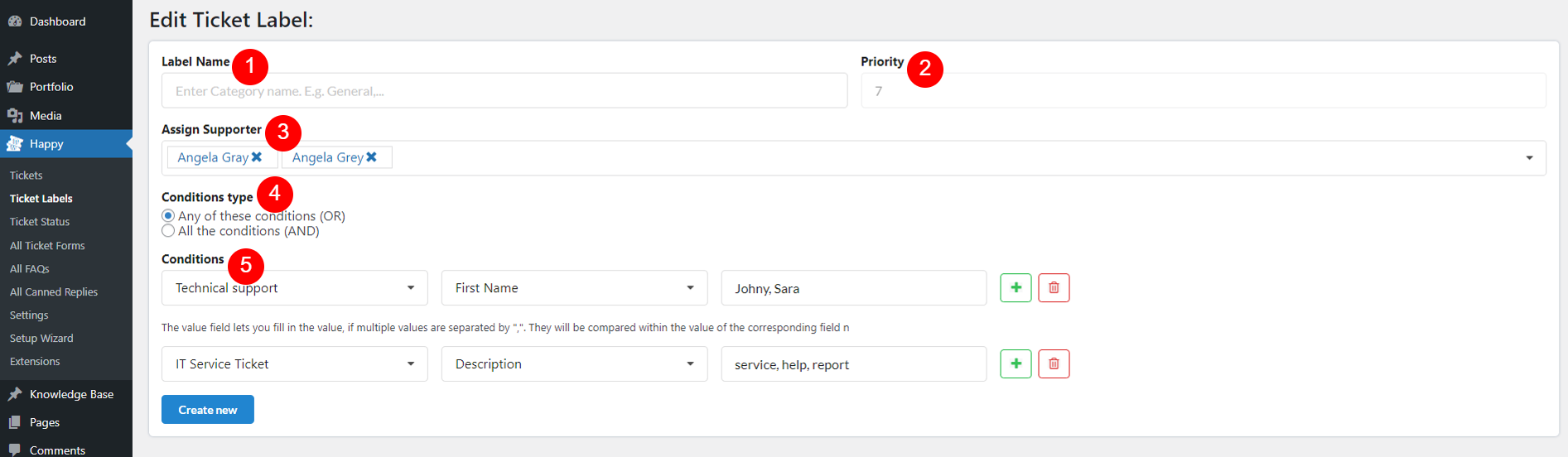
 Add new condition: Click this button to create a new condition. You can define multiple conditions to refine how tickets are labeled.
 Remove the condition: Click this button to delete an existing condition. This allows you to update or simplify your condition rules.
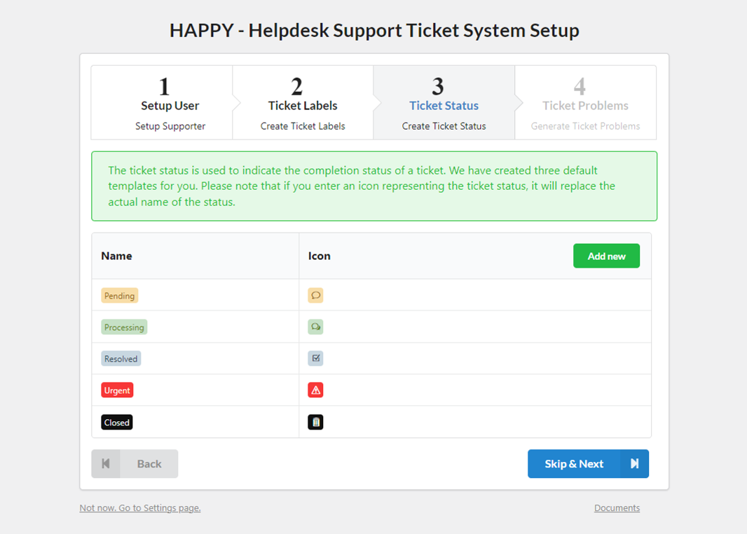
Create and manage different statuses for support tickets. These statuses provide clear visibility into the progress and current state of each ticket.
After creating your status, assign specific status to events in “Ticket status” section under General tab.
On the Status list:
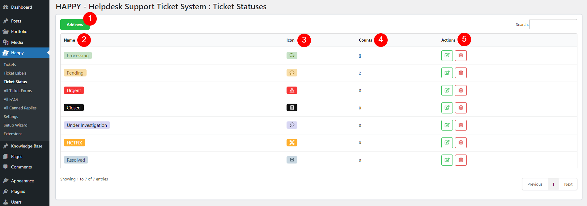
 Edit status
 Remove status
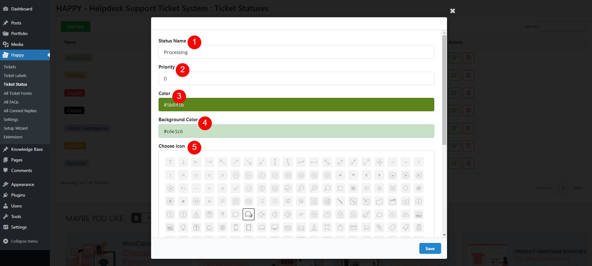
When you click the green Edit button under “Action” column. A popup for status settings appears, allowing you to customize the settings for each ticket status to ensure they align with your support workflow:
Go to Dashboard >> Happy >> All Ticket Forms
The Ticket Forms feature lets you create and manage various forms for ticket submission. Customize forms for specific needs, such as technical support or feature requests, with tailored fields to collect essential information efficiently. This helps your support team address issues effectively.
The All Ticket Forms page provides an overview of all the ticket forms you have created. This page allows you to manage and organize your forms effectively.
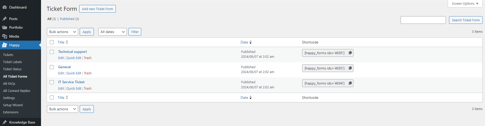
This page helps you maintain and organize your support ticket forms, ensuring you can easily manage and update them as needed. Click the Edit button or “Add new Ticket Form” to go to the template editor.
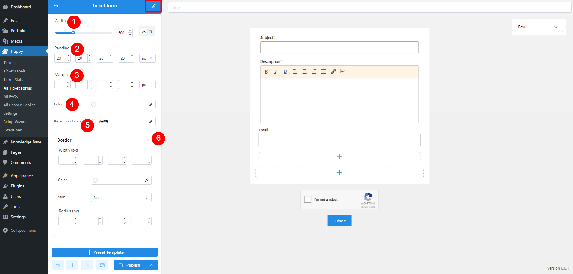
The Ticket Form Template Editor allows you to create and customize the layout and content of your ticket forms.
Refer to this documentation for more details.
The shortcode to display list of published FAQ posts on front end is: [happy_list_faq]
The FAQs feature allows you to create and manage a comprehensive list of frequently asked questions to help users quickly find answers to common queries. This self-service resource can reduce the volume of support tickets and provide immediate assistance to your customers.
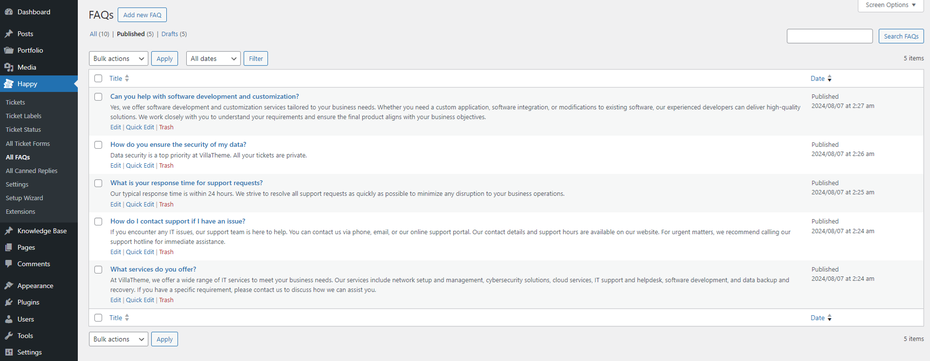
Creating and Managing FAQs
By utilizing the FAQ feature, you can improve user experience by providing clear and accessible information, reducing the need for direct support and enhancing overall efficiency.
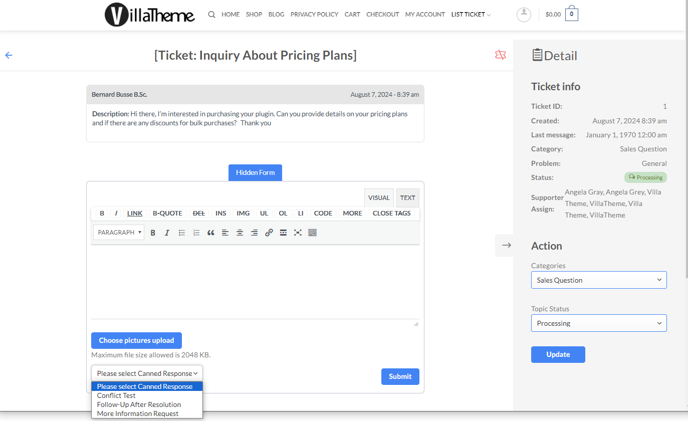
Go to Dashboard >> HAPPY >> All Canned Replies
This feature allows support staff to create and use pre-written responses for common queries. This can significantly speed up response times, ensure consistency in communication, and improve overall efficiency in handling support tickets.
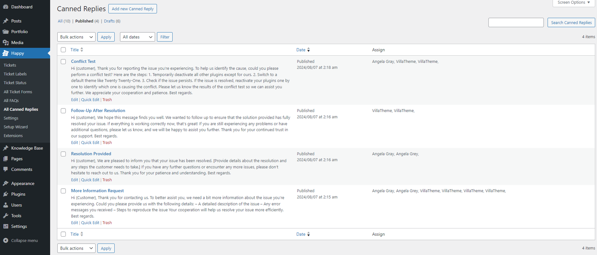
When responding to a ticket, support staff can choose from the list of canned replies which they’re assigned to, to insert a pre-written response.
Refer to this documentation for details.
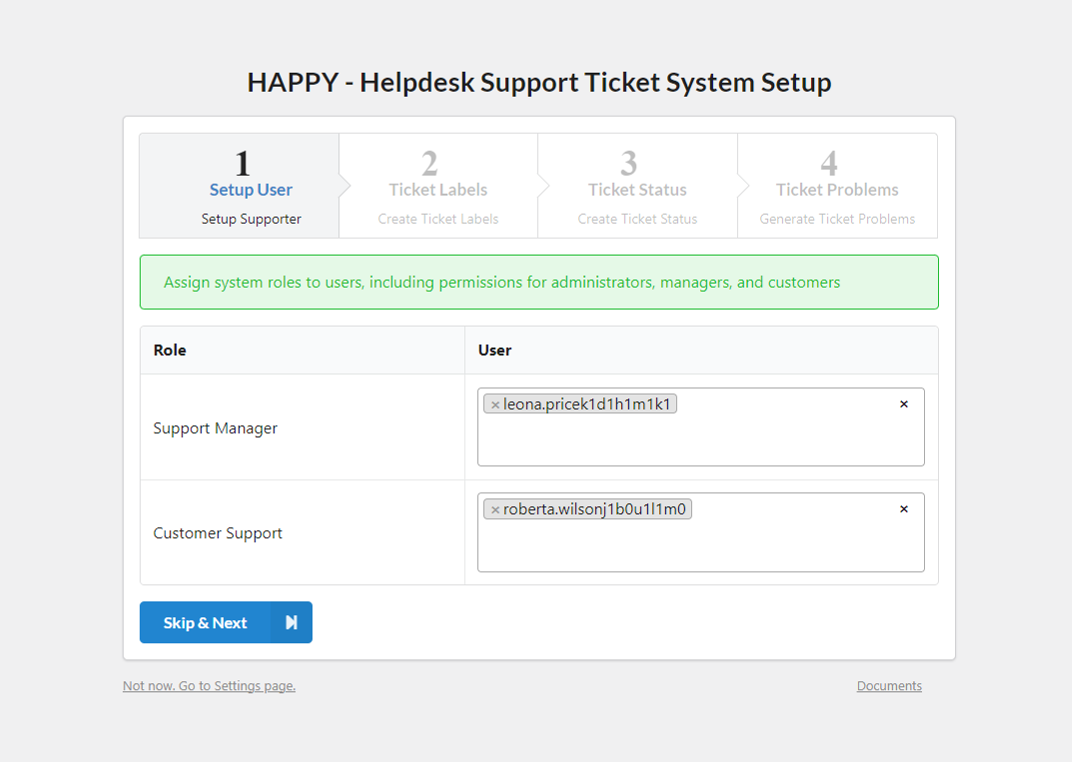
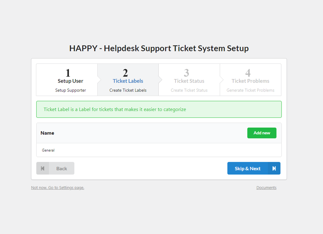
Go to Dashboard >> Happy >> Setup Wizard
The Setup Wizard in HAPPY guides you through the initial configuration of your helpdesk system to ensure it meets your specific needs. Here’s a step-by-step overview of the setup process:
Step 1: Setup User
Configure user roles and permissions within the system:
Step 2: Ticket Labels
Create and manage Ticket Labels to categorize and organize incoming tickets:
Step 3: Ticket Status
Set up Ticket Statuses to track the progress of tickets:
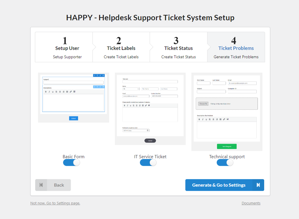
Step 4: Generate Ticket Forms
Create Ticket Forms to collect detailed information from users when they submit a ticket. Quick generate forms using 3 built-in templates.
The setup wizard guides you through basic configuring HAPPY in clear, easy stages.
Knowledge Base articles are displayed on front end by the shortcode [happy_list_kb]
Place the shortcode to a page >> All published KB articles will be displayed there. Then use the option under Page Setting to assign the page.
The Knowledge Base is a helpful resource where users can find solution to common problems and issues. It provides articles, guides, and tutorials to assist users without needing to contact support.
While FAQs address common questions that users frequently ask. It’s designed to quickly provide answers to the most common queries. They typically includes brief, straightforward answers to common questions. FAQs are usually concise and focus on the most frequent issues or concerns.
Knowledge Base provides a comprehensive collection of articles, guides, and tutorials on various topics. It’s a broad resource designed to address a wide range of issues and questions. A KB post can include detailed information, step-by-step troubleshooting guide, how-to articles, and in-depth explanations. It may cover complex topics and offer solutions to a variety of problems.
Moreover, KB posts can be categorized into different sections or topics, making it easier to navigate and find specific information.
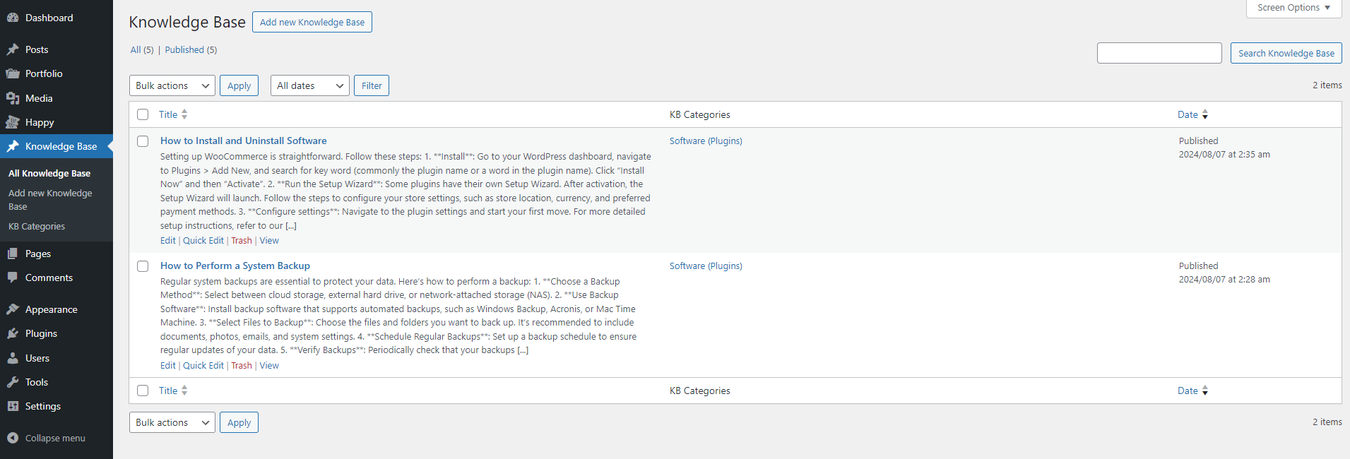
Go to Dashboard >> Knowledge Base >> All Knowledge Base
The All Knowledge Base page provides an overview of all the available Knowledge Base articles. This page helps you manage and maintain your Knowledge Base effectively by providing easy access to all your content in one place.
The Add New Knowledge Base page allows you to create and publish new articles to expand your Knowledge Base.
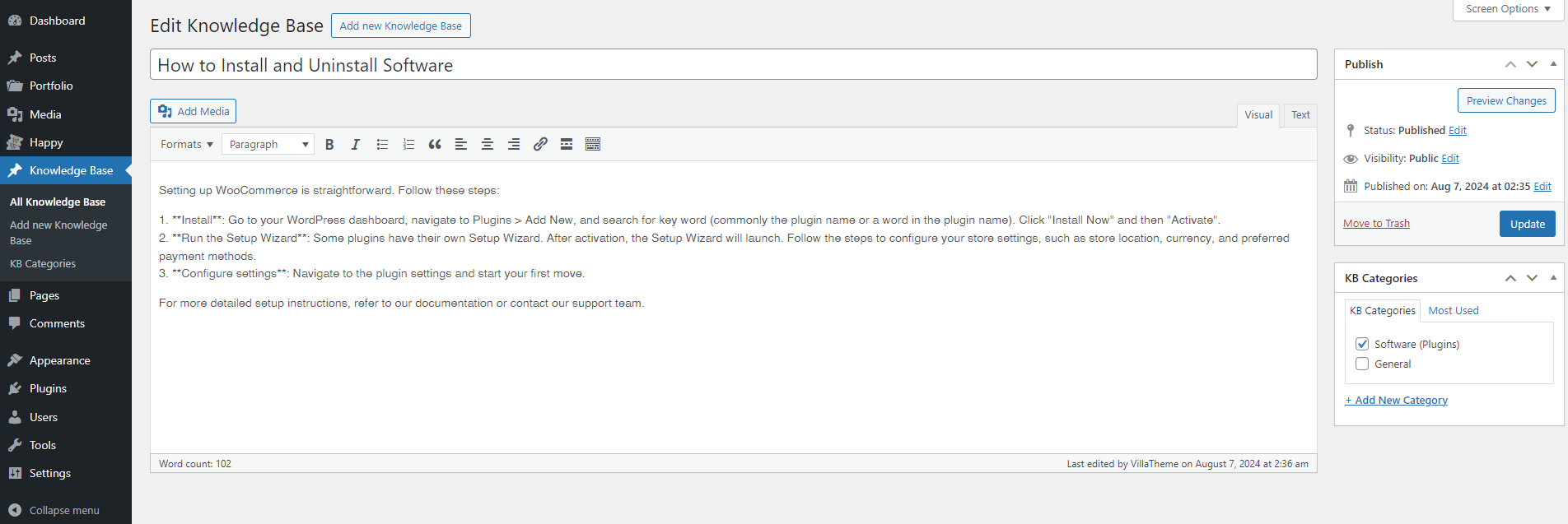
This page is where you can add new resources to your Knowledge Base, helping to keep your support documentation current and useful.
The Knowledge Base Categories page lets you create and organize your KB categories.
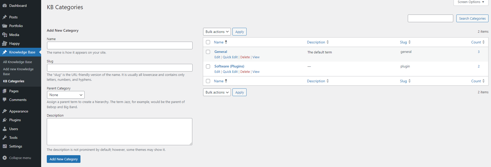
Use the options under “Add New Category” section on the left to create new KB categories
The KB Categories list section on the right provides an overview of all the categories used in your Knowledge Base, allowing you to manage and organize them efficiently.
This page is essential for managing the structure of your Knowledge Base, making it easier for users to find relevant information and improving the overall user experience.
Go to Dashboard >> Happy >> Settings
The Settings page is where you can configure various aspects of the HAPPY, to ensure it operates smoothly and meets your support requirements. Scroll down to read explanation of each section within the Settings page:
Go to Dashboard >> Happy >> Settings >> General
Configure basic settings for your helpdesk system, including User login form, ticket/reply pagination and ticket status for specific action.
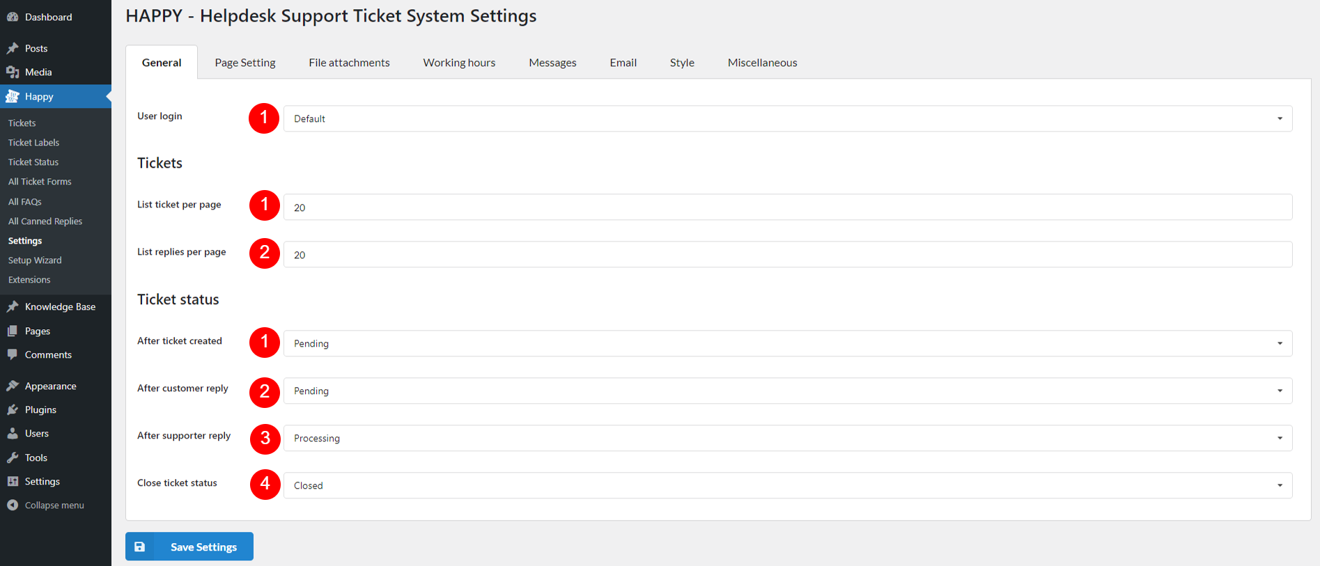
Use login:
Tickets: This is the Ticket Pagination settings – Configure how tickets and replies are displayed
Ticket status: Set the status for each ticket action:
HAPPY uses shortcodes to create three essential pages:
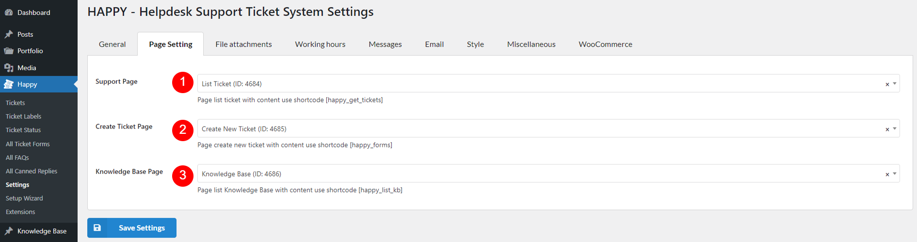
After creating these pages with the respective shortcodes, assign them here. Customers will be redirected to these pages for ticket lists, knowledge base articles, and new ticket creation.
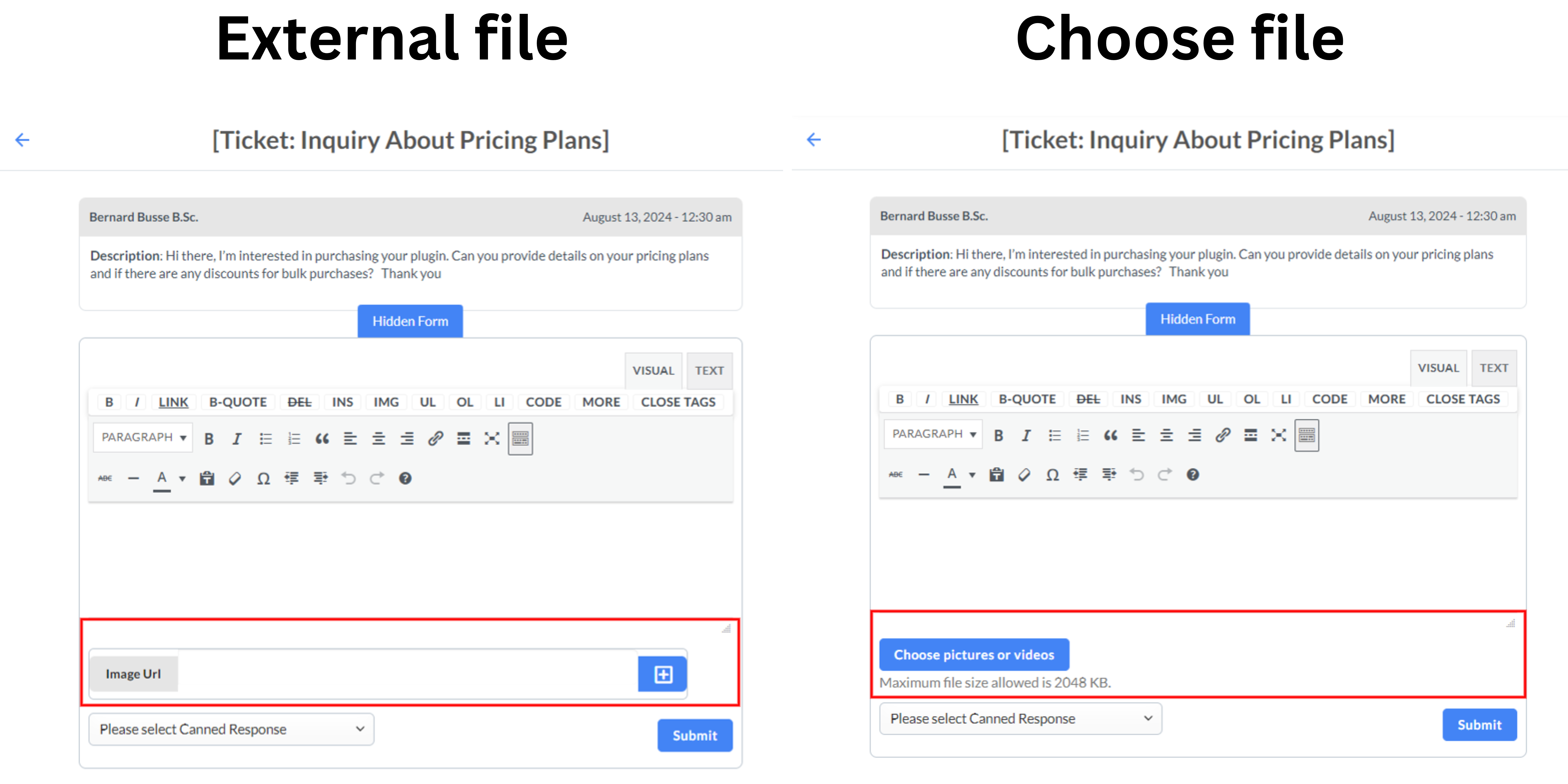
Configure how file attachments are handled in tickets and replies:
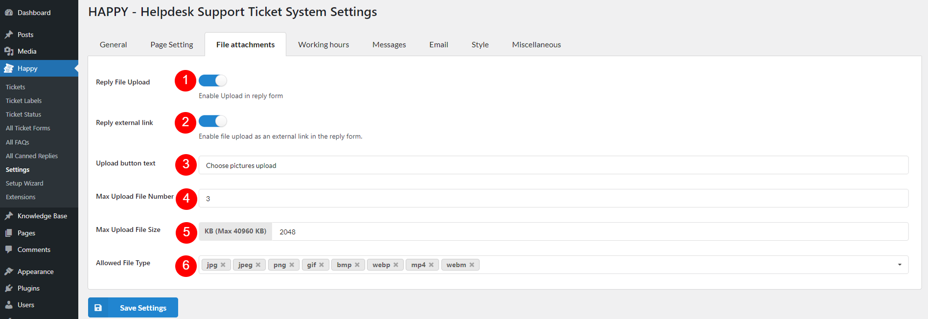
*Here’s the file attachment on a real reply form
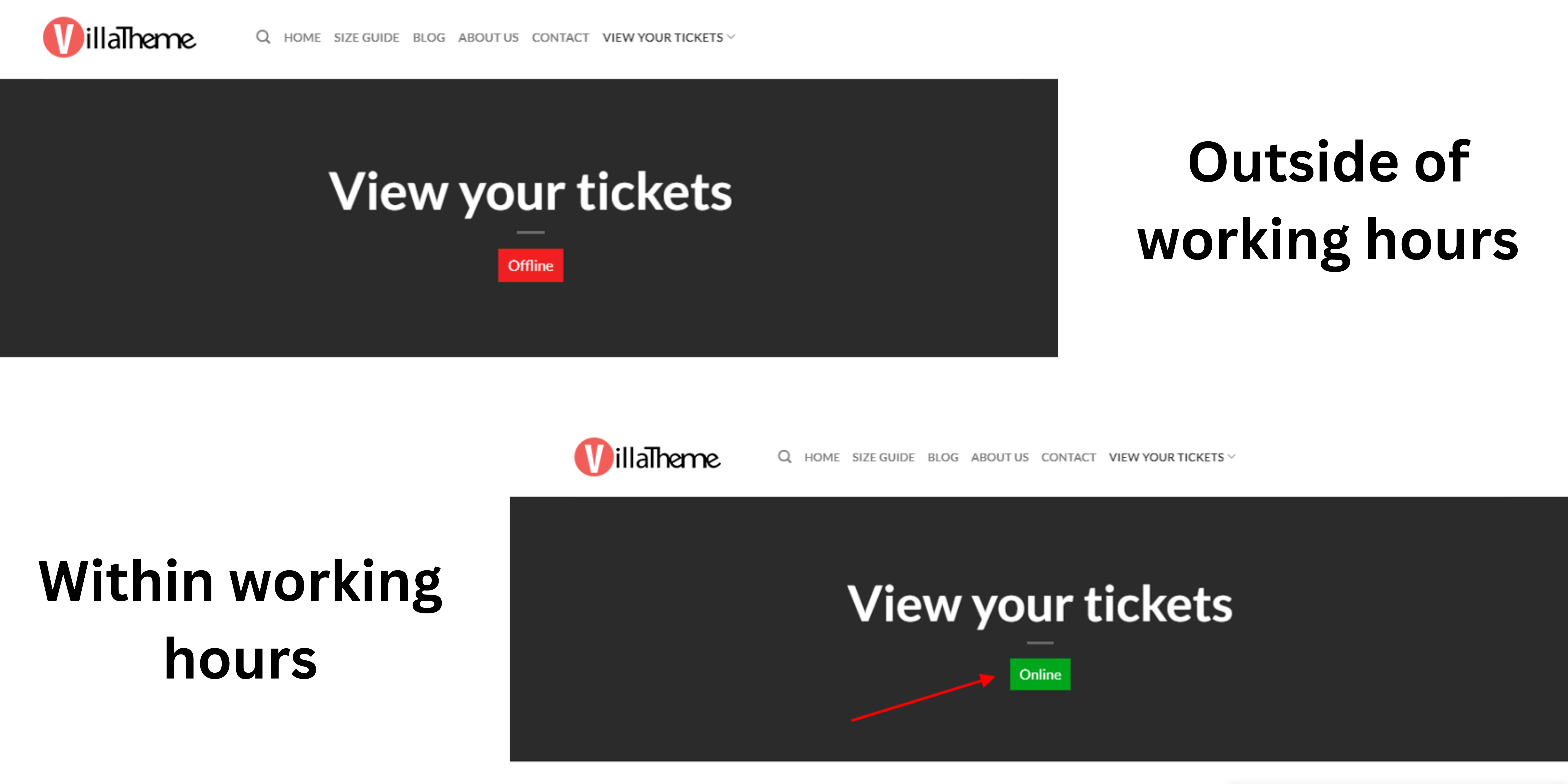
Settings in this page allow you to define your support team’s availability and manage holidays effectively. These settings help ensure that your customers are informed about when they can expect support and when your team is unavailable.

Configure your support team’s availability by setting specific working hours for each day of the week.
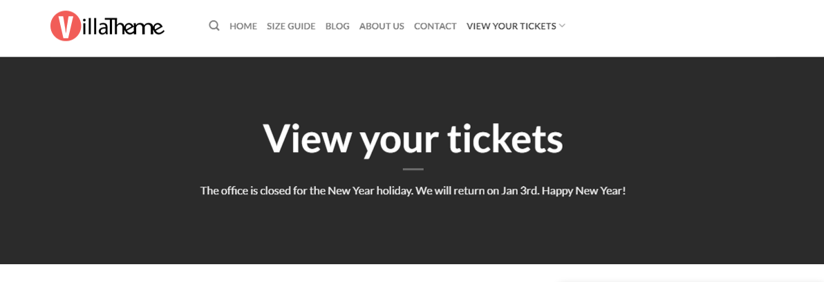
Define specific holidays when your support team will be unavailable.
Toggle the arrow on the top left corner to open/close the current event. The holiday title is displayed right next to that arrow. Use the X button on the top right corner to remove a holiday.
*Working hours
*Holidays
The Messages settings page allows you to customize the various messages displayed to users during form submission, attachment uploads, thank you responses, and error handling. These messages ensure clear communication and guidance for users interacting with your support system.
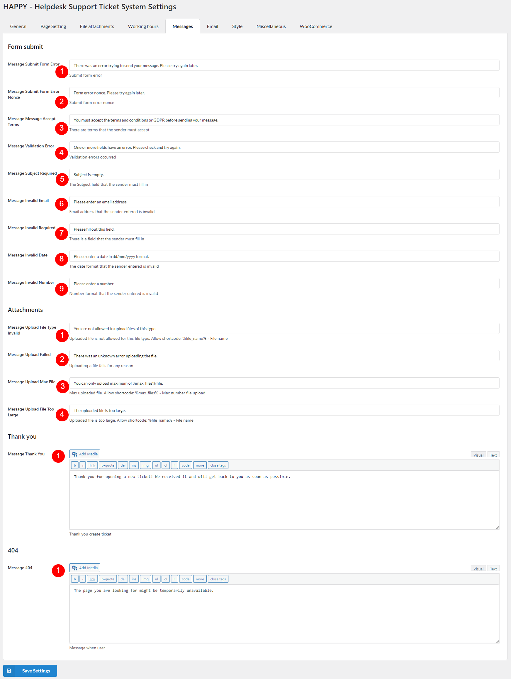
Customize the messages shown to users when they submit forms.
Set the messages related to file attachments in support forms.
Customize the thank you message shown to users after successfully submitting a form.
Set the message displayed when a user encounters a 404 error.
The Emails settings page allows you to configure and customize the email notifications, which ensure that both your support team and customers stay informed about ticket activities and updates through clear and consistent email communications.
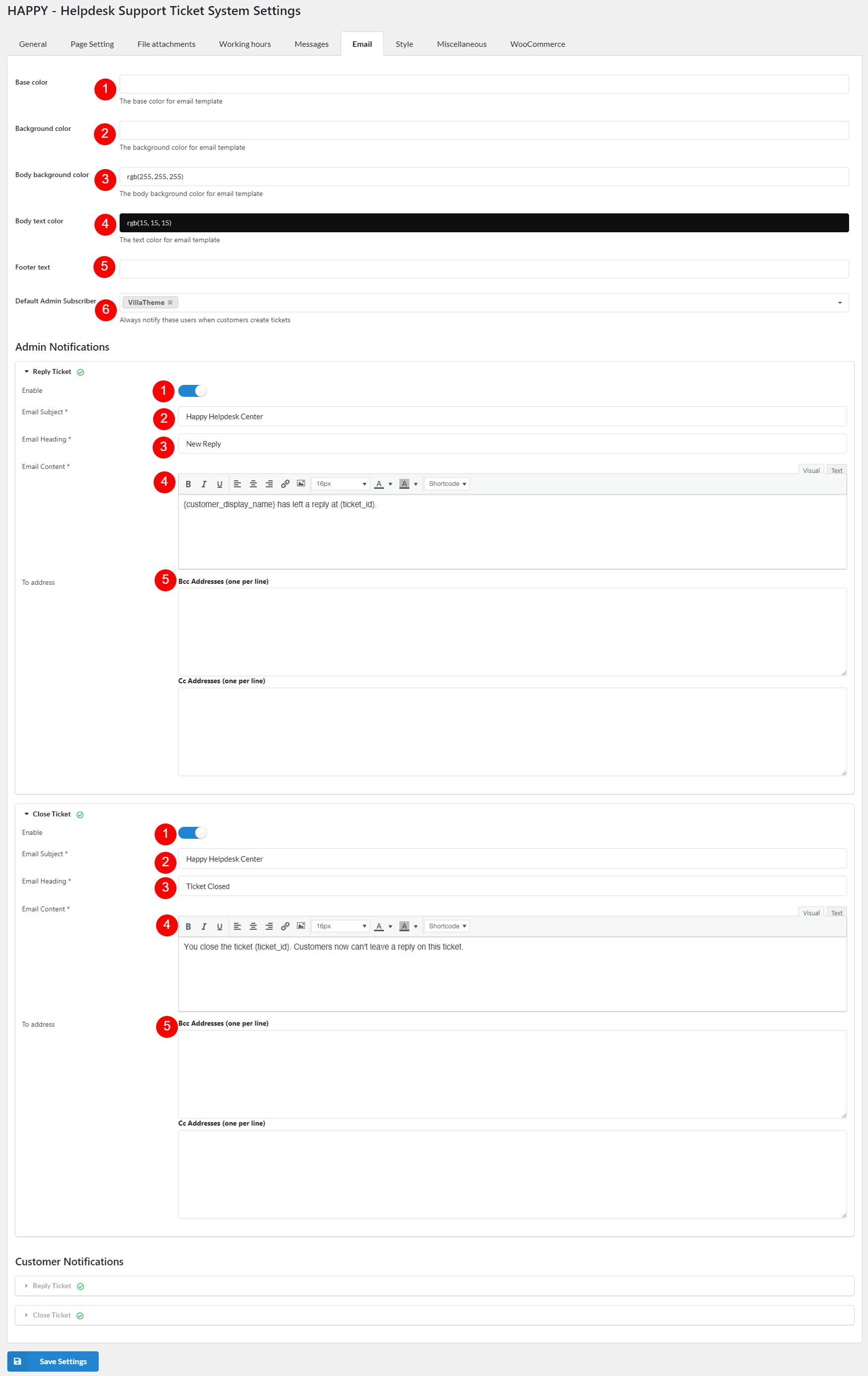
The Global Settings allow you to customize the visual and general appearance of your email notifications to ensure they align with your brand’s identity. Here’s a breakdown of each setting:
Admin Notifications keep your support team informed about ticket activities and updates. Configure these settings to ensure timely and accurate communication:
Customer Notifications ensure that your users are kept informed about their tickets and interactions with your support team. The email settings for these notifications are similar to those for admin notifications, with the primary difference being the recipient. So you can refer to the explanatory of Admin Notifications settings above.
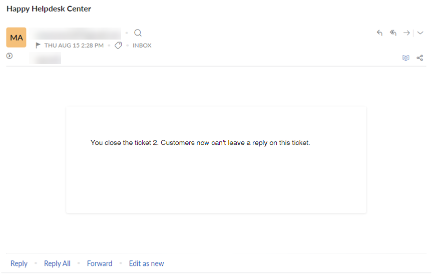
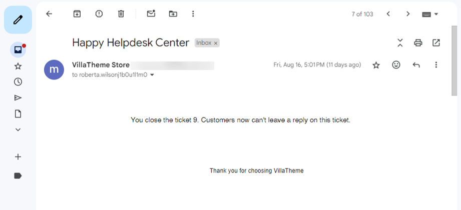
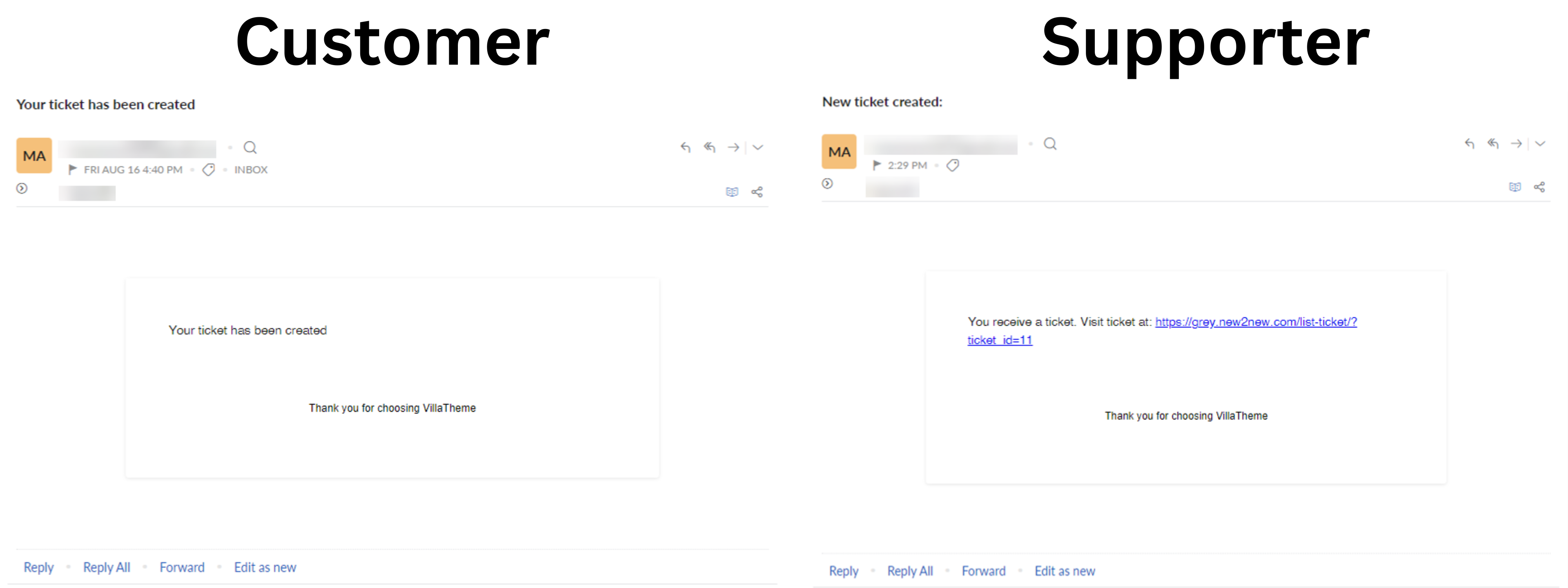
An email sent to customer/user may look like this:
*Without custom footer text
*With custom footer text
The settings page allows you to customize the appearance and functionality of your Helpdesk Support Ticket System, including:
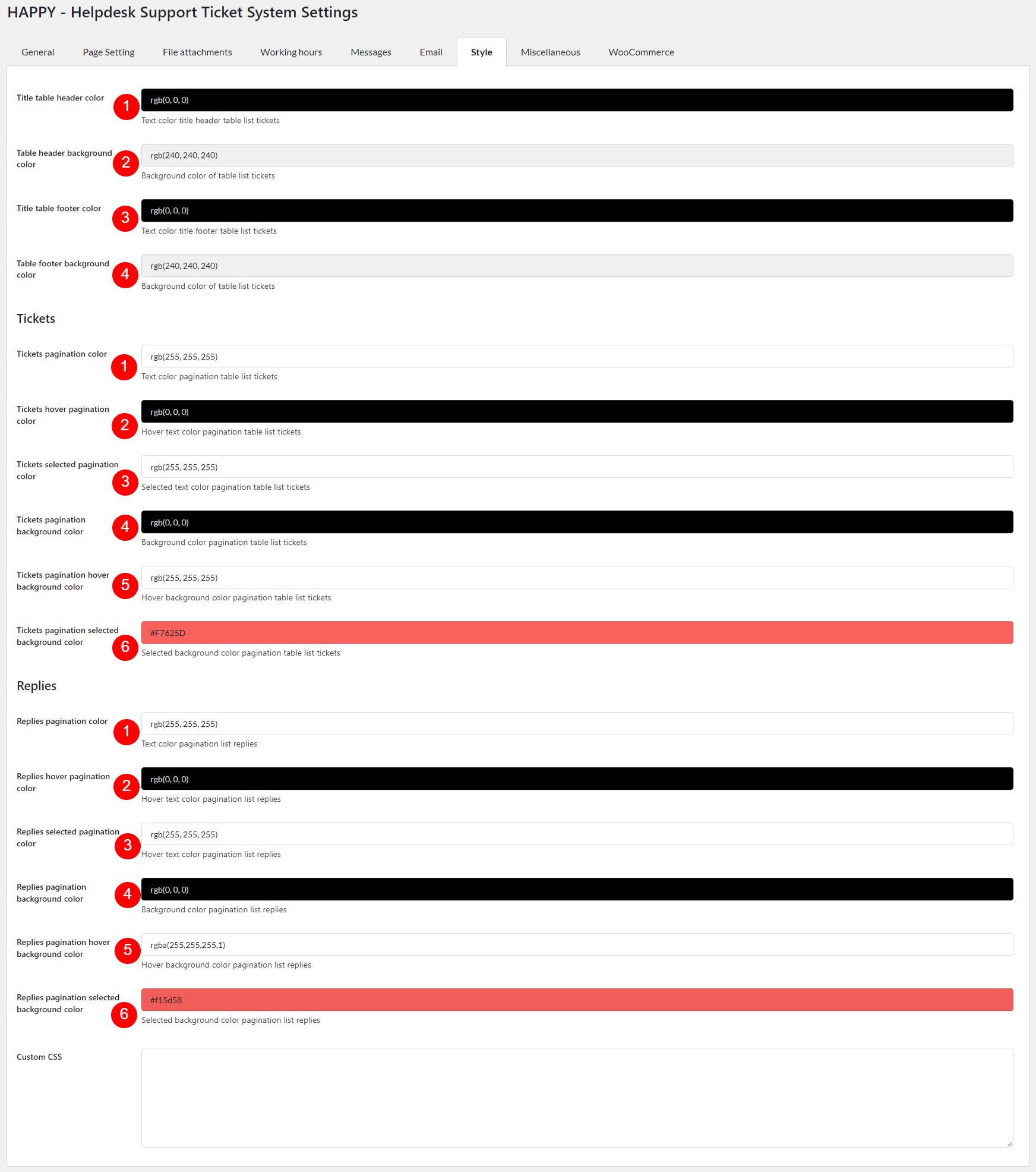
Add your custom CSS to the input field, to further style and customize your helpdesk interface.
The Miscellaneous settings page allows you to configure various important options to enhance your support system’s functionality and compliance. These settings cover:
After you enable and configure the required settings, these fields will show up in the reply form, right above the Submit button. Scroll down to read the details.
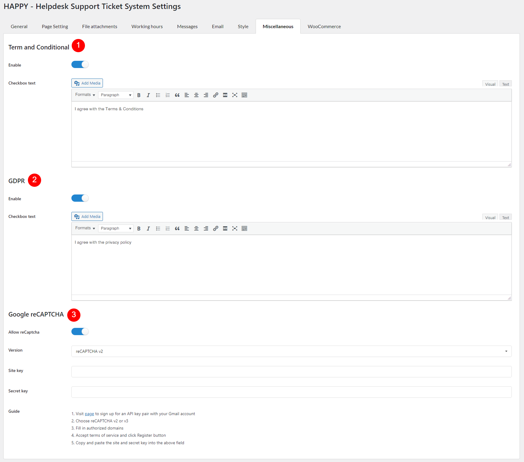
By setting up these options, you can ensure that your support system is secure, compliant with regulations, and clear about terms and conditions, providing a better experience for both your support team and customers.
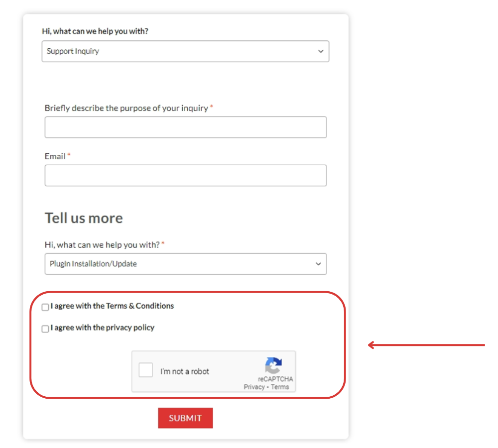
*An example of a ticket form with all
Refer to this documentation
The Ticket Form Template Editor allows you to create and customize the layout and content of your ticket forms.
The template has a clean interface for creating and customizing your support ticket forms. It consists of 4 section – with 3 main ones:
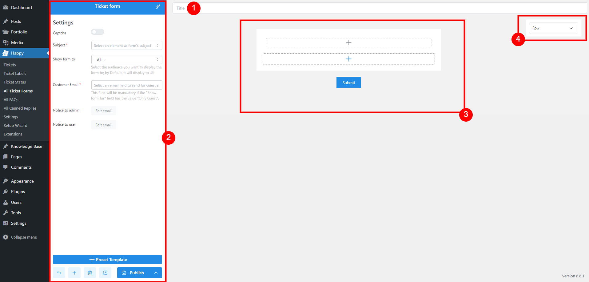
Enter the title of the form to specify its purpose.
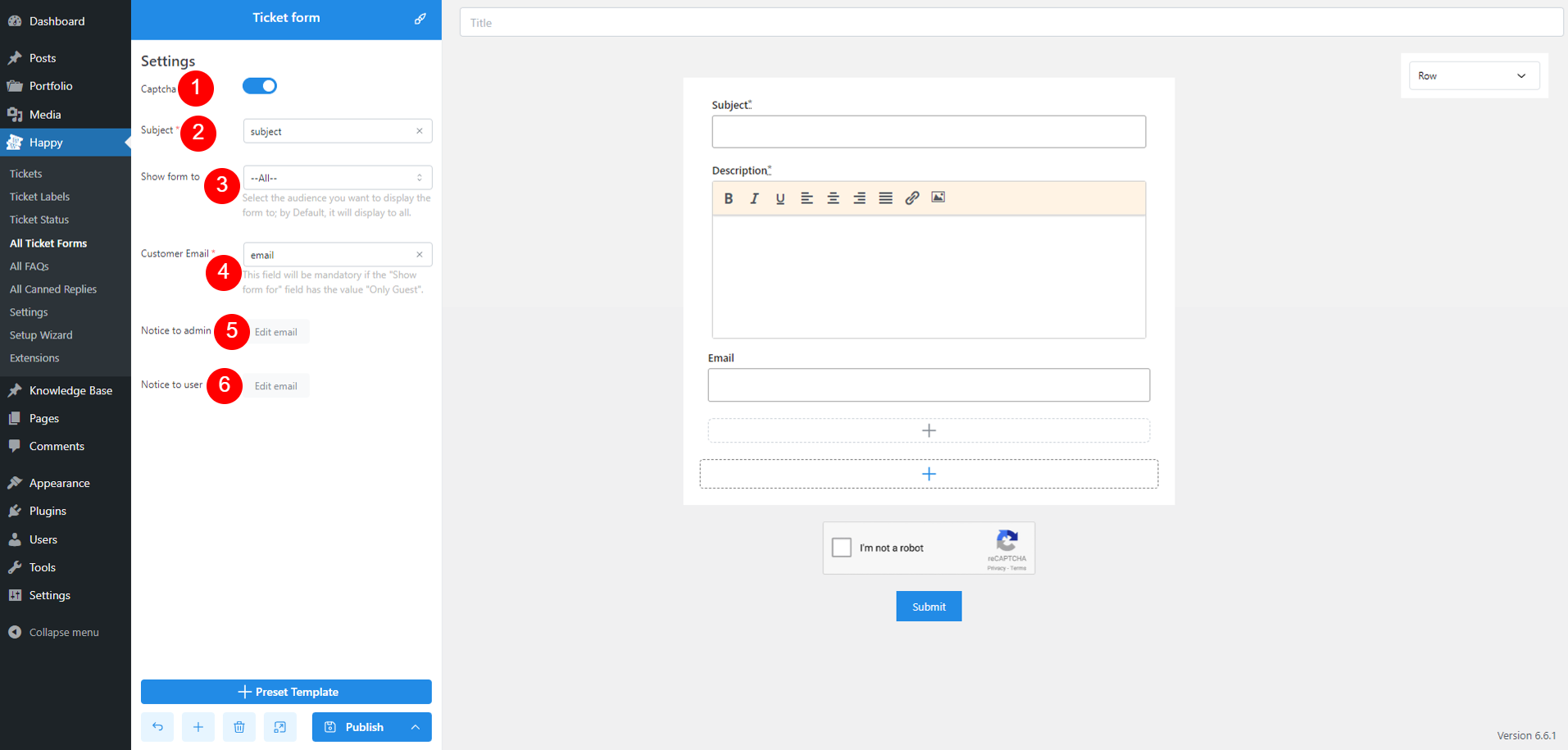
Note: If you select ‘All‘ or ‘Only Guest,’ the form must include a Customer Email field. Add a text input field and set the type to ‘Email.’ This field will then be available for selection under Customer Email options.
An email to admin/user upon ticket creation looks like this
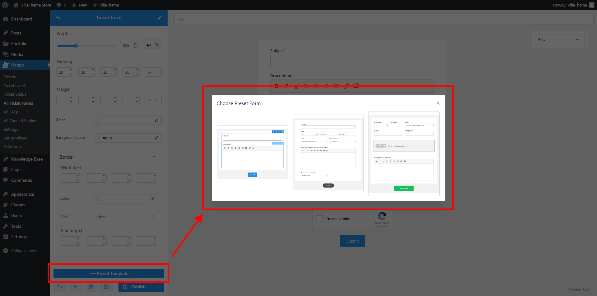
The Preset Template option allows you to quickly create a new ticket form using pre-designed templates. At the moment, we have 3 built-in templates.
Each field in your ticket form has three setting pages:
Displays a title or heading in the form, ranging from h1 to h6, and p. Useful for organizing and labeling different sections
General
Style
Advanced
Adds spacing between form elements to improve layout and readability. Helps separate sections visually
General
Style
Advanced
Inserts a horizontal line to separate sections within the form. Useful for clearly demarcating different areas of the form.
General
Style
Advanced
Provides a text block for instructions, explanations, or any additional information needed for users filling out the form. This field is defined by admin and customer can’t edit it.
General
Style
Advanced
Text input is meant to receive any small string of characters such as: Username, Name, Last Name, Date of birth, etc
General
Style
Advanced
Lets users enter numeric values. Useful for fields requiring numbers, like age or quantity
General
Style
Advanced
Compared to Text input, text area is ideal for long text inputs. This element provides a larger text area for users to enter multi-line text
General
Style
Advanced
Creates a dropdown menu for users to choose from a list of options. Efficient for selecting one item from multiple choices
General
Style
Advanced
Enables users to select one or more options from a list. Useful for multiple-choice questions where more than one option can be selected
General
Style
Advanced
Allows users to select a single option from a set of choices. The difference between Select and Radio lies in their design – Radio shows a list of options with radio buttons, where users can see all options at once and select only one
General
Style
Advanced
This is an upload file button that lets users attach files to their submission. Useful for forms that require image uploads.
General
Style
Advanced
Provides a rich text editor for users to input and format text. Suitable for detailed content, like descriptions or formatted responses
General
Style
Advanced
Base on the information above, you can
 button to add field to the template
[happy_forms ids=''] to display any form wherever you want.[happy_forms ids='1,2'][happy_forms]
From the Ticket List on front end, users can access their happy author page.
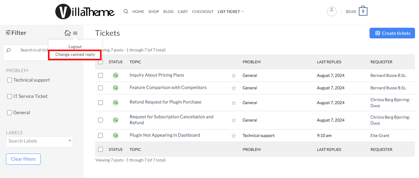
Step 1: Hover over the hamburger menu and click “Change canned reply”
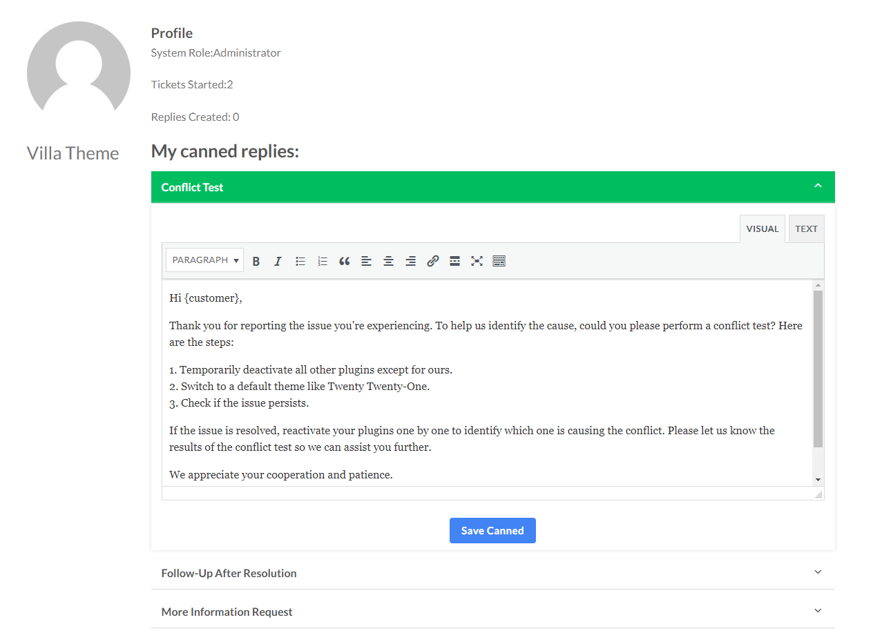
Step 2: Now they are redirected to the author page. The page URL will look like this http://yourwebsite/list-ticket/happy-author/
Here they can edit all canned replies assigned to them.
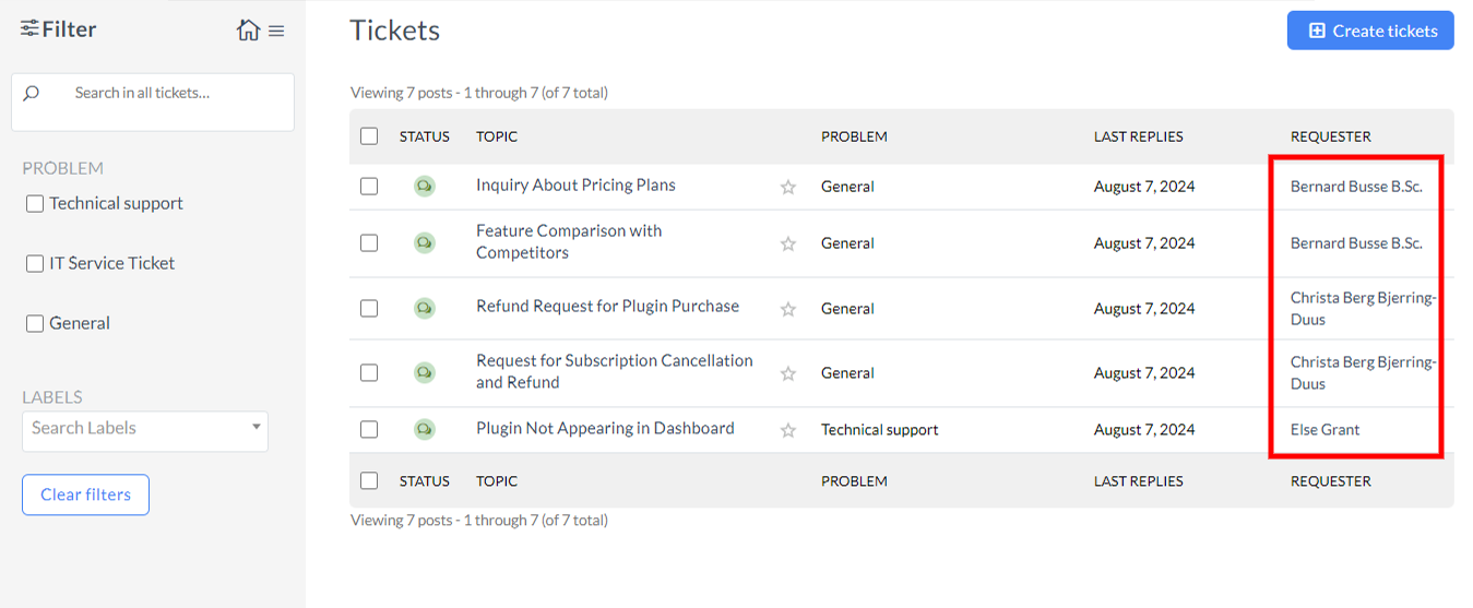
Step 1: Click the customer name under “REQUESTER” column
Step 2: Now they are redirected to the author page. The page URL will look just like above plus the author ID http://yourwebsite/list-ticket/happy-author/8/
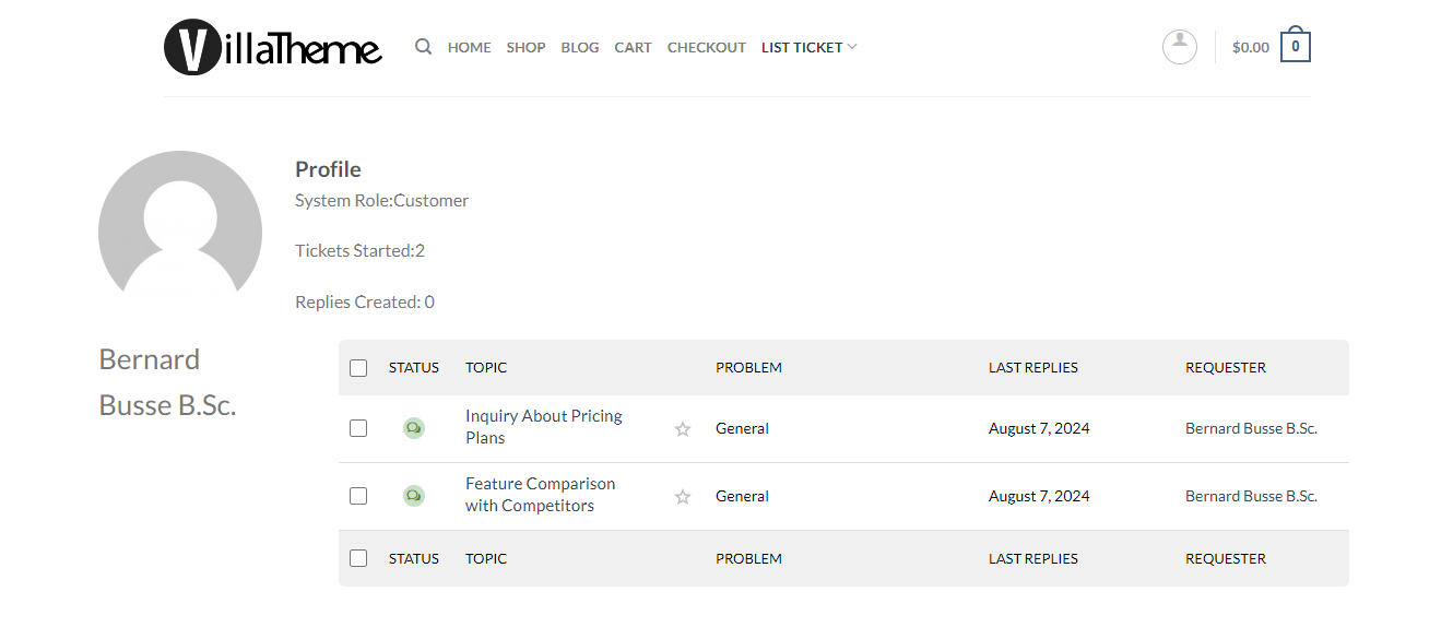
Customer can access their HAPPY author page via this URL: http://yourwebsite/list-ticket/happy-author/
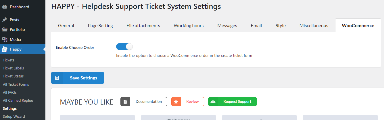
When both WooCommerce and HAPPY are enabled, a ‘WooCommerce’ tab will appear in the HAPPY settings.
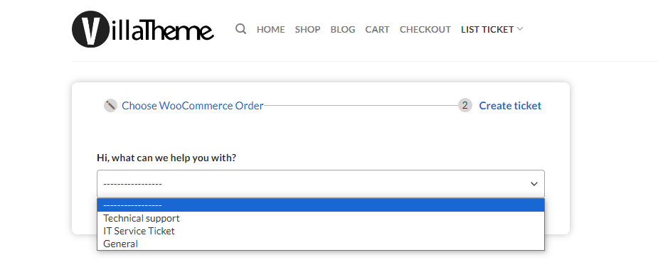
Step 1: Enable the “Enable Choose Order” option to allow users to create tickets for specific order or order item
Step 2: Choose WooCommerce Orders
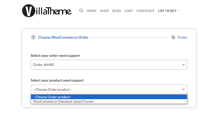
Step 3: Create ticket
Then, you’ll be redirected to the ticket form, start creating your ticket now.