Once you click on “Go to design,” you will be redirected to the customizer, where you can personalize the appearance and layout of your size chart.
-
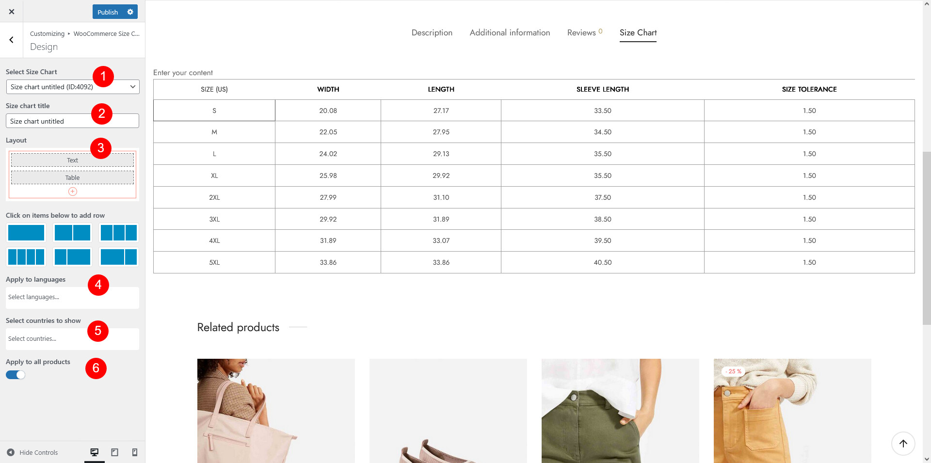
- Select Size Chart: Design the currently selected size chart or choose a specific size chart you want to design or edit from the list of available charts.
- Size chart title: Enter the size chart title
- Layout: Choose the layout structure for your size chart. You can select from various predefined layouts that fit your design needs.
- Choose row/layout
- Add component(s) to the layout structure: You can click on the plus button
 add different components to your size chart for flexibility and customization. The available components include:
- Tab: Organize information into tabs, useful if you have multiple sizing categories (e.g., Men’s, Women’s, Kids).
- Accordion: This is great for collapsible sections, allowing users to expand and view detailed sizing info as needed.
- Image: Add visuals like product illustrations, size guides, or charts to help users understand measurements better.
- Table: Create a table to clearly list sizes, measurements, and any relevant data.
- Text: Include text blocks to provide explanations, instructions, or extra sizing tips.
- Divider: Use dividers to separate different components for a cleaner layout visually.
- Edit component: After adding components, you can click the Edit button
 to edit each one to customize it to your needs. Adjust the content, font style, colors, and alignment to ensure the design matches your style and is easy to read. For more setting details, go to the How Does It Work > Size chart components section.
 - Duplicate the current component using
 icon
icon - Delete the current icon using
 icon
icon
- Apply to languages: Use this option when you have a multilingual plugin in use, as guided in this documentation
- Select countries to show: Specify the country where customer can see this size chart. You can either set it up here or inside the Size chart back end
- Apply to all products:
- If enabled: The size chart is visible on all product pages
- If disabled: Configure the following options
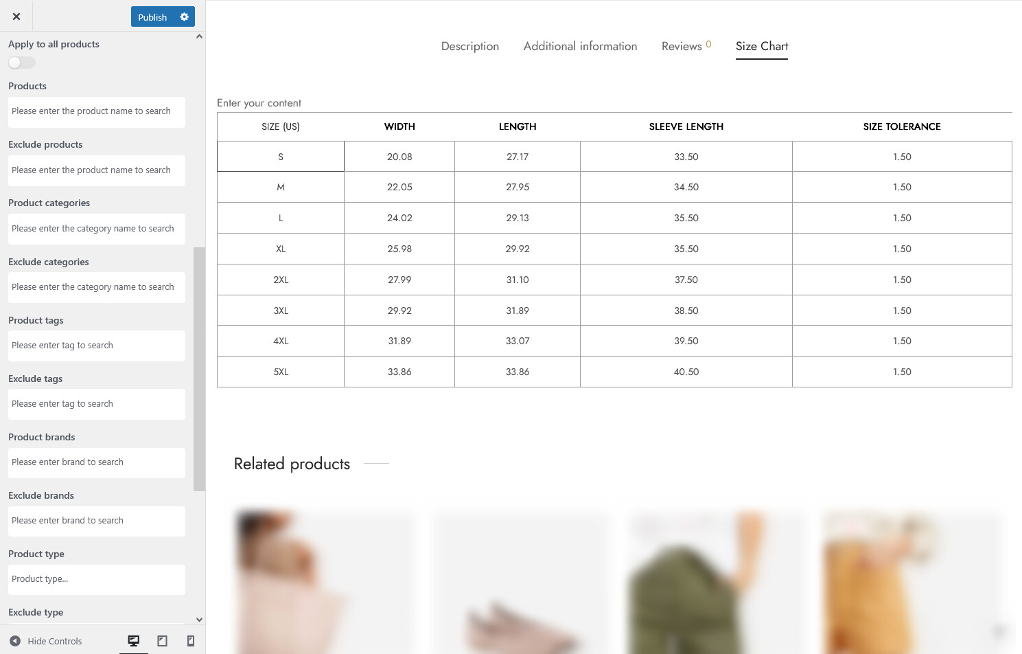
- Products: Choose one or more individual products where this size chart should be displayed. This is ideal if only a few items need special sizing guidance.
- Exclude products: Use this to hide the chart on certain products, even if they match other conditions like category or tag.
- Product categories: Assign the size chart based on the product categories, such as “Shoes”; “Skirt”; “Tank Top” etc
- Exclude categories: Hide the size chart from categories selected in this field.
- Product tags: Use tags like ‘Unisex’, ‘Slim Fit’, or ‘Tall’ to apply the chart based on product labeling.
- Exclude tags: Add tags to skip the chart on specific labeled items.
- Product brands: Select the product brands for which the size chart will be displayed.
- Exclude brands: Select the brands where the size chart should not be shown
- Product type: Apply charts only to specific types – e.g. simple, variable…
- Exclude type: Skip chart display for certain product types
- Catalog visibility: Show the size chart based on how the product is listed in your store – Shop and search results; Shop only; Search only; Hidden
- Exclude catalog visibility: Hide the chart based on specific catalog visibility rules
- Shipping class: Assign the size chart based on product shipping classes. Set in WooCommerce Settings > Shipping > Class, and assigned to certain products.
- Exclude class: Prevent the chart from showing based on selected shipping classes
Once you’ve completed your size chart design and made sure everything is in place, click “Publish” to make the size chart live.