-
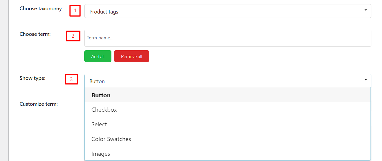
Choose taxonomy: Choose one option of taxonomy.
-
Choose term: You can add terms of category or tag based on your selection above manually. Or use Add all Button to add all available terms.
- Show type: Type to display taxonomy filter. There are 6 options: Button, Checkbox, Select, Color Swatches, and Images.
BUTTON TYPE
When you choose this type, Taxonomy will display as a button.
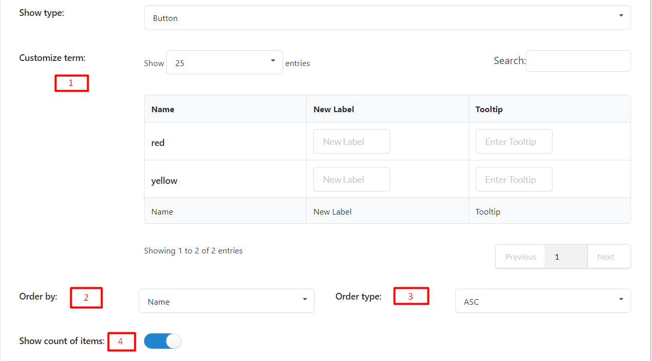
- Customize term:
-
Name: After you add a term, the name of the term will appear in this column.
-
New Label: Add a label for the term. This field is optional and will appear on the frontend when you show Filter. If this field is empty, it will take the Name to display
- Tooltip: Add tooltip. This field is optional. It will appear on the front end when the user hovers the mouse over the term.
-
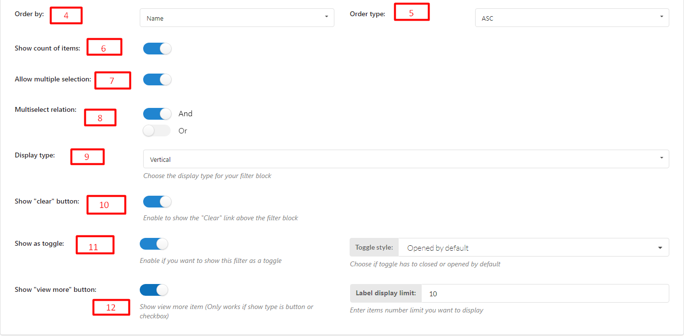
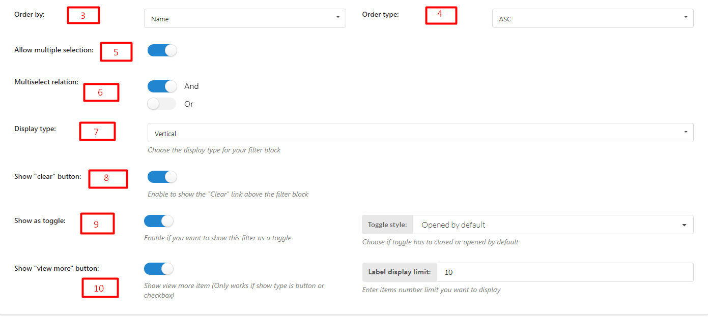
- Order by: Sort the terms based on their name, slug, ID, or default order.
- Order type: ASC or DESC
- Show count of items: Enable to show the number of items
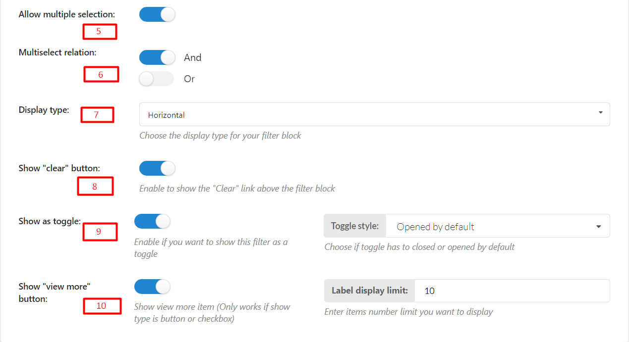
- Allow multiple selection: Enable this if you want to allow customers to choose more than 1 option
- Multiselect relation: If you enable “Allow multiple selection”, choose a relation “And” or “Or”
If “And”: Products after being filtered MUST include all filter values selected
If “Or”: Products after being filtered may include one/particular/all filter values selected. - Display Type: Choose the display type for your filter block – Vertical or Horizontal
- Show “clear” button: Enable to show the “Clear” link above the filter block
- Show as toggle: Enable if you want to show this filter as a toggle
- Show “view more” button: Show view more item (Only works if show type is button or checkbox)
CHECKBOX TYPE
When you choose this type, Taxonomy will display as checkboxes.
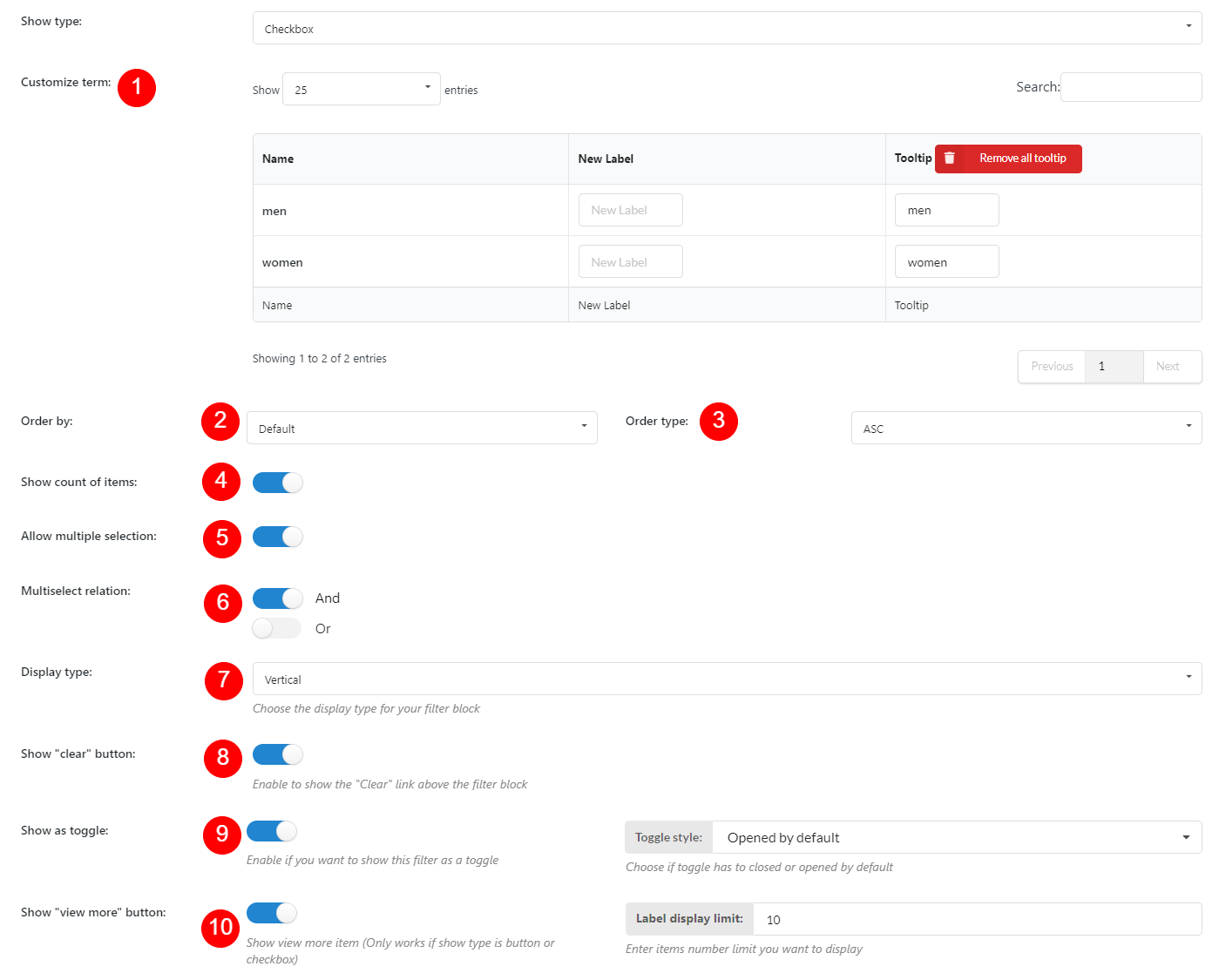
- Customize term:
-
Name: After you add a term, the name of the term will appear in this column.
-
New Label: Add a label for the term. This field is optional and will appear on the frontend when you show Filter. If this field is empty, it will take the Name to display
- Tooltip: Add tooltip. This field is optional. It will appear on the front end when the user hovers the mouse over the term.
-
- Order by: Sort the terms based on their name, slug, ID, or default order.
- Order type: ASC or DESC
- Show count of items: Enable to show the number of items
- Allow multiple selection: Enable this if you want to allow customers to choose more than 1 option
- Multiselect relation: If you enable “Allow multiple selection”, choose a relation “And” or “Or”
If “And”: Products after being filtered MUST include all filter values selected
If “Or”: Products after being filtered may include one/particular/all filter values selected. - Display type: Choose the display type for your filter block
- Show “clear” button: Enable to show the “Clear” link above the filter block
- Show as toggle: Enable if you want to show this filter as a toggle
- Show “view more” button: Show view more item
SELECT TYPE
When you choose this type, Taxonomy will show up as selections.
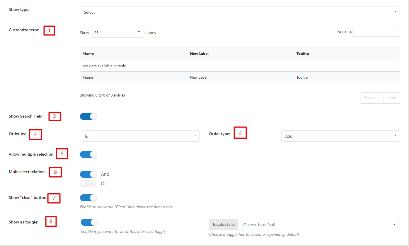
- Customize term:
-
Name: After you add a term, the name of t the term will appear in this column.
-
New Label: Add a label for the term. This field is optional and will appear on the frontend when you show Filter. If this field is empty, it will take the Name to display
- Tooltip: Add tooltip. This field is optional. It will appear on the front end when the user hovers the mouse over the term.
-
- Show search field: Enable to show search field.
- Order by: Sort the terms based on their name, slug, ID, or default order.
- Order type: ASC or DESC
- Allow multiple selection: Enable this if you want to allow customers to choose more than 1 option
- Multiselect relation: If you enable “Allow multiple selection”, choose a relation “And” or “Or”
If “And”: Products after being filtered MUST include all filter values selected
If “Or”: Products after being filtered may include one/particular/all filter values selected. - Show “clear” button: Enable to show the “Clear” link above the filter block
- Show as toggle: Enable if you want to show this filter as a toggle, and choose toggle style.
COLOR SWATCHES TYPE
When you choose this type, taxonomy will show up as colored buttons.
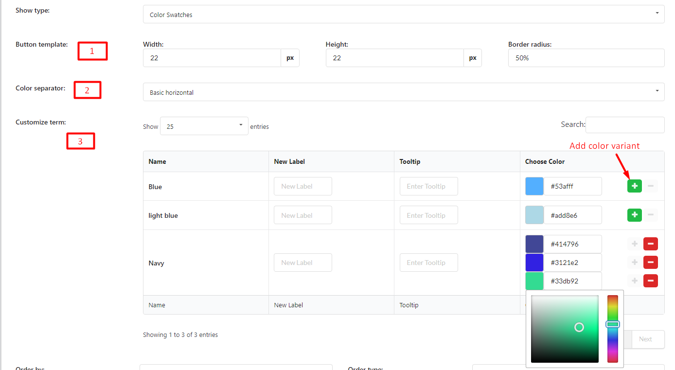
- Button template: Customize button by changing the value in Width, Height, and Border-radius columns.
- Color separator: When you add more than one color variant for one term (maximum 3), choose a separator to separate the colors.
- Customize term:
-
Name: After you add a term, the name of the term will appear in this column.
-
New Label: Add a label for the term. This field is optional and will appear on the frontend when you show Filter. If this field is empty, it will take the Name to display
- Tooltip: Add tooltip. This field is optional. It will appear on the front end when the user hovers the mouse over the term.
-
- Order by: Sort the terms based on their name, slug, ID, or default order.
- Order type: ASC or DESC
- Show count of items: Enable to show the number of items
- Allow multiple selection: Enable this if you want to allow customers to choose more than 1 option
- Multiselect relation: If you enable “Allow multiple selection”, choose a relation “And” or “Or”
If “And”: Products after being filtered MUST include all filter values selected
If “Or”: Products after being filtered may include one/particular/all filter values selected. - Display type: Choose the display type for your filter block – Vertical or Horizontal
- Show “clear” button: Enable to show the “Clear” link above the filter block
- Show as toggle: Enable if you want to show this filter as a toggle
- Show “view more” button: Show view more item (Only works if show type is button or checkbox)
IMAGES TYPE
When you choose this type, Taxonomy will display as images.
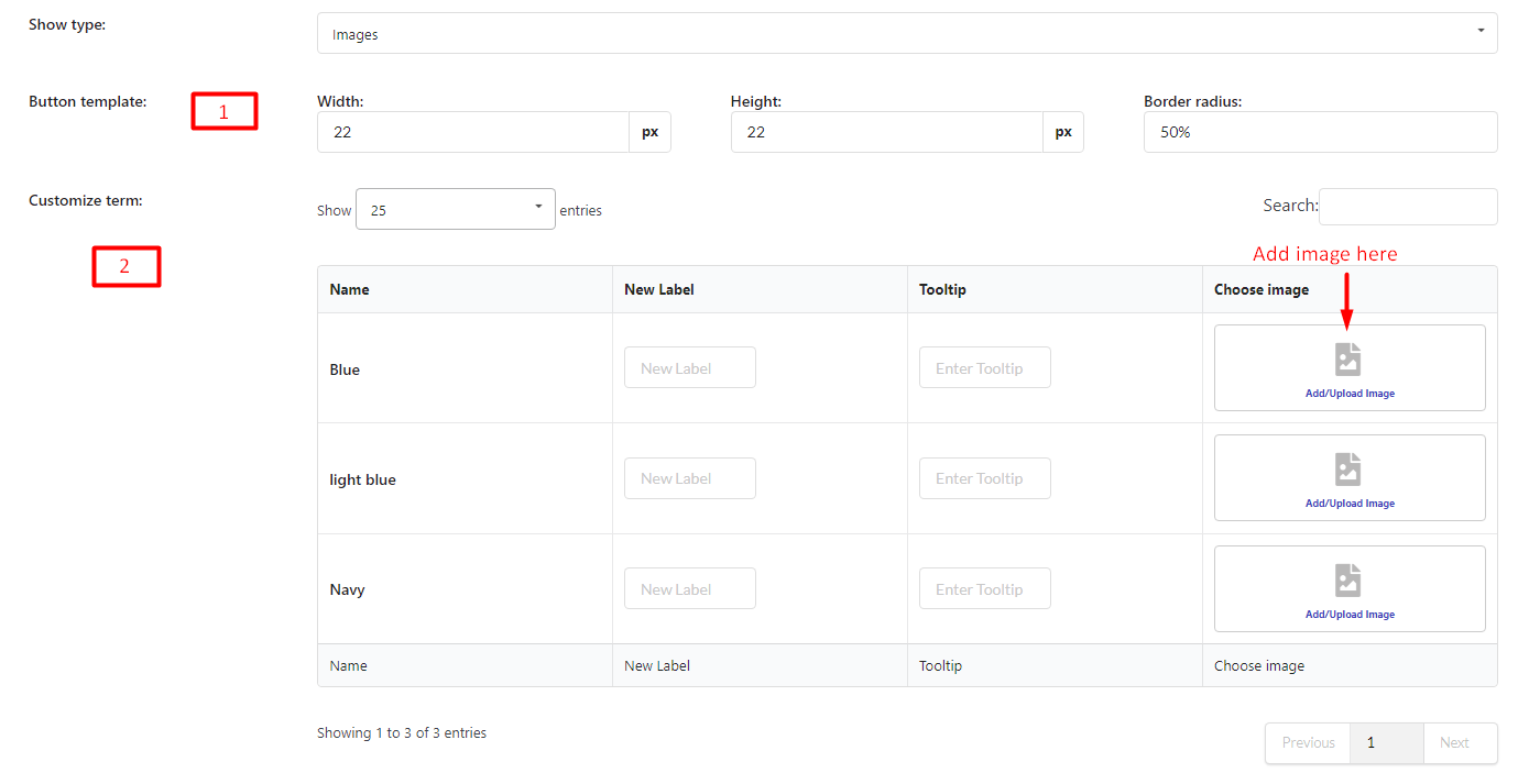
- Button template: Customize image display by changing the value in Width, Height, and Border-radius columns.
- Customize term:
-
Name: After you add a term, the name of the term will appear in this column.
-
New Label: Add a label for the term. This field is optional and will appear on the frontend when you show Filter. If this field is empty, it will take the Name to display
- Tooltip: Add tooltip. This field is optional. It will appear on the front end when the user hovers the mouse over the term.
-
- Order by: Sort the terms based on their name, slug, ID, or default order.
- Order type: ASC or DESC
- Allow multiple selection: Enable this if you want to allow customers to choose more than 1 option
- Multiselect relation: If you enable “Allow multiple selection”, choose a relation “And” or “Or”
If “And”: Products after being filtered MUST include all filter values selected
If “Or”: Products after being filtered may include one/particular/all filter values selected. - Display type: Choose the display type for your filter block – Vertical or Horizontal
- Show “clear” button: Enable to show the “Clear” link above the filter block
- Show as toggle: Enable if you want to show this filter as a toggle, then choose toggle style
- Show “view more” button: Show view more item (Only works if show type is button or checkbox)