In this tab, you can design plugin including:
General:
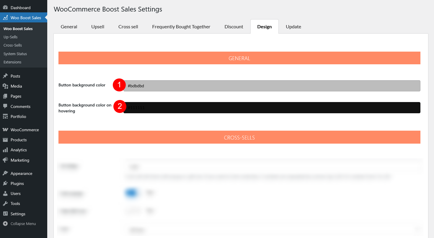
- Button background color: Set the default background color of any button handled by WooCommerce Boost Sales
- Button background color on hovering: Set the background color of the button when customers hover their cursor over it
Cross sells:
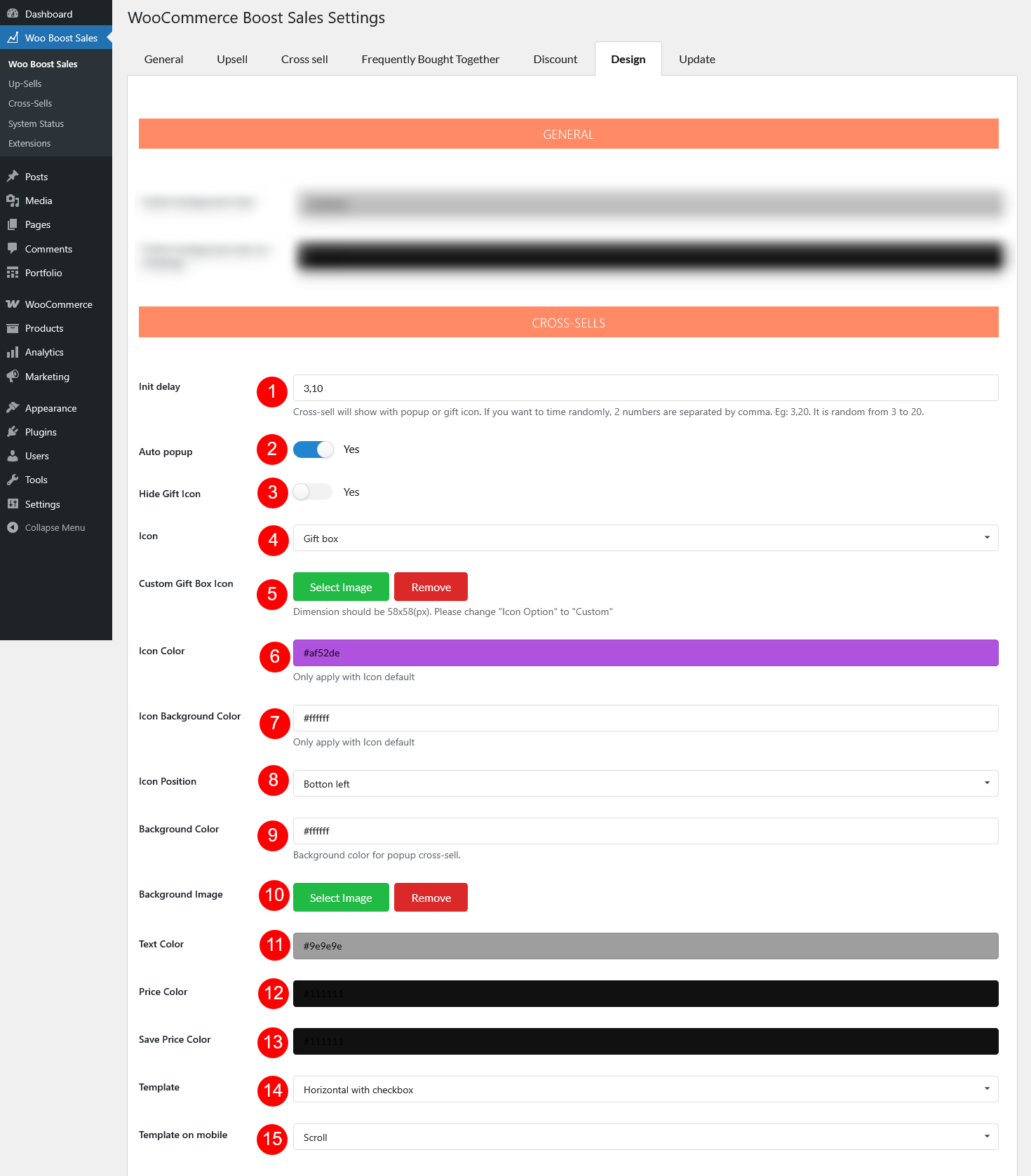
- Init delay: Set the delay before the cross-sell popup or gift icon appears. To randomize, enter two numbers separated by a comma (e.g., 3,20 = show randomly between 3 and 20 seconds)
- Auto popup: Enable to show cross sell popup automatically.
- Hide Gift Icon: Enable to hide the gift icon, or disable to show it. The gift icon allows customers to open the cross-sell popup manually.
- Icon: Choose the icon style: Default, Gift box, or Custom.
- Custom Gift Box Icon: If “Icon” is “Custom”, select a custom image
- Icon Color: Change the color of the default icon (not applied to custom or gift box icons).
- Icon Background Color: Only apply with Icon default.
- Icon Position: Set where the icon appears: Bottom right or Bottom left of the screen.
- Background Color: Set the background color of the cross-sell popup.
- Background Image: Add an image as the popup background.
- Text color: Choose the color for popup text
- Price color: Choose the color for product prices
- Save price color: Choose the color for discounted “Save” prices
- Template: Choose how products are displayed in the popup – Slider; Vertical with checkbox; Horizontal with the checkbox.
- Template on mobile: Choose the mobile layout – Slider; Scroll; Vertical with the checkbox.
Upsells:
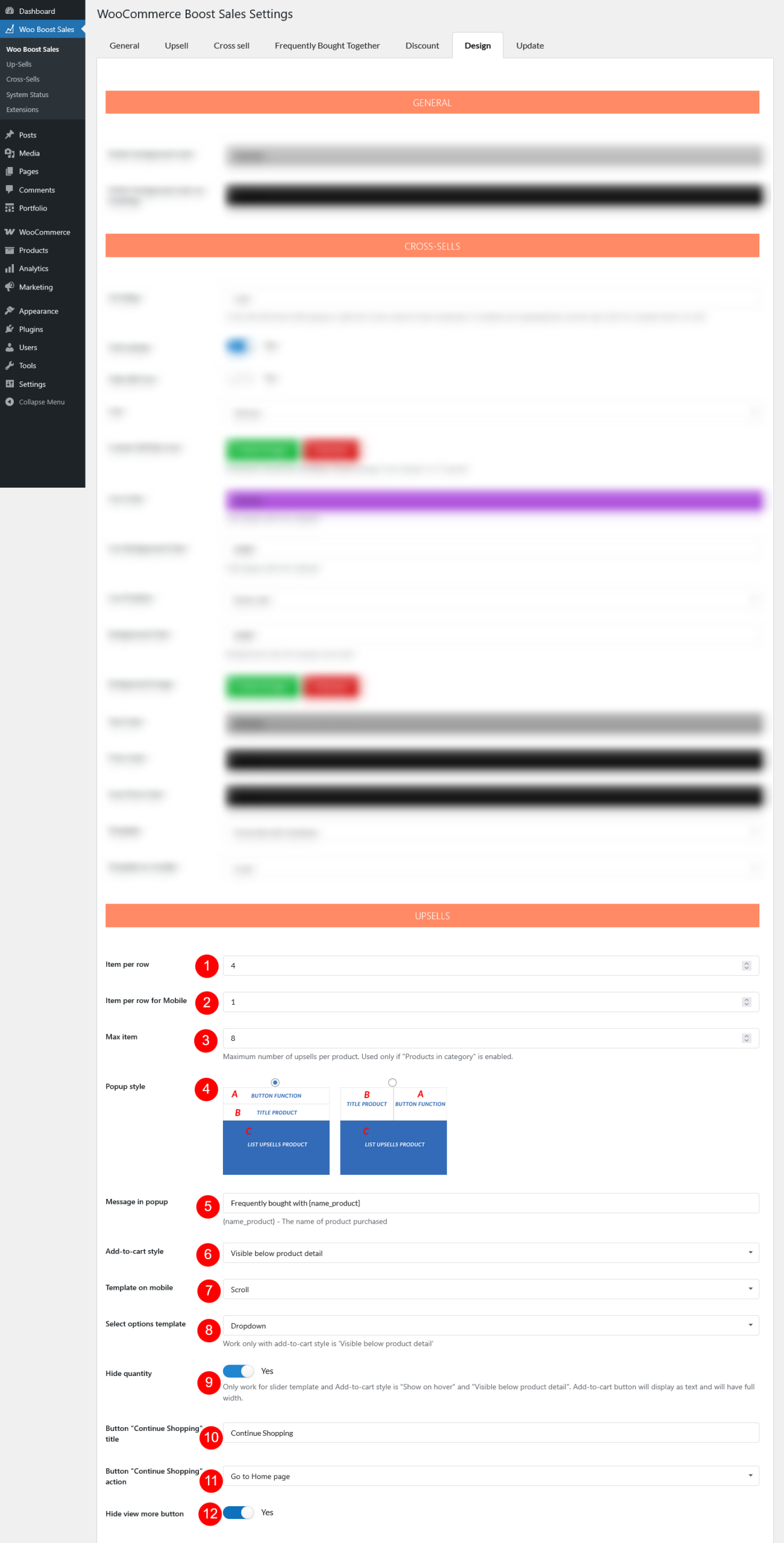
- Item per row: Set the number of upsell products displayed per row in the popup on desktop.
- Item per row for Mobile: Set the number of upsell products displayed per row in the popup on mobile devices.
- Max item: Set the maximum number of upsell products per popup. Only applies if Products in category – under Upsell settings is enabled.
- Popup style: Choose between two available popup styles
- Message in popup: Set the title of the upsell popup. You can include the main product name using the shortcode {product_title}.
- Add-to-cart style: Choose how the Add to Cart button appears in the popup – Hide, Show on hover, Show on click, Theme default, Visible below product detail.
- Template on mobile: Choose the product display style on mobile – Slider, or Scroll.
- If “Slider”: Configure Add-to-cart style on mobile – Choose how the Add to Cart button appears in the mobile popup: Hide, Show on hover, Theme default, or Visible below product detail.
- Select options template: Decide how product variations are shown – Dropdown or Button. (Applies only when Add-to-cart style is Visible below product detail)
- Hide quantity: Make the Add-to-cart button will be displayed as text with full width, no quantity field. Available only with the Slider template and Add-to-cart style set to Show on hover or Visible below product detail.
- Button “Continue Shopping” title: Customize the text shown on the Continue Shopping button.
- Button “Continue Shopping” action: Define what happens when customers click Continue Shopping – Just close popup; go to shop page; Go to home page.
- Hide view more button: Enable this option to hide the View More button in the upsell popup.
Discount bar:
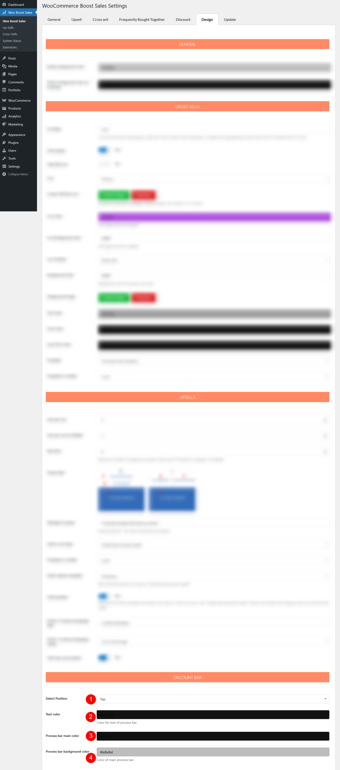
- Select Position: Choose where the discount bar appears – Top or Bottom of the page
- Text color: Set the color of the text displayed on the discount bar
- Process bar main color: Choose the primary color of the progress bar that shows discount progress
- Process bar background color: Set the background color of the progress bar behind the main progress indicator.
Custom
Add custom CSS for your custom design