This section ensures your upsell product list matches your store’s design and improves user experience by offering customization for appearance and functionality.
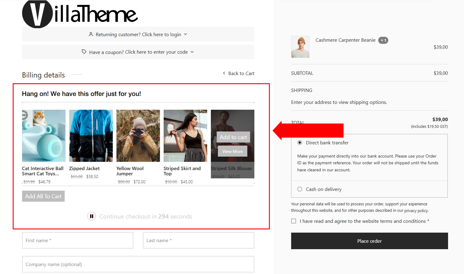
Layout
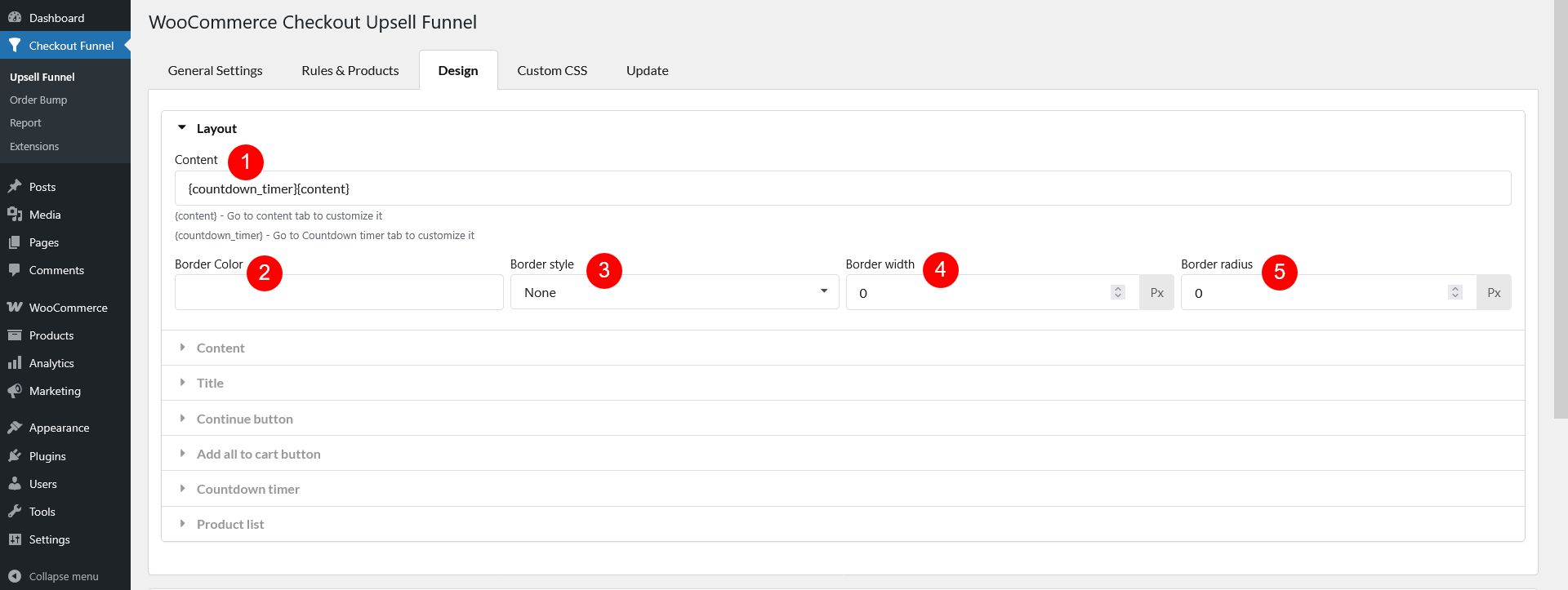
- Content: Content will not show without {content} – configure setup for this placeholder in Content section. If using the countdown timer shortcodes {countdown_timer}, configure them in the Countdown Timer section. The countdown timer sets a time limit for adding recommended products to the cart, while the content displays the recommended products
- Border Color: Set up the color of the border around the box of recommended products
- Border Style: Set up the style of the border around the box of recommended products. There are five styles: None, dashed, Double, Dotted, Solid.
- Border width: Set up the width of the border around the box of recommended products
- Border radius: Set up the radius of the border around the box of recommended products.
Content
The {content} placeholder structures the upsell funnel layout, divided into the following sections:
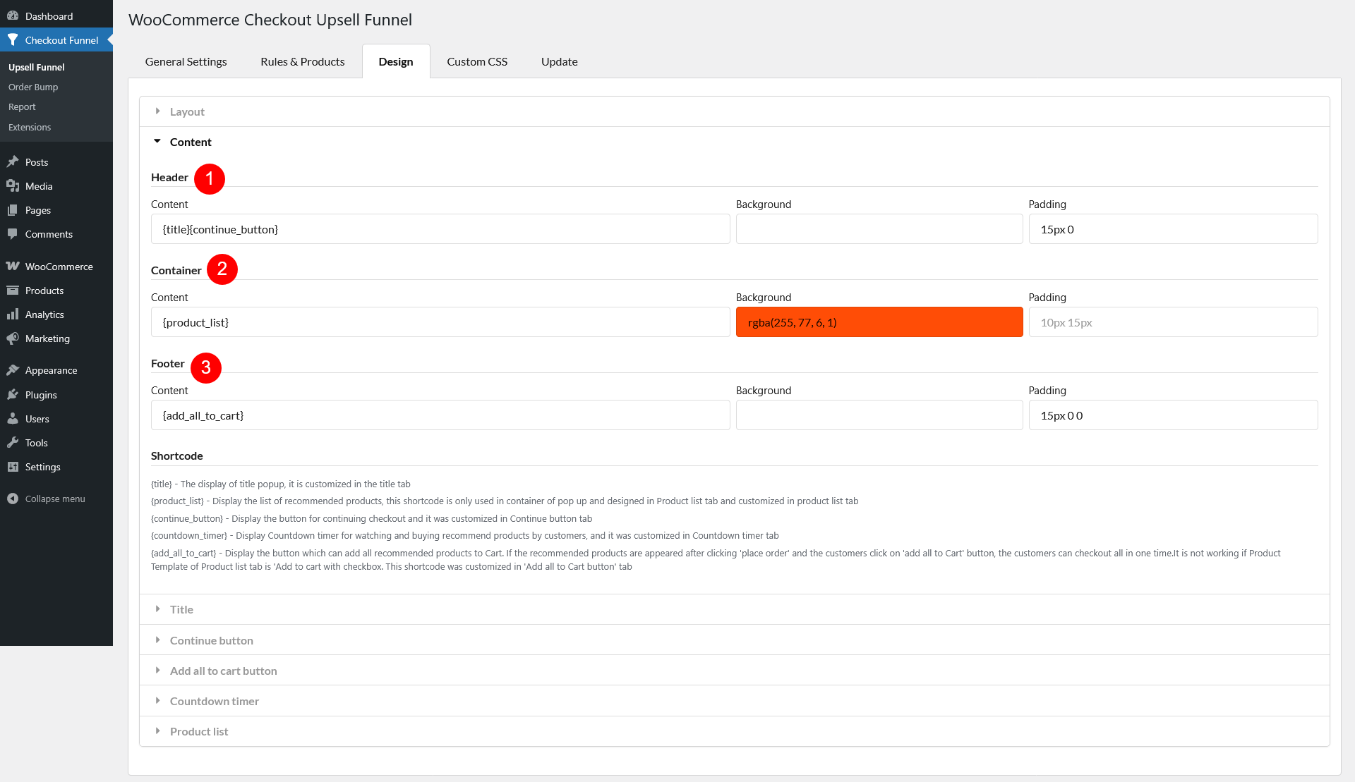
- Header
- Content: Set up the header text or elements.
- Background: Choose the color of the header background
- Padding: The padding of header background.
- Container
- Content: The content of the popup. It is the list of the recommended products.
- Background: Choose the color for the content background in popup.
- Padding: Choose the Padding for the container
- Footer
- Content: The content of the Popup footer
- Background: Choose the color for the footer background in popup
- Padding: Choose the Padding for the Popup footer
Supported placeholder:
{title} – Displays the popup title, customizable in the Title tab.
{product_list} – Shows the recommended products list, customizable in the Product List tab. Only used in the popup container.
{continue_button} – Displays the “Continue Checkout” button, customizable in the Continue Button tab.
{countdown_timer} – Shows a countdown timer for purchasing recommended products, customizable in the Countdown Timer tab.
{add_all_to_cart} – Displays an “Add All to Cart” button. If products appear after clicking “Place Order,” customers can add them all to the cart and check out in one step. Not compatible with the Add to Cart with Checkbox product template. Customizable in the Add All to Cart Button tab.
Title
Setup for the {title} placeholder displays the popup title, which can be customized with the following options:
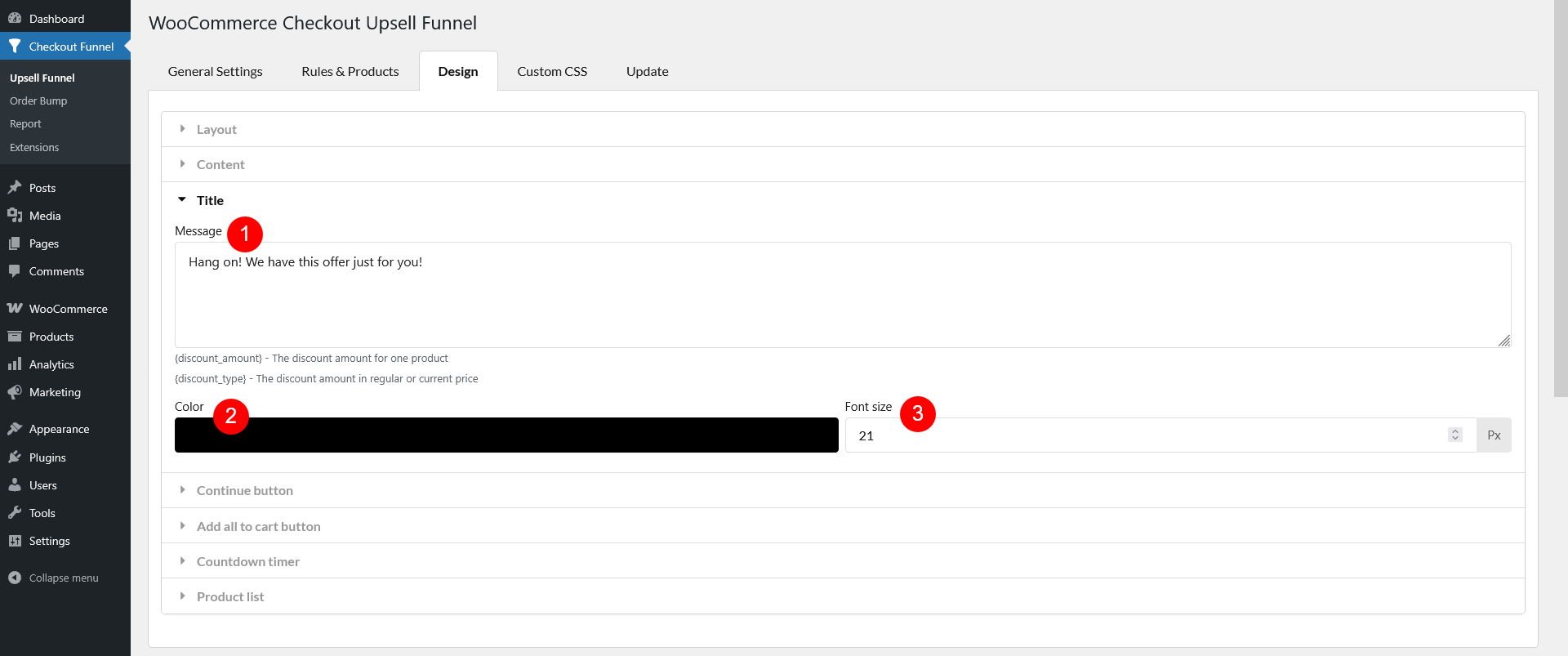
- Message: Enter the title text. Supports placeholders:
- {discount_amount} – Displays the discount value.
- {discount_type} – Displays the discount type (e.g., percentage or fixed amount).
- Color: Set the text color of the title
- Font size: Adjust the font size of the title
Continue button
The {continue_button} placeholder displays the button for continuing checkout. Customize it with the following options:
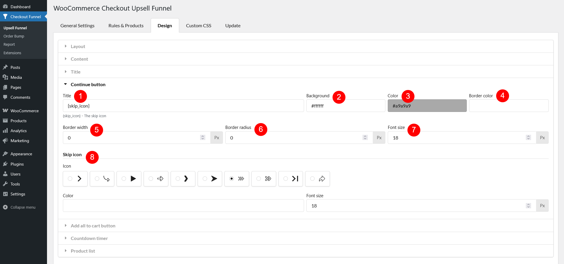
- Title: Set the button text, you can use the title as you want in the Continue button or use the available icons with shortcode {skip_icon}
- Background: Choose the button’s background color
- Color: Set the button text color
- Border color: Choose the color of the button border
- Border width: Adjust the thickness of the button border
- Border radius: Set the roundness of the button corners
- Font size: Customize the text size of the button
- Skip icon: If you insert the shortcode {skip_icon} into the “Title” field, set up the shortcode using the options below
- Icon: Select an icon to display on the button
- Color: Set the icon color
- Font size: Adjust the size of the icon
Add all to cart button
The “Add All to Cart” button allows customers to add all recommended products to their cart at once. However, this button will not work if the Product Template in the Product list settings tab is set to “Add to cart with checkbox”
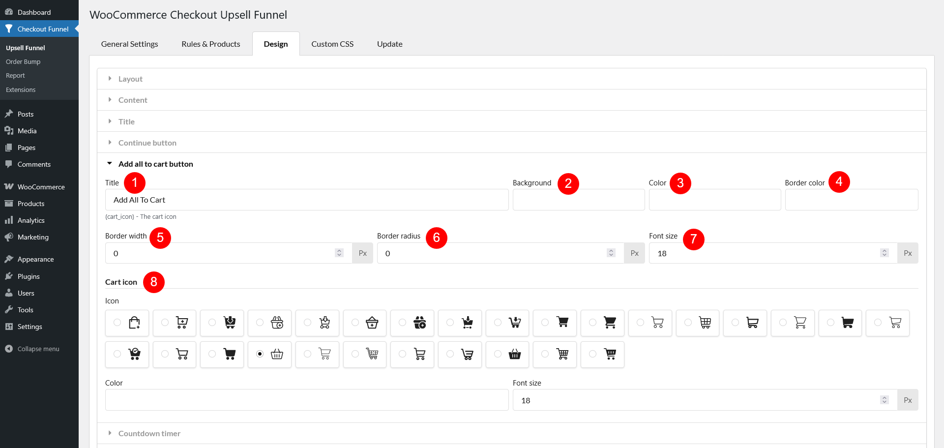
- Title: Set the button text, you can use the title as you want in the Add all to cart button or use the available icons with shortcode {cart_icon}
- Background: Choose the button’s background color
- Color: Set the button text color
- Border color: Choose the color of the button border
- Border width: Adjust the thickness of the button border
- Border radius: Set the roundness of the button corners
- Font size: Customize the text size of the button
- Cart icon: If the “Title” field has the placeholder {cart_icon} in use, set up this placeholder using the following options
- Icon: Select an icon to display on the button
- Color: Set the icon color
- Font size: Adjust the size of the icon
Countdown timer
The {countdown_timer} placeholder inside the Layout section displays a countdown timer, creating urgency for customers to add recommended products to their cart before time runs out.
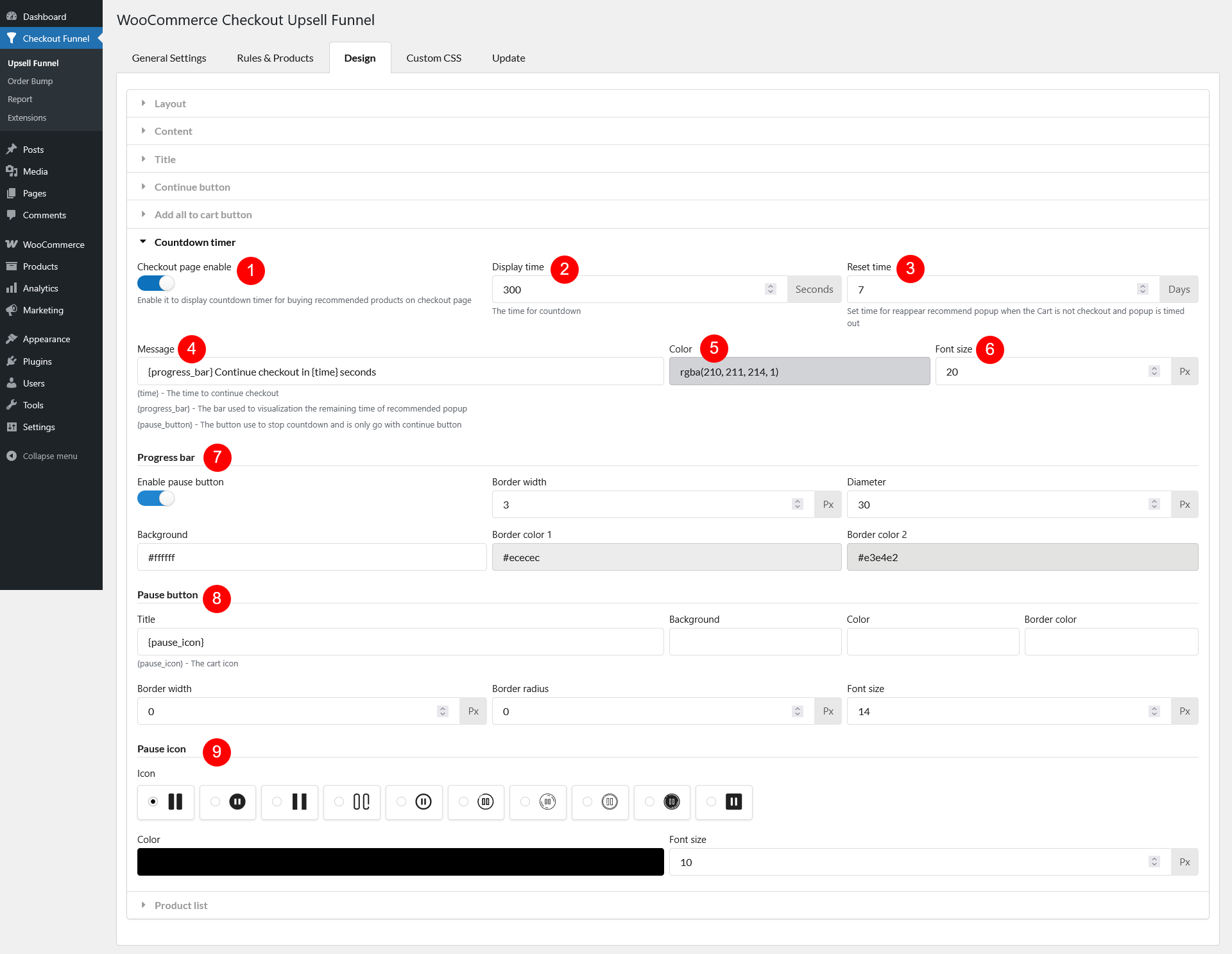
- Checkout page enable: Enable or disable the countdown timer on the checkout page
- Display time: Set the duration of the countdown timer (seconds)
- Reset time: Define when the recommendation popup should reappear if the cart is not checked out and the popup times out
- Message: Enter a message to display alongside the countdown. Supported shortcodes are
- {time} – The time to continue checkout
- {progress_bar} – The bar used to visualization the remaining time of recommended popup
- {pause_button} – The button use to stop countdown and is only go with continue button
- Color: Set the message text color
- Font size: Adjust the message text size
- Progress bar
- Enable pause button: Allow customers to pause the countdown
- Border width: Adjust the thickness of the progress bar’s border
- Diameter: The distance between the the border and the button center – the overall size of the pause button
- Background: Choose a background color for the pause button
- Border color 1: The countdown timer isn’t just a number – the pause button border visually represents the remaining time, similar to a clock filling up or emptying out. This color represents the portion of time that has already elapsed. As time counts down, this section of the border gradually expands, filling up the circle
- Border color 2: This color represents the time still left before the countdown ends. It shrinks as Border color 1 grows, showing how much time remains.
- Pause button
- Title: Use custom text or the {pause_icon} shortcode to display an icon
- Background: Choose the button background color
- Color: Set the button text color
- Border color: Define the button border color
- Border width: Adjust the thickness of the border
- Border radius: Set the roundness of the button corners
- Font size: Customize the text size on the button
- Pause icon: If the “Title” field under option 8 Pause button contains the {pause_icon}, configure options for that shortcode using
- Icon: Select an icon for the pause button
- Color: Set the icon color
- Font size: Adjust the size of the icon
Product list
The {product_list} placeholder controls how recommended products appear inside the upsell popup. These settings allow you to adjust the layout, appearance, and functionality of the product list for both desktop and mobile views.
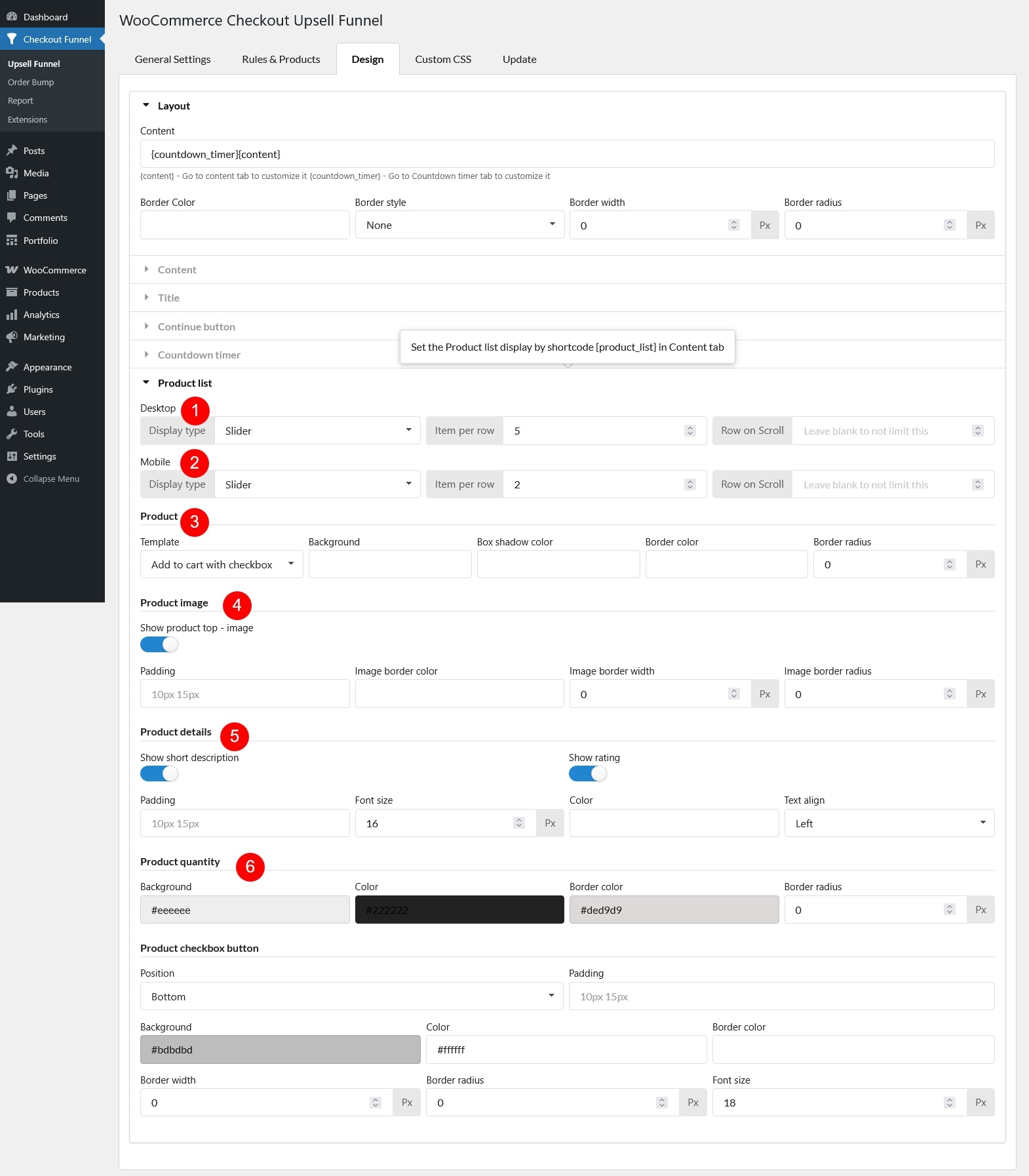
- Desktop
- Display type: Choose between Slider (carousel format) or Scroll (static list)
- Item per row: Set how many products appear per row
- Row on Scroll: Adjust how many rows display when scrolling
- Mobile
- Display type: Choose between Slider or Scroll for mobile devices
- Item per row: Set how many products appear per row on mobile
- Row on Scroll: Adjust the number of visible rows when scrolling
- Product
- Template: Choose the display style for products
- Basic template: Set up the following options
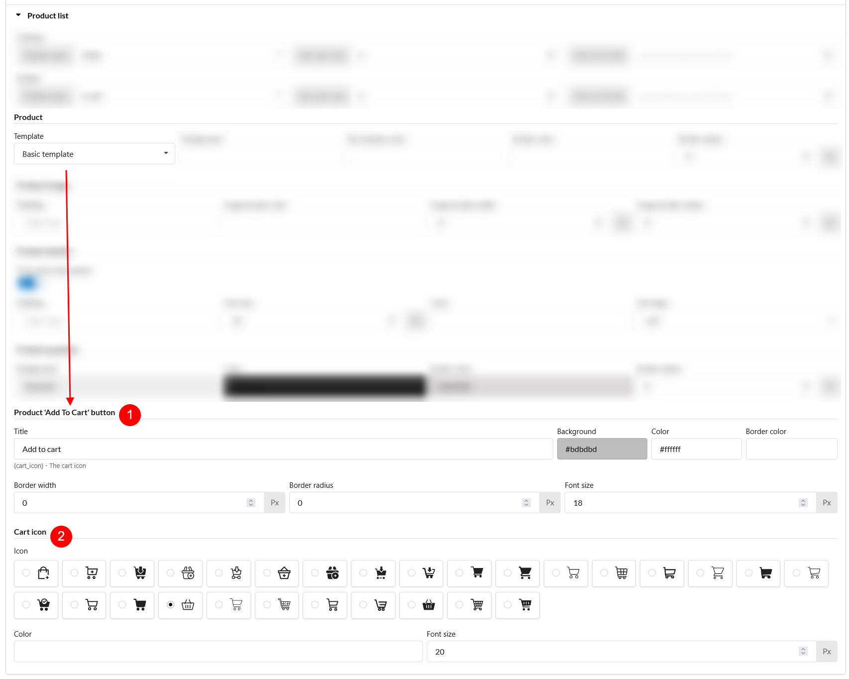
- Product “Add To Cart” button
- Title: Use custom text for this button or use the shortcode {cart_icon} and customize the icon under Cart icon – option 5
- Background: Choose the button background color
- Color: Set text color
- Border color: Define the button’s border color
- Border width: Adjust border thickness
- Border radius: Set button corner roundness
- Font size: Customize button text size
- Cart icon: If the “Add to Cart” button title has {cart_icon} placeholder in use, customize the icon using the options below
- Icon: Select an icon for the button
- Color: Choose the cart icon color
- Font size: Adjust the size of the cart icon
- Product “Add To Cart” button
- Add to Cart with Checkbox: Set up the Product checkbox button section
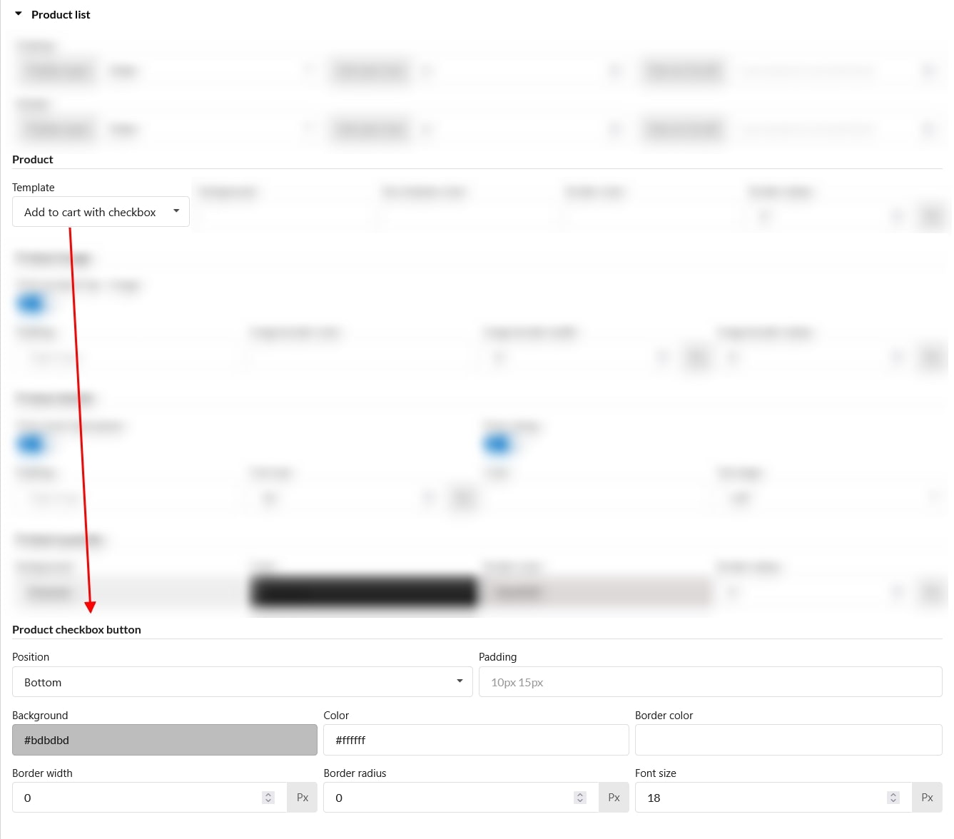
- Position: Set the position of the “Add to Cart” block
- Top: Above product title
- Bottom: Below product title
- Padding: Adjust the spacing (padding) around the “Add to Cart” checkbox block
- Background: Choose checkbox background color
- Color: Set text color
- Border color: Define checkbox border color
- Border width: Adjust border thickness
- Border radius: Set checkbox corner roundness
- Font size: Customize checkbox text size
- Position: Set the position of the “Add to Cart” block
- Basic template: Set up the following options
- Background: Set the background color for the product list
- Box shadow color: Customize the shadow effect around each product box.
- Border color: Define the border color for the product container
- Border radius: Adjust the roundness of product box corners
- Template: Choose the display style for products
- Product Image
- Show product top – image: Display or hide the product image in your Upsell offer
- Padding: Adjust spacing inside the product image
- Image border color: Set a color for the image border
- Image border width: Define the thickness of the image border
- Image border radius: Adjust image corner roundness
- Product Details:
- Show short description: Enable/disable product short descriptions
- Show rating: Choose whether to display the product’s star rating within the Upsell section. Disable this if you want a cleaner look without rating details.
- Padding: Adjust spacing inside the details section
- Font size: Customize text size
- Color: Set text color
- Text align: Align the text (left, center, right)
- Product quantity
- Background: Set background color
- Color: Choose the text color
- Border color: Define border color
- Border radius: Adjust roundness of quantity selector corners