The variations of each attribute can be different with various combination of Display Type and Swatches Profiles. On this settings page, you can create as many profiles and configure them.
By default, the plugin builds 3 profiles for you – Button, Color, and Image. Each profile includes settings of swatches : on default status; on hover status; on selected status; settings for tooltip; and settings for attribute value if the Display Type is “Color”, or “Image”.
When you add more profiles by “cloning” any particular profile, the settings will be the same.
Go to Dashboard >> Variation Swatches >> Swatches Profile.
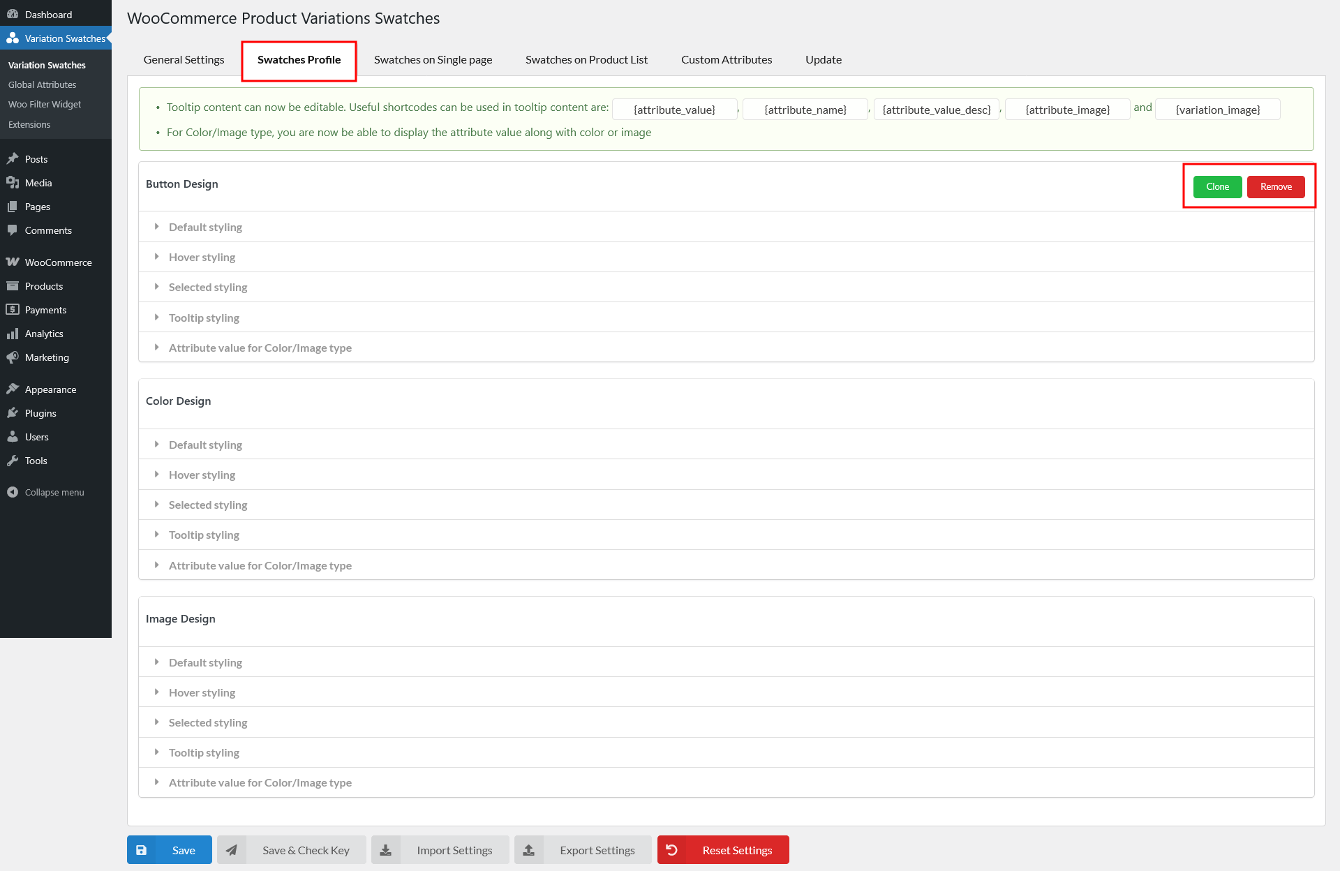
- Clone: Click this button to duplicate the current swatch profile
- Remove: Click to remove the current swatch profile.
Now let’s configure the settings for each swatch profile.
Default Styling
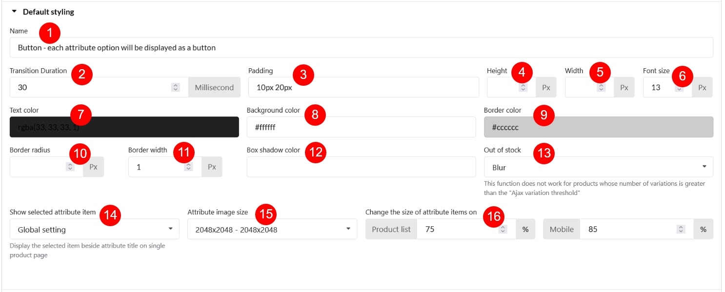
- Name: Swatch profile name
- Transition Duration: Set the time the swatch transition should take to complete (each time the swatch changes its status; for example; from Default status to Selected status). The unit is Millisecond.
- Padding: Manage the padding of the profile.
- Height: Manage the profile height.
- Width: Manage the profile width.
- Font size: Manage the font size of the profile text
- Text color: Manage the profile text color.
- Background color: Manage the profile background color.
- Border color: Manage the profile border color.
- Border radius: Manage the radius of the swatch profile’s corners.
- Border width: Specifies the width of all four sides of the swatch profile’s border
- Box shadow color: Select the box shadow color for the swatch profile.
- Out of stock: Out-of-stock items will become one of the 4 status you selected in this option. Leave “Do not change” if you want the out-of-stock items to not look different from in-stock items
- Show selected attribute item: Choose whether the selected attribute value should appear next to the attribute title on the single product page. Available options:
- Global: Follows the configuration set in Swatches on Single Page settings.
- Yes: Always show the selected attribute value beside the title.
- No: Do not display the selected attribute value.
- Attribute image size: Set the image size of the attribute.
- wooCommerce gallery thumbnail – 100×100
- medium large -768×0
- large – 1024×1024
- 1536×1536 -1536×1536
- 2048×2048 – 2048×2048
- trp custom language flag – 18×12
- woocommerce thumbnail – 324×324
- woocommerce single – 416×0
- Change the size of attribute items on: Make the swatch size on the product list/mobile devices based on its initial size on product page.
- Product list: Manage the size of the swatches on the product list.
- Mobile: Manage the size of the swatches on mobile devices.
Hover Styling
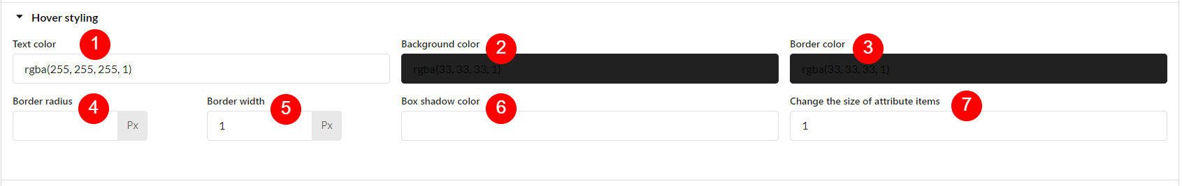
- Text color: Select the text color for the swatch profile when it’s hovered.
- Background color: Select the swatch profile’s background color when it’s hovered.
- Border color: Select the swatch profile’s border color when it’s hovered.
- Border radius: Manage the radius of the swatch profile’s corners when it’s hovered.
- Border width: Manage the width of all four sides of the swatch profile’s border when it’s hovered.
- Box shadow color: Select the swatch profile’s box shadow color when it’s hovered.
- Change the size of attribute items: When the swatch profile is hovered, change its size to maximum 2 times its size in the default status.
Selected Styling
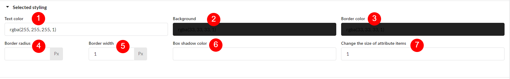
- Text color: Select the text color for the swatch profile when it’s selected.
- Background color: Select the swatch profile’s background color when it’s selected.
- Border color: Select the swatch profile’s border color when it’s selected.
- Border radius: Manage the radius of the swatch profile’s corners when it’s selected.
- Border width: Manage the width of all four sides of the swatch profile’s border when it’s selected.
- Box shadow color: Select the swatch profile’s box shadow color when it’s selected.
- Change the size of attribute items: When the swatch profile is selected, change its size to maximum 2 times its size in the default status.
Tooltip Styling
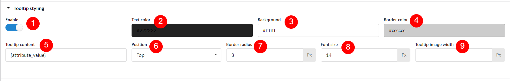
- Enable: Enable to display the extra information when the user moves the mouse pointer over an element.
- Background color: Select the tooltip background color.
- Border color: Select the tooltip border color.
- Tooltip content: Tooltip content can be shown in either image or text, some shortcodes can be used in the tooltip content are:
- {attribute_value} Display the name of the attribute term.
- {attribute_name} Display the attribute name.
- {attribute_value_desc} Display the description of each attribute term.
- {attribute_image} Display the image set for the each attribute term as tooltip
- {variation_image} Display the variation image as the tooltip.
- Position: The place where the tooltip appears, in relation to the swatch profile.
- Border radius: Set the tooltip border radius.
- Border width: Manage the width of all four sides of the swatch profile’s border when it’s selected.
- Font size: Font size of the tooltip text if the tooltip is displayed as text.
- Tooltip image width: Image width of the tooltip if it’s displayed as an image.
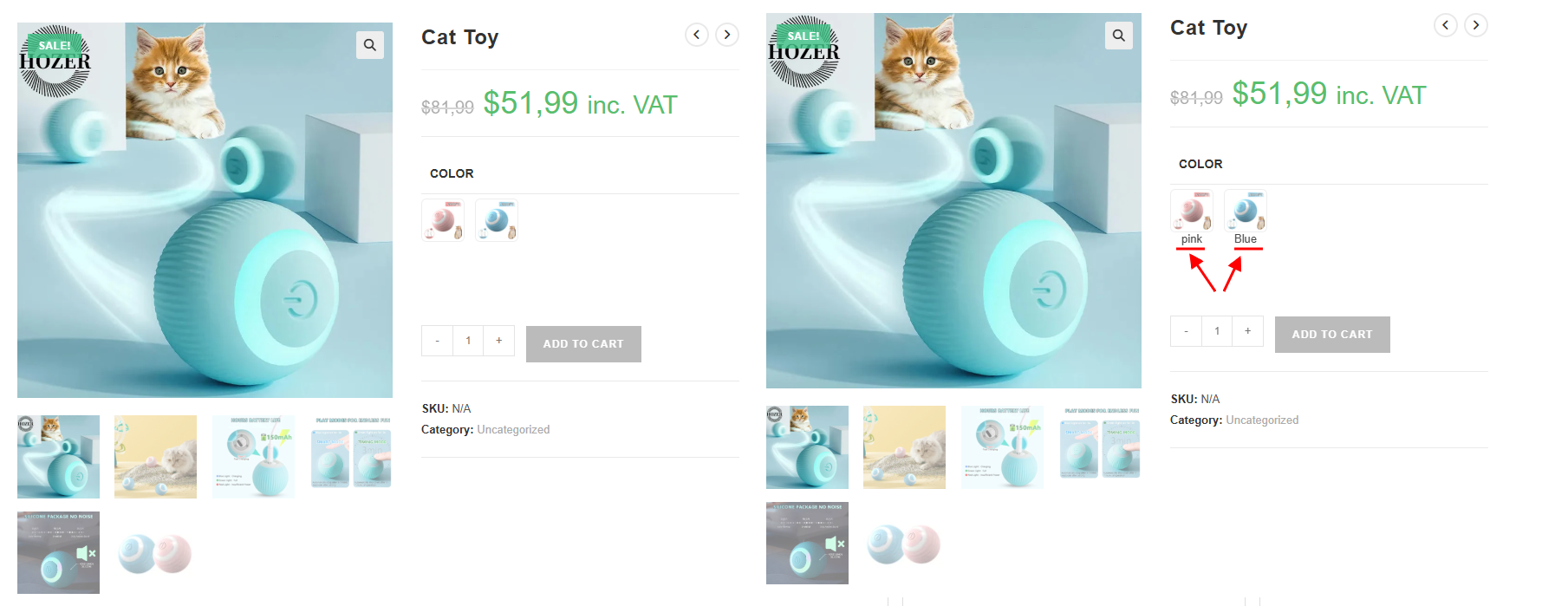
Attribute value for Color/Image type
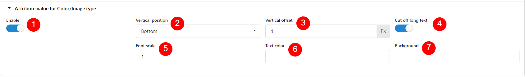
- Enable: Enable this option to display the value of each attribute term when the Display Type of the attribute is Image/Color
- Vertical position: The place of the attribute value in the swatches to display vertically.
- Vertical offset: Indicate the distance of the attribute value vertically from its “Vertical position”.
- Cut off long text: If the attribute value text is long, enable this option to cut it off.
- Font scale: Set the font scale based on the swatch size.
- Text color: Text color for the attribute value.
- Background: Background color for the attribute value.