Go to Dashboard > WooCommerce > Settings > Rees settings > Basic Search
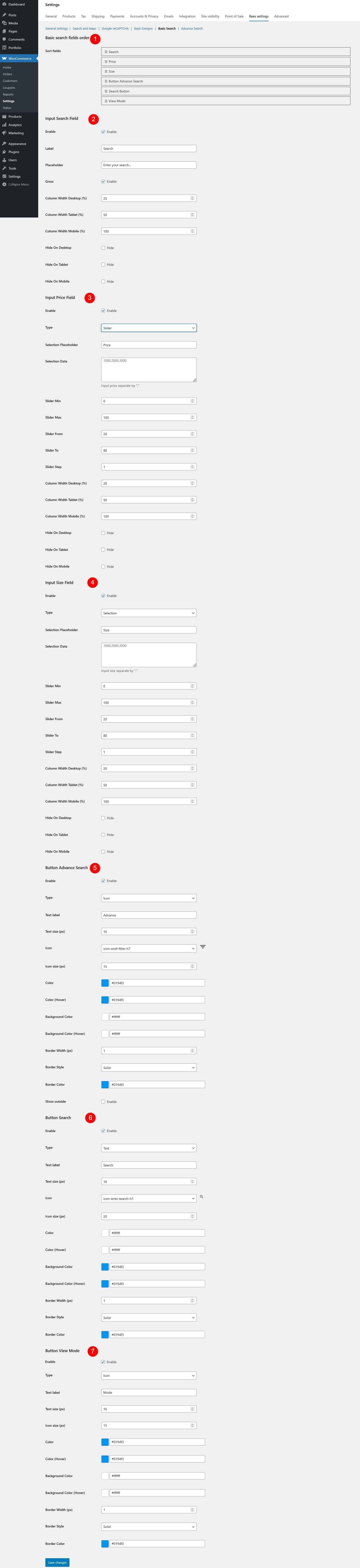
- Basic Search Fields Order
- Sort fields: Drag and drop to define the display order of search fields in the search form.
- Input Search Field
- Enable: Turn the keyword search field on/off.
- Label: Text shown as the field label.
- Placeholder: Text displayed inside the input field.
- Grow: Controls whether the Input Search Field can expand to fill available space in its row.
- Enabled: The search field will automatically grow and take up more horizontal space compared to other fields in the same row, making it more prominent and easier to use.
- Disabled: The search field keeps its fixed width based on the column width settings and will not expand beyond that size
- Column Width Desktop (%): Field width on desktop.
- Column Width Tablet (%): Field width on tablet.
- Column Width Mobile (%): Field width on mobile.
- Hide On Desktop: If enabled, this field will be hidden on desktop devices.
- Hide On Tablet: If enabled, this field will be hidden on tablet devices.
- Hide On Mobile: If enabled, this field will be hidden on mobile devices.
- Input Price Field
- Enable: Enable or disable price filtering.
- Type: Choose the type for the price input field
- Input
- Slider
- Selection
- Selection Placeholder: Text displayed when no price option has been selected.
- Selection Data: Available price options for selection type. Values must be separated by commas.
- Slider Min: Set the minimum price value available in the slider.
- Slider Max: Set the maximum price value available in the slider.
- Slider From: Default starting price when the slider is first loaded.
- Slider To: Default ending price when the slider is first loaded.
- Slider Step: Set the price increment step for the slider.
- Column Width Desktop (%): Field width on desktop.
- Column Width Tablet (%): Field width on tablet.
- Column Width Mobile (%): Field width on mobile.
- Hide On Desktop: If enabled, this field will be hidden on desktop devices.
- Hide On Tablet: If enabled, this field will be hidden on tablet devices.
- Hide On Mobile: If enabled, this field will be hidden on mobile devices.
- Input Size Field
- Enable: Enable or disable size filtering.
- Type: Choose how the size filter works
- Input
- Slider
- Selection
- Selection Placeholder: Text displayed when no size option has been selected.
- Selection Data: Define the available size options for the dropdown selection type. Values must be separated by commas.
- Slider Min: Set the minimum size value available in the slider.
- Slider Max: Set the maximum size value available in the slider.
- Slider From: Default starting size when the slider is first loaded.
- Slider To: Default ending size when the slider is first loaded.
- Slider Step: Set the size increment step for the slider.
- Column Width Desktop (%): Field width on desktop.
- Column Width Tablet (%): Field width on tablet.
- Column Width Mobile (%): Field width on mobile.
- Hide On Desktop: If enabled, this field will be hidden on desktop devices.
- Hide On Tablet: If enabled, this field will be hidden on tablet devices.
- Hide On Mobile: If enabled, this field will be hidden on mobile devices.
- Button Advance Search
- Enable: Show or hide the advanced search button.
- Type: Choose the button style – Text, Icon, or Icon Text (Text + Icon)
- Text Label: Text displayed on the button.
- Text Size (px): Font size of the button text.
- Icon: Select an icon from the built-in icon list and preview it.
- Icon Size (px): Set the size of the icon.
- Color: Set the text or icon color.
- Color (Hover): Set the text or icon color when hovered.
- Background Color: Set the button background color.
- Background Color (Hover): Set the background color when hovered.
- Border Width (px): Set the thickness of the button border.
- Border Style: Choose the border style – dashed, solid, or dotted.
- Border Color: Set the color of the button border.
- Show Outside: Display the button outside the search form layout.
- Button Search
- Enable: Enable or disable the search button.
- Type: Choose the button style – Text, Icon, or Icon Text (Text + Icon)
- Text label: Text displayed on the button.
- Text size (px): Font size of the button text.
- Icon: Select an icon to display on the button.
- Icon size (px): Set the size of the icon.
- Color: Set the text or icon color.
- Color (Hover): Set the text or icon color when hovered.
- Background Color: Set the button background color.
- Background Color (Hover): Set the background color when hovered.
- Border Width (px): Set the thickness of the button border.
- Border Style: Choose the border style – dashed, solid, or dotted.
- Border Color: Set the color of the button border.
- Button View Mode
- Enable: Enable or disable view mode switch.
- Type: Choose the button style – Text, Icon, or Icon Text (Text + Icon)
- Text label: Text displayed on the button.
- Text size (px): Font size of the button text.
- Icon size (px): Set the size of the icon.
- Color: Set the text or icon color.
- Color (Hover): Set the text or icon color when hovered.
- Background Color: Set the button background color.
- Background Color (Hover): Set the background color when hovered.
- Border Width (px): Set the thickness of the button border.
- Border Style: Choose the border style – dashed, solid, or dotted.
- Border Color: Set the color of the button border.