The Button element helps you easily design and customize buttons without the need for any other plugins or shortcodes.
A. Content
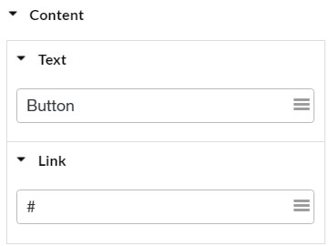
- Enter the button’s text and you can add (
 )shortcode if you need
 - Set the URL for the button’s link.
B. Style
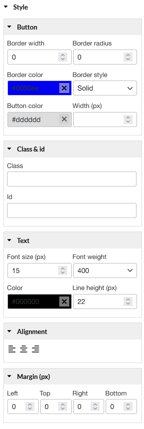
You can style the button includes:
- Button: Border width; Border radius; Border color; Border style; Button color; and Button width.
- Class & id: Specify a class and/or ID for the component. One can have only one ID, but you can assign multiple classes, just separate them with spaces.
- Text: Font size (px); Font weight; Color;
- Alignment: Align the text to the left, right, or center.
- Margin (px): Left; Top; Right; Bottom.