The Divider element allows you to add styled horizontal lines that divide your content.
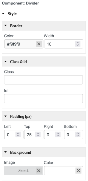
- Border: Color – Choose the color of the divider; Width – Control the width of the divider.
- Class & id: Specify a class and/or ID for the component. Each component can have only one ID, but you can assign multiple classes, just separate them with spaces.
- Padding: Left; Top; Right; Bottom.
- Background: Set Image and color for divider background if it is necessary.