In Design settings, you can configure how the sales countdown timer looks like in front-end.
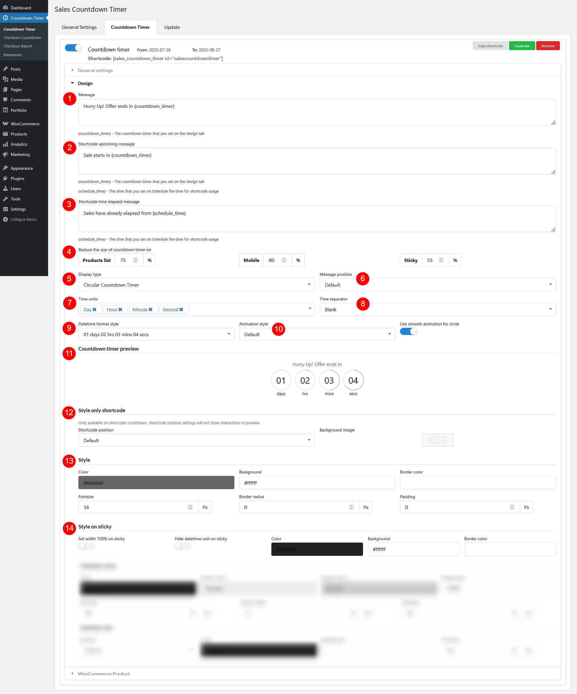
- Message: The main message displayed along with the countdown timer (e.g., “Sale ends in:”).
- Shortcode upcoming message: Message shown when the countdown hasn’t started yet (before the start date/time)
- Shortcode time elapsed message: Message shown after the countdown has ended
- Reduce the size of countdown timer on: Option to make the timer smaller when shown on Product list (archive/shop pages); Mobile devices; and Sticky countdown (if enabled)
- Display type: Choose the layout style of the countdown
- Square Countdown Timer
- Square Countdown Timer 1
- Basic Countdown Timer
- Circle Countdown Timer: Toggle “Use smooth animation for circle” for a better experience.
- Circle Countdown Timer 1: Toggle “Use smooth animation for circle” for a better experience
- Sleek Countdown Timer
- Sleek Countdown Timer 1
- Message position: Choose where the message appears relative to the timer – Default or on the same line as the countdown timer
- Time units: Select which time units to display on the timer: Day, Hour, Minute, Second
- Time separator: Choose the symbol or character to separate time units (e.g., :,)
- Datetime format style: Define how the date are shown on the timer
- Animation style: Choose animation for the countdown clock (e.g., Slide, 3D Flip – only works with Sleek Countdown Timer and Sleek Countdown Timer 1, Default).
- Countdown timer preview: Instantly preview how your timer will look with current settings and reset the default settings using the “Reset” button
- Style only shortcode
- Shortcode position: Define where the timer appears when using the shortcode in content
- Default: Exactly where the shortcode is inserted
- Site static top banner
- Sticky on top
- Sticky on bottom
- Background image: Add a background image behind the countdown block
- Shortcode position: Define where the timer appears when using the shortcode in content
- Style
- Color: Text color of the timer
- Background: Background color of the countdown block
- Border color: Color of the border around the countdown
- Fontsize: Size of the timer’s text
- Border radius: Rounded corners for the countdown block
- Padding: Spacing inside the countdown block
- Style on sticky
- Set width 100% on sticky: Make the sticky countdown stretch full width
- Hide datetime unit on sticky: Enable to remove labels like “days”, “hours” from sticky countdown for compact display
- Color: Adjust the text color of the sticky timer
- Background: Adjust the background color of the sticky timer
- Border color: Adjust the border color of the sticky timer
Datetime value and Datetime unit settings are Display type-specific (5). Scroll down to learn the options for each type.
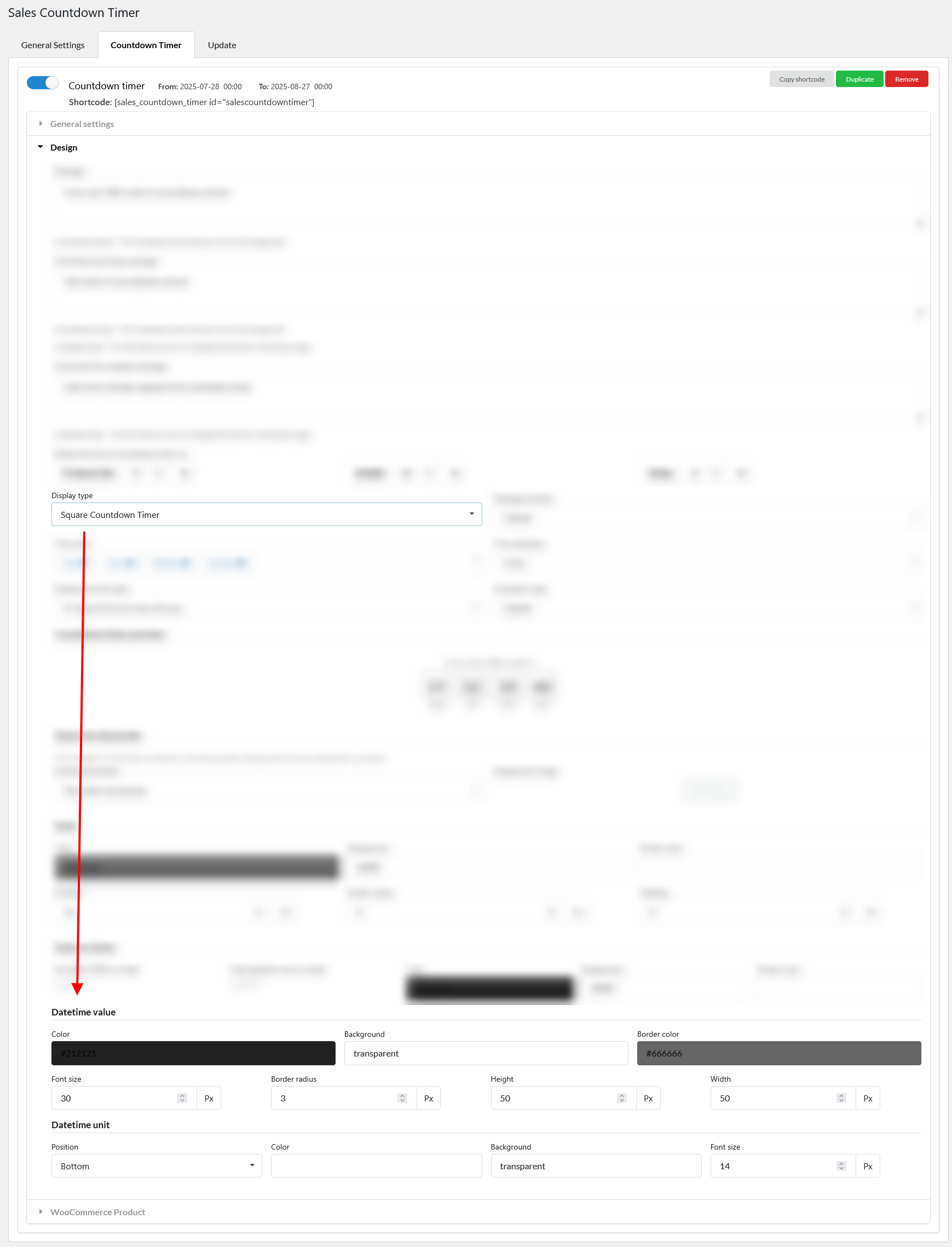
Square Countdown Time
- Datetime value
- Color: Text color for datetime values
- Background: Background color for datetime boxes
- Border color: Border color for datetime boxes
- Font size: Font size of datetime values
- Border radius: Rounded corners of each datetime box
- Height: Set the height for the time unit block
- Width: Set the width for the time unit block
- Datetime unit
- Position: Placement of unit labels
- Color: Text color for datetime unit
- Background: Background color of unit labels
- Font size: Font size of the unit labels
Square Countdown Timer 1
- Datetime value
- Color: Text color for datetime values
- Background: Background color for datetime boxes
- Font size: Font size of datetime values
- Datetime unit
- Position: Placement of unit labels
- Color: Text color for datetime unit
- Background: Background color of unit labels
- Font size: Font size of the unit labels
Basic Countdown Timer
- Datetime value
- Color: Text color for datetime values
- Background: Background color for datetime boxes
- Font size: Font size of datetime values
- Datetime unit
- Color: Text color for datetime unit
- Background: Background color of unit labels
- Font size: Font size of the unit labels
Circle Countdown Timer
This style displays each time block (e.g., days, hours) inside a circular timer. The circle’s outer border represents the total time (100%), and it visually fills as time passes:
- Datetime value
- Color: Text color of the datetime values inside each circle
- Border color 1: The initial circle outline – the full ring
- Border color 2: The active color that fills over Border Color 1 as time decreases – gradually fills over Color 1 to indicate remaining time
- Font size: Size of the datetime value text
- Border width: Thickness of the circle border line
- Diameter: Total size (height/width) of each circular time block
- Datetime unit
- Position: Placement of unit labels
- Color: Text color for datetime unit
- Background: Background color of unit labels
- Font size: Font size of the unit labels
Circle Countdown Timer 1
This type shows each countdown timer item (date, hour, minute, second) in a circle block just like Circle Countdown Timer, but with individual style settings for each unit. Each time unit (Date, Hour, Minute, Second) can be styled with its own colors. The circle border visually fills as time progresses – similar to a progress ring.
- Countdown timer items
- Datetime value color: Text color of the numeric value inside each circle (e.g., 10, 24)
- Datetime unit color: Text color of the unit label
- Border width: Thickness of the circle ring around each time block
- Diameter: Total size (width/height) of each circular timer block
- Datetime value font size: Font size of the numeric value
- Datetime unit font size: Font size of the unit label
- Countdown timer date
- Border color 1: Base ring color
- Border color 2: Fills over color 1 as time passes
- Background: Background color inside the circle
- Countdown timer hour
- Border color 1: Base ring color
- Border color 2: Fills over color 1 as time passes
- Background: Background color inside the circle
- Countdown timer minute
- Border color 1: Base ring color
- Border color 2: Fills over color 1 as time passes
- Background: Background color inside the circle
- Countdown timer second
- Border color 1: Base ring color
- Border color 2: Fills over color 1 as time passes
- Background: Background color inside the circle
Sleek Countdown Timer
This countdown timer style features a clean, split layout, where each time block (e.g., hours, minutes, seconds) is divided into two distinct halves by a horizontal dividing line if enabled.
- Datetime value
- Color 1: Text color for the top half of each datetime value
- Color 2: Text color for the bottom half of each datetime value
- Background 1: Background color of the top half of each time unit block
- Background 2: Background color of the bottom half of each time unit block
- Width: Width of each time unit block
- Height: Height of each time unit block
- Border radius: Adjust the roundness of each time unit block’s corners
- Fontsize: Size of the text used for datetime values (both top and bottom halves)
- Enable box shadow: Toggle to add a subtle shadow around each time unit block for depth and emphasis
- Show dividing line behind datetime value: Enable this to display a horizontal line, creating a layered effect
- Dividing line color: Choose the color of the dividing line that separates the top and bottom halves
- Datetime unit
- Position: Choose where the unit label appears relative to the time value
- Color: Text color of the datetime unit
- Fontsize: Size of the unit label text
- Distance to time value: Adjust the spacing between the unit label and the datetime value block
Sleek Countdown Timer 1
- Datetime value
- Color 1: Text color for the top half of each datetime value
- Color 2: Text color for the bottom half of each datetime value
- Background 1: Background color of the top half of each time unit block
- Background 2: Background color of the bottom half of each time unit block
- Width: Width of each time unit block
- Height: Height of each time unit block
- Border radius: Adjust the roundness of each time unit block’s corners
- Fontsize: Size of the text used for datetime values (both top and bottom halves)
- Dividing line color: Choose the color of the dividing line that separates the top and bottom halves
- Datetime unit
- Position: Choose where the unit label appears relative to the time value
- Color: Text color of the datetime unit
- Fontsize: Size of the unit label text
- Distance to time value: Adjust the spacing between the unit label and the datetime value block