The Design Settings tab allows you to customize how pre-order elements appear throughout your store. Access these tabs using “Go to Design” option under General settings or by going to Appearance > Customize > Prena WooCommerce Product Design
Pre-Order Button
Customize the appearance of the pre-order button displayed on product and shop pages.
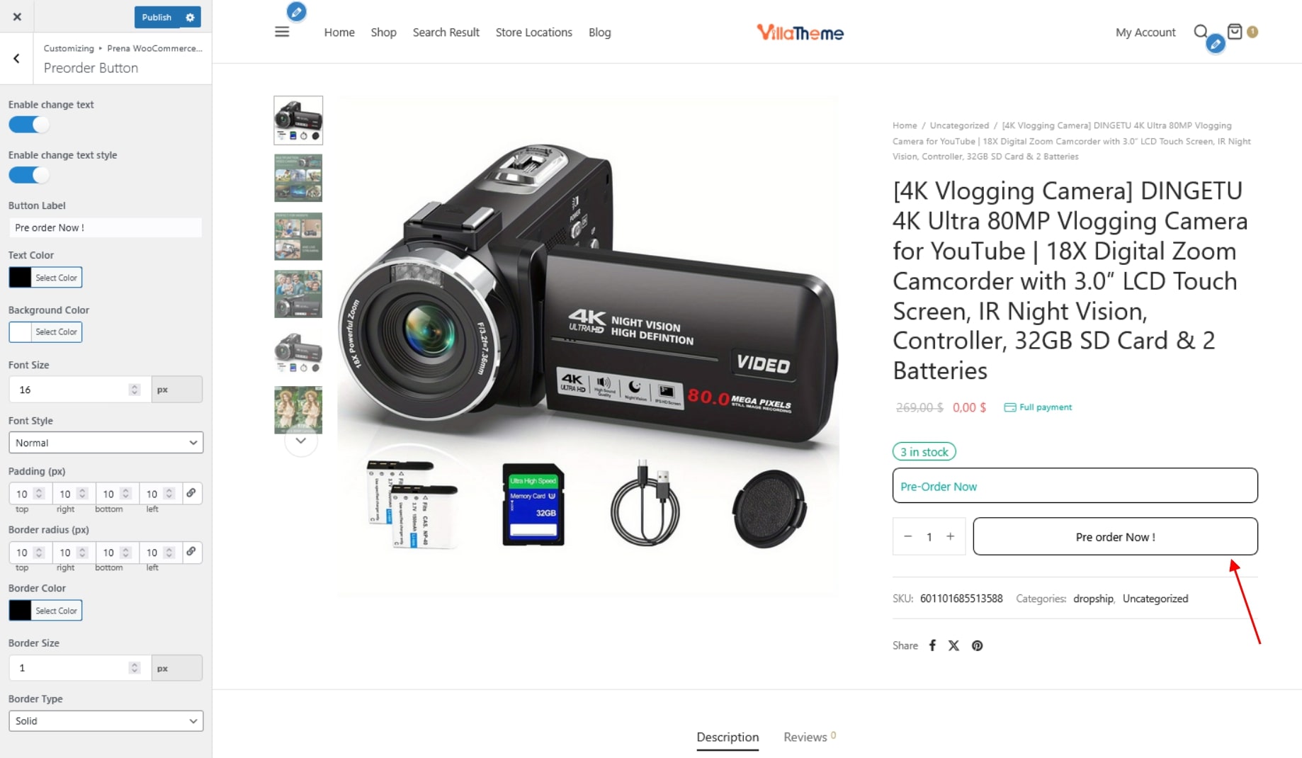
- Enable change text: Allow editing of the default pre-order button label.
- Enable change text style: Enable customization of the button design. Disable this option to use the theme’s default button style.
- Button Label: Set the text displayed on the pre-order button.
- Text Color: Choose the color of the button text.
- Background Color: Set the background color of the button.
- Font Size: Define the size of the button text.
- Font Style: Choose the font style for the button text: Normal, Italic, or Oblique.
- Padding (px): Control the inner spacing between the button content and its border.
- Border radius (px): Adjust the roundness of the button corners.
- Border Color: Set the color of the button border.
- Border Size: Define the thickness of the button border.
- Border Type: Choose the border style
- Solid
- Dashed
- Dotted
- Double
Cart Notice
Add a customizable notice in the cart when it contains pre-order products.
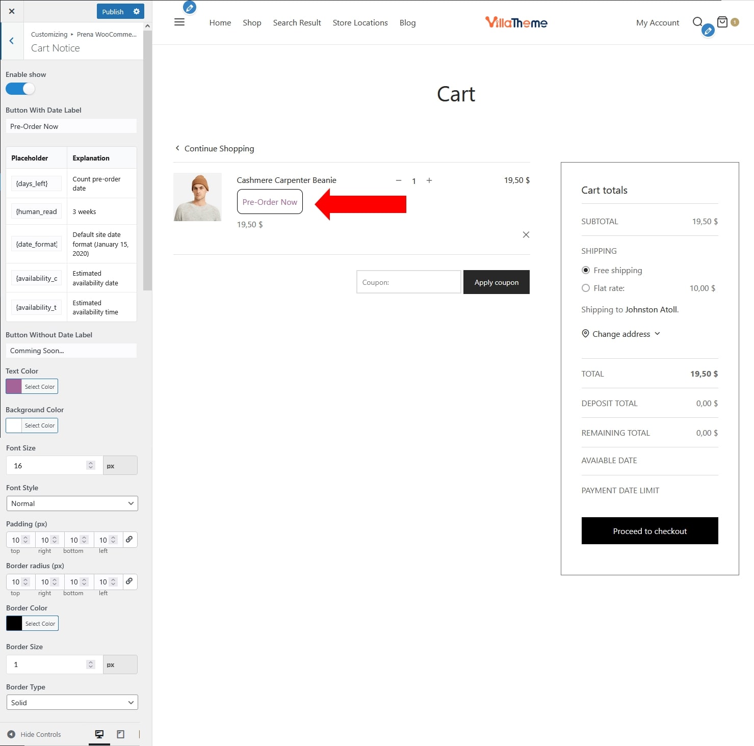
- Enable show: Enable or disable the cart notice for pre-order products.
- Button With Date Label: Set the notice text when the pre-order product has an availability date.
- Supported placeholders: {days_left}; {human_readable}; {date_format}; {availability_date}; {availability_time}
- Button Without Date Label: Set the notice text when the pre-order product does not have an availability date.
- Text Color: Choose the color of the notice text.
- Background Color: Set the background color of the notice.
- Font Size: Define the size of the notice text.
- Font Style: Choose the font style for the notice text: Normal, Italic, or Oblique.
- Padding (px): Control the inner spacing inside the notice.
- Border radius (px): Adjust the roundness of the corners.
- Border Color: Set the color of the border.
- Border Size: Define the thickness of the border.
- Border Type: Choose the border style
- Solid
- Dashed
- Dotted
- Double
Product Page Notice
Display a pre-order notice on product detail pages.
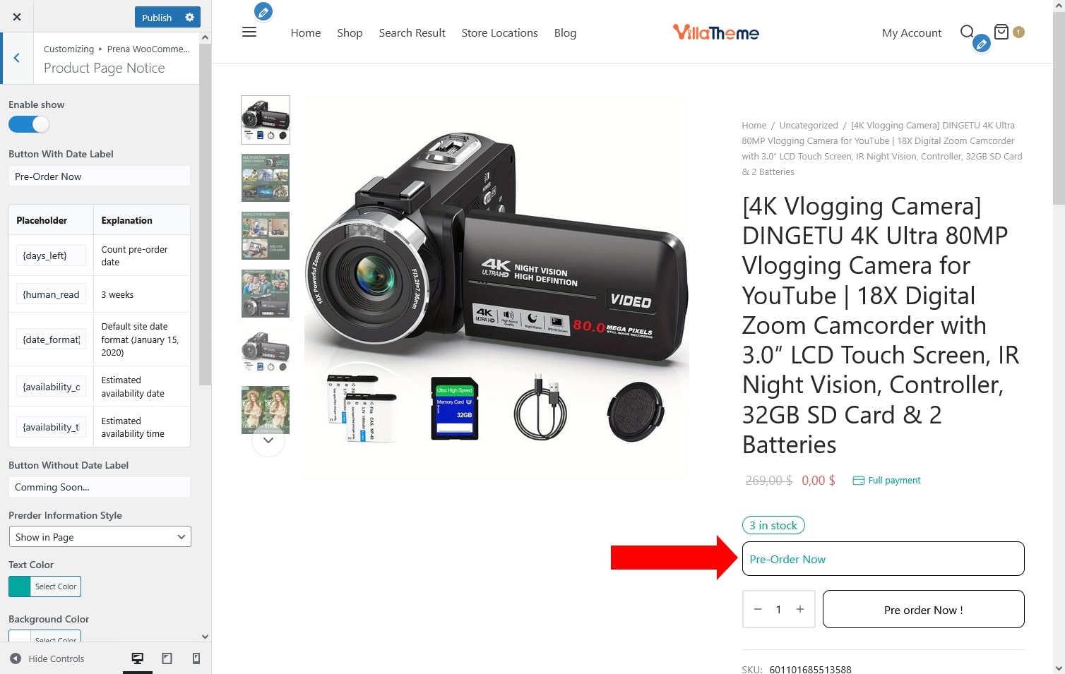
- Enable show: Enable or disable the pre-order notice on product detail pages.
- Button With Date Label: Set the notice text when the pre-order product has an availability date.
- Supported placeholders: {days_left}; {human_readable}; {date_format}; {availability_date}; {availability_time}
- Button Without Date Label: Set the notice text when no availability date is defined.
- Prerder Information Style: Choose how the notice is displayed – Show in Page or Show in Popup.
- Text Color: Choose the color of the notice text.
- Background Color: Set the background color of the notice.
- Font Size: Define the size of the notice text.
- Font Style: Choose the font style for the notice text: Normal, Italic, or Oblique.
- Padding (px): Control the inner spacing inside the notice.
- Border radius (px): Adjust the roundness of the corners.
- Border Color: Set the color of the border.
- Border Size: Define the thickness of the border.
- Border Type: Choose the border style
- Solid
- Dashed
- Dotted
- Double
Shop Page Notice
Show a pre-order notice on product listings in the shop/archive pages.
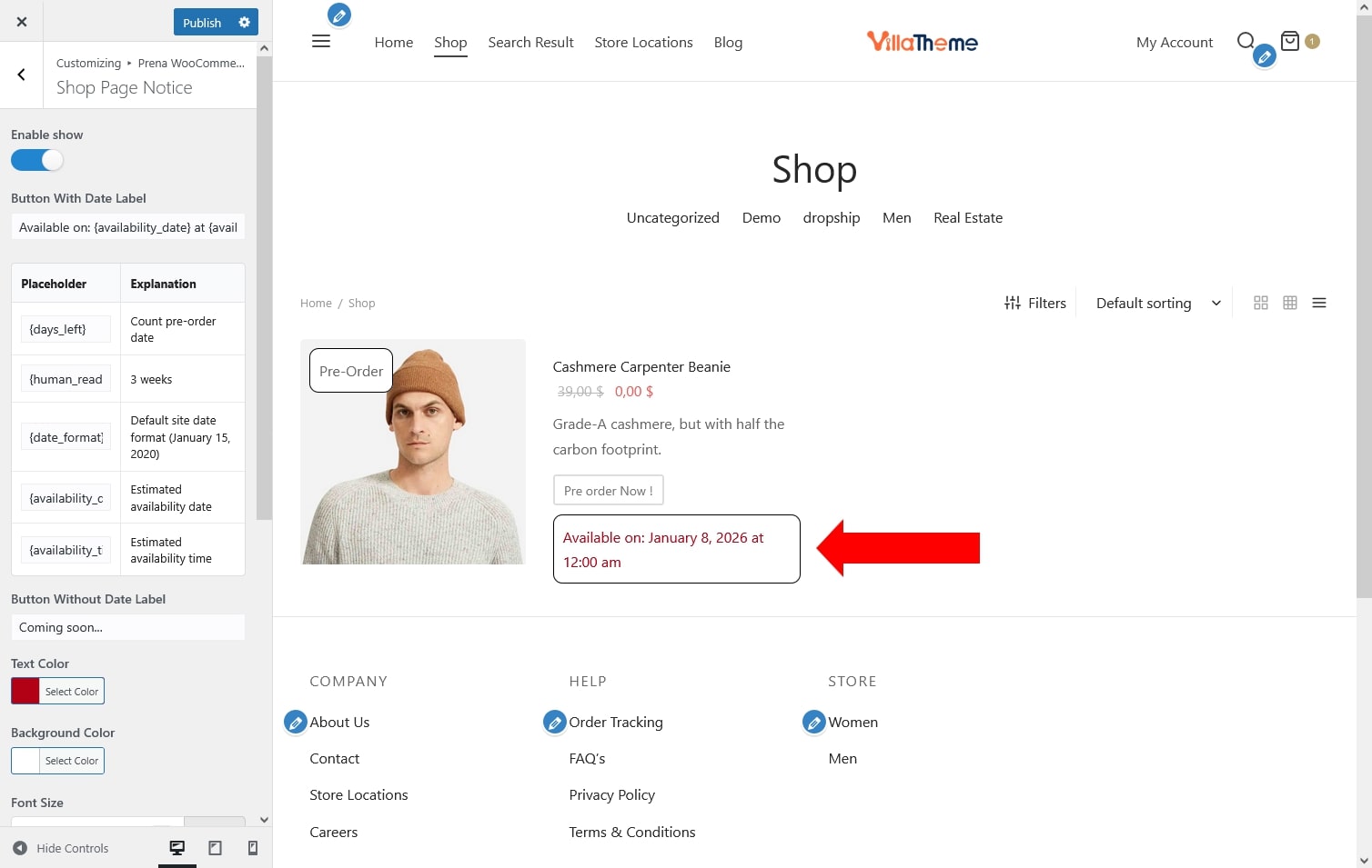
- Enable show: Enable or disable the pre-order notice on shop and archive pages.
- Button With Date Label:Set the notice text when the pre-order product has an availability date
- Supported placeholders: {days_left}; {human_readable}; {date_format}; {availability_date}; {availability_time}
- Button Without Date Label: Set the notice text when no availability date is available.
- Text Color: Choose the color of the notice text.
- Background Color: Set the background color of the notice.
- Font Size: Define the size of the notice text.
- Font Style: Choose the font style for the notice text: Normal, Italic, or Oblique.
- Padding (px): Control the inner spacing inside the notice.
- Border radius (px): Adjust the roundness of the corners.
- Border Color: Set the color of the border.
- Border Size: Define the thickness of the border.
- Border Type: Choose the border style
- Solid
- Dashed
- Dotted
- Double
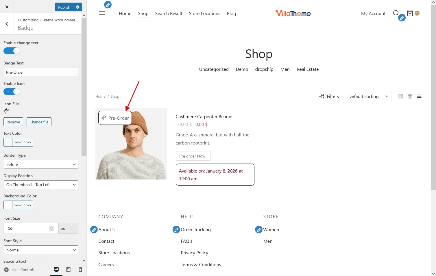
Badge
Add a badge to highlight pre-order products in the shop or product pages.
- Enable change text: Enable or disable the pre-order badge.
- Badge Text: Customize the text displayed inside the badge.
- Enable Icon: Enable or disable an icon displayed with the badge text.
- Icon File: Choose an icon to display in the badge.
- Text Color: Choose the color of the badge text.
- Border Type: Choose whether the icon appears before or after the badge text.
- Display Position: Select the badge placement
- On Thumbnail – Top Left
- On Thumbnail – Top Right
- On Thumbnail – Bottom Left
- On Thumbnail – Bottom Right
- Before Item Title
- After Item Title
- Before Item
- After Item
- Background Color: Set the background color of the badge.
- Font Size: Define the badge text size.
- Font Style
- Normal
- Italic
- Oblique
- Spacing: Adjust the distance between the badge icon and the badge text.
- Page To Display: Define where the badge will appear
- Shop / Archive Page
- Related / Widgets
- Search Page
- Padding (px): Adjust spacing inside the badge.
- Border Radius (px): Set roundness of the badge corners.
- Border Color: Set the color of the border.
- Border Size: Define the thickness of the border.
- Border Type: Choose the border style
- Solid
- Dashed
- Dotted
- Double