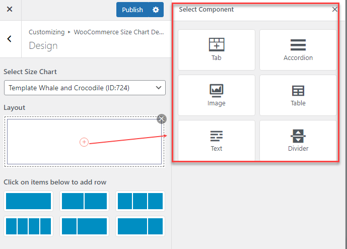
Size chart components can be added to the layout structure to enhance the presentation and usability of the size chart, including Tab; Accordion; Image; Table; Text; Divider
A. Tab
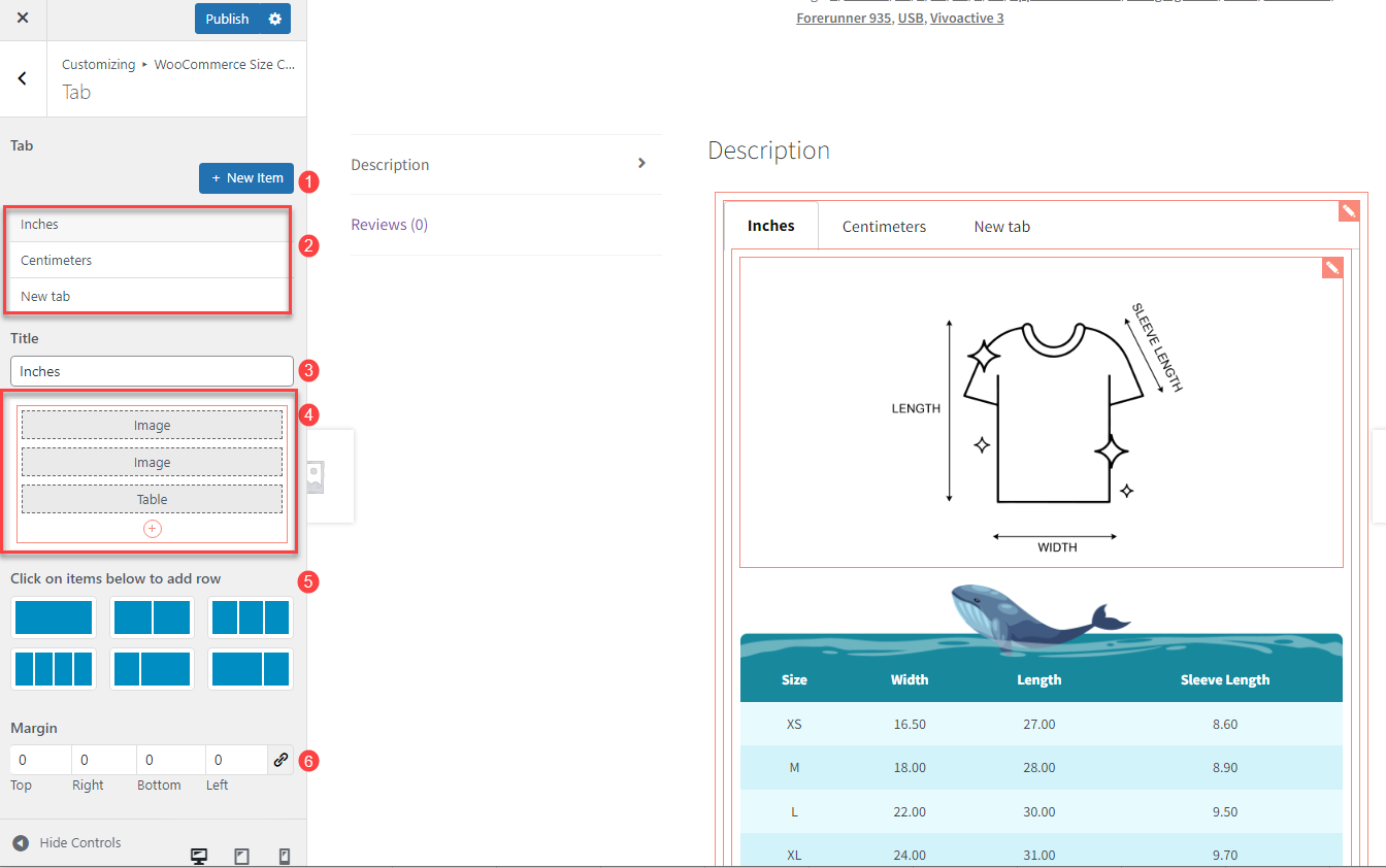
- New Item: Click to add new tabs
- Available tabs: Display the created tabs
- Title: Enter the title of the tab
- Tab Components: Design components appearing on the tabs
- Layout: Select layout row(s) built in the size chart tab
- Margin: You can customize the space around the tab by adjusting the margin
B. Accordion
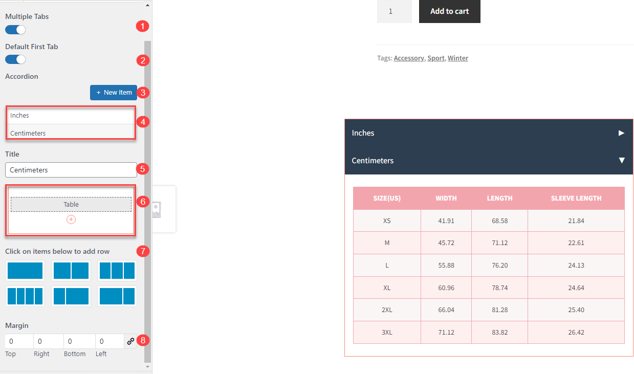
- Multiple Tabs: When enabled, this feature allows multiple sections in the accordion to remain open at the same time when you click on different sections. If disabled, only the clicked section will open, while the other sections will automatically close.
- Default First Tab: When you enable this option, the first section in the accordion always remains open, if you disable it, all sections will stay closed.
- New Item: Click to add new sections in the accordion.
- Available items in Accordion: Display the created sections in the accordion.
- Title: Name of the section.
- Accordion Components: Design components appearing on the accordion.
- Layout: Select layout row(s) built in the size chart accordion.
- Margin: You can customize the space around the accordion by adjusting the margin.
C. Image
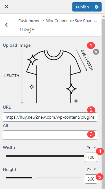
- Image Preview: This shows a preview of the image you upload for the size chart
- Image URL: Enter the URL where the image is hosted
- Image ALT: This field is for the alternative text (alt text) of the image
- Width: Set the width of the image in pixels, allowing you to control how wide the image appears in the size chart
- Height: Set the height of the image in pixels, determining how tall the image appears in the size chart
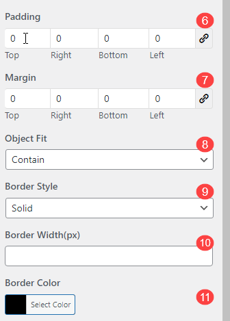
- Padding: Adjust the padding around the image, which adds space between the image and other elements of the size chart, measured in pixels
- Margin: Set the margin around the image, which creates space between the image and the border of the size chart container or adjacent content
- Object Fit: This controls how the image fits within its container. You can choose options like ‘cover’, ‘contain’, ‘fill’, or ‘upset’, which determines whether the image will stretch, resize, or crop to fit
- Border Style: Choose the style of the border around the image. Options may include solid, dotted, dashed, dashed, double, groove, ridge, inset, outset
- Border Width (px): Set the width of the image border in pixels. The thicker the width, the more prominent the border will appear
- Border Color: Select the color of the image border to match the design of your size chart or product page styling
D. Table
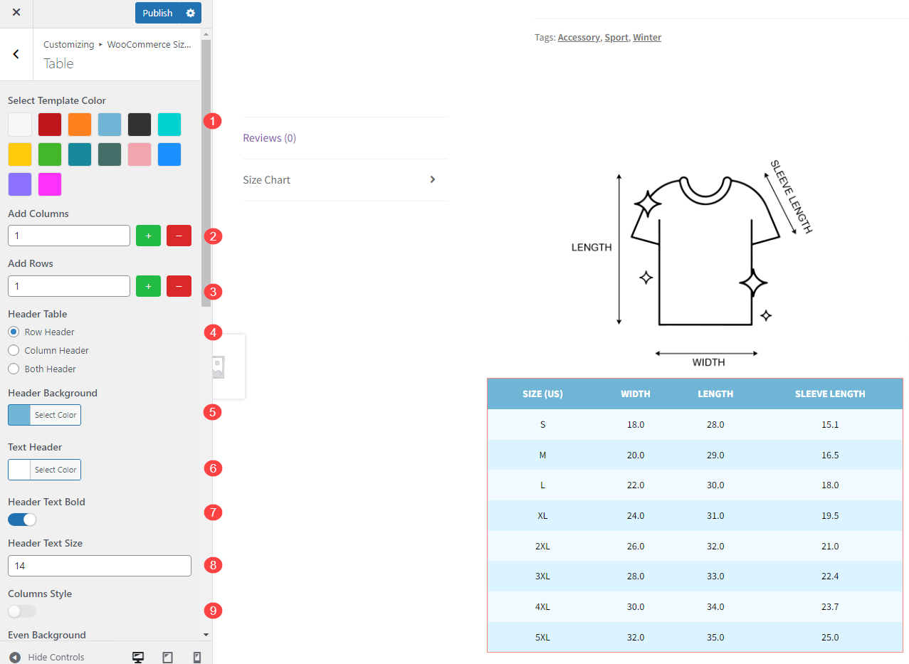
- Select Template Color: Choose the overall color scheme for your size chart table
- Add Columns: Add additional columns to your table
- Add Row: Add extra rows to input size details
- Header Table: Select where the header of the table should be located. You can choose to place the header in the top row, in the first column, or both
- Header Background: Set the background color for the header row
- Text Header: Define the color of the text in the header row
- Header Text Bold: Enable or disable bold formatting for the header text
- Header Text Size: Customize the font size for the text in the header
- Column Style: This option allows you to choose how to highlight your odd and even table in rows or columns
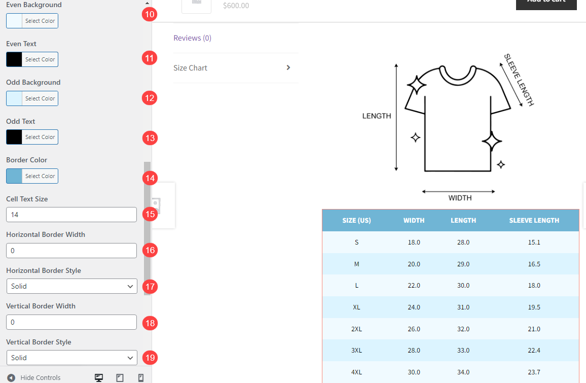
- Even Background: Set a background color for even-numbered rows
- Even Text: Customize the text color for even-numbered rows
- Odd Background: Set a background color for odd-numbered rows
- Odd Text: Customize the text color for odd-numbered rows
- Border Color: Choose the color for the table’s borders
- Cell Text Size: Adjust the font size for the text inside table cells
- Horizontal Border Width: Set the thickness of the borders between rows
- Horizontal Border Style: Choose the style for the horizontal borders, it can be: solid, dotted, dashed, dashed, double, groove, ridge, inset, outset
- Vertical Border Width: Set the thickness of the borders between columns
- Vertical Border Style: Choose the style for the vertical borders, it can be: solid, dotted, dashed, dashed, double, groove, ridge, inset, outset
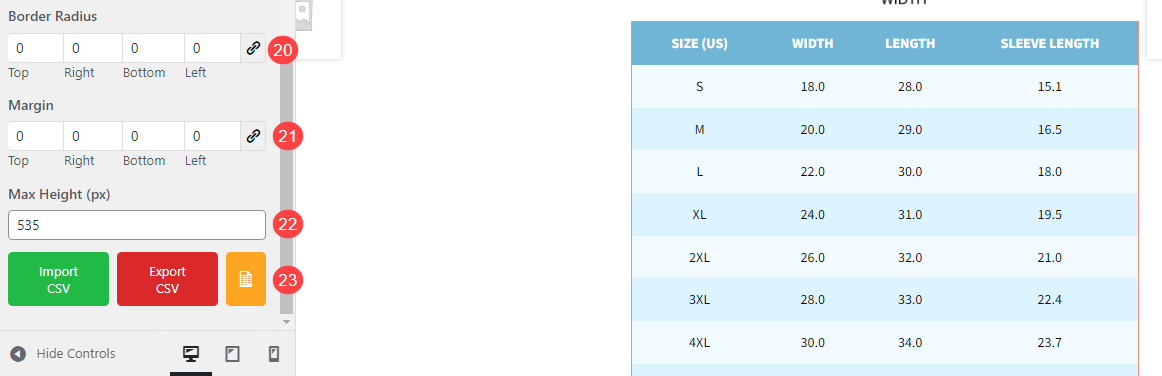
- Border Radius: Define how rounded the corners of the table cells should be
- Margin: Set the space around the table to create a clean layout on the page
- Max Height (px): Limit the maximum height of the table in pixels to control the table’s display size
- Import CSV, Export CSV, Sample: Import data into the table from a CSV file, export your table data as a CSV file for backup or editing, and download a sample CSV file to see the required format
E. Text
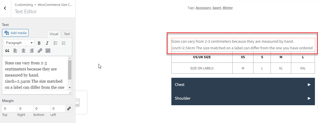
Text Component provides a versatile way to customize the textual content within your size charts. It supports a range of formatting and editing options:
- Text Formatting: Offers basic formatting options like bold, italic, bullet points, numbering, and other text styles
- Text Alignment: Allows you to align the text (left, center, or right) to control how the text appears
- Add Links: Provides the ability to insert hyperlinks within the text
- Add Media: Lets you insert images, videos, or other media directly into the size chart text section to enhance the content
- Visual: Allowing you to edit and format the text visually without needing to write HTML code
- Text Mode: Switch to editing the text in HTML for more advanced formatting and customization options
- Text Margin: Adjusts the space around the text, allowing you to set margins to create a comfortable visual spacing around the text
F. Divider
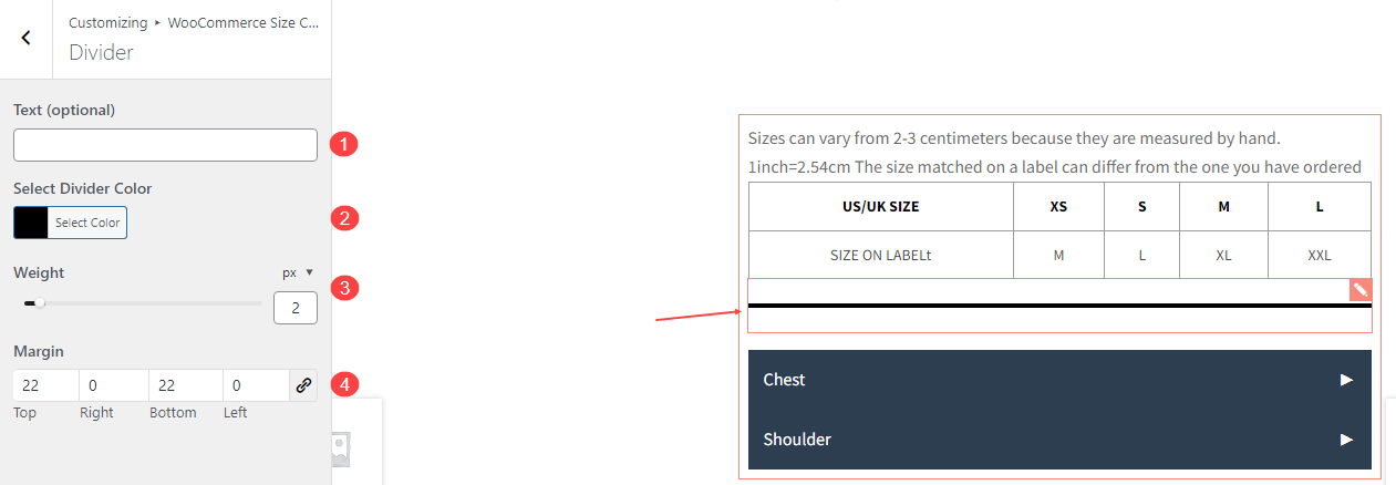
- Text (Optional): You can add texts to the divider if you want.
- Select Divider Color: Choose color for the divider
- Weight: The weight setting controls the thickness of the divider
- Margin: You can customize the space around the divider by adjusting the margin.