Ticket Form settings
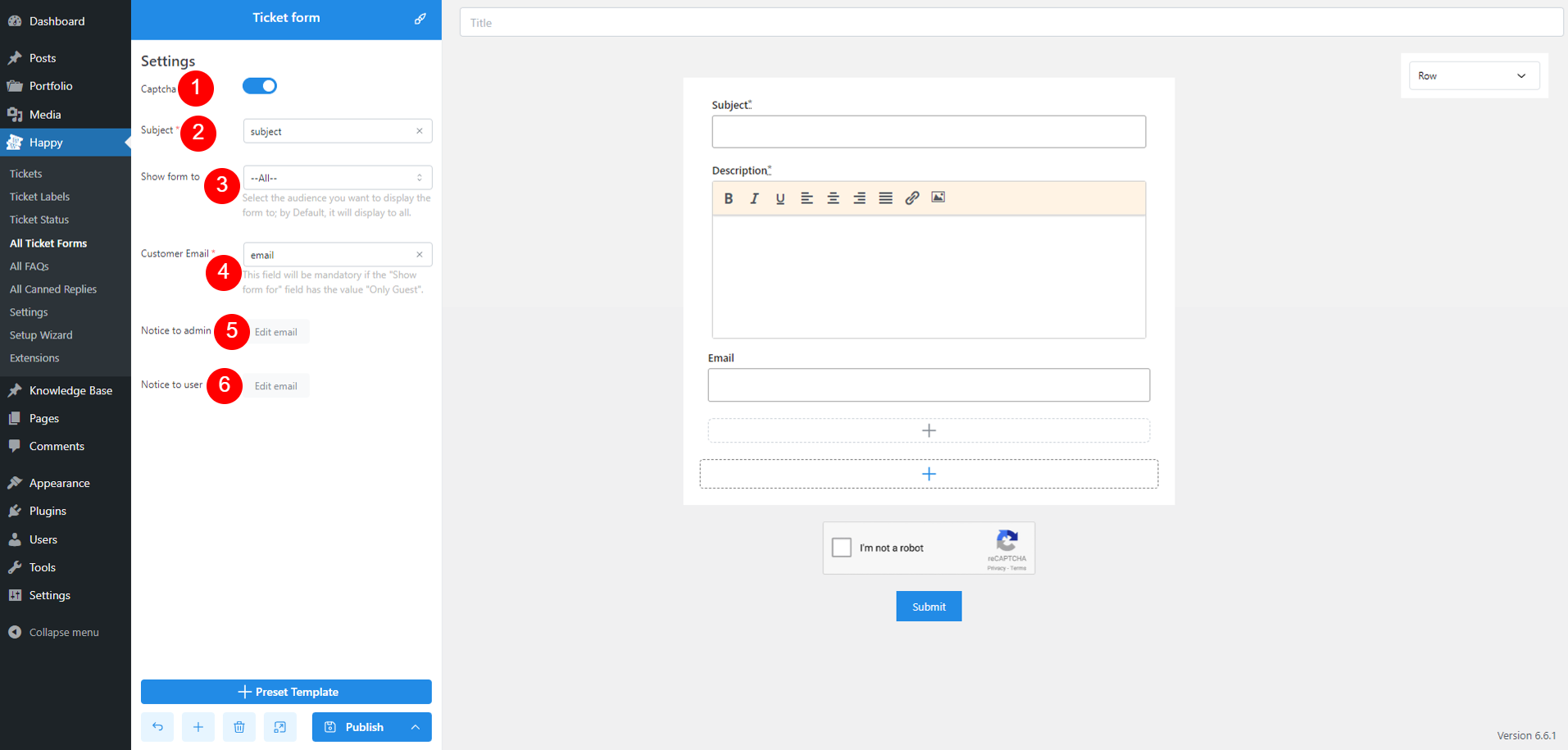
- Captcha: Add a Captcha to your form to prevent spam and ensure submissions are from real users. Configure Captcha settings in Miscellaneous settings page
- Subject: Add a text input field. These fields will then be available for you to choose in this option
Note: Ticket subject is a required field in a form - Show form to: Control who can view and access the form. Options may include:
- All: Anyone can view and submit the form.
- Only User Login: Only users who are logged in can access the form.
- Only Guest: Only users who are not logged in can access the form
Note: If you select ‘All‘ or ‘Only Guest,’ the form must include a Customer Email field. Add a text input field and set the type to ‘Email.’ This field will then be available for selection under Customer Email options.
- Customer Email: This field is available and required when you select “All” or “Only Guest” in option 3 above.
- Notice to admin: Click the Edit email button to edit email notification sent to admin.
- Enable Admin notification email: Send an email notification to admin when a ticket is submitted.
- CC/BCC: Additional recipients who will receive a copy of the notification, or who will receive the notification without other recipients knowing
- Email Subject: Customize the subject line for admin notification emails.
- Email Body: Configure the content of the email sent to admin, including dynamic placeholders supported.
- Notice to user: Click the Edit email button to edit email notification sent to admin.
- Enable User notification email: Send an email notification to admin when their ticket is submitted.
- CC/BCC: Additional recipients who will receive a copy of the notification, or who will receive the notification without other recipients knowing
- Email Subject: Customize the subject line for user notification emails.
- Email Body: Configure the content of the email sent to users, including dynamic placeholders supported.
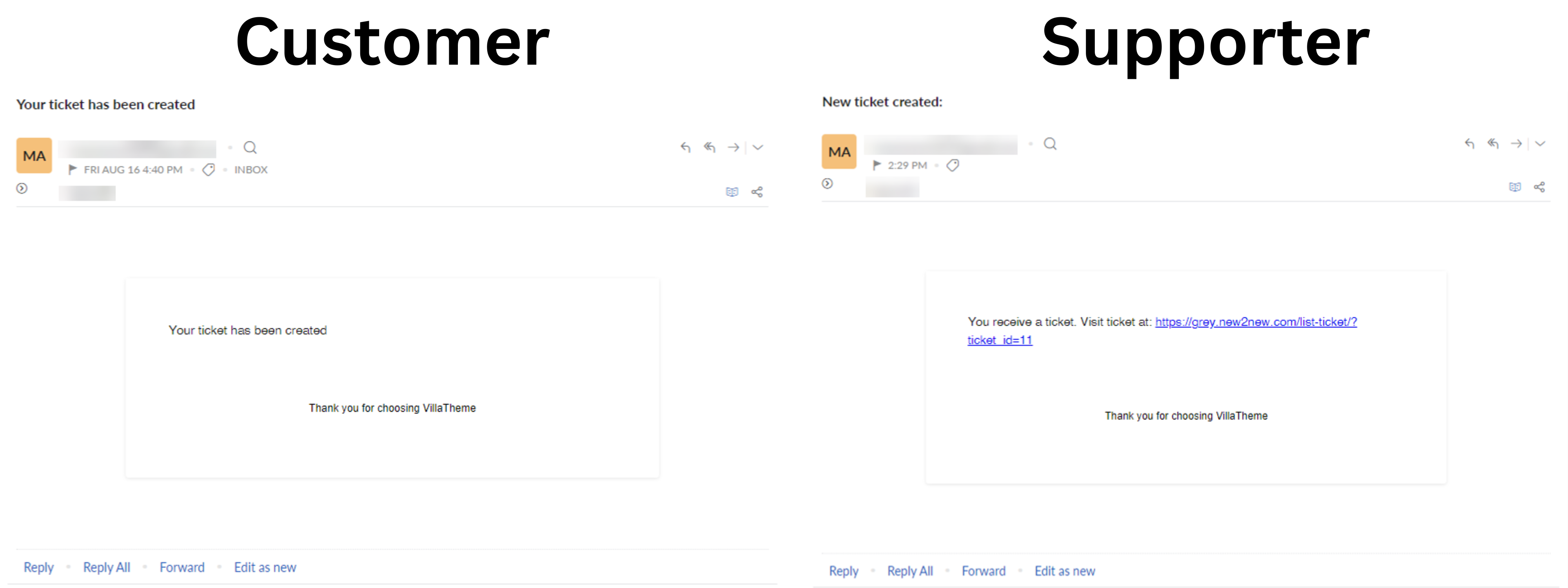
An email to admin/user upon ticket creation looks like this
Ticket Form customizing options
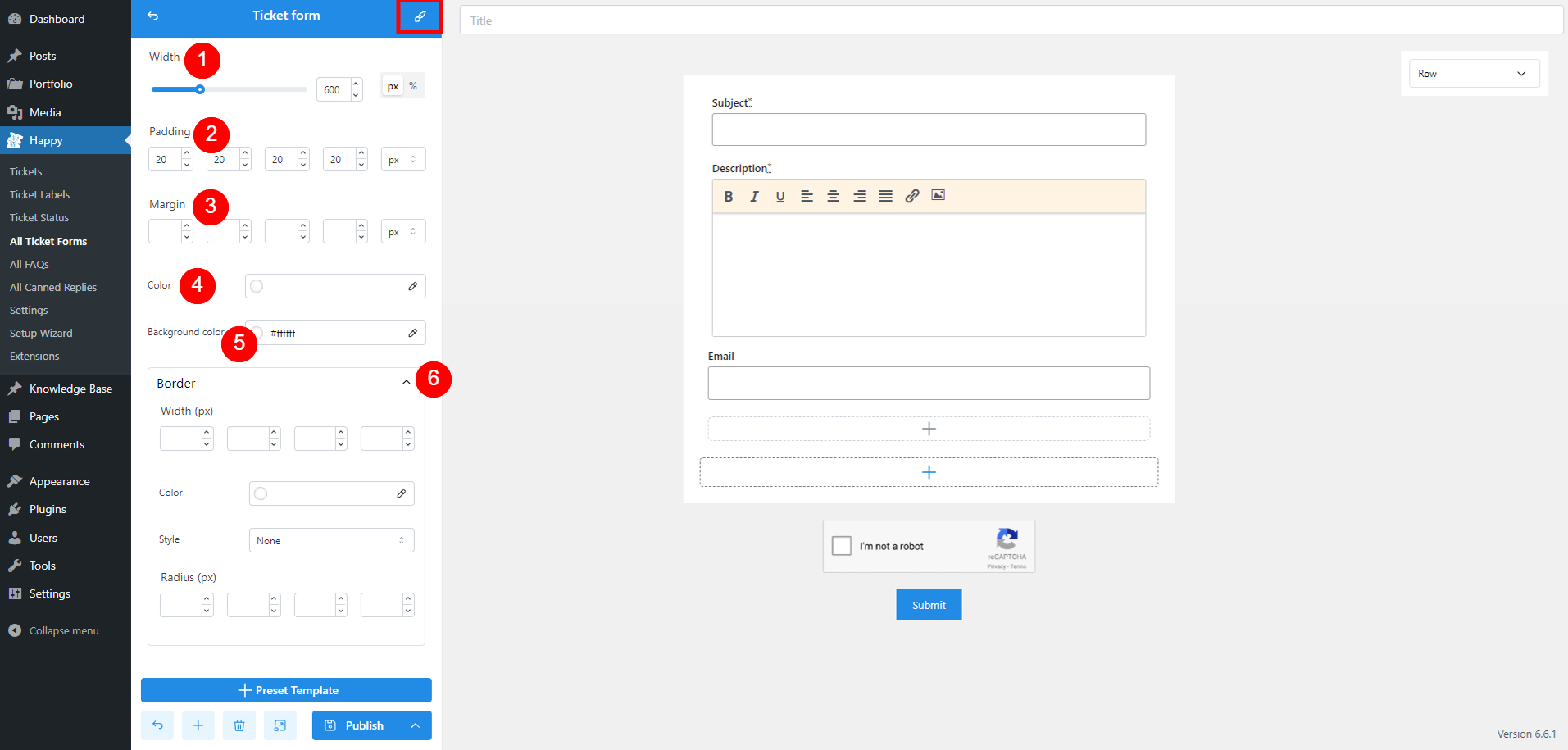
- Width: Adjust the overall width of the form to fit your design requirements
- Padding: Set the internal spacing between the form’s content and its edges to ensure content is not too close to the borders
- Margin: Define the external spacing around the form to control how it is positioned relative to other elements on the page
- Color: Choose a global color for the entire form. You can also customize the color of individual fields within their settings
- Background color: Select a background color for the form
- Border:
- Width: Set the thickness of the form’s border in pixels
- Color: Choose the color of the border to match your design
- Style
- None: No border
- Solid: A single, continuous line
- Dotted: A line made of dots
- Dashed: A line made of dashes
- Double: A line with a double border
- Radius: Adjust the roundness of the border corners by setting the radius in pixels
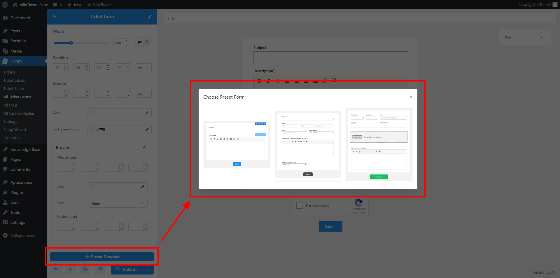
Preset Template
The Preset Template option allows you to quickly create a new ticket form using pre-designed templates. At the moment, we have 3 built-in templates.
Field settings
Each field in your ticket form has three setting pages:
- General: Configure basic properties such as field label, placeholder text, and whether the field is required or optional.
- Style: Adjust the visual appearance of the field, including font size, text color, and background color, to match your form’s design.
- Advanced: You can configure conditional logic for showing or hiding a field based on user input.
Heading
Displays a title or heading in the form, ranging from h1 to h6, and p. Useful for organizing and labeling different sections
General
- Enable: Toggle this option to show/hide the field
- Content: Label the field how you want
- Heading type: Define the importance and hierarchy of headings, ranging from h1 to h6 and p
Style
- Width: Adjust the overall width of the form to fit your design requirements
- Padding: Set the internal spacing between the form’s content and its edges to ensure content is not too close to the borders
- Margin: Define the external spacing around the form to control how it is positioned relative to other elements on the page
- Color: Choose a color for the heading text
- Background color: Select a background color for the field
- Alignment: Align the field – Left, Center or Middle
- Border: Customize the field border – refer to Ticket Form customizing options for more details
- Custom class: Define a class for this field for custom CSS if needed
Advanced
- Enable: Turn on or off the conditional display settings for the field
- Display: Choose whether to show or hide the field based on specific conditions below
- Relation: Define how multiple conditions are combined:
- And: All specified conditions must be met for the field to be displayed.
- Or: Any one of the specified conditions must be met for the field to be displayed.
- Rules: Set up the criteria for displaying or hiding the field by selecting
- Element: The specific field that will be used to trigger the condition.
- Operation: The type of comparison to apply (e.g., is, is not, is empty, is not empty).
- Value: The value that the selected element or field must meet for the condition to apply.
Gap
Adds spacing between form elements to improve layout and readability. Helps separate sections visually
General
- Enable: Toggle this option to show/hide the field
- Gap: Adjust the gap space by px
Style
- Width: Adjust the overall width of the form to fit your design requirements
- Padding: Set the internal spacing between the form’s content and its edges to ensure content is not too close to the borders
- Margin: Define the external spacing around the form to control how it is positioned relative to other elements on the page
- Color: Choose a color for the field
- Background color: Select a background color for the field
- Alignment: Align the field – Left, Center or Middle
- Border: Customize the field border – refer to Ticket Form customizing options for more details
- Custom class: Define a class for this field for custom CSS if needed
Advanced
- Enable: Turn on or off the conditional display settings for the field
- Display: Choose whether to show or hide the field based on specific conditions below
- Relation: Define how multiple conditions are combined:
- And: All specified conditions must be met for the field to be displayed.
- Or: Any one of the specified conditions must be met for the field to be displayed.
- Rules: Set up the criteria for displaying or hiding the field by selecting
- Element: The specific field that will be used to trigger the condition.
- Operation: The type of comparison to apply (e.g., is, is not, is empty, is not empty).
- Value: The value that the selected element or field must meet for the condition to apply.
Divider
Inserts a horizontal line to separate sections within the form. Useful for clearly demarcating different areas of the form.
General
- Enable: Toggle this option to show/hide the field
- Thickness (px): Set the thickness of the divider line in pixels
- Line style: Solid, Dotted, Dashed, or Double
- Line color: Select the color of the divider line to match your form’s design
Style
- Width: Adjust the overall width of the form to fit your design requirements
- Padding: Set the internal spacing between the form’s content and its edges to ensure content is not too close to the borders
- Margin: Define the external spacing around the form to control how it is positioned relative to other elements on the page
- Color: Choose a color for the field
- Background color: Select a background color for the field
- Alignment: Align the field – Left, Center or Middle
- Border: Customize the field border – refer to Ticket Form customizing options for more details
- Custom class: Define a class for this field for custom CSS if needed
Advanced
- Enable: Turn on or off the conditional display settings for the field
- Display: Choose whether to show or hide the field based on specific conditions below
- Relation: Define how multiple conditions are combined:
- And: All specified conditions must be met for the field to be displayed.
- Or: Any one of the specified conditions must be met for the field to be displayed.
- Rules: Set up the criteria for displaying or hiding the field by selecting
- Element: The specific field that will be used to trigger the condition.
- Operation: The type of comparison to apply (e.g., is, is not, is empty, is not empty).
- Value: The value that the selected element or field must meet for the condition to apply.
Paragraph
Provides a text block for instructions, explanations, or any additional information needed for users filling out the form. This field is defined by admin and customer can’t edit it.
General
- Enable: Toggle this option to show/hide the field
- Content field: Add the content you want here. This field supports media, visual/text editor and text customizing options.
Style
- Width: Adjust the overall width of the form to fit your design requirements
- Padding: Set the internal spacing between the form’s content and its edges to ensure content is not too close to the borders
- Margin: Define the external spacing around the form to control how it is positioned relative to other elements on the page
- Color: Choose a color for the field
- Background color: Select a background color for the field
- Alignment: Align the field – Left, Center or Middle
- Border: Customize the field border – refer to Ticket Form customizing options for more details
- Custom class: Define a class for this field for custom CSS if needed
Advanced
- Enable: Turn on or off the conditional display settings for the field
- Display: Choose whether to show or hide the field based on specific conditions below
- Relation: Define how multiple conditions are combined:
- And: All specified conditions must be met for the field to be displayed.
- Or: Any one of the specified conditions must be met for the field to be displayed.
- Rules: Set up the criteria for displaying or hiding the field by selecting
- Element: The specific field that will be used to trigger the condition.
- Operation: The type of comparison to apply (e.g., is, is not, is empty, is not empty).
- Value: The value that the selected element or field must meet for the condition to apply.
Text input
Text input is meant to receive any small string of characters such as: Username, Name, Last Name, Date of birth, etc
General
- Enable: Toggle this option to show/hide the field
- Required: Enable to make this field mandatory for users to complete before submitting the form
- Label: Enter the text that will appear as the label for the text input field
- Slug: This value can be auto-generated by the label, or admin can manually enter a unique identifier or name for the field
- Type: Specify the type of input expected. This influences the keyboard layout on mobile devices and validation. These supported formats are commonly used by HTML5
- Text: Basic text input for general text entry
- Email: Validates that the input is in the format of an email address (e.g., example@domain.com)
- Tel: Designed for phone number input, often with a numeric keypad on mobile devices
- URL: Ensures the input is formatted as a valid URL (e.g., https://www.example.com)
- Date: Allows users to select a date from a calendar picker
- Time: Provides a time picker for selecting a specific time
- Date time: Combines date and time inputs into a single field, allowing for both date and time selection
- Default value: Set a pre-filled value (placeholders supported) that appears in the field by default. This can provide users with a starting point or example.
- Placeholder: Add placeholder text that appears in the field when it is empty, giving users a hint about the expected input.
- Set as subject field button: Click this option if you want the text input field to be used as the subject field for the ticket, without the need to go back to the form settings to set up. Once selected, it becomes “Is subject field” button.
Style
- Input are style: These settings are for the input information – the content which is filled in the input field
- Text Color: Adjust the color of the text that users input into the field
- Background Color: Set the background color of the input field.
- Border (px): Define the thickness of the input field borders in pixels
- Border Color: Choose the color of the input field borders
- Border Style: Specify the style of the input field border, such as solid, dotted, or dashed
- Radius (px): Set the curvature of the input field’s corners in pixels, giving it a rounded appearance
- Field area style : These settings are for the entire field
- Width: Adjust the overall width of the form to fit your design requirements
- Padding: Set the internal spacing between the form’s content and its edges to ensure content is not too close to the borders
- Margin: Define the external spacing around the form to control how it is positioned relative to other elements on the page
- Color: Choose a color for the field
- Background color: Select a background color for the field
- Alignment: Align the field – Left, Center or Middle
- Border: Customize the field border – refer to Ticket Form customizing options for more details
- Custom class: Define a class for this field for custom CSS if needed
Advanced
- Enable: Turn on or off the conditional display settings for the field
- Display: Choose whether to show or hide the field based on specific conditions below
- Relation: Define how multiple conditions are combined:
- And: All specified conditions must be met for the field to be displayed.
- Or: Any one of the specified conditions must be met for the field to be displayed.
- Rules: Set up the criteria for displaying or hiding the field by selecting
- Element: The specific field that will be used to trigger the condition.
- Operation: The type of comparison to apply (e.g., is, is not, is empty, is not empty).
- Value: The value that the selected element or field must meet for the condition to apply.
Number input
Lets users enter numeric values. Useful for fields requiring numbers, like age or quantity
General
- Enable: Toggle this option to show/hide the field
- Required: Enable to make this field mandatory for users to complete before submitting the form
- Label: Enter the text that will appear as the label for the number input field
- Slug: This value can be auto-generated by the label, or admin can manually enter a unique identifier or name for the field
- Default value: Set a pre-filled value (placeholders supported) that appears in the field by default. This can provide users with a starting point or example.
- Placeholder: Add placeholder text that appears in the field when it is empty, giving users a hint about the expected input.
- Min: Minimum allowable value. Users will not be able to enter a number lower than this value.
- Max: Maximum allowable value. Users will not be able to enter a number higher than this value.
Style
- Width: Adjust the overall width of the form to fit your design requirements
- Padding: Set the internal spacing between the form’s content and its edges to ensure content is not too close to the borders
- Margin: Define the external spacing around the form to control how it is positioned relative to other elements on the page
- Color: Choose a color for the field
- Background color: Select a background color for the field
- Alignment: Align the field – Left, Center or Middle
- Border: Customize the field border – refer to Ticket Form customizing options for more details
- Custom class: Define a class for this field for custom CSS if needed
Advanced
- Enable: Turn on or off the conditional display settings for the field
- Display: Choose whether to show or hide the field based on specific conditions below
- Relation: Define how multiple conditions are combined:
- And: All specified conditions must be met for the field to be displayed.
- Or: Any one of the specified conditions must be met for the field to be displayed.
- Rules: Set up the criteria for displaying or hiding the field by selecting
- Element: The specific field that will be used to trigger the condition.
- Operation: The type of comparison to apply (e.g., is, is not, is empty, is not empty).
- Value: The value that the selected element or field must meet for the condition to apply.
Textarea
Compared to Text input, text area is ideal for long text inputs. This element provides a larger text area for users to enter multi-line text
General
- Enable: Toggle this option to show/hide the field
- Required: Enable to make this field mandatory for users to complete before submitting the form
- Label: Enter the text that will appear as the label for the text area field
- Slug: This value can be auto-generated by the label, or admin can manually enter a unique identifier or name for the field
- Default value: Set a pre-filled value that appears in the field by default. This can provide users with a starting point or example.
- Placeholder: Add placeholder text that appears in the field when it is empty, giving users a hint about the expected input.
- Row: Specify the number of visible rows in the text area. This setting determines the height of the text area and how much content is visible without scrolling. Increasing the number of rows will make the text area taller, allowing users to see more of their input at once.
Style
- Input are style: These settings are for the input information – the content which is filled in the input field
- Text Color: Adjust the color of the text that users input into the field
- Background Color: Set the background color of the input field.
- Border (px): Define the thickness of the input field borders in pixels
- Border Color: Choose the color of the input field borders
- Border Style: Specify the style of the input field border, such as solid, dotted, or dashed
- Radius (px): Set the curvature of the input field’s corners in pixels, giving it a rounded appearance
- Field area style : These settings are for the entire field
- Width: Adjust the overall width of the form to fit your design requirements
- Padding: Set the internal spacing between the form’s content and its edges to ensure content is not too close to the borders
- Margin: Define the external spacing around the form to control how it is positioned relative to other elements on the page
- Color: Choose a color for the field
- Background color: Select a background color for the field
- Alignment: Align the field – Left, Center or Middle
- Border: Customize the field border – refer to Ticket Form customizing options for more details
- Custom class: Define a class for this field for custom CSS if needed
Advanced
- Enable: Turn on or off the conditional display settings for the field
- Display: Choose whether to show or hide the field based on specific conditions below
- Relation: Define how multiple conditions are combined:
- And: All specified conditions must be met for the field to be displayed.
- Or: Any one of the specified conditions must be met for the field to be displayed.
- Rules: Set up the criteria for displaying or hiding the field by selecting
- Element: The specific field that will be used to trigger the condition.
- Operation: The type of comparison to apply (e.g., is, is not, is empty, is not empty).
- Value: The value that the selected element or field must meet for the condition to apply.
Select
Creates a dropdown menu for users to choose from a list of options. Efficient for selecting one item from multiple choices
General
- Enable: Toggle this option to show/hide the field
- Required: Enable to make this field mandatory for users to complete before submitting the form
- Label: Enter the text that will appear as the label for the Select field
- Slug: This value can be auto-generated by the label, or admin can manually enter a unique identifier or name for the field
- Placeholder: Add placeholder text that appears in the field when it is empty, giving users a hint about the expected input.
- Options: Click the plus icon to add more options and the red X button to remove an option. Value and Name are required for each option and you can make one option default. After configuring, this field will show up as a dropdown on front end.
Style
- Width: Adjust the overall width of the form to fit your design requirements
- Padding: Set the internal spacing between the form’s content and its edges to ensure content is not too close to the borders
- Margin: Define the external spacing around the form to control how it is positioned relative to other elements on the page
- Color: Choose a color for the field
- Background color: Select a background color for the field
- Alignment: Align the field – Left, Center or Middle
- Border: Customize the field border – refer to Ticket Form customizing options for more details
- Custom class: Define a class for this field for custom CSS if needed
Advanced
- Enable: Turn on or off the conditional display settings for the field
- Display: Choose whether to show or hide the field based on specific conditions below
- Relation: Define how multiple conditions are combined:
- And: All specified conditions must be met for the field to be displayed.
- Or: Any one of the specified conditions must be met for the field to be displayed.
- Rules: Set up the criteria for displaying or hiding the field by selecting
- Element: The specific field that will be used to trigger the condition.
- Operation: The type of comparison to apply (e.g., is, is not, is empty, is not empty).
- Value: The value that the selected element or field must meet for the condition to apply.
Checkbox
Enables users to select one or more options from a list. Useful for multiple-choice questions where more than one option can be selected
General
- Enable: Toggle this option to show/hide the field
- Required: Enable to make this field mandatory for users to complete before submitting the form
- Label: Enter the text that will appear as the label for the Checkbox field
- Slug: This value can be auto-generated by the label, or admin can manually enter a unique identifier or name for the field
- Direction: Make the checkboxes show up vertically or horizontally
- Options: Click the plus icon to add more options and the red X button to remove an option. Value and Name are required for each option and you can make one option default. After configuring, this field will show up as checkboxes on front end.
Style
- Width: Adjust the overall width of the form to fit your design requirements
- Padding: Set the internal spacing between the form’s content and its edges to ensure content is not too close to the borders
- Margin: Define the external spacing around the form to control how it is positioned relative to other elements on the page
- Color: Choose a color for the field
- Background color: Select a background color for the field
- Alignment: Align the field – Left, Center or Middle
- Border: Customize the field border – refer to Ticket Form customizing options for more details
- Custom class: Define a class for this field for custom CSS if needed
Advanced
- Enable: Turn on or off the conditional display settings for the field
- Display: Choose whether to show or hide the field based on specific conditions below
- Relation: Define how multiple conditions are combined:
- And: All specified conditions must be met for the field to be displayed.
- Or: Any one of the specified conditions must be met for the field to be displayed.
- Rules: Set up the criteria for displaying or hiding the field by selecting
- Element: The specific field that will be used to trigger the condition.
- Operation: The type of comparison to apply (e.g., is, is not, is empty, is not empty).
- Value: The value that the selected element or field must meet for the condition to apply.
Radio
Allows users to select a single option from a set of choices. The difference between Select and Radio lies in their design – Radio shows a list of options with radio buttons, where users can see all options at once and select only one
General
- Enable: Toggle this option to show/hide the field
- Required: Enable to make this field mandatory for users to complete before submitting the form
- Label: Enter the text that will appear as the label for the Radio field
- Slug: This value can be auto-generated by the label, or admin can manually enter a unique identifier or name for the field
- Direction: Make the radio buttons show up vertically or horizontally
- Options: Click the plus icon to add more options and the red X button to remove an option. Value and Name are required for each option and you can make one option default. After configuring, this field will show up as radio buttons on front end.
Style
- Width: Adjust the overall width of the form to fit your design requirements
- Padding: Set the internal spacing between the form’s content and its edges to ensure content is not too close to the borders
- Margin: Define the external spacing around the form to control how it is positioned relative to other elements on the page
- Color: Choose a color for the field
- Background color: Select a background color for the field
- Alignment: Align the field – Left, Center or Middle
- Border: Customize the field border – refer to Ticket Form customizing options for more details
- Custom class: Define a class for this field for custom CSS if needed
Advanced
- Enable: Turn on or off the conditional display settings for the field
- Display: Choose whether to show or hide the field based on specific conditions below
- Relation: Define how multiple conditions are combined:
- And: All specified conditions must be met for the field to be displayed.
- Or: Any one of the specified conditions must be met for the field to be displayed.
- Rules: Set up the criteria for displaying or hiding the field by selecting
- Element: The specific field that will be used to trigger the condition.
- Operation: The type of comparison to apply (e.g., is, is not, is empty, is not empty).
- Value: The value that the selected element or field must meet for the condition to apply.
Upload
This is an upload file button that lets users attach files to their submission. Useful for forms that require image uploads.
General
- Enable: Toggle this option to show/hide the field
- Custom Button: the upload button will use the default style and settings provided by the form builder. Enable this option and open the “Custom Button” section to access advanced settings for customization
- Label: Enter the text that will appear as the label for the Radio field
- Slug: This value can be auto-generated by the label, or admin can manually enter a unique identifier or name for the field
- Button label: Specify the text that will appear on the upload button itself, such as “Choose File” or “Upload Now.”
- Multiple: Toggle this option to allow users to upload multiple files at once. When enabled, users can select and upload more than one file in a single action.
Style
- Width: Adjust the overall width of the form to fit your design requirements
- Padding: Set the internal spacing between the form’s content and its edges to ensure content is not too close to the borders
- Margin: Define the external spacing around the form to control how it is positioned relative to other elements on the page
- Color: Choose a color for the field
- Background color: Select a background color for the field
- Alignment: Align the field – Left, Center or Middle
- Border: Customize the field border – refer to Ticket Form customizing options for more details
- Custom class: Define a class for this field for custom CSS if needed
Advanced
- Enable: Turn on or off the conditional display settings for the field
- Display: Choose whether to show or hide the field based on specific conditions below
- Relation: Define how multiple conditions are combined:
- And: All specified conditions must be met for the field to be displayed.
- Or: Any one of the specified conditions must be met for the field to be displayed.
- Rules: Set up the criteria for displaying or hiding the field by selecting
- Element: The specific field that will be used to trigger the condition.
- Operation: The type of comparison to apply (e.g., is, is not, is empty, is not empty).
- Value: The value that the selected element or field must meet for the condition to apply.
Editor
Provides a rich text editor for users to input and format text. Suitable for detailed content, like descriptions or formatted responses
General
- Enable: Toggle this option to show/hide the field
- Custom Button: the upload button will use the default style and settings provided by the form builder. Enable this option and open the “Custom Button” section to access advanced settings for customization
- Label: Enter the text that will appear as the label for the Radio field
- Slug: This value can be auto-generated by the label, or admin can manually enter a unique identifier or name for the field
- Default value: Set a pre-filled value (placeholders supported) that appears in the field by default. This can provide users with a starting point or example.
Style
- Width: Adjust the overall width of the form to fit your design requirements
- Padding: Set the internal spacing between the form’s content and its edges to ensure content is not too close to the borders
- Margin: Define the external spacing around the form to control how it is positioned relative to other elements on the page
- Color: Choose a color for the field
- Background color: Select a background color for the field
- Alignment: Align the field – Left, Center or Middle
- Border: Customize the field border – refer to Ticket Form customizing options for more details
- Custom class: Define a class for this field for custom CSS if needed
Advanced
- Enable: Turn on or off the conditional display settings for the field
- Display: Choose whether to show or hide the field based on specific conditions below
- Relation: Define how multiple conditions are combined:
- And: All specified conditions must be met for the field to be displayed.
- Or: Any one of the specified conditions must be met for the field to be displayed.
- Rules: Set up the criteria for displaying or hiding the field by selecting
- Element: The specific field that will be used to trigger the condition.
- Operation: The type of comparison to apply (e.g., is, is not, is empty, is not empty).
- Value: The value that the selected element or field must meet for the condition to apply.